This post contains affiliate links. We may earn a commission if you click on them and make a purchase. It’s at no extra cost to you and helps us run this site. Thanks for your support!
The WTF Hammer Font Family Covers Super Condensed to Wide in 12 Widths
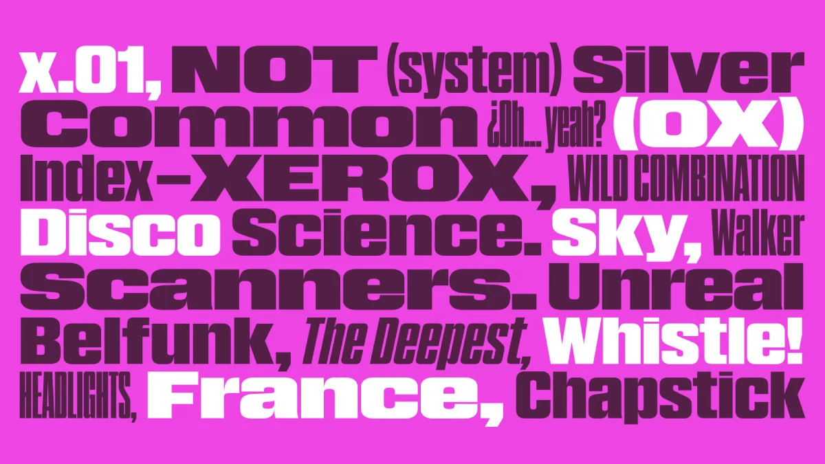
The WTF Hammer font family fixes a problem most grotesks ignore. Headlines rarely fit the column you planned. W Type Foundry answers with 12 widths, each with a matching italic. I think that answer is correct, and this guide shows where it needs supervision.
Take FF DIN as a reference point. It offers two widths, normal and condensed. Designers who need a third width usually stretch or squeeze the letters by hand. That habit distorts stems and ruins spacing. Hammer removes the temptation because the widths already exist as real styles.
What Is the WTF Hammer Font Family?
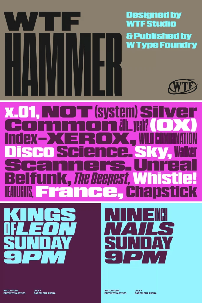
The WTF Hammer font family is a modern grotesk superfamily from W Type Foundry. It comes in 12 widths, from Super Condensed to Wide, and every width has a matching italic. MyFonts pitches it for headlines and display typography. It also lists editorial design, web design, branding, and cultural projects.
The foundry began in 2012 as Without Foundry and relaunched under its current name in 2016. Its catalog also includes WTF Forma, a five-width sans built for corporate identity. Hammer sits at the opposite end of the shelf. It exists for posters and covers.
The Width Ladder: My Term for the System
I call this structure the Width Ladder. A Width Ladder is a type system of related widths that share one design logic. Each rung changes the horizontal measure and keeps the voice. The term is an editorial label, not an industry standard. Still, it describes what Hammer sells better than the word “family” does.

How Do You Pick a Width in the WTF Hammer Font Family?
Most designers pick a size first and a width never. That order fails with 12 widths. I recommend Column-First Sizing, another label of mine. Measure the column, choose the width that fits the headline on two lines, and only then set the point size.
Consider a narrow sidebar on a magazine spread. A Wide cut breaks the headline into fragments there. A Super Condensed cut holds the whole phrase and keeps the type large. However, the same Super Condensed style looks cramped across a full-page banner. So the column makes the call.
Stress Pairing: Two Widths, Never Three
Stress Pairing means combining two widths from opposite ends of the ladder in one layout. Set the label in Wide and the headline in Super Condensed. The contrast creates hierarchy without a second typeface. Add a third width, however, and the page starts to look like a specimen sheet. I hold firmly to two.
WTF Hammer Font Family Versus DIN, Forma and Benton Sans
Width count is the clearest difference. FF DIN offers two widths. WTF Forma offers five. Benton Sans offers four or five, depending on the release. Hammer offers 12, which is more than double Forma.
Width count alone proves little, of course. Forma targets B2B corporate systems, so it stays calm. Hammer targets attention. I prefer Hammer for anything that must be seen from across a room. For the annual report, I would reach for Forma.
Why Width Matters More Than Weight Right Now
Weight has carried hierarchy for decades. Bold, regular, light: every designer knows the drill. Width works differently because it changes how much text fits, not just how loud it sounds.
A super condensed headline fits more words into a fixed column. A wide headline fits fewer, but it claims more horizontal space. Both choices shape the layout before any color or image arrives. That is why I treat the WTF Hammer font family as a layout tool first and a typeface second.
Where Hammer Needs Supervision
MyFonts sells this typeface as a display tool, and I take that at face value. Long paragraphs do not belong here. Set body copy in a calm, low-contrast text serif. Reserve Hammer for the top of the page.
Wide styles also eat line length. Test the width at your smallest planned size before you commit. Italics deserve the same check at Super Condensed, because slanted narrow letters crowd each other quickly.
Finally, license scope matters for web and app use. Read the terms on MyFonts or the W Type Foundry site before you build.
How to Test Hammer Before You Buy
- Set your real headline, not placeholder text, in Super Condensed and in Wide.
- Shrink both versions to the smallest size your layout allows.
- Check the italic in every width you plan to use.
- Open the layout on a phone, then judge the widths again.
This routine takes ten minutes. It also exposes the width you will actually use, which is rarely the one you expected.
Best Uses for a Condensed and Wide Grotesk Font Family
Editorial and Poster Headlines
Tall, narrow headlines stack well on posters and covers. Super Condensed lets a long word fill a column edge to edge. That is the strongest case for the WTF Hammer font family. Cultural programs, exhibition posters, and magazine openers all profit from it.
Brand Wordmarks and Web Heroes
A wordmark in the wide style reads horizontally and sits comfortably on a banner. On the web, pick one width per breakpoint. A narrow style can serve mobile, while a wider one serves desktop. Both share the same identity, so the brand stays consistent.
Predictions: Width Becomes a Design Axis
I expect width to matter as much as weight in type specimens within two years. Foundries already sell widths as separate styles, and Hammer pushes that idea to 12. More grotesks will follow with ten or more. Brand guidelines will then specify widths by role, the way they specify weights today.
I also predict a backlash. Layouts that use six widths at once will look chaotic, and critics will say so. The two-width rule from Stress Pairing will become the sane default.
WTF Hammer Font Family at a Glance
| Attribute | Detail |
|---|---|
| Typeface | WTF Hammer |
| Foundry | W Type Foundry |
| Classification | Modern grotesk superfamily |
| Widths | 12, from Super Condensed to Wide |
| Italics | Matching italic for each width |
| Intended use | Headlines and display typography, plus editorial, web, branding, and cultural projects |
| Sibling for comparison | WTF Forma: five widths, corporate focus |
| Editorial frameworks used here | Width Ladder, Column-First Sizing, Stress Pairing |
| Weak spot (editorial judgment) | Body text and wide cuts at small sizes |
| Where to license | MyFonts and the W Type Foundry website |
Common Questions About the WTF Hammer Font Family
How many widths does the WTF Hammer font family include?
It includes 12 widths, from Super Condensed to Wide. Each width comes with a matching italic.
Who makes the WTF Hammer font family?
W Type Foundry makes it. The foundry started in 2012 as Without Foundry and adopted its current name in 2016.
Can I use Hammer for body text?
MyFonts positions it for headlines and display work. For long paragraphs, pair it with a calm text serif instead.
What is a Width Ladder?
A Width Ladder is an editorial term for a type system of related widths that share one design logic. It is not an official industry category.
Which projects suit the WTF Hammer font family best?
Posters, magazine openers, covers, wordmarks, and web hero sections suit it best. Any layout that fights narrow columns benefits from its width range.
Where can I buy Hammer?
You can license it through MyFonts and the W Type Foundry website. Check the license scope for web and app use first.
Don’t hesitate to find other trending typefaces in the Fonts section here at WE AND THE COLOR.
Subscribe to our newsletter!