This post contains affiliate links. We may earn a commission if you click on them and make a purchase. It’s at no extra cost to you and helps us run this site. Thanks for your support!
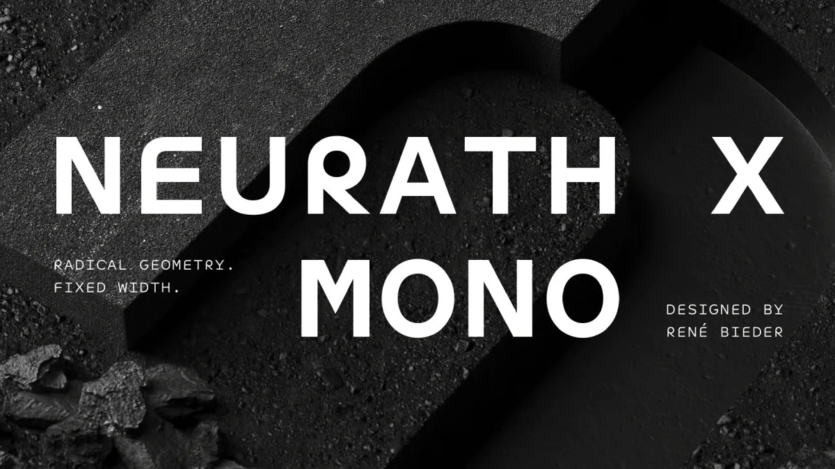
When Monospace Gets a Little Rounder—Neurath X Mono Bets That Monospace Type Can Stay Round and Still Line Up.
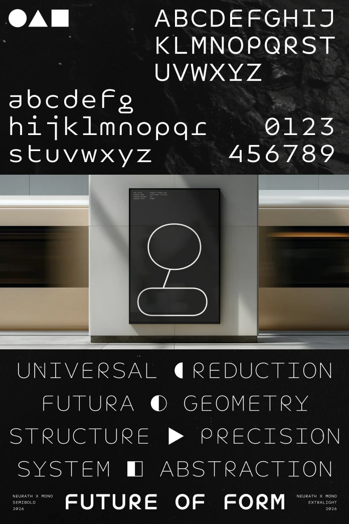
Neurath X Mono is the stronger half of René Bieder’s newest collection, and one unfashionable decision explains why. Bieder gave every character an unusually wide cell. That choice lets round letters stay round, which most monospace fonts cannot afford.
The timing matters. WE AND THE COLOR already covered Neurath Mono and Neurath X, so this is the missing third piece. Neurath X Mono and Neurath X launched together as one collection of 36 styles. Because they share a design logic, Neurath X Mono works as a second voice in the same argument.
If you want a geometric monospace font with real personality, Neurath X Mono belongs on your shortlist. Below, you get the design logic first and the trade-offs second. Then come three predictions about where this category goes next.
What Is Neurath X Mono, and Who Should Use It?
Neurath X Mono is a geometric, fixed-width typeface family from Berlin-based Studio René Bieder. It offers 18 styles, which cover nine weights from thin to black plus matching italics.
Bieder designed Neurath X Mono as a standalone monospace system. He did not squeeze a proportional design into a grid. Instead, he simplified and redrew the traditional letter shapes for a fixed width.

The design starts from the same reinterpretation of Paul Renner’s Futura that drives Neurath X. It also borrows ideas from Herbert Bayer’s Universal Alphabet and Herb Lubalin’s ITC Ronda. Bieder named the family after Otto Neurath, the Austrian philosopher who co-developed the ISOTYPE pictogram system. The X stands for “extreme.”
The MyFonts description targets creative coding environments and contemporary graphic design. It also names interfaces, branding, editorial layouts, terminals, and display type. My read is simple. Designers get the most from Neurath X Mono, and developers with strong opinions about their editor come second.
Why Does the Cell Matter More Than the Letters?
Cell Tension: The Problem Behind Every Monospace Font
Every monospace font fights the same battle. A lowercase i and a capital M must occupy identical horizontal space. Typewriters set ten characters per inch at 12 points. That works out to a 0.6 em cell, and many coding fonts still stay close to it.
I call the pressure between a glyph’s natural width and its fixed cell Cell Tension. Low tension looks calm. High tension shows up as an “i” floating in a box or an “m” squeezed into one. Cell Tension and the other named ideas below are my own editorial constructs, not industry standards.
The Set Width Dividend: What a Wide Cell Buys
Bieder chose the Neurath X Mono set width on purpose. In his words, the “unusually generous set width isn’t a compromise.” He adds that this width lets the geometry survive.
I call that payoff the Set Width Dividend. A wide cell gives round forms room to stay round. Meanwhile, the fixed width makes the geometric character more pronounced.
The dividend has a price. A wider cell means fewer characters per line at any given point size. At 14 px, a 0.6 em cell measures 8.4 px, so 100 columns need 840 px. Bieder calls his width unusually generous, so expect a 100-column window to run wider than that.
The Raised x-Height Finishes the Job
Bieder also raised the x-height of Neurath X Mono sharply. That keeps the simplified forms clear at a fixed width. Neurath Mono already pulled the same lever, so both mono families share this trait.
My opinion: x-height beats every alternate on the feature list. A monospace lives at small sizes, and lowercase letters carry most of the text. Tall lowercase forms therefore do more daily work than any stylistic set.
How Far Can Geometric Reduction Go Inside a Fixed Grid?
In my Neurath X review, I named the Reduction Ceiling. It marks the point where stripping a letter stops looking modern and starts looking broken. A fixed grid pushes that ceiling lower, because every glyph must justify the same footprint.
Bieder studied earlier experiments closely. Renner’s Futura from 1927 and Bayer’s Universal Alphabet both pushed geometry toward the abstract, and Bayer dropped uppercase entirely. ITC Ronda by Herb Lubalin took a looser mood and treated circles as play. Bieder says he broke from all three on readability.
He also revisited Renner’s lesser-known alternate characters. Those forms reveal a more experimental direction that lost out to broader acceptance. The Neurath X collection revisits that road, and Neurath X Mono tests it on a grid.
The Alternate Range Index from the proportional sibling carries over here. Neurath X Mono includes stylistic sets and alternate characters. Some revisit the radical reduction of early geometric type, and others go further. Bieder says each alternate extends the design philosophy instead of padding the menu.
How Does Neurath X Mono Handle Code, Tables, and Terminals?
The Column Test
Here is a simple check I call the Column Test. Set a table of numbers and a block of code side by side. Then ask whether the columns align and whether the type still shows character.
Neurath X Mono passes the first half by definition. In a monospace, alignment comes free. Character is the part that costs. The feature list helps on both counts, with ligatures, fractions, tabular figures, and case-sensitive punctuation for uppercase settings.
Language coverage reaches more than 200 Latin-based languages. That matters for interfaces that display user-generated names.
Setup takes a minute. In VS Code, point the editor.fontFamily setting at the family name your system lists. Then switch on editor.fontLigatures if you want the ligatures. Web designers can activate alternates through the CSS font-feature-settings property, using the tags from the specimen.
Where Neurath X Mono Will Annoy You
It costs money. JetBrains Mono and IBM Plex Mono cost nothing. On MyFonts, Neurath X lists at $35 per style and $199 for the full 18. Check the current Neurath X Mono price before you plan a budget.
Thin weights in Neurath X Mono fail at code sizes. Keep Thin and ExtraLight for large labels and posters. Likewise, the 18 styles exceed what an editor needs, because most editors call for two weights and their italics. The rest exist for designers.
Finally, the wide cell costs columns, as the earlier math showed. If you work in split panes on a laptop, test this before you buy.
How Does Neurath X Mono Compare With JetBrains Mono and IBM Plex Mono?
JetBrains Mono wins on price and ergonomics. It costs nothing and has shipped inside JetBrains IDEs since version 2019.3. IBM Plex Mono and the retro-futurist Space Mono also cost nothing. For pure coding comfort, those three make Neurath X Mono a harder sell.
Neurath X Mono wins on identity. IBM Plex Mono ties into a corporate type system. Neurath X Mono ties into a Futura lineage, with a proportional sibling on the same geometry. Also, the raised x-height and generous width give it a look you can spot across a room.
If comfort is your only goal, download JetBrains Mono and stop reading. If editor screenshots and brand data labels should share one geometric voice, Neurath X Mono is the better buy.
How Should You Pair Neurath X Mono With Neurath X and Neurath?
Call the method One-Grid Pairing. A proportional face carries headlines and body copy. Neurath X Mono takes anything that must align, such as timestamps or data labels, and one baseline grid governs both.
I would pair Neurath X Mono with Neurath, not Neurath X, for body text. Neurath plays it straighter, so the mono’s radical alternates read as accents. Neurath X then handles headlines where a brand needs an edge.
Some practical starting points for Neurath X Mono follow:
- Brand systems: use the mono as a secondary voice for labels and metadata.
- Editorial design: set data tables, captions, and pull statistics in regular or medium.
- Interfaces: reserve the mono for timestamps, IDs, and code snippets.
- Display work: try the black weight at large sizes and keep thin above roughly 40 px.
Neurath X Mono at a Glance
| Attribute | Detail |
|---|---|
| Font name | Neurath X Mono |
| Designer and foundry | René Bieder, Studio René Bieder (Berlin) |
| Classification | Geometric monospace sans serif |
| Styles | 18: nine weights from Thin to Black, each with a matching italic |
| Design lineage | Reinterpretation of Paul Renner’s Futura, with ideas from Herbert Bayer’s Universal Alphabet and Herb Lubalin’s ITC Ronda |
| Proportional sibling | Neurath X (the original Neurath and Neurath Mono form a calmer pair) |
| Signature traits | Sharply raised x-height and an unusually generous set width |
| OpenType features | Ligatures, fractions, tabular figures, case-sensitive punctuation, stylistic sets, alternate characters |
| Language support | More than 200 Latin-based languages |
| Intended use | Creative coding, interfaces, branding, editorial design, terminals, display typography |
| Price reference | Sibling Neurath X lists at $35 per style and $199 for the family on MyFonts |
| Editorial terms in this article | Cell Tension, Set Width Dividend, Column Test, One-Grid Pairing |
Three Predictions for Geometric Monospace Type
Prediction 1: Foundries Will Launch the Mono on Day One
Within two years, I expect most new geometric families from independent foundries to ship a monospace sibling at launch. Neurath reached MyFonts on October 15, 2024. Neurath Mono drew its first coverage in early August 2026, nearly two years later. Neurath X and its mono arrived together instead.
Prediction 2: Paid Monos Become Brand Voices
Design-led software companies will license paid monospace fonts for labels and data views. Developers will keep free defaults in their editors. Bieder positions the collection for interfaces, data screens, and code. Neurath X Mono is the half built for that job.
Prediction 3: Set Width Becomes a Spec
Foundries will advertise set width the way they advertise x-height, and buyers will start comparing it. At 14 px, that comparison already has a number: 840 px for 100 columns at 0.6 em.
Frequently Asked Questions About Neurath X Mono
What is Neurath X Mono?
It’s a geometric monospace typeface family by René Bieder. It offers 18 styles and pairs with the proportional Neurath X.
Who designed Neurath X Mono?
René Bieder designed Neurath X Mono. He is a German type designer who runs Studio René Bieder, an independent foundry in Berlin.
How many styles does Neurath X Mono include?
It includes 18 styles. They cover nine weights from Thin to Black, each with a matching italic.
What is the difference between Neurath X Mono and Neurath Mono?
Neurath Mono pairs with the calmer Neurath and stays open and approachable. Neurath X Mono follows the more radical Neurath X and adds a wider alternate range. Both raise the x-height.
What is the difference between Neurath X and Neurath X Mono?
Neurath X uses proportional widths, so each letter takes the space it needs. Neurath X Mono gives every character the same width, which suits code, tables, and data screens. Both share one design logic and were launched together.
Is it good for coding?
Yes, if you value character over column density. It offers a raised x-height, ligatures, and a wide cell. JetBrains Mono costs nothing, so compare both in your own editor first.
Does Neurath X Mono support many languages?
Yes. Neurath X Mono supports more than 200 Latin-based languages.
Where can I buy Neurath X Mono?
You can license it through MyFonts or Studio René Bieder’s own site. MyFonts sells desktop and webfont licenses separately.
Browse WE AND THE COLOR’s Fonts category for more.
Subscribe to our newsletter!