This post contains affiliate links. We may earn a commission if you click on them and make a purchase. It’s at no extra cost to you and helps us run this site. Thanks for your support!
René Bieder’s Neurath Mono Typeface Proves Monospace Type Doesn’t Have to Feel Cramped.
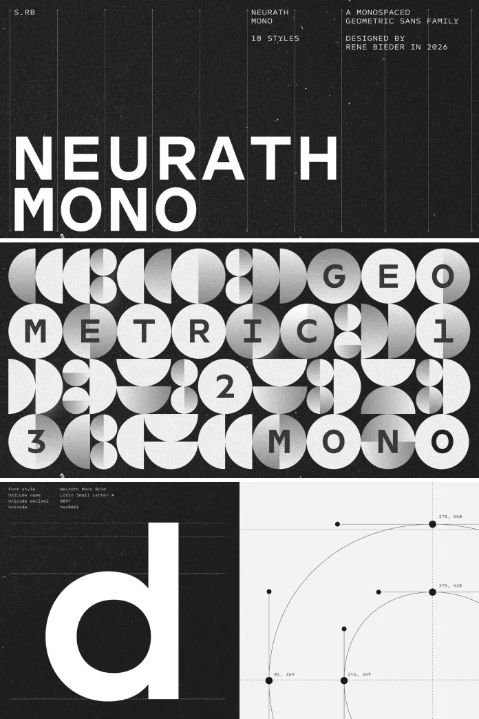
I’m pretty excited because Neurath Mono just landed from Studio René Bieder, and it’s one of those releases that makes you rethink an entire category. I often had the feeling that monospace type has a reputation problem because many fixed-width fonts feel like they were built for terminals in 1998 and never left that mindset. Neurath Mono breaks that pattern, and it does it without gimmicks. It’s a geometric monospace font that borrows its bones from Futura, filters them through a modern lens, and somehow keeps every character exactly the same width while still feeling generous and open. That’s a harder trick than it sounds.
What Exactly Is Neurath Mono, and Why Should Typography Nerds Care?
Neurath Mono is the fixed-width companion to Neurath, the proportional typeface René Bieder released alongside it. Both fonts share the same design foundation, a fresh interpretation of Paul Renner’s Futura. But Neurath Mono had to solve a completely different puzzle. Proportional fonts let each letter take up exactly the space it needs. An “i” gets a sliver of width; an “m” gets a lot more. Monospace fonts throw that flexibility out the window. Every character occupies the same horizontal space, whether it’s a period or a capital W.
That constraint usually produces cramped, awkward letterforms. Designers end up squeezing round shapes into boxes they don’t fit, and the results look stiff. Neurath Mono avoids that trap. It uses an enlarged x-height and carefully balanced proportions so round letters and generous spacing can coexist inside a rigid grid. The font reads as open and relaxed, not compressed, even though it follows the strict math of a monospace system underneath.
The Fixed-Width Openness Principle: A Framework Worth Naming
I want to introduce a term here because I think it captures what makes Neurath Mono worth talking about. Call it the Fixed-Width Openness Principle. It’s my own label, not an industry standard, but it describes a real design tension. Every monospace font has to answer one question: how much visual air can you give a letterform before the fixed grid makes it look distorted?
Most monospace fonts solve this by shrinking. They tighten proportions until everything fits, and legibility becomes an afterthought. Neurath Mono solves it by expanding the x-height instead of shrinking the letters. That single decision changes the entire feel of the font. Lowercase letters gain more visual weight relative to the cap height, so the eye has more surface area to latch onto at small sizes. It’s a smart workaround, and it’s the kind of decision that only shows up when a designer actually understands what monospace type is for, not just what it looks like.

The x-Height Compensation Model
Here’s a second framework, and I think it deserves its own heading. Call it the x-Height Compensation Model. The idea is simple. Monospace fonts lose legibility because of horizontal restriction, so Neurath Mono compensates vertically. A bigger x-height means lowercase letters sit closer in size to the capitals, which reduces the visual noise that usually comes from cramped mono spacing.
This matters more than it sounds like it should. Anyone who has stared at code for eight hours knows how much eye strain comes from tight, inconsistent spacing. A taller x-height doesn’t just look nice; it actually reduces the cognitive load of scanning long blocks of repetitive text. Whether that’s a terminal window, a spreadsheet, or a data table doesn’t matter much. The compensation model holds up across all of them.
Punctuation, Diacritics, and the Legibility Threshold
One detail in Neurath Mono stands out immediately once you start setting real text with it. Punctuation marks and diacritics are drawn slightly larger than convention dictates. That’s a deliberate choice, not an oversight. At small sizes, this boosts clarity during continuous reading. Commas don’t disappear, periods don’t vanish into the baseline, and accented characters stay legible even when the point size shrinks.
At display sizes, something else happens. Those same oversized punctuation marks become a visible signature of the typeface. They don’t dominate the composition, but they give Neurath Mono a small personality quirk that experienced type nerds will spot instantly. I’d call this the Legibility Threshold effect, the point where a functional adjustment doubles as a stylistic fingerprint. Not every foundry manages that balance. This one does.
How Many Styles Does Neurath Mono Include?
Neurath Mono ships with 18 styles, ranging from Thin all the way to Black. That’s a serious range for a monospace family. Most fixed-width fonts stop at four or five weights because building consistent optical weight across a wide range is genuinely difficult when every glyph has to occupy an identical width. Eighteen styles means designers get real flexibility for hierarchy, from delicate editorial captions to bold, chunky interface labels.
The family also ships with a full set of OpenType features. Stylistic alternates, fractions, and arrows are all included, which opens the door to interface design, branding systems, editorial layouts, coding environments, and large-scale display work. That’s an unusually wide net for one typeface to cast, and it works specifically because the underlying structure stays disciplined across every weight and every feature set.
Where Neurath Mono Actually Performs Well
- Interface and product design: the extra x-height helps UI text stay legible in small components like buttons, tags, and data tables.
- Branding and identity work: the geometric Futura lineage gives it a clean, confident presence on packaging and logotypes.
- Editorial typography: pair it with Neurath’s proportional sibling for a system that feels intentional rather than mismatched.
- Coding environments: the fixed width and generous spacing reduce fatigue during long reading sessions.
- Display applications: the oversized punctuation becomes a genuine visual feature at large sizes, not just a legibility fix.
How Does Neurath Mono Compare to Other Monospace Typefaces?
Plenty of monospace fonts exist for coding and interface work, and most of them chase the same goal: technical clarity above everything else. Few of them treat monospace type as a design opportunity rather than a constraint to survive. Neurath Mono sits in a smaller category of fonts that ask what a fixed-width system could look like if openness, not compression, was the starting point.
That doesn’t make older, utilitarian monospace fonts wrong. They serve their purpose well. But Neurath Mono targets a different audience, one that wants a monospace font capable of carrying brand identity, not just displaying code. It’s less about replacing your terminal font and more about giving designers a monospace option that doesn’t look like an afterthought next to a proportional sans serif.
The Mono Sibling Consistency Test
Here’s a third framework I want to put on the table, one I’d call the Mono Sibling Consistency Test. When a foundry releases a proportional font and a monospace font together, built from the same design source, you can measure how well they actually match. Do they share stroke contrast? Do the letterforms feel like they came from the same hand, or does the monospace version feel like a rushed adaptation?
Neurath and Neurath Mono pass this test cleanly. Both trace back to the same Futura reinterpretation, and the family relationship is visible immediately when you set them side by side. That consistency matters for brands that need both a display voice and a technical, tabular voice under one visual system. Too many foundries treat monospace versions as an obligation rather than a genuine design extension, and it shows.
Who Designed Neurath Mono?
René Bieder is a German type designer and the founder of Studio René Bieder, an independent type foundry established in 2013. He came up through graphic design and art direction, working for both small boutique agencies and larger international studios before moving into type design full time. His commercial catalog spans contemporary sans and serif families along with monospace and display fonts, many of which now show up in branding and editorial work worldwide.
Beyond the retail library, Studio René Bieder also builds custom typefaces for international clients across branding, editorial, corporate communication, and digital products. The studio has picked up multiple design awards along the way, and its fonts are currently used by companies, cultural institutions, and designers across a wide range of industries. Neurath Mono fits squarely into that trajectory, a technically disciplined font that still carries genuine design intent.
Neurath Mono at a Glance
| Attribute | Detail |
|---|---|
| Font name | Neurath Mono |
| Designer | René Bieder |
| Foundry | Studio René Bieder (founded 2013) |
| Classification | Geometric monospace typeface |
| Design lineage | Reinterpretation of Paul Renner’s Futura |
| Proportional sibling | Neurath |
| Number of styles | 18, from Thin to Black |
| Key structural feature | Enlarged x-height with balanced proportions |
| Distinct detail | Slightly oversized punctuation and diacritics |
| OpenType features | Stylistic alternates, fractions, arrows, and more |
| Best use cases | Interface design, branding, editorial typography, coding, display |
My Honest Take on Neurath Mono
I’ve reviewed a lot of monospace fonts for this publication, and most of them blur together after a while. Neurath Mono didn’t. The x-height decision alone tells you the designer actually sat with the constraint instead of fighting it. That’s rarer than it should be in this category.
What I appreciate most is that Neurath Mono doesn’t try to disguise the fact that it’s a monospace font. It leans into the grid and finds openness inside the rules instead of pretending the rules don’t exist. Eighteen weights is also just generous. Most studios would have stopped at six and called it complete. This one didn’t, and the range genuinely pays off across branding, interface, and editorial applications alike.
Frequently Asked Questions About Neurath Mono
What is Neurath Mono?
Neurath Mono is a geometric monospace typeface designed by René Bieder, built as the fixed-width companion to the proportional font Neurath, both based on a reinterpretation of Futura.
Who designed Neurath Mono?
René Bieder, a German type designer and founder of Studio René Bieder, designed Neurath Mono.
How many styles does Neurath Mono include?
Neurath Mono includes 18 styles, ranging from Thin to Black.
What makes Neurath Mono different from other monospace fonts?
Neurath Mono uses an enlarged x-height and balanced proportions to allow open, round letterforms inside a fixed-width structure, along with slightly oversized punctuation and diacritics for better legibility.
What is Neurath Mono best used for?
Neurath Mono works well for interface design, branding, editorial typography, coding environments, and display applications.
Does Neurath Mono have a proportional version?
Yes. Neurath is the proportional sibling of Neurath Mono, and both share the same design foundation.
What OpenType features does Neurath Mono support?
Neurath Mono includes stylistic alternates, fractions, arrows, and additional OpenType features for flexible typesetting.
Hungry for more typefaces? If so, feel free to browse WE AND THE COLOR’s Fonts category.
Subscribe to our newsletter!