This post contains affiliate links. We may earn a commission if you click on them and make a purchase. It’s at no extra cost to you and helps us run this site. Thanks for your support!
Nobody gets hired because a portfolio has twelve pages instead of nine. Somebody gets hired because a hiring manager stopped scrolling for four extra seconds. That pause turned into a reply. I hear this question constantly: what do good graphic design portfolio examples actually look like? Most people who ask don’t believe my answer until they see it happen. So here’s the blunt version. Your portfolio’s job isn’t to show everything you’ve ever made. Its job is to buy your work enough attention to argue its own case.
That’s why I spent the last few weeks testing five different graphic design portfolio examples by hand. Real content, not the placeholder text every listing hides behind. Three are InDesign presentation templates. One is a printed brochure layout. One is a full WordPress theme built for agencies. I didn’t skim a single file. I opened every page, swapped every image, and pushed each layout until something either broke or held its shape.
What Actually Makes a Graphic Design Portfolio Work?
Ask ten creative directors what makes a strong portfolio, and you’ll get ten different answers, most of them vague. “Show your best work first.” Sure, but best according to whom? A recruiter skimming forty applications an hour cares about something narrower. Does this document respect my time? A good portfolio survives contact with real content. A weak one only survives the demo screenshot.
Over years of reviewing templates and finished portfolios, I built a small scoring system for myself. I use it every time someone asks me to evaluate graphic design portfolio examples, paid templates, or a friend’s self-built PDF. I call it the Five-Point Portfolio Credibility Score. It looks at five separate things instead of one vague gut feeling.
The Five-Point Portfolio Credibility Score, Explained
- Narrative Arc: Does the document open with intent and close with a clear next step, or does it just stop?
- Grid Discipline: Does the underlying structure hold up once real images and real copy replace the placeholders?
- Image Economy: Do the visuals carry weight the text can’t, instead of decorating space that should stay quiet?
- Format Fit: Was this built for how the work will actually be seen, on a screen, in print, or through a browser?
- Time to Value: How long does it take a working designer to go from download to something they’d actually send?
Each category earns a score from one to five, for a possible total of twenty-five. I ran every one of the five graphic design portfolio examples below through this exact scale. I’ll show my math instead of just handing you a verdict.

5 Graphic Design Portfolio Examples I Tested by Hand
Every listing below includes an affiliate link, and yes, I’ll earn a small commission if you buy through one. That doesn’t change my scoring. I’ve passed on plenty of templates that looked sharp in a browser tab and fell apart the moment I opened the file. These five didn’t fall apart.
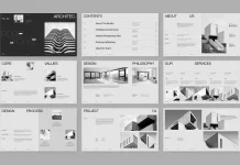
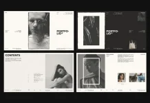
1. The RedGiant Personal Portfolio Template: Monochrome Confidence in Twelve Slides

This one comes from Adobe Stock contributor RedGiant, built specifically for screens at 1920 by 1080 pixels. That detail matters more than it sounds. Most InDesign portfolio templates still start life as print documents, then get stretched awkwardly for a monitor later. This one never makes that mistake.
Twelve slides carry the whole story. A bold typographic opener, a personal introduction, education and experience pages, three individual project spreads, and a closing thank-you page. The palette stays black, white, and deep gray throughout, which forces your own work to supply every scrap of color. If your photography or product shots already carry strong tone, that restraint works entirely in your favor.
My score: Narrative Arc 5, Grid Discipline 4, Image Economy 5, Format Fit 5, Time to Value 4. Total: 23 out of 25.
You’ll need Adobe InDesign installed to open it.
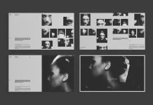
2. The E-Type Graphic Design Portfolio Template: Eighteen Pages, One Honest Catch

I spent three afternoons inside this file, swapping every placeholder header, body paragraph, and image frame to see where the grid would bend. It held up well. Column structure stayed consistent, and text frames resized cleanly even with longer job titles than the template expected.
Here’s the catch, and it’s worth knowing before you buy. The photos and mockups in the preview are for display only. None of them ship in the download. Budget real time for sourcing your own imagery, because the eighteen pages will look thin without strong photography behind them. That’s not really a flaw. It’s a cost the listing just doesn’t shout about.
My score: Narrative Arc 4, Grid Discipline 5, Image Economy 3, Format Fit 4, Time to Value 3. Total: 19 out of 25.
Also built for InDesign, at the same 1920 by 1080 screen size.
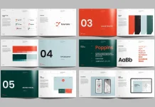
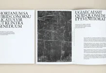
3. The bourjart Portfolio Brochure: Sixteen Pages Built for Print, Not Just PDF

This is the only one of the five graphic design portfolio examples here built primarily for a printer instead of a screen. It ships in CMYK from the start, in both US Letter and A4. That spares you the flattened blues that show up when an RGB file gets converted late in a project.
The sixteen pages alternate between dense project spreads with client and category tables, then quieter full-bleed gallery pages. That rhythm keeps a reader from facing two heavy text pages back to back. One real constraint worth knowing: the project overview and solution fields read best under twenty-five words each. Longer copy crowds the layout below it. Treat that as discipline the template quietly enforces on your writing, not a bug.
My score: Narrative Arc 4, Grid Discipline 5, Image Economy 4, Format Fit 5, Time to Value 4. Total: 22 out of 25.
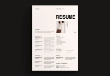
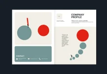
4. The Royal Studio Resume and Portfolio Layout: Nine Pages, Twenty Photos, Zero Neutrality

Most resumes look the same, and that sameness is the real problem, not a lack of experience on the page. This nine-page A4 template from The Royal Studio refuses to play it safe. It bundles a CV directly into the portfolio, using twenty included abstract, colorful photographs, so you never send two separate documents that speak two different visual languages.
The typography stays deliberately small and quiet. The images carry every ounce of emotional temperature instead. That’s a real design decision, and a smart one, because generous image space consistently makes small type read as more confident, not less. Some hiring managers won’t respond to anything this bold. Honestly, that’s fine. It works as a filter, not a flaw.
My score: Narrative Arc 5, Grid Discipline 4, Image Economy 5, Format Fit 4, Time to Value 4. Total: 22 out of 25.
5. The Redox WordPress Theme: When a PDF Stops Being Enough

Every other entry on this list is a document you send by email. Redox works differently. RavexTheme built it as a full WordPress theme for creative agencies and portfolio-driven studios that need an actual website, not an attachment. Twenty-three home demos, over forty-five inner pages, and eleven header variations give you real starting points instead of one fixed look.
RavexTheme built Redox on Bootstrap 5 and Elementor, so you customize everything through drag-and-drop instead of code. The animation runs on GSAP, genuinely one of the most respected motion libraries in professional web work, and it shows in the scroll-triggered reveals and parallax carousels. At $39 for a regular license, plus lifetime updates and six months of support, the math is hard to argue with if your agency needs a live site instead of a static deck.
My score: Narrative Arc 4, Grid Discipline 5, Image Economy 4, Format Fit 5, Time to Value 3. Total: 21 out of 25.
How These 5 Graphic Design Portfolio Examples Compare
| Example | Format | Best Suited For | Price / Access | Credibility Score |
|---|---|---|---|---|
| RedGiant Personal Portfolio Template | InDesign, 1920×1080 px screen deck, 12 slides | Individual designers pitching digitally | Adobe Stock single template | 23/25 |
| E-Type Graphic Design Portfolio Template | InDesign, 1920×1080 px, 18 pages | Designers with strong existing photography | Adobe Stock single template | 19/25 |
| bourjart Portfolio Brochure | InDesign, CMYK print, US Letter/A4, 16 pages | Architects, studios, in-person pitches | Adobe Stock single template | 22/25 |
| The Royal Studio Resume + Portfolio | InDesign, A4, CMYK, 9 pages, 20 photos | Designers wanting one combined CV and portfolio | Adobe Stock single template | 22/25 |
| Redox WordPress Theme | Elementor and WordPress, live website | Agencies and studios needing a full site | $39, ThemeForest regular license | 21/25 |
Static Deck or Full Website? Choosing Between These Portfolio Formats
This question shows up in nearly every email I get about graphic design portfolio examples, so let’s settle it plainly. If you’re job hunting as an individual designer, a screen-native InDesign deck almost always wins. It’s fast to send, cheap to update, and doesn’t demand hosting or maintenance you don’t have time for.
Print still earns its place too, especially for architects, interior designers, and anyone pitching in person. A well-produced brochure now stands out precisely because most competitors default to a forgettable PDF attachment. If you run a studio or agency instead of applying for a single job, a full website like the one Redox builds becomes the smarter long-term move. Clients expect to browse your work before a call ever gets booked.
My Predictions for Where Portfolio Design Goes Next
Screen-native formats built at 1920 by 1080 pixels will keep replacing A4 print decks as the default starting point. Most portfolio reviews now happen on a laptop or during a call instead of on paper, and I don’t see that reversing anytime soon.
Bilingual paper-size support, the kind bourjart already builds into its US Letter and A4 layout, will stop being a nice extra. It’ll become expected, since client pitching rarely respects a single country’s paper standard anymore. And as AI-generated visuals make mediocre design cheaper to produce, a portfolio that clearly reflects considered human structure, not just pretty images, will read as more distinctive, not less. That’s the opposite of what a lot of designers currently assume.
Frequently Asked Questions About Graphic Design Portfolio Examples
What’s the best format for a graphic design portfolio in 2026?
For most individual job seekers, an interactive PDF exported from a screen-native InDesign template works best. It’s portable, fast to update, and skips the hosting question entirely. Agencies and studios benefit more from a full website, since clients expect to browse work before booking a call.
How many projects should a graphic design portfolio include?
Three to six strong projects beat twelve mediocre ones every time. Every graphic design portfolio example in this article builds around three individual project spreads as its core structure. That’s not a coincidence. It’s where the real consensus sits.
Do I need Adobe InDesign, or can I use Canva or Figma?
Four of the five templates here require InDesign, mainly for its master page system, precise typographic controls, and native print preparation. Canva and Figma both work fine for simpler portfolios, but neither matches InDesign’s control once a document grows past a handful of pages.
Should a portfolio include a resume?
It can, and doing so removes a real seam between two documents that often speak different visual languages. The Royal Studio’s resume and portfolio layout in this list handles that integration especially well.
What image resolution do these portfolio templates need?
For screen presentations, 72 to 150 dpi works fine. For anything headed to a commercial printer, aim for 300 dpi minimum. Always work in CMYK if the final file is going to press instead of a monitor.
Is a printed portfolio brochure still worth making in 2026?
Yes, especially for architects, interior designers, and anyone pitching face to face. Most competitors default to a digital-only PDF now, so a well-produced printed piece stands out simply by existing.
How long does it take to customize one of these templates?
Expect four to six hours for a full content swap on an eighteen-page deck, less for the shorter nine- or twelve-page layouts. Add extra time if you need to source your own photography, since a couple of these templates ship with placeholder images only.
One last thing worth saying plainly. None of these five graphic design portfolio examples will do the work for you. They’ll just stop getting in the way of it, which turns out to be the harder problem to solve.
Browse WE AND THE COLOR’s Branding, Graphic Design, and Templates categories for more.
Subscribe to our newsletter!