This post contains affiliate links. We may earn a commission if you click on them and make a purchase. It’s at no extra cost to you and helps us run this site. Thanks for your support!
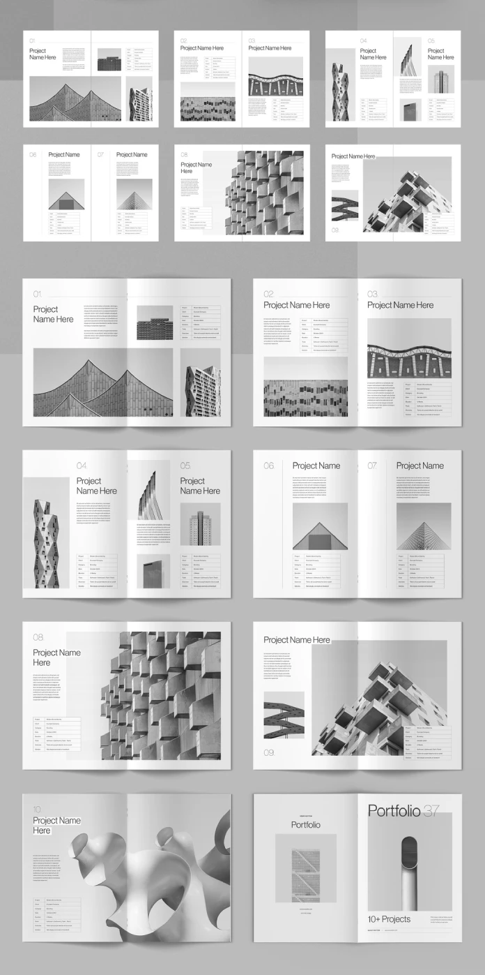
A portfolio brochure template only earns its price when it survives contact with real content. Most templates look sharp in the preview and fall apart the moment you drop in your own photos, your own project names, and your own eighty-word case study text. So I tested one directly: a 16-page portfolio brochure built by Adobe Stock contributor bourjart, sized for both US Letter and A4, and set up in CMYK for print. I did not skim it. I opened every page, swapped every placeholder, and stress-tested the grid until I understood exactly why it works and where it demands attention.
This article documents that process. I am introducing a small set of terms along the way, because “good layout” and “clean design” are too vague to be useful. If you are a freelance architect, a design studio, a photographer, or an agency preparing a leave-behind for a pitch, this breakdown will tell you precisely what you are buying before you buy it.
Please note that this template requires Adobe InDesign installed on your computer. Whether you use Mac or PC, the latest version is available on the Adobe Creative Cloud website—take a look here.
Why Does a Portfolio Brochure InDesign Layout Matter More Than a PDF Deck?
A portfolio brochure is not a slide deck. It is a printed object, or at least an object that pretends to be printable, and that changes the design math entirely. Slide decks live on screens where color shifts, bleed does not exist, and pagination is invisible. A print-ready brochure has to survive a printing press, a trim line, and a reader who physically turns pages in a specific order.
That is the first thing I checked. The template ships in CMYK color mode, which means it is built for offset or digital print from the start rather than converted after the fact. Converting an RGB file to CMYK late in a project usually dulls blues and flattens contrast. Starting in CMYK avoids that entire problem. If you plan to hand this brochure to a printer, you inherit none of the color-shift headaches that ambush designers who build in RGB and convert at the last minute.

The Sixteen-Page Structure, Explained
Sixteen pages sounds arbitrary until you map them. In this layout, the structure breaks into three functional zones, and I am calling this the Three-Zone Portfolio Model because it applies well beyond this single template.
- Signal Pages: the cover and closing spread. Their only job is identity. A large project count, a name, a single striking image.
- Anchor Pages: the case study spreads with project detail tables (client, category, date, duration, tools). These carry credibility weight.
- Gallery Pages: full-bleed or near-full-bleed image spreads with minimal text, giving the eye a rest between anchor pages.
This template alternates between anchor and gallery pages consistently. Consequently, a reader never faces more than one dense text page before getting a visual break. That rhythm is deliberate, and it is the single biggest reason the brochure reads as premium rather than cluttered.
How Does the Grid System Actually Hold Up Under Real Content?
I replaced every placeholder image with my own architecture photography and swapped every “Project Name Here” label with real project titles. Here is what survived and what needed adjustment.
The underlying grid is a modular column system, and it holds its shape well even with images of mismatched aspect ratios. Because the layout uses consistent gutters and a repeating baseline, dropping in a portrait-oriented photo next to a landscape one did not break alignment. I want to name this behavior the Grid Tolerance Score: how much abuse a layout absorbs before a designer has to manually nudge frames. This template scores high. Most swaps took under two minutes each.
Where it demanded more care was the project detail table. Fields like Client, Category, Date, Duration, Tools, Overview, and Solution are preset with generous line height, which looks elegant with short answers. Longer answers push the table taller and can crowd the image below it. My workaround was simple: keep the Overview and Solution fields under twenty-five words each. That constraint is not a flaw. It is a discipline the template quietly enforces, and it makes every case study tighter as a result.
Typography and Hierarchy
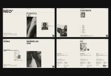
The typeface pairing leans on a clean sans-serif for headlines and a lighter weight for body copy, with generous tracking on section numbers like “01,” “02,” and “03.” That numbering system matters more than it appears to. It gives the reader a built-in progress marker, so a ten-project portfolio never feels shapeless. I call this a Wayfinding Numeral System, borrowed loosely from signage design, where sequential markers replace a table of contents.
Color Restraint as a Design Argument
The palette stays almost entirely grayscale, with soft gray blocks used to separate text from image zones. This is a specific choice, not a default. A neutral palette means your project photography becomes the only source of color in the entire brochure. Therefore, your images carry the visual weight, and the template gets out of the way. If your portfolio depends on strong photography, this restraint works in your favor. If your images are inconsistent in tone or quality, the lack of color camouflage will expose that quickly.
Why Is InDesign the Right Tool for This Kind of Brochure?
Someone could ask why this needs InDesign at all instead of a general design tool. The answer comes down to three structural advantages InDesign has for multi-page print documents.
- Master pages. Every anchor page inherits shared elements from a master page. Change the numbering style once, and it updates across all sixteen pages instantly.
- Paragraph and object styles. Swapping body text globally, adjusting one style definition, cascades through the entire brochure without touching each frame by hand.
- Native print preparation. Bleed, trim marks, and CMYK output are built into InDesign’s export pipeline, so print handoff does not require a second tool.
Other design tools can approximate this, but few combine long-document tooling with print precision the way InDesign does. For a 16-page brochure meant for a real printer, InDesign is not a preference. It is the appropriate tool for the job.
US Letter and A4: Why Both Formats Matter
Building a template that supports both US Letter and A4 solves a real, recurring headache. A brochure designed only in US Letter often gets awkward margins when someone in Europe tries to print it on A4 paper, and vice versa. Having both formats available from the start means a studio in Chicago and a studio in Berlin can use the identical file without renegotiating the layout. That is a small detail with outsized practical value for any agency working across markets.
A Structured Summary of the Template
| Feature | Detail |
|---|---|
| Page count | 16 fully customizable pages |
| Formats supported | US Letter and A4 |
| Color mode | CMYK, print-ready |
| Best suited for | Architecture, design, photography, and agency portfolios |
| Page types | Signal pages, anchor pages with project data tables, gallery spreads |
| Typography style | Clean sans-serif hierarchy with numeral-based navigation |
| Color palette | Grayscale-dominant, image-led color |
| Software required | Adobe InDesign |
My Honest Take After Testing It
I like templates that trust the content instead of decorating around it. This one does that. The grid does not shout, the color palette does not compete with your photography, and the numbering system does something most portfolio brochure templates skip entirely: it gives the reader a sense of place. You always know where you are in the document. If I had to name one limitation, it is the Overview and Solution field length I mentioned earlier. Writers who are used to padding case studies with extra sentences will need to edit themselves down. I consider that a feature disguised as a constraint, but it will frustrate anyone allergic to trimming their own copy.
Who Should Use This Layout
Architects, interior designers, product photographers, and small agencies get the most value here. The project-detail table format (Client, Category, Date, Duration, Tools) fits any discipline where a portfolio doubles as a proposal document. Freelancers pitching new clients will find the Signal Page cover, with its bold project count, does real persuasive work before a client reads a single case study.
Where This Format Is Heading
Print portfolios are not disappearing, even in a digital-first industry. If anything, a well-produced printed brochure now stands out precisely because most competitors default to a PDF attachment. My prediction: portfolio brochure InDesign layout templates with built-in bilingual paper-size support, like this US Letter and A4 file, will become the standard rather than the exception, because global client pitching no longer respects a single paper format. Expect future templates to add modular page counts, letting designers choose eight, twelve, or sixteen pages from one master file instead of committing to a fixed length.
Frequently Asked Questions
Is this portfolio brochure InDesign layout suitable for professional printing?
Yes. It is built in CMYK color mode, which is the standard color profile for offset and digital print production.
Do I need advanced InDesign skills to customize it?
No. The 16 pages use consistent master styles, so swapping images, text, and project tables requires only basic InDesign knowledge.
Can I use this layout for industries outside architecture?
Yes. While the sample content shows architecture projects, the grid and table structure adapt well to photography, branding, interior design, and agency portfolios.
What is the difference between the US Letter and A4 versions?
Both versions share the same design system, but page dimensions and margins are adjusted to match regional printing standards.
Why does the template use mostly grayscale colors?
The neutral palette keeps focus on your project photography instead of competing with brand colors, which makes the brochure adaptable to any industry.
Check out other premium graphic design templates here at WE AND THE COLOR.
Subscribe to our newsletter!