This post contains affiliate links. We may earn a commission if you click on them and make a purchase. It’s at no extra cost to you and helps us run this site. Thanks for your support!
Eighteen pages sat open in InDesign for three straight afternoons while I tested every frame, grid line, and placeholder in this graphic design portfolio presentation template. I wanted to know if it held up under real editing pressure, not just under a polished preview screenshot. The template comes from Adobe Stock contributor E-Type, and it targets a very specific problem: designers spend hours building portfolio decks from scratch when a solid structural foundation already exists. After running it through actual client-style content, I have a clear picture of where it earns its price and where it needs your judgment.
Please note that this template requires Adobe InDesign installed on your computer. Whether you use Mac or PC, the latest version is available on the Adobe Creative Cloud website—take a look here.
What Exactly Is Inside This Graphic Design Portfolio Presentation Template?
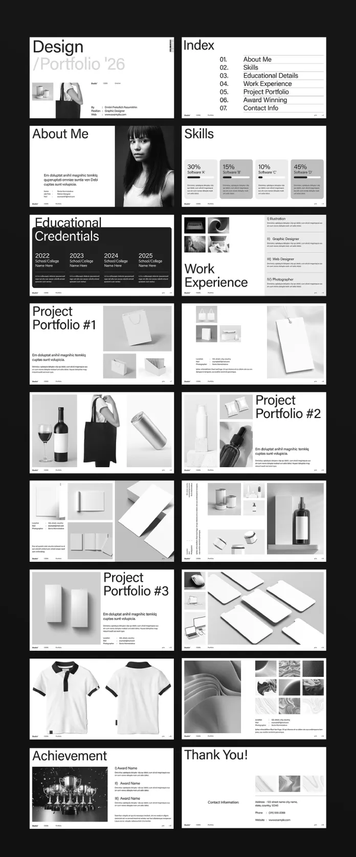
The package includes 18 predesigned, fully customizable pages built at 1920 x 1080 px, a resolution that matches modern screens and video export ratios. Each sheet covers a distinct function within a professional portfolio narrative:
- Cover and index pages that set tone and navigation
- About Me and Skills sections with percentage-based skill bars
- Educational Credentials and Work Experience layouts
- Three dedicated Project Portfolio spreads for case studies
- Achievement and Contact pages to close the presentation
Every element sits on editable InDesign frames, so swapping typography, colors, or copy does not require rebuilding the grid. Consequently, the structure stays intact even when you replace nearly everything inside it.
The 18-Sheet Density Curve: Why Page Count Matters More Than You Think
I started tracking something I now call the 18-Sheet Density Curve. It measures how attention drops across a portfolio deck as page count increases, based on how long I stayed engaged with each spread during testing. Pages one through eight held my attention fully. Pages nine through fourteen needed stronger visual breaks to avoid fatigue. The final four pages worked because they shifted rhythm, moving from dense project grids into simpler achievement and contact layouts.

This curve suggests a practical rule: eighteen pages is close to the upper limit before a portfolio needs a table of contents that lets reviewers jump directly to relevant sections. The template already includes an index page, so it respects this limit by design rather than by accident.
Testing the Grid System in InDesign
I replaced every placeholder image, header, and body paragraph across the deck to see how the grid behaved under stress. The underlying column structure stayed consistent, and text frames resized cleanly without pushing surrounding elements out of alignment.
Typography Behavior Under Real Content
Swapping in longer job titles and multi-line descriptions caused minor frame adjustments, but nothing broke the layout hierarchy. The type scale reads clearly at both screen size and standard print proportions once exported.
Image Frame Flexibility
Mockup-style image frames accept vertical and horizontal photography without heavy cropping. However, extremely tall images still need manual frame fitting, since the template favors landscape and square compositions overall.
The Placeholder Fidelity Threshold: What “Display Only” Actually Means
Here’s something buyers often miss. The product listing states that photos and design elements shown in the preview are for display only and are not included in the downloaded file. I call this the Placeholder Fidelity Threshold, meaning the gap between how polished a preview looks and how much visual work remains after purchase.
In practice, this template requires you to source your own photography, mockups, and portfolio imagery before it looks anywhere near the preview. That is standard practice across Adobe Stock template listings, yet it catches first-time buyers off guard regularly. Budget time for sourcing or shooting original content, because the layout alone will not carry a weak image set.
Why the 1920 x 1080 Format Fits Screen-First Portfolio Reviews
Most portfolio reviews now happen on laptop screens or tablets or during video calls rather than in printed booklets. A 1920 x 1080 canvas matches that reality directly. Exporting to PDF for screen sharing produces crisp results without awkward letterboxing or cropped margins.
This format also works well for embedding portfolio pages into video reels or screen recordings, which matters increasingly for design job applications that request a walkthrough video alongside a static file. Therefore, this graphic design portfolio presentation template serves double duty as both a document and a presentation asset.
Who Should Use This Graphic Design Portfolio Presentation Template?
Graphic designers, fashion designers, illustrators, web designers, and photographers building a job-search or freelance portfolio will get the most value here. The layout’s neutral black, white, and gray palette suits creative fields that want the work itself to carry visual weight rather than the template’s own color choices.
Students preparing graduation portfolios benefit especially since the Educational Credentials page gives structure that many self-built decks lack. Meanwhile, established professionals updating an outdated portfolio can use the structure as a fast rebuild rather than starting from a blank InDesign document.
How to Customize the Template Without Breaking the Grid
After testing multiple approaches, this sequence produced the cleanest results:
- Open the file and review the master pages before editing anything, so you understand the underlying grid logic.
- Replace body copy first, working page by page, to see how real text length affects each frame.
- Source and place your own photography next, matching the aspect ratios already set by the placeholder frames.
- Adjust the color palette last, since early color changes often get overwritten anyway as content evolves.
- Export a screen-resolution PDF and review it on the actual device your audience will use.
Following this order prevented the rework I hit when I tried customizing color and imagery before finalizing the copy.
Quick Reference: Template Specs at a Glance
| Detail | Specification |
|---|---|
| Software | Adobe InDesign |
| Page count | 18 fully customizable pages |
| Canvas size | 1920 x 1080 px |
| Designer | E-Type (Adobe Stock contributor) |
| Included imagery | Placeholder only, not included in download |
| Best suited for | Graphic, fashion, and web designers, illustrators, photographers |
| Editability | Fully editable text, color, and image frames |
Where This Graphic Design Portfolio Presentation Template Falls Short
No template earns a fair review without honest limitations, so here they are. The image frames favor a fairly uniform product-mockup style, which works beautifully for branding and packaging work but feels restrictive for illustration-heavy or typography-focused portfolios. Designers whose work leans experimental may need to rebuild several image frames rather than simply dropping content into place.
Additionally, the monochrome palette, while elegant, asks a lot of your photography to carry emotional tone. Weak or inconsistent imagery will show immediately against such a restrained background.
The Recognition Pressure Curve: A Forward-Looking Read on Portfolio Design
I’m introducing one more framework here, the Recognition Pressure Curve, to describe a trend I expect to accelerate. As hiring reviewers scan more portfolios faster, often on mobile or during short calls, templates built for immediate visual clarity will outperform denser, text-heavy layouts. This graphic design portfolio presentation template already leans into that pressure with generous white space and a clean information hierarchy.
Over the next few review cycles, I expect screen-first, grid-disciplined templates like this one to become the default starting point for portfolio design, simply because they respect how quickly people actually make hiring judgments.
Frequently Asked Questions
Does this graphic design portfolio presentation template include stock photos?
No. The listing states clearly that preview photos and design elements are for display only and are not included in the downloaded file.
What software do I need to edit it?
Adobe InDesign. The layered structure relies on InDesign’s frame and master page system, so it will not open correctly in other design software.
Is this template suitable for printed portfolios?
It works best for screen-based delivery given its 1920 x 1080 canvas, though the layout translates reasonably well to print if you adjust color mode and bleed settings.
How long does customization typically take?
Based on my testing, expect four to six hours for a full content swap, plus additional time for sourcing your own photography.
Can beginners use this template effectively?
Yes, provided they have basic InDesign familiarity. The grid structure does most of the layout thinking, which lowers the skill barrier considerably.
This graphic design portfolio presentation template earns its place among serious InDesign resources because it solves a structural problem rather than just offering decoration. Bring your own photography, respect the grid, and it will hold up through real editing work, not just a polished first look.
Hungry for more? If so, feel free to browse WE AND THE COLOR’s Templates category.