This post contains affiliate links. We may earn a commission if you click on them and make a purchase. It’s at no extra cost to you and helps us run this site. Thanks for your support!
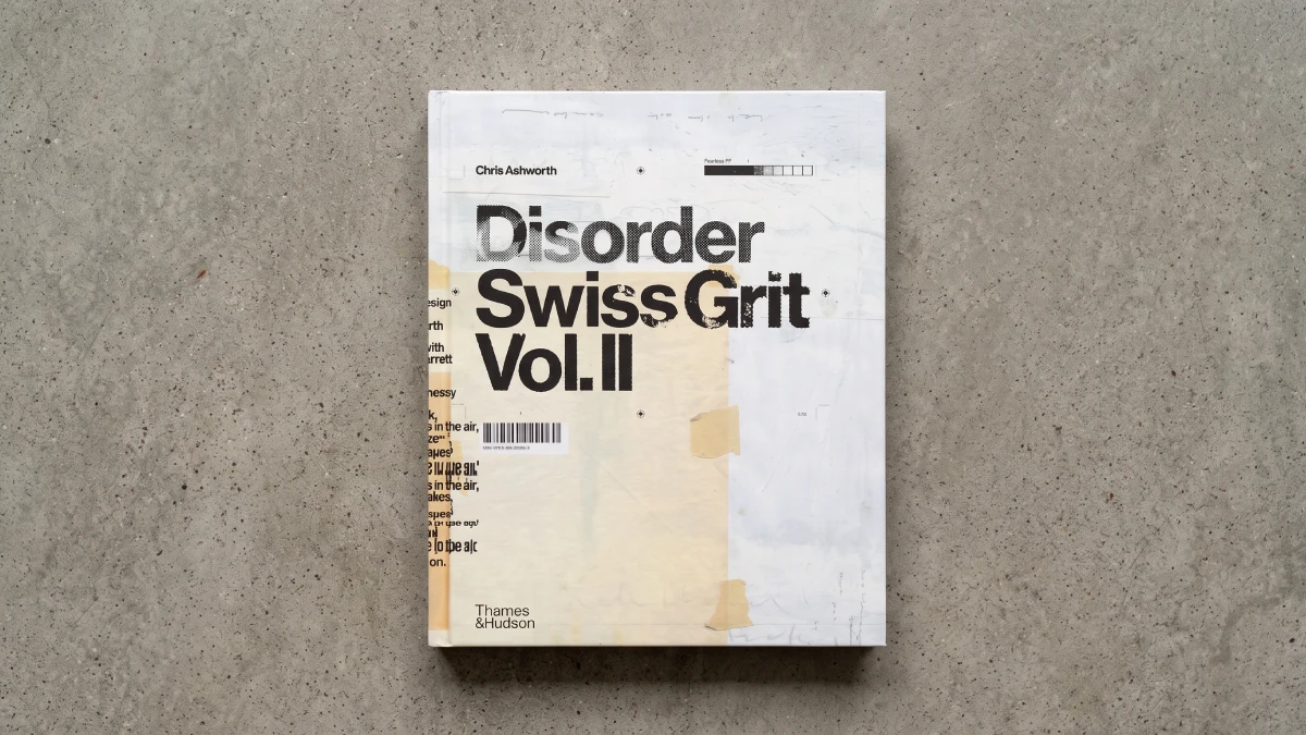
Disorder: Swiss Grit Vol. II is a loud book with a quiet thesis. Chris Ashworth argues for handmade design through Cromalin marks and flatplan pencil, not through a manifesto. Well, I think he wins.
You know the dilemma; generative tools now fill design feeds with smooth, plausible layouts. Against that flood, a 488-page monograph that counts its own AI use at zero feels almost rude. One library catalog even lists a variant title ending in “47,360 words, 548 images, 0 Ai.”
I got the book as a birthday present last year. Now I have spent several more days with it before writing this review. The verdict held. So did my respect for the sheer labor.
Is Disorder: Swiss Grit Vol. II Worth the 5.34 Pounds on Your Desk?
Yes, if you design with your hands or wish you did. Skip it if you want software tutorials, because the book teaches no tool. Instead, it shows one working mind. Among the best graphic design books of 2025, it argues most openly against the screen.
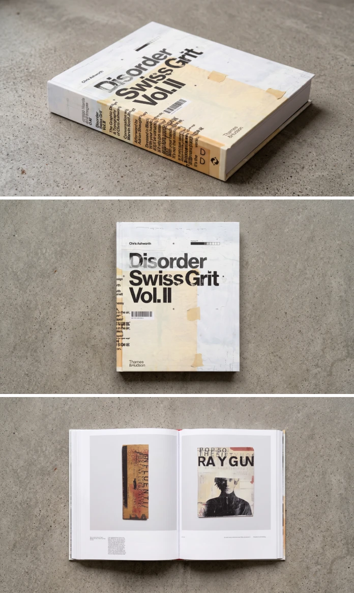
Disorder: Swiss Grit Vol. II is a 488-page monograph on the designer Chris Ashworth. Thames & Hudson released it in March 2025, after a first UK edition from its Unit Editions imprint in 2024. The book covers work from 1997 to 2024. It documents his Swiss Grit method, which fuses Swiss discipline with street typography.

Amazon lists the hardcover at 9.2 by 11.2 inches, 1.9 inches thick, and 5.34 pounds. Eye magazine’s reviewer rounds the weight to 2.5 kilograms. The UK list price is £60. You will not read it on a train.
Quick Facts at a Glance
| Detail | Fact |
|---|---|
| Title | Disorder: Swiss Grit Vol. II |
| Author | Chris Ashworth |
| Contributors | Conversation with Marvin Scott Jarrett; afterword by Adrian Shaughnessy |
| Publisher | Thames & Hudson (first published in 2024 by its Unit Editions imprint) |
| Publication date | March 18, 2025 |
| Pages | 488 |
| Format | Hardcover, 9.2 x 1.9 x 11.2 inches, 5.34 pounds |
| Work covered | 1997 to 2024, including Ray Gun issues 44 to 58 |
| ISBN-13 / ISBN-10 | 978-0500029060 / 0500029067 |
| UK list price | £60 |
| Core idea | Handmade, process-first graphic design with no AI |
What Does Swiss Grit Mean, and Why Does the Title Say Disorder?
Ashworth names two influences. The first is the Swiss international style of the 1950s and 1960s. He studied it at York College of Arts & Technology from 1988 to 1990. Josef Müller-Brockmann, Armin Hofmann, and Emil Ruder shone brightest for him. His thesis covered Ruder, and he still keeps a copy in his archive.
Street culture supplies the second influence. Think of signage, peeling posters, and any type that people and weather have damaged outdoors. Ashworth finds beauty in that imperfection. He also treats it as a personal comment on life.
So here is a working definition. Swiss Grit is a design method that keeps the Swiss grid and lets street texture and chance act on it. The publisher’s copy says the blend brings “some soul.” I would add that it also brings risk.
Next comes the title. Ashworth says, “Disorder” captures the duality inside “Swiss Grit,” a mix of rigor and serendipity. It also nods to Joy Division, because music shapes how he works.
Adrian Shaughnessy wrote the afterword, titled Grit and Grunge vs. Digital Hygiene. His image for the method is the best one on offer. Swiss Modernism is a boat moored at a harbor wall. Ashworth has untied it and let it drift out to sea. He adds his own condition. Nobody can untie a boat that nobody built well.
What Is Inside Disorder: Swiss Grit Vol. II?
The book mixes Ray Gun spreads with other commissions. Personal projects add a third strand. Each one shows a different side of the same hand.
Ray Gun, 1997 to 1998
Ashworth made his name by replacing David Carson at Ray Gun, as Steven Heller notes in Print. The book prints published and unpublished work from issues 44 to 58. It also adds marked-up Cromalins, diary entries, and discarded early layouts.
Four spreads reward a slow look. Pages 36 and 37 hold the Bowie feature. Goldie follows on pages 184 and 185. Radiohead sits on pages 192 and 193, and Pearl Jam fills pages 232 and 233.
Ray Gun publisher Marvin Scott Jarrett gave Ashworth carte blanche. As a result, you can feel the freedom in the layouts.
Commissioned Work Beyond the Magazine
Ashworth counts about 350 pages of paid work, Ray Gun included. Besides the magazine, that figure covers a Getty Images book from Laurence King. It also covers a Michael Stipe book from Little, Brown. Music commissions came from Gavin Rossdale at Capitol Records and from New Order at Mute Records. Campaigns for Nike and Adobe round it out.
One anecdote sticks. Rossdale answered Ashworth’s first Bush roughs with a couple of lines by email. Then a single turn of phrase in those lines guided the rest of the project. Clients who trust a designer rarely need to say more.
Personal Work on Pages 350 to 435
Eighty-five pages hold Ashworth’s own projects. They include sound-in-print art and typewriter poems, plus photographs of found type. Pages 364 and 365 show type in the wild, while pages 428 and 429 show typewriter art.
Here is my least safe opinion. This section matters more than Ray Gun. The magazine work sells the book, but the personal work shows why Ashworth keeps making things when no client asks.
Why the Process Archive Is the Real Subject
Most monographs hide the mess. This one prints it.
Heller observes that the majority of images show chaotic work in progress instead of pristine finishes. Jeremy Leslie, reviewing the book in Eye, adds that it prints sketches, flat plan diagrams, and Cromalin proofs beside finished layouts. That archive exists because Ashworth hoards. He mentions shifting 36 boxes of material across the Atlantic several times in 30 years.
In practice, a flatplan shows the pacing of an issue before any type touches a page, and a marked-up Cromalin shows exactly what the designer wanted changed after the first proof, so a reader who has only worked on screens gets a clear view into decisions that software now hides behind an undo button. Because Disorder: Swiss Grit Vol. II prints both, it works as a studio manual disguised as a fan book. When did you last see a proof with a designer’s pen marks on it?
Ashworth also tackles the question every designer asks about finishing. His rule is simple. A piece ends when it feels resolved and whole. Sometimes a client’s feedback shaped the result, and he admits it. That honesty carries weight, because he spent over two decades running in-house studios at Microsoft, Nokia, and Getty Images.
The captions do the teaching.
Ashworth wrote them himself, in a chatty first-person voice. Leslie finds them engaging and sometimes repetitive. Shaughnessy calls that candor unusual for a designer. I agree with both. The text runs to 47,360 words, roughly a short novel. Those captions turn a picture book into a working diary.
Scoring the Book With the Hand-Trace Index
Star ratings judge pictures. This book deserves a score for labor, so I built the Hand-Trace Index (HTI). The HTI is a 10-point measure of how much visible human work a design book exposes. It averages three sub-scores.
| HTI Component | What It Measures | Score | Why |
|---|---|---|---|
| Process Exposure | Share of pages that show work in progress | 9 / 10 | Heller reads most images as in-process, not polished |
| Material Variety | Range of physical methods on display | 9 / 10 | Cromalins, flatplans, diary entries, typewriter poems, found-type photography |
| Caption Candor | How openly the designer explains decisions | 8 / 10 | First-person and engaging, but Leslie notes repetition |
| Hand-Trace Index | Average of the three | 8.7 / 10 | High on labor, slightly loose on editing |
The Mooring Test
Chaos alone proves nothing. A messy spread can hide the absence of any skeleton. So I use the Mooring Test. Look at a chaotic spread and ask whether you could redraw a grid beneath the damage.
If you can, the spread still has a boat to untie, and if you cannot, the designer only made noise, so try the test on the Radiohead spread on pages 192 and 193 with tracing paper and a ruler, and decide for yourself whether the grid survives the damage. My read is that the best spreads pass.
Where Disorder: Swiss Grit Vol. II Falls Short
No book this heavy escapes complaints. Leslie flags the captions as sometimes repetitive, and that is fair. A 488-page diary will circle back to its favorite stories.
Analog nostalgia is a trap here too. Leslie points out that older designers have long fetishized scalpels and Letraset. Ashworth escapes it because his passion for self-expression reads as real. Even so, designers under 30 who never touched Letraset may want a glossary.
Size creates an irony. Shaughnessy admits unease about the ecological footprint of giant books. Yet Disorder is a giant book that argues against screen dependency. A 5.34-pound hardcover has a footprint of its own.
Scope surprises some buyers. Vol. II starts in 1997. The rave flyers belong to Vol. I. So do the Interference collaboration with photographer John Holden and the early Blah Blah Blah work. Ashworth described that book as in progress in March 2025.
Finally, the AI-free label deserves less attention than it gets. It makes a good headline. The pages make a better argument.
How Do the Three Swiss Grit Volumes Fit Together?
Ashworth maps the trilogy onto Depeche Mode records. Vol. II is the expansive Music for the Masses period. Vol. I is the claustrophobic Black Celebration. For Vol. III he wonders whether he has a Violator left in him or a Memento Mori.
| Volume | Period | Planned Content | Status |
|---|---|---|---|
| Vol. I | 1990 to 1997 | Rave and club flyers from northern England, Interference with John Holden, MTV work with Tomato and Anton Corbijn, Blah Blah Blah, Ray Gun: Out of Control | In the works |
| Vol. II | 1997 to 2024 | Ray Gun, commissions, personal work, found type | Published |
| Vol. III | Not specified | Left open by Ashworth | No details given |
Who Should Buy This Analog Graphic Design Book?
Editorial designers get the most from it, because the flat plans and Cromalin proofs show how an issue gets built. Students come second, since the book prices a finished layout in discarded drafts. Type people will treat it as a handmade typography book. Collectors will want Disorder: Swiss Grit Vol. II as a Ray Gun magazine design book with real archive value.
Readers who want a style template should pass. Ashworth sells no preset, and no filter copies the Swiss Grit method. Does your own work still carry a trace of your hand?
How Should You Use This Book?
Treat it as a studio exercise book. These four steps get the most out of it:
- Read Shaughnessy’s afterword first. It frames the argument before the images start.
- Open pages 350 to 435 and use the personal work as a prompt list for your own side projects.
- Pick one Ray Gun spread and run the Mooring Test with tracing paper.
- Start a Hand-Trace Log. Print one layout, mark it up with a pen, scan it back, and note which marks survive.
Predictions: Where Swiss Grit and Handmade Design Go Next
These are my forecasts, not facts. Judge them in 2027.
- Human-made statements will spread. More design publishers will print a human-made line on the colophon, and some will mean it.
- Process-first monographs will gain ground. Designers who started before 2000 will favor archives of proofs and flat plans over polished retrospectives.
- Vol. III will decide the story. Vol. I will pull in club-flyer collectors, while Vol. III will show whether the trilogy reads as one argument or three catalogs.
- Swiss Grit will become a search term. Typographers need a name for grid-plus-texture work, and Ashworth has supplied one.
Frequently Asked Questions
What is Disorder: Swiss Grit Vol. II about?
Disorder: Swiss Grit Vol. II is a Thames & Hudson monograph on the designer Chris Ashworth. It follows his Swiss Grit method from Ray Gun in 1997 to 2024. Sketches, proofs and personal projects fill the pages.
Who is Chris Ashworth?
Chris Ashworth is a British graphic designer who gained notice at Ray Gun magazine in the late 1990s. He later spent more than two decades as a creative director running in-house studios at Microsoft, Nokia and Getty Images.
What does Swiss Grit mean?
Swiss Grit is Ashworth’s name for a design method that blends Swiss modernist principles with a typographic street aesthetic. The grid supplies the discipline. Street texture and chance supply the soul.
Is Disorder really AI-free?
Thames & Hudson describes the book as an AI-free zone. Ashworth is blunter in his Print interview: “AI can kiss my art.” He argues that creative development away from the computer has unique merits.
Do I need Vol. I before reading Vol. II?
No. Vol. II came out first and stands alone. Vol. I, covering 1990 to 1997, was still in progress when Print interviewed Ashworth in March 2025.
How big is the book, and what does it cost?
The hardcover has 488 pages, measures 9.2 by 11.2 inches, and weighs 5.34 pounds. Eye lists the UK price at £60.
Which spreads should I look at first?
Start with the Bowie spread on pages 36 and 37, then the typewriter art on pages 428 and 429. The Nike commission on pages 472 and 473 comes last.
Browse WE AND THE COLOR’s Graphic Design and Books categories for more.
Subscribe to our newsletter!