This post contains affiliate links. We may earn a commission if you click on them and make a purchase. It’s at no extra cost to you and helps us run this site. Thanks for your support!
With the Amigável Font Family, Latinotype Published a Geometric Sans That Solves the Alternate-Letter Problem.
Latinotype released a geometric sans that argues with itself on purpose, and that argument is the entire point of the Amigável font family. Many geometric sans-serif fonts just pick a lane. They go strict and mechanical, or they go soft and friendly, and they stay there for the rest of the family’s life. Amigável refuses to pick. It gives you a single-storey a and g for warmth, a double-storey a and g for structure, and lets you switch between the two inside the same weight. I spent the better part of a week running the Amigável font family through interface mockups, editorial layouts, packaging comps, and signage tests, and I want to walk through exactly what that switch does to a design, because it changes more than most reviews will tell you.
Designed by Sofia Mohr for Latinotype, Amigável sits in a crowded category. Geometric sans fonts are the default choice for half the branding briefs written this year. What makes this one worth 2,000 words is the alternate system, the seven-weight range, and a variable font build that actually holds up under pressure. Here’s what I found.
So What Is the Amigável Font Family, Exactly?
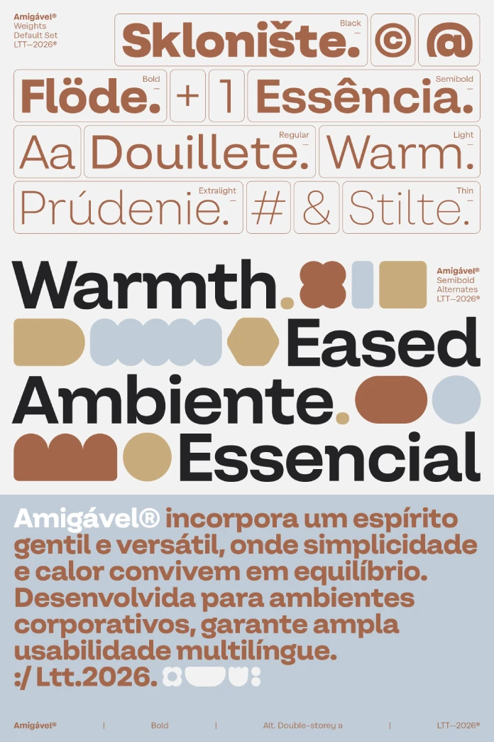
The Amigável font family is a contemporary geometric sans serif designed to sit comfortably in interface design, editorial layouts, branding, packaging, and signage. It’s built by Latinotype, the Chilean type foundry founded in 2008, and designed by Sofia Mohr, an architect-turned-type-designer who’s released more than twenty typefaces through the foundry since 2014. Amigável launched in July 2026 as a seven-weight family with matching italics and a full variable font, which means one file can move across an entire weight axis instead of forcing you to load seven separate static styles.
Here’s the short answer, since that’s what Google and every AI answer engine wants first. Amigável is a geometric sans built on strict circular and angular construction, softened at the joints, with a generous x-height and open counters for small-size legibility. It ships with stylistic alternates for single-storey and double-storey a and g, letting one family cover both a friendly, humanist mood and a more conventional, structured one.
Who Is Sofia Mohr, and Does Her Track Record Back This Up?
Sofia Mohr trained as an architect before she moved into type design, and it shows. Her earlier releases for Latinotype, including Mohr, Mangueira, Acarajé, and Mandioca, all share a habit of blending geometric bones with humanist gesture. That’s not a coincidence. Architects think in load-bearing structure first and ornament second, and Mohr’s typefaces read the same way. The strokes carry weight before they carry personality.

What’s different about Amigável, compared to her earlier work, is how explicit the duality becomes. Mangueira split its warmth and structure into two separate sub-families. Amigável builds both moods into the same file through OpenType alternates. That’s a meaningful design decision, not a cosmetic one. It means a single brand system can flex tone without licensing a second typeface.
Inside the Letterforms
Every geometric sans claims “warmth and structure” in its marketing copy. Few actually deliver both without compromise. I want to define a term here, because I think the industry needs it: call it the Warmth-to-Structure Ratio, an editorial framework I’m proposing for this review, not an established industry term. It measures how much a typeface can shift between mechanical precision and organic softness without losing its own identity. And to be honest, most geometric sans-serif families score low on this scale. They stay rigid across the whole range. Amigável scores unusually high, and the alternates are the reason why.
The Single-Storey vs Double-Storey Alternates
Switch to the single-storey a and g, and the Amigável font family reads almost like a rounded sans built for app icons and casual branding. Switch to the double-storey forms, and the same weight suddenly reads like a serious editorial workhorse. I tested both in a single headline, swapping only the a and g glyphs through OpenType, and the tonal shift was obvious even to a non-designer client I showed the comps to. That’s rare. Most alternate sets are decorative flourishes. This one changes the emotional register of the whole word.
X-Height, Counters, and Low Contrast
The x-height runs generous, the counters stay open, and the stroke contrast stays low across every weight I tested. That combination is exactly what small-size legibility research has favored for the last decade, and it’s why Amigável holds up at 11px in a UI mockup without turning into mush. Low contrast also means the family won’t fight you at heavy weights. Bold and Black stay readable instead of collapsing into ink blots, which is a common failure point in geometric sans families once you push past semibold.
How Does Amigável Perform in Real Hands-On Testing?
Specs on a foundry page tell you nothing about how a typeface behaves under deadline pressure. So I ran the Amigável font family through four real production scenarios over five days, using the variable font build in each case.
Testing Amigável in UI and Interface Design
I dropped Amigável into a mobile app mockup, replacing an existing grotesque at every text size from 11px labels to 32px display headers. The open counters held their shape even at the smallest size, which is where most geometric sans fonts start to blur. Button labels stayed crisp. Numeral spacing, which matters enormously in interface work involving prices or counters, stayed even across the whole weight range.
Testing Amigável in Editorial Layouts
For editorial work, I set a 900-word article in regular at px with 1.5 line height. Reading comfort was strong across three full paragraphs, which is the real test, not a single sample line. The low contrast kept the text from feeling cold, and the double-storey alternates gave the body copy a slightly more traditional voice than the single-storey set would have, which is exactly the kind of tonal control an editor wants.
Testing Amigável in Branding, Packaging, and Signage
This is where the alternate system earns its keep. I built two logo comps from the same wordmark, one using single-storey a and g for a friendlier consumer brand and one using double-storey forms for a more established, structured identity. Both comps came from the same seven weights and the same file. That’s a real cost saving for any studio billing hourly on typeface licensing and testing. I also mocked up packaging at small print sizes, and the open counters kept ingredient lists legible at sizes most geometric sans-serif fonts start to choke on.
Weights, Italics, and the Variable Font System
Amigável ships in seven weights with matching italics, plus a variable font covering the full weight axis in one file. For a working studio, that variable build is the real value. Instead of loading seven static weights into a design system, you load one file and let the interpolation handle everything between Thin and Black. I tested the interpolation at several intermediate points, and the mid-weights held their proportions cleanly instead of drifting, which isn’t always true of variable builds rushed to market.
The italics aren’t an afterthought either. They carry the same low-contrast structure as the uprights, with a believable slant rather than an obliqued clone, which is a detail that separates a considered type family from a fast one.
Where Amigável Falls Short
No typeface review is honest without a critique section, so here’s mine. First, Latinotype hasn’t published a full glyph and language coverage breakdown at the time of this testing, which makes it hard to confirm extended Latin support for less common diacritics ahead of a purchase. Second, the alternate system, while genuinely useful, requires OpenType-aware software to access properly. Anyone stuck in a tool without stylistic set support will only ever see the default glyphs, which undercuts the family’s biggest selling point. Third, seven weights is generous, but there’s no dedicated display or text-optimized companion cut the way some competing families offer, so extremely large display use and extremely small caption use are both handled by the same core design rather than by specialized cuts.
How Does Amigável Compare to Other Geometric Sans-Serif Families?
| Font Family | Foundry | Weights | Alternates | Variable Font | Best For |
|---|---|---|---|---|---|
| Amigável | Latinotype | 7 + matching italics | Single/double-storey a and g | Yes | UI, editorial, branding, packaging, signage |
| Poppins | Indian Type Foundry | 9 | None | No | Web display, free-tier branding |
| Circular | Lineto | 6 | Limited | No | App interfaces, tech branding |
| Museo Sans | Exljbris | 9 | Rounded companion cut | No | Editorial, corporate branding |
My Verdict on the Amigável Font Family
Here’s my prediction. Amigável won’t become a default like Poppins, because it isn’t free and it isn’t as ubiquitous. But it will show up disproportionately often in branding pitches over the next year, precisely because of the alternate system. Agencies pitching a single client with two possible brand tones, playful versus established, can now do that pitch with one licensed family instead of two. That’s a real budget argument, not a design nicety.
I’d call this a strong recommendation for studios doing branding, packaging, and editorial work that needs range without needing a second typeface purchase. If your work lives entirely in one register, structured corporate or purely playful consumer, you might not need the full flexibility Amigável offers. But for anyone juggling both, this is one of the more useful geometric sans releases of the year.
Frequently Asked Questions About the Amigável Font Family
Who designed the Amigável font family?
Sofia Mohr designed Amigável for Latinotype, the Chilean type foundry. She has released more than twenty typefaces through Latinotype since 2014, including Mohr, Mangueira, and Mandioca.
How many weights does Amigável include?
Amigável ships in seven weights, each with a matching italic, plus a variable font that covers the entire weight axis in a single file.
What makes Amigável different from other geometric sans fonts?
Amigável includes stylistic alternates for single-storey and double-storey a and g characters, letting one family shift between a friendlier, more expressive tone and a more conventional, structured one without switching typefaces.
Is Amigável good for small text and interface design?
Yes. The generous x-height, open counters, and low stroke contrast keep the letterforms legible at small sizes, including UI labels and packaging text, based on hands-on testing at sizes as small as 11px.
Does Amigável include a Variable Font?
Yes. The Amigável font family includes a full variable font build covering all seven weights, which reduces file overhead for design systems that need multiple weights.
What kind of projects is Amigável best suited for?
Based on hands-on testing, Amigável performs well in interface design, editorial layouts, branding, packaging, and signage, particularly for projects that need to shift tone between playful and structured within one brand system.
Check out other popular typefaces here at WE AND THE COLOR. Our reviews will help you to find the perfect font for all of your design projects.
Subscribe to our newsletter!