Latinotype: The Chilean Font Powerhouse Shaping Modern Design
Latinotype is a remarkable independent type foundry from Chile. You might be wondering what sets Latinotype apart in the vast world of typography. Well, imagine a design ethos deeply rooted in South American vibrancy, meticulously crafted for the modern creative. The founders of Latinotype, Luciano Vergara and Daniel Hernández, based in Concepción and Santiago, Chile, state their mission clearly. They say, “Our goal is to design new fonts that combine various influences reflecting our South American identity with high-quality products for the contemporary design industry.” And since their foundry’s inception in 2007, this dynamic duo has been doing precisely that. This font company is a cultural ambassador in the design world.
The Genesis of Latinotype: A Vision from South America
What truly sparks the creation of a globally recognized type foundry? For Latinotype, it began with a clear vision. Luciano Vergara and Daniel Hernández didn’t just want to make fonts. They aimed to infuse their creations with the distinct flavors of their South American heritage. Think about that for a moment. How often do you see a font collection explicitly celebrating a continental identity? This commitment is foundational to Latinotype.
Founded in 2007, Latinotype emerged from Concepción and Santiago, Chile, with a mission to carve out a unique space. Their work is a testament to the idea that typography can be both a universal communication tool and a deeply personal expression of culture. The team works to bridge these two aspects. They don’t just follow trends; they seek to contribute something fresh and authentic, drawn from a rich local tapestry yet designed for global appeal. This approach has allowed the foundry to offer something genuinely different.
Meet the Minds: Luciano Vergara and Daniel Hernández
Behind every successful venture are passionate individuals. Luciano Vergara and Daniel Hernández are the driving forces of Latinotype. These two designers are not just business partners; they are typographic visionaries. From their bases in Chile, they have cultivated the company into one of the most successful type foundries in recent years. What does that tell you about their dedication and skill?
Their collaborative spirit and shared commitment to quality are evident in every font family Latinotype releases. They oversee a rapidly growing collection of typefaces, showcasing an impressive variety of genres. This isn’t accidental. It’s the result of persistent effort and a keen understanding of what designers need. The success is intrinsically linked to Vergara and Hernández’s ability to translate their cultural insights and design expertise into tangible, high-quality typographic tools. They truly embody the spirit of Latinotype.
The Latinotype Signature: Colorful, Expressive, and Culturally Rich
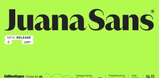
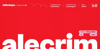
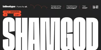
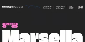
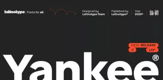
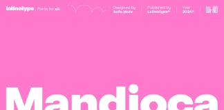
So, what does a Latinotype font actually look like or feel like? If you explore their collection, you’ll quickly notice a specialization in vibrant, colorful display and script faces. These aren’t your average, run-of-the-mill fonts. They burst with personality. The very name, “Latinotype,” underscores this strong connection to their cultural identity. It’s a bold declaration of their roots and their design philosophy.
Are you looking for fonts that make a statement? Latinotype delivers. Their display fonts often feature intricate details and a lively aesthetic, perfect for headlines, branding, and projects that demand attention. Similarly, their script fonts are known for their elegance and human touch, adding a personal flair to any design. But this type foundry isn’t limited to just these styles. Their ever-expanding library also includes versatile text families, ensuring that designers have a comprehensive toolkit. This dedication to variety, while maintaining a distinct South American essence, is a hallmark of Latinotype. Exploring their font families often feels like discovering a new artistic expression.
Beyond Borders: Latinotype’s Growing Global Impact
From Chile to the global design stage – how did this company achieve such reach? Their consistent quality and unique offerings quickly gained international recognition. As mentioned, Latinotype has become a prominent name on platforms like MyFonts, which speaks volumes about their popularity among designers worldwide. This isn’t just about selling fonts; it’s about influencing contemporary design.
The “fast-growing collection of their fonts isn’t just about quantity. It’s about a diverse portfolio that caters to a wide array of design needs. Whether it’s for sophisticated branding projects, engaging web design, or expressive editorial work, you’ll likely find a Latinotype font that fits the bill. Have you considered how Latinotype fonts enhance branding? Their unique character can help businesses stand out. The international success of the type foundry demonstrates that a strong local identity, when combined with universal design principles, can resonate across cultures and borders. The foundry continues to expand its influence.
Why Designers Consistently Choose Latinotype Fonts
What draws designers, project managers, and creative agencies to Latinotype time and again? It’s a combination of factors. Firstly, the undeniable quality. Each font is designed with attention to detail, ensuring technical excellence and aesthetic appeal. Secondly, it’s the uniqueness. In a crowded marketplace, the brand offers typefaces that feel fresh and carry a distinct cultural narrative. Understanding the cultural influence in Latinotype designs adds another layer of appreciation.
Think about your own projects. Do you ever search for a font that does more than just convey information? A font that adds personality, tells a story, or evokes a specific mood? This is where Latinotype excels. Their fonts are not merely tools; they are creative partners. For those asking where to buy Latinotype fonts, major distributors like MyFonts make their extensive catalog accessible. The consistent innovation from Latinotype keeps designers excited for their next release. The value Latinotype brings to the design community is significant, providing solutions that are both beautiful and functional.
Ultimately, Latinotype has carved a significant niche by staying true to its core vision: blending South American identity with world-class typographic design. Their journey from a Chilean startup to an influential global foundry is inspiring. So, next time you’re searching for that perfect font, perhaps you’ll consider the vibrant, culturally rich, and impeccably crafted options from Latinotype. What kind of impact could a Latinotype font make on your next creative endeavor?

