
This post contains affiliate links. We may earn a commission if you click on them and make a purchase. It’s at no extra cost to you and helps us run this site. Thanks for your support!
Unleash Dynamic ’90s Energy in Your Designs Today with the Shamgod Font!
Sometimes you see words on a screen, on a poster, or in a book. Yet, beyond the meaning of the words themselves, the shape of the letters speaks volumes. Some fonts feel serious and traditional. Others might seem playful and lighthearted. Then there are those that just burst with energy, almost leaping off the page. They grab your attention instantly. You know the ones I mean? They feel fast, bold, and impossible to ignore. Getting that feeling right is crucial in design. It’s about communicating a mood, an attitude, even before someone reads the first word. Well, there’s a font family out there that absolutely nails this energetic vibe. We’re talking about the Shamgod font family from the talented folks at Latinotype. If you’re looking for a typeface that packs a visual punch, Shamgod might just be your new best friend.
Typography is such a powerful tool. It’s the visual voice of written language. Choosing the right font can make the difference between a message that connects and one that falls flat. It sets the tone. It builds personality. Think about your favorite brands. Chances are, their choice of typography plays a big part in how you perceive them. Are they modern? Classic? Edgy? Fun? The font choices help tell that story. So, when a font like Shamgod comes along, designed specifically to radiate speed and raw energy, it’s worth paying attention. It’s not just about making words legible; it’s about making them feel something. Ready to explore what makes Shamgod so special? Let’s get into it.
What Exactly is the Shamgod Typeface?
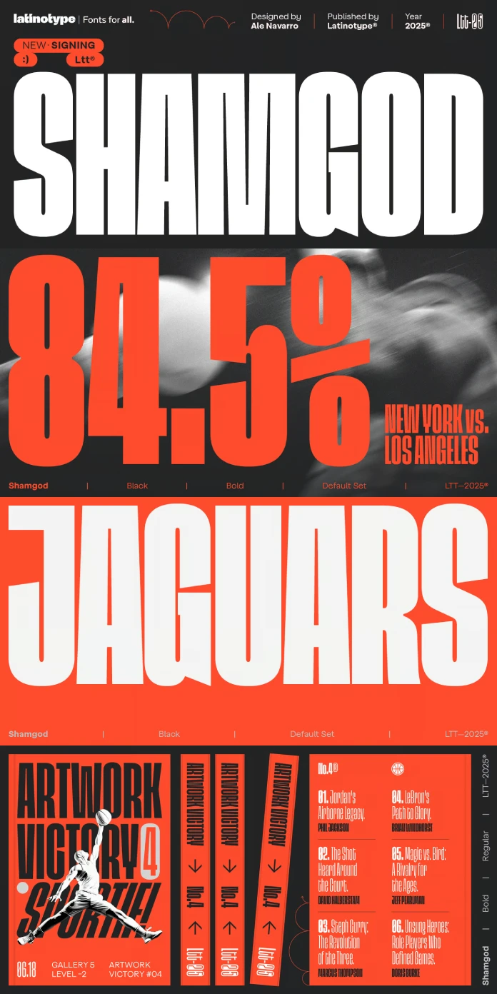
Alright, let’s break it down. Shamgod, created by the type foundry Latinotype, is described as a bold, ultra-compact font. Imagine letters squeezed tightly together, standing tall and strong. That’s the core feeling. Its style is categorized as grotesque – think sans-serif with a bit of an edge, often with uniform stroke widths and a clean, modern feel, but Shamgod adds its own unique twists.
What really makes Shamgod stand out are its sharp diagonal cuts and its incredibly compact form. These aren’t gentle curves; these are decisive, angular slices that give the letters a sense of movement and dynamism. It’s like the font itself is in motion. This combination – the boldness, the compactness, the sharp cuts – works together perfectly. The result? A typeface that screams speed, power, and undeniable energy. It feels athletic, intense, and it feels now.
Inspired by Intensity: The Roots of Shamgod
So, where does all this energy come from? Latinotype explicitly states that Shamgod captures the raw intensity of sports and urban culture, particularly from the 90s and early 2000s. Does that era ring a bell? Think about the bold graphics on sportswear. Consider the vibrant energy of street art and hip-hop culture during that time. There was a certain unapologetic boldness, a dynamic aesthetic that Shamgod taps into brilliantly.

The name itself, Shamgod, likely nods to the legendary streetball move popularized by God Shammgod. That move is all about misdirection, speed, and flair – qualities perfectly reflected in the font’s design. The sharp cuts mimic quick changes in direction. The condensed form suggests contained power, ready to explode. It’s a fantastic example of how typography can encapsulate the spirit of a movement, an era, or even a specific iconic action. It’s not just retro; it’s channeling a specific, high-octane vibe. Do you remember that visual style? Can you see how Shamgod fits right in?
Shamgod’s Visual DNA: Key Features
Let’s look closer at the design elements that define Shamgod.
- Ultra-Compact Width: This is immediately noticeable. The letters are tightly packed, demanding attention and maximizing impact in limited space. This density contributes significantly to its powerful presence. Perfect for making a statement.
- Sharp Diagonal Cuts: Look at letters like ‘A’, ‘K’, ‘M’, ‘N’, ‘V’, ‘W’, ‘Z’. Instead of standard terminals or joins, you’ll often find sharp, angled cuts. These diagonals inject a sense of speed and urgency. They break the monotony of simple vertical and horizontal lines.
- Grotesque Foundation: Underlying the unique features is a solid grotesque structure. This gives Shamgod a modern, clean base despite its expressive details. It ensures readability while still pushing boundaries.
- Boldness and Energy: Every aspect of Shamgod is designed to convey strength. The stroke weights are confident, the forms are assertive. It doesn’t whisper; it shouts.
- Multiple Weights: Thankfully, Shamgod isn’t just a one-trick pony. It often comes in a family of weights (you’d want to check the specific package from Latinotype). This typically ranges from lighter versions to heavier, blacker styles. This versatility means you can use Shamgod for more than just headlines. You can create visual hierarchy, pairing different weights for emphasis while maintaining a consistent, energetic aesthetic.
These features combine to create a typeface that is both distinctive and impactful. It’s designed to be seen, to make an impression, and to convey a very specific kind of dynamic energy.
Where Does Shamgod Truly Shine?
Given its expressive character, where is Shamgod most effective? Its personality makes it a natural fit for applications that need to grab attention and convey power or speed.
- Eye-Catching Headlines: This is prime territory for Shamgod. Its boldness and unique style make titles and headers impossible to miss, whether online or in print.
- Logos and Wordmarks: Looking for a logo with attitude? Shamgod provides instant personality. Its compact nature works well for creating strong, memorable brand marks.
- Sports Branding: This feels like a perfect match. From team names on jerseys to promotional materials for sporting events, Shamgod’s inherent athleticism and energy resonate strongly.
- Streetwear Brands: Capturing that 90s/00s urban vibe? Shamgod fits right in with the aesthetics of modern streetwear, adding an edgy, confident touch to apparel graphics and branding.
- Digital Design: On websites, apps, or social media graphics, Shamgod can create focal points that draw the user’s eye. It works especially well for campaigns targeting younger, energetic audiences.
- Modern Branding: For any brand wanting to project dynamism, confidence, and a contemporary edge, Shamgod is a compelling choice. Think tech startups, energy drinks, and music labels.
- Posters and Editorial Layouts: Need to make a statement on a poster or add punch to a magazine spread? Shamgod delivers a striking visual impact.
Basically, anywhere you need type that feels alive, assertive, and full of momentum, Shamgod is a strong contender. Can you picture it being used in a project you know? Perhaps one you are working on?
Why Choose Shamgod Over Other Bold Fonts?
There are many bold, condensed sans-serifs out there. So, what makes Shamgod stand out? It’s that unique combination of features we discussed.
Firstly, it’s the specific flavor of energy it brings – that connection to 90s/00s sports and urban culture is quite distinct. It’s not just generic boldness; it has a specific cultural resonance.
Secondly, the sharp diagonal cuts are a key differentiator. Many condensed grotesques are clean and perhaps a bit neutral. Shamgod uses these cuts to add flair, movement, and a touch of aggression (in a design sense!). It refuses to be neutral.
Furthermore, its ultra-compact nature is pushed to an extreme, creating a dense, powerful texture that’s visually arresting. It feels intentionally compressed, like potential energy coiled up.
Choosing Shamgod means you’re opting for a typeface that makes an immediate, unambiguous statement. It’s for designs that need to feel dynamic, contemporary, and maybe even a little bit rebellious. It’s less about quiet sophistication and more about loud confidence. If that aligns with your project’s goals, Shamgod offers a unique voice that’s hard to replicate.
Bringing It All Together: The Shamgod Impact
So, there you have it. The Shamgod font family by Latinotype isn’t just another set of letters. It’s a carefully crafted typographic tool designed to inject pure energy and a distinct retro-modern vibe into your projects. Its bold, ultra-compact form, combined with those signature sharp diagonal cuts, makes it instantly recognizable and impactful.
Drawing inspiration from the vibrant intensity of the 90s and 2000s sports and urban culture, Shamgod is perfect for making bold statements. Think powerful headlines, dynamic logos, energetic sports branding, edgy streetwear, and any design needing a strong, contemporary voice. With multiple weights likely available, it offers versatility while maintaining its core personality.
If you’re looking for a font that’s more than just readable – a font that feels fast, powerful, and undeniably cool – then Shamgod absolutely deserves your attention. It’s a testament to how type design can capture cultural moments and translate them into compelling visual language.
Are you ready to harness the power and energy of Shamgod in your next design? It might just be the game-changer you’ve been searching for.
Feel free to find other trending typefaces on WE AND THE COLOR.
Subscribe to our newsletter!


