
This post contains affiliate links. We may earn a commission if you click on them and make a purchase. It’s at no extra cost to you and helps us run this site. Thanks for your support!
Latinotype’s Alecrim is a Grotesque Typeface with No Expiration Date
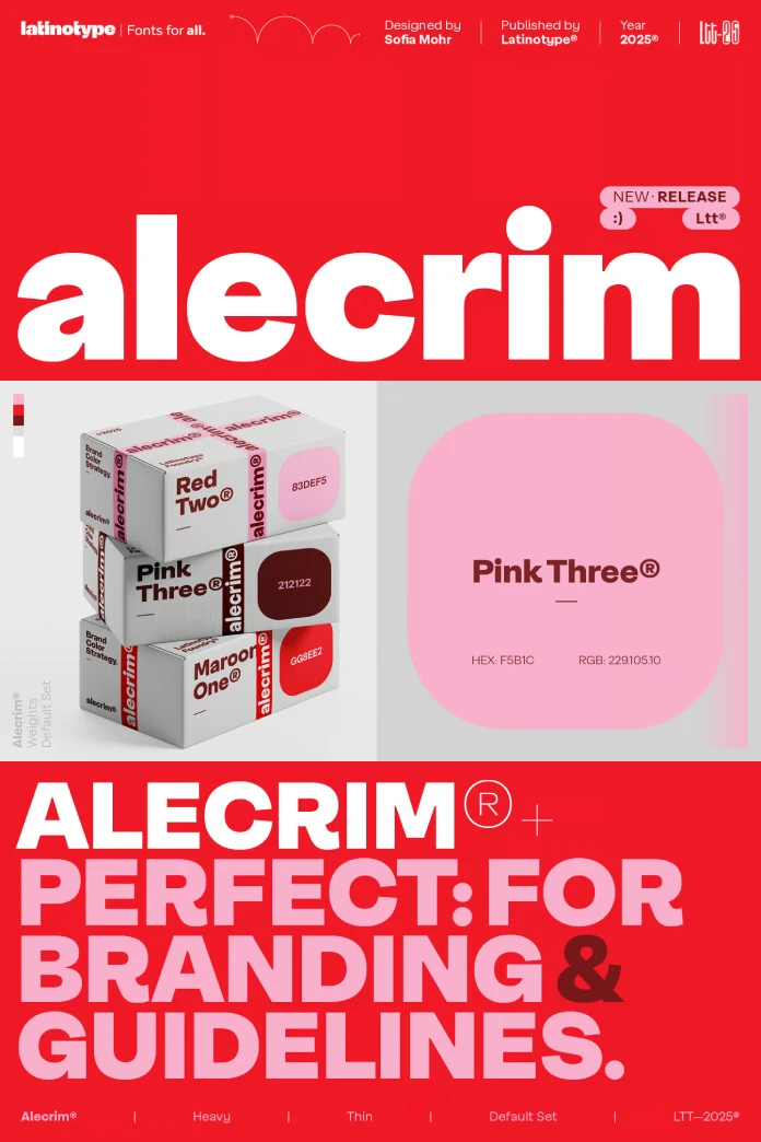
The Alecrim font family combines timeless design and modern functionality. It’s a sans-grotesque typeface, designed by Sofia Mohr and the Latinotype Team, that offers a compelling blend of precision and clarity. Its design resonates with contemporary visual demands. Consequently, its release is timely, arriving as designers seek versatile, enduring type systems that transcend fleeting trends. Alecrim provides a robust solution. It proves that classic inspiration can indeed fuel forward-thinking design.
The name “Alecrim,” Portuguese for rosemary, fittingly hints at the font’s inherent qualities. Much like the herb, the typeface is versatile, pleasant, and leaves a lasting impression. Furthermore, it avoids unnecessary ornamentation. Instead, it focuses on a sober rhythm and structural integrity. This thoughtful approach makes the Alecrim font family a formidable tool for a wide array of design applications, from crisp body text to impactful headlines.
The Anatomy of a Modern Classic
The Alecrim font family is characterized by its firm strokes, generous x-height, and meticulous construction. These elements combine to create a typeface that is highly legible in small sizes. It is also visually striking in larger display formats. Its design philosophy is rooted in the influential grotesques of the 20th century. Therefore, it draws inspiration from iconic classics like Helvetica and Franklin Gothic. However, Alecrim is not merely an echo of the past. It reinterprets these timeless qualities with a contemporary precision. This precision makes it distinctly relevant for today’s design challenges.
An Extensive and Versatile Family
Versatility is at the core of the Alecrim font family. The complete set includes a comprehensive range of 10 weights, from the delicate Ultra Thin to a powerful Black. In addition, each weight has a corresponding italic version. This brings the total to 20 distinct styles, offering a rich typographic palette for any project. The family’s structure is carefully considered. Text-optimized variants enhance readability, while alternate sets boost expressiveness for display purposes.
Key features that give Alecrim its unique character include:

- Taut curves: These contribute to its clean and controlled appearance.
- Closed terminals: This design choice enhances its solid and compact feel.
- Low contrast: The minimal variation in stroke weight lends the text a consistent and even rhythm.
The Power of a Variable Font
Beyond its extensive static styles, the Alecrim font family was also conceived as a variable font. This is a game-changer for digital design. It offers unparalleled flexibility within a single, efficient font file. Designers can precisely adjust weight and other axes to create custom instances. These instances can perfectly fit their layout without being confined to predefined styles. This capability is invaluable for responsive web design. Ultimately, it ensures optimal readability and aesthetic consistency across all devices. For branding, variable fonts like Alecrim allow for a dynamic yet cohesive visual identity.
The Design Philosophy Behind the Alecrim Font Family
The staying power of the Alecrim font family lies in its commitment to neutrality and durability. In a design world often saturated with stylistic excesses, Alecrim offers a return to clarity and purpose. Its structure is intentionally sober. Thus, it resists ephemeral trends to provide a reliable and lasting visual voice. This makes it an ideal choice for projects that demand longevity, such as corporate identities and extensive editorial systems.
Why choose a grotesque typeface like Alecrim today? Grotesque sans-serifs are known for their straightforward, unadorned letterforms. Unlike some of their successors, they often retain a subtle warmth and character. Alecrim masterfully captures this essence. It provides a voice that is both neutral and approachable. This quality makes it a versatile asset for brands and publications seeking a sophisticated yet friendly tone.
Practical Application: How to Wield Alecrim Effectively
The true measure of a typeface is in its application. The Alecrim font family is engineered for performance across a multitude of contexts. Its clean and contemporary nature makes it a reliable tool for establishing a strong visual identity. It also excels at guiding readers through complex editorial content and creating intuitive digital experiences.
Building a Lasting Brand Identity
For visual identity systems, the Alecrim font family provides the consistency and flexibility that brands require. Its extensive range of weights allows for a clear typographic hierarchy. This hierarchy works for everything from bold logos to legible body copy. Moreover, the variable font version empowers brands to maintain a consistent visual language across diverse platforms. It adapts seamlessly from print to digital screens.
Elevating Editorial Design
In editorial design, clarity is paramount. Alecrim’s text variants are optimized for readability. They ensure a comfortable reading experience in long-form content like magazines and books. The taut curves and low contrast contribute to a unique rhythm that is engaging without being distracting. Furthermore, the display-oriented alternate sets offer expressive options for headlines and pull quotes, adding a layer of visual interest.
Enhancing User Interfaces
The precision and generous height of Alecrim make it an excellent choice for user interface (UI) design. Text on screens needs to be exceptionally clear, and Alecrim delivers. Its crispness at small sizes ensures that UI elements like buttons and labels are perfectly legible. The variable font’s adaptability is also a significant advantage here. It allows typography to adjust dynamically to different screen sizes and resolutions with ease.
The Alecrim font family stands as a powerful example of how classic typographic principles can be evolved to meet modern needs. Its blend of timeless neutrality, extensive functionality, and contemporary precision makes it a durable and invaluable asset. By resisting stylistic whims in favor of enduring clarity, Alecrim secures its place as a grotesque without an expiration date.
Check out other trending typefaces here at WE AND THE COLOR.


