This post contains affiliate links. We may earn a commission if you click on them and make a purchase. It’s at no extra cost to you and helps us run this site. Thanks for your support!
The Astoria’s Editorial Serif is a font family from CarmineType that promises retro charm with a modern edge, and that’s a big claim in a market full of “vintage-inspired” serifs that all look the same after five minutes. So I tested it the way I test every typeface before I write about it: I built real pages, swapped it into old projects, and pushed the italics until something broke. Nothing broke. That’s worth saying up front.
Editorial serifs are having a moment right now. Magazines are leaning harder into print nostalgia, brand identities want typography with actual personality instead of another geometric sans, and packaging design keeps circling back to advertising-era letterforms from the 1950s and 60s. The Astoria’s Editorial Serif sits right in that gap, and after a week of testing, I have opinions about where it belongs and where it doesn’t.
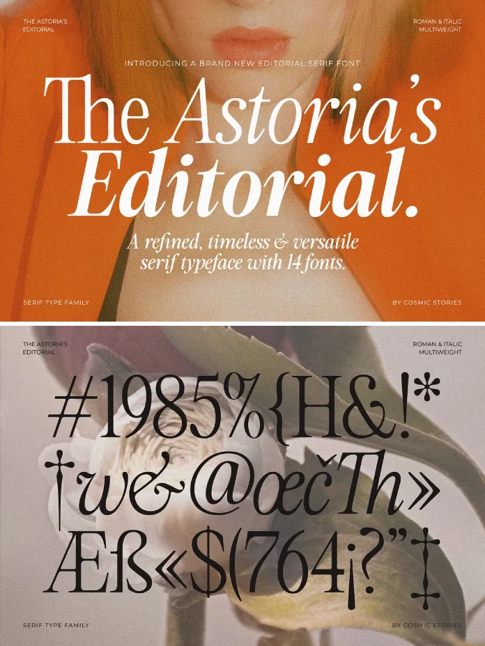
What Exactly Is The Astoria’s Editorial Serif, and Where Does It Come From?
The Astoria’s Editorial Serif is a fourteen-style type family built by CarmineType, made up of seven weights and their matching italics. It draws its structure from mid-century advertisement typography and classic magazine mastheads, but it doesn’t try to be a museum piece. The letterforms have that bold retro soul, sure, but the proportions feel calibrated for screens and modern grid systems, not just nostalgic mood boards.
I want to introduce a term here because I think it’s useful: call it the Retro Recall Index. It’s my own shorthand for how quickly a typeface reads as “vintage” to a viewer before they consciously notice a single letterform. The Astoria’s Editorial Serif scores high on Retro Recall, especially in its bolder weights, but it doesn’t tip into pastiche. That balance is harder to pull off than it sounds. Plenty of retro serifs either whisper (forgettable) or shout in a way that dates the whole design in five years (also a problem).
Testing the Seven Weights: My Weight Ladder Test
Seven weights sounds generous until you actually try to use all of them, so I ran what I call the Weight Ladder Test. I placed all seven side by side in a single layout, from the thinnest to the boldest, and checked whether each step felt distinct or just repetitive. The Astoria’s Editorial Serif passed this cleanly. Each weight has its own personality instead of feeling like a slider someone dragged in software.

The lighter weights work beautifully for body copy in editorial layouts, something a lot of “display-first” retro serifs completely fail at. I dropped the regular weight into a mock magazine spread, and it held up at 11 pt without losing its character. The heaviest weight, on the other hand, is built for headlines and packaging, where you want the type to do the shouting so the layout doesn’t have to.
Where the Italics Actually Shine
Matching italics across seven weights is a real commitment from a foundry, and CarmineType didn’t phone this part in. The italics aren’t just slanted romans; they have genuine calligraphic swing in the lowercase, particularly in the ‘g,’ ‘y,’ and ‘f.’ For editorial pull quotes, that swing does a lot of heavy lifting. It’s the difference between italics that feel like an afterthought and italics that feel like a second typeface designed with intent.
Ligatures: Small Details, Bigger Payoff
Refined ligatures show up across the family, and this is where I ran my next test, something I’m calling the Ligature Restraint Principle. Good ligatures should solve a spacing or collision problem, not just exist because a foundry wanted to advertise “has ligatures” on a product page. The Astoria’s Editorial Serif keeps its ligatures functional. The ‘ct,’ ‘st,’ and ‘fi’ combinations tighten naturally instead of drawing attention to themselves, which is exactly what an editorial typeface needs when it’s set at length.
I tested this directly by typesetting a full paragraph with heavy ligature triggers on purpose. No awkward overlaps, no ligatures that fought the kerning around them. That’s a small technical win, but it’s the kind of detail that separates a font built by people who actually set type from a font built by people who just draw letters.
How Does The Astoria’s Editorial Serif Perform in Real Layouts?
Theory is one thing. A live layout tells you the truth fast. I built three test projects: a magazine spread, a luxury packaging mockup, and a brand identity concept for a fictional heritage bakery. Across all three, the typeface held its “retro-modern fusion” promise without needing extra tricks like heavy letter-spacing or forced texture overlays to sell the vintage feel.
The packaging mockup surprised me the most. The Astoria’s Editorial Serif at a heavier weight gave the label an advertisement-era confidence that didn’t need supporting graphics to feel finished. That’s rare. Most retro display serifs need a whole art direction system around them to land. This one carries weight on its own, literally and stylistically.
Multilingual Support and File Formats
The family ships in OTF, TTF, WOFF, and WOFF2, which covers both desktop design work and web deployment without extra conversion. Multilingual character support is included, so international editorial and branding projects aren’t locked out, something I always check before recommending a typeface for client work.
The Astoria’s Editorial Serif at a Glance
| Attribute | Detail |
|---|---|
| Foundry | CarmineType |
| Total styles | 14 (7 weights + matching italics) |
| Category | Editorial serif, advertisement-inspired |
| Design influence | Mid-century advertisement typography, vintage signage |
| Best use cases | Editorial layouts, brand identities, luxury packaging, headlines |
| Ligatures | Yes, functional rather than decorative |
| File formats | OTF, TTF, WOFF, WOFF2 |
| Language support | Multilingual |
| Retro Recall Index | High, especially in bold weights |
Who Should Actually Buy This Typeface?
If you’re building an editorial brand, a magazine identity, or packaging that needs a heritage feel without looking dated in two years, The Astoria’s Editorial Serif earns its place in your library. It’s also a strong pick for anyone searching for a vintage serif font with ligatures that still performs at body-copy sizes, which is a narrower category than people think.
Where I’d hesitate: if your brand needs something quiet and neutral, this isn’t it. This typeface has opinions. It wants to be noticed, and it does that job well, but it’s not a safe, invisible workhorse font for dense technical documents.
My Prediction for Where This Typeface Ends Up
I’ll go on record with this: expect The Astoria’s Editorial Serif to show up in independent magazine relaunches and small-batch packaging within the next year or two. Retro-modern serifs with this level of weight range are still uncommon enough that early adopters will get real differentiation out of it before it becomes a design trend everyone recognizes on sight. That window won’t stay open forever, so if the Retro Recall Index matters for your next project, testing it now instead of later makes sense.
Frequently Asked Questions
Is The Astoria’s Editorial Serif good for body text?
Yes, particularly the lighter weights. I tested it at 11 pt. in a magazine layout, and it stayed legible without losing its editorial character.
How many fonts are included in the family?
Fourteen total: seven weights, each with a matching italic.
Does The Astoria’s Editorial Serif work for logo design?
Yes, especially for heritage-inspired or advertisement-style brand identities. The heavier weights carry visual weight on their own.
What file formats are included?
OTF, TTF, WOFF, and WOFF2, covering both design software and web use.
Does it support languages beyond English?
Yes, the family includes multilingual character support.
Who makes The Astoria’s Editorial Serif?
CarmineType, a foundry specializing in editorial and advertisement-inspired typography.
Browse WE AND THE COLOR’s Fonts category for more or check out our huge collection of the 100 best fonts in 2026.
Subscribe to our newsletter!