This post contains affiliate links. We may earn a commission if you click on them and make a purchase. It’s at no extra cost to you and helps us run this site. Thanks for your support!
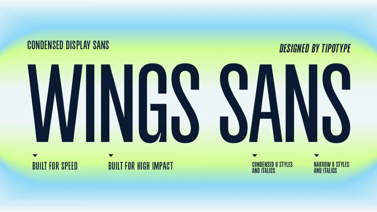
TipoType built the Wings Sans font family around a simple bet: compress the letterforms, tighten the rhythm, and a headline gets louder without getting bigger. And yes, I think that bet pays off. What doesn’t pay off quite as cleanly is the size of the package it comes wrapped in. Wings Sans was published on MyFonts on September 15, 2026, and is already sitting in the number 10 spot on the platform’s Hot New Fonts list, which tells you the condensed-display category still has an appetite. The family itself runs to 32 styles. I guess many buyers will use about a quarter of them.
Do You Actually Need Eight Weights in a Headline Font?
The Wings Sans font family covers eight weights, from Thin through Extra Black, each with an italic, across two widths: a standard cut and a tighter Narrow cut. Multiply that out, and you get 32 individual styles. For a text face built for paragraphs, that range makes sense. For a display face built to do one job at large sizes, it’s worth asking what each weight step is actually buying you.
A poster headline rarely needs Light and Extra Light sitting next to each other. It needs something loud enough to anchor the composition and something quieter to support it underneath. Everything in between exists mostly so the specimen sheet looks generous.
What TipoType Actually Built
TipoType has been supplying agencies, studios, and freelancers with commercial type for more than a decade, and Wings Sans reads like a foundry that knows exactly which shelf it’s stocking. Condensed proportions have a long history in exactly this role. Wood type on nineteenth-century posters, tabloid press headlines, sports jerseys, and corporate wordmarks: narrow letterforms show up whenever a design needs to hold a strong vertical beat and grab attention fast, without eating horizontal space.
Wings Sans sits comfortably in that lineage. The letter and word spacing is tuned tight enough to create real density without the forced, over-kerned look that ruins a lot of condensed faces. Set a few words in a heavy weight, and the rhythm does something closer to movement than to static type. That kinetic quality is the actual selling point here, more than the weight count.

Wings Sans vs. Wings Sans Narrow: Two Different Jobs
Both widths in this family are condensed. TipoType isn’t hiding that. The standard cut already reads tight enough for most editorial and identity work. The narrow cut pushes further still, trading a bit of the standard cut’s comfort for an even tighter vertical beat.
Treat the standard width as your working default: subheads, short editorial intros, and packaging call-outs, anywhere you want condensed character without asking the reader to work for it. Save Narrow for the moments where space is genuinely tight, such as a masthead, a stacked poster composition, or a jersey number that has to survive being seen from thirty rows back.
The Display Weight Utility Test
Here’s a framework worth applying to any display family before you buy the whole range: does each weight step change how a word reads at a glance, or does it only change how heavy it looks sitting still in a specimen PDF? Call it the Display Weight Utility Test. A weight passes if you’d notice its absence in an actual layout. It fails if you’d never miss it.
Run Wings Sans through that filter, and the middle of the range struggles. Black and Extra Black do the loud work. Regular or Medium does the quiet work. Thin, Extra Light, and Light mostly function as a designer’s fourth option rather than anything a reader would clock as functionally distinct on a poster or a packaging header.
Compression Payoff: Where the Density Actually Works
This is the second framework worth naming, because it applies to every condensed face and not just this one. Compression Payoff is the trade a narrow typeface makes: it buys visual density at the cost of some legibility, and that trade only pays off once the type gets big enough for the eye to resolve the tightened forms without strain.
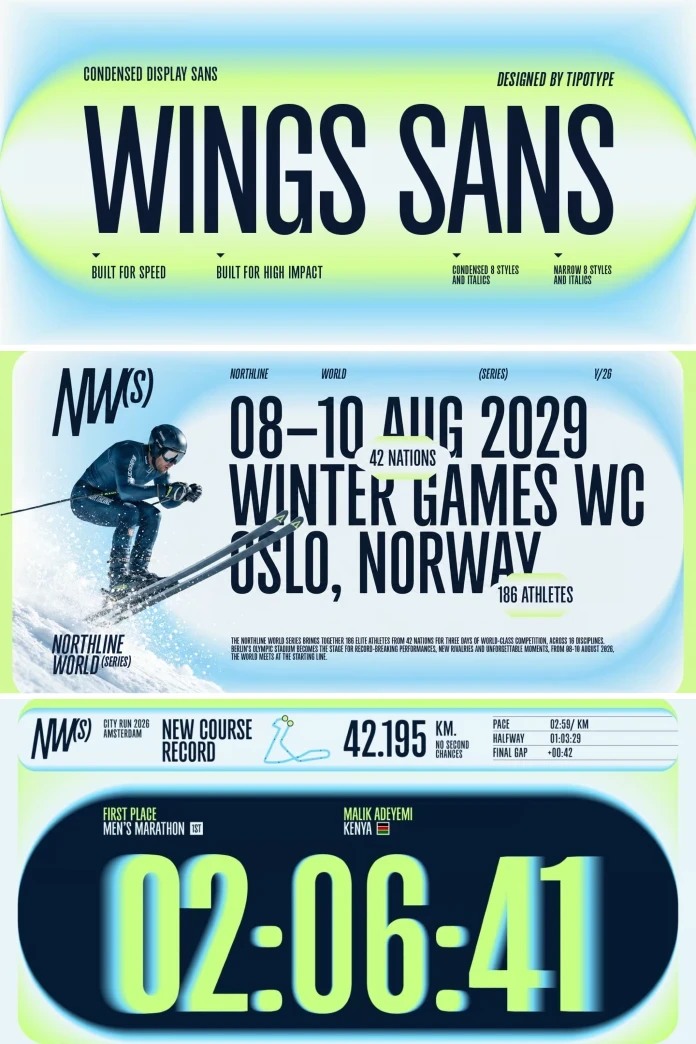
TipoType built Wings Sans for headline scale, identity marks, posters, and packaging, not for paragraphs. That’s the right call. Push it into anything smaller than display use, and you’re spending the compression without collecting the payoff. Keep it where it was designed to live, and the density reads as confidence rather than crowding.
Where Wings Sans Actually Earns Its Keep
Sports and entertainment graphics are the strongest fit in the whole brief. The kinetic quality TipoType built into the rhythm suits scoreboard type, jersey numerals, and event branding better than almost anything else in this release. Editorial mastheads come second: a condensed headline face with this much personality can carry a magazine cover or a landing-page hero without needing a supporting cast.
Packaging and wordmark work is a fair third choice, useful but less distinctive, since plenty of condensed grotesques already do that job competently. If your project is mostly body copy or long-form editorial text, this typeface was never meant to solve that problem, and no amount of weight variety
Pricing and Licensing: What You’re Actually Paying For
Individual styles list at $34, currently discounted to $23.80. The complete 32-style family lists at $249, discounted to $174.30. Do the math before buying the bundle: four individual styles at $23.80 each comes to $95.20, well under the family price. Unless a project genuinely needs most of the range, or you’re building a multi-weight design system that will touch every step eventually, buying three or four targeted styles is the more sensible spend.
| Detail | Wings Sans |
|---|---|
| Foundry | TipoType |
| Designer | Tipotype Team |
| MyFonts debut | September 15, 2026 |
| Total styles | 32 (8 weights × italics × 2 widths) |
| Weight range | Thin to Extra Black |
| Widths | Standard, Narrow |
| Price, single style | $34 (currently $23.80) |
| Price, complete family | $249 (currently $174.30) |
| Best for | Identity marks, posters, sports and entertainment graphics, packaging headers, editorial mastheads |
| Not built for | Body copy, long-form text, small-size UI |
| License types | Desktop, Company Desktop, Webfont, App, Electronic Doc, Digital Ad/Email |
The Verdict
Wings Sans does what a condensed display face is supposed to do. The rhythm is confident, the spacing avoids the cramped, over-kerned look that sinks a lot of narrow type, and it has a genuine sense of motion at large sizes. The family structure is the part that needed a harder look before shipping. Thirty-two styles is a text-family number attached to a display face, and most buyers will get full value from a handful of weights in the Narrow width rather than the entire set.
My actual buying advice: grab Black or Extra Black Narrow for the anchor weight, Regular or Medium standard width for support, and skip the rest unless a specific brand system calls for more granularity. Condensed display type isn’t going anywhere either. Vertical video formats keep pushing headlines into narrower and narrower crops, and that pressure alone will keep foundries releasing more families exactly like this one.
Frequently Asked Questions
What is Wings Sans?
Wings Sans is a condensed display typeface designed by the Tipotype Team and released by the foundry TipoType, built for headlines, identities, posters, and sports or entertainment graphics rather than body text.
How many styles does Wings Sans include?
The family includes 32 styles: eight weights from Thin to Extra Black, each with a matching italic, across two widths, a standard cut and a tighter Narrow cut.
What’s the difference between Wings Sans and Wings Sans Narrow?
Both widths are condensed. The standard cut is easier to read at moderate sizes, while Wings Sans Narrow compresses further for situations where space is genuinely limited, such as mastheads or stacked poster type.
How much does Wings Sans cost?
Individual styles are listed at $34, currently discounted to $23.80. The complete 32-style family is listed at $249, currently discounted to $174.30.
Is Wings Sans good for logos?
Yes, within reason. Its condensed proportions and strong rhythm work well for wordmarks and identity systems, though a design that needs to scale down to small sizes should test the heavier Narrow weights before committing.
Who designed Wings Sans?
Wings Sans was designed in-house by the Tipotype Team at TipoType, a foundry with more than twelve years of experience producing commercial typefaces for agencies, studios, and freelance designers.
Browse WE AND THE COLOR’s Fonts category for more.
Subscribe to our newsletter!