This post contains affiliate links. We may earn a commission if you click on them and make a purchase. It’s at no extra cost to you and helps us run this site. Thanks for your support!
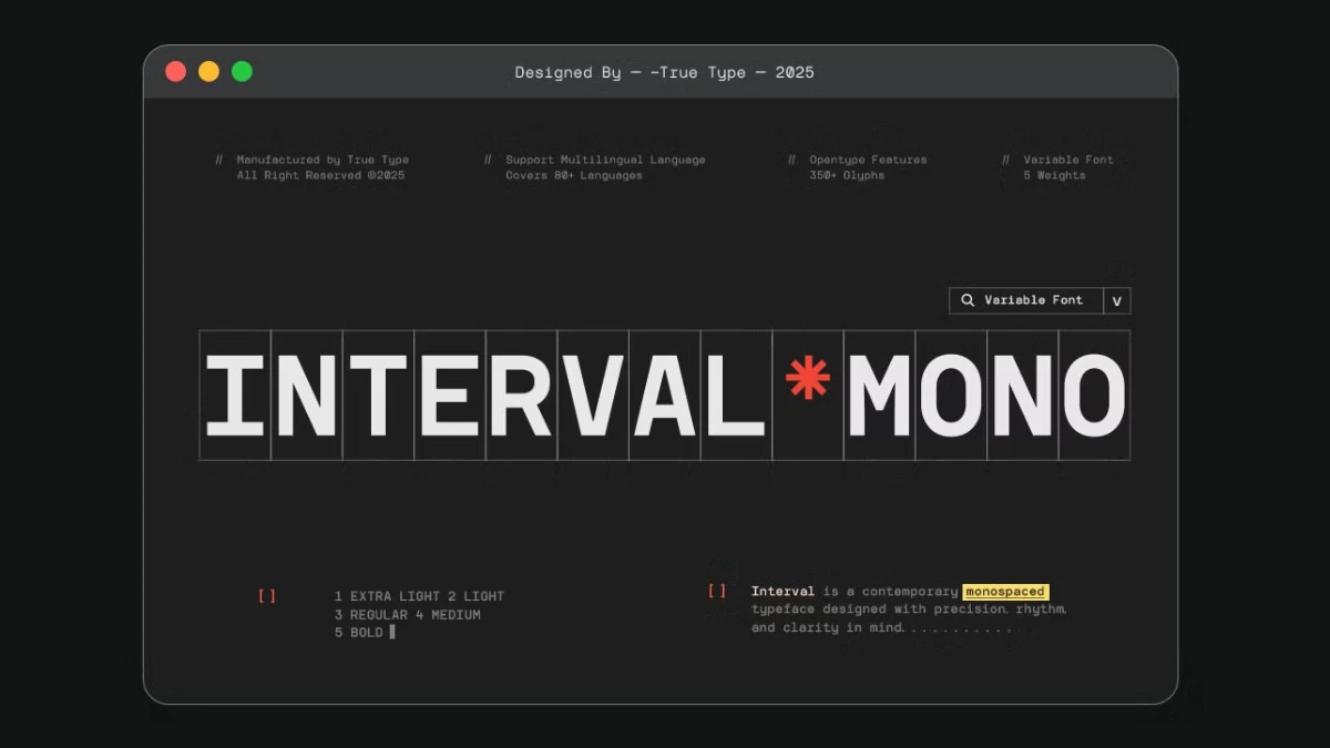
TRT Interval Mono is a good monospace font family with only one little hole in its range. It ships in five weights, from ExtraLight to Bold. But its listing shows no italics, whether on Envato Elements, MyFonts, or Creative Market. That single gap decides where you can use it.
Yusilo Oktaprima Ardani designed the family, and his studio True Type Lab published it. Monospace type keeps leaving the terminal for brand identities and app screens. So a clean, grid-based option deserves a proper look.
You can get the complete family from:
My detailed review covers what the family contains and where TRT Interval Mono fits. It also explains how to test any fixed-width typeface. I name four testing ideas of my own along the way. They are editorial constructs, not industry standards.
You can get the complete family from:

What Is TRT Interval Mono, Exactly?
TRT Interval Mono is a monospace sans serif family from True Type Lab. Every character takes the same horizontal width. That fixed advance width forces text onto a strict grid.
In one sentence, TRT Interval Mono is a five-weight monospace sans serif. Yusilo Oktaprima Ardani designed it, and True Type Lab publishes it.
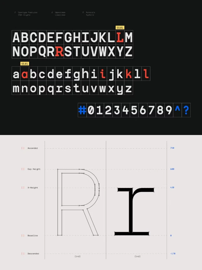
The product description says the family rests on geometry and a modular grid. It also claims that select glyphs carry subtle details, which add a human touch. I treat that claim as a hypothesis. The test section below checks it.
Who Sells TRT Interval Mono, and for How Much?
Four storefronts carry the family. MyFonts charges $19 per style and $29 for all five weights. A Designer Edition bundle with three styles (Light, Regular, Bold) costs $21. Creative Market lists the font at $25. Gumroad and Envato Elements also carry it.
A demo version exists as well. It has three weights and a limited glyph set. The license allows personal use only.
What Is Listing Drift?
Listing Drift is the mismatch between what different stores say about one family. TRT Interval Mono shows it clearly.
Creative Market sells it as “TRT Interval Mono Font.” MyFonts and Gumroad use the name “TRT Interval.” Gumroad lists OTF, TTF, WOFF and variable formats. The MyFonts page lists five styles and mentions no variable file. So check the file list before you pay.
How Do You Test a Monospace Font Like TRT Interval Mono?
A specimen tells you little about a fixed-width face. Alignment, weight, spacing, and missing styles show up only when you set real text. I use three checks. Each one targets a known weak point of monospace type.
Column Drift
Column Drift is the sideways creep that appears when one glyph breaks the fixed advance width. It ruins tables and code. Set 60 lines of an ASCII table at 12 px. Then draw a vertical guide and look for any character that leaves its column.
The Weight Ladder
The Weight Ladder describes how far apart neighboring weights sit. TRT Interval Mono has five rungs: ExtraLight, Light, Regular, Medium, and Bold. Set one line in all five at 12, 16, and 48 px. Can you tell Regular from Medium at 12 px? Close neighbors often blur at small sizes.
The Italic Gap
The Italic Gap is the set of jobs a family cannot do because it ships no italic styles. For TRT Interval Mono, that set is real. Many code editor themes italicize comments. Editorial layouts need italics for titles and emphasis, and some interfaces use them for hints.
You have two workarounds. First, pair the family with an italic from another typeface. Second, use weight or color for emphasis. I prefer the second option in code and the first in print. A mismatched italic always looks borrowed.
Where Does TRT Interval Mono Work Best?
Branding and Wordmarks
Fixed widths give a wordmark an even rhythm. You don’t kern a monospace font, because the grid spaces every letter. That makes TRT Interval Mono a sensible base for technical brands. Use ExtraLight and Light at 48 px or larger, since thin strokes need room. Bold is the safer choice for small marks.
Editorial Layouts
Monospace type suits captions, data labels, and pull statistics. Long body text is another matter. Letters like i and l take the same width as m and w, so reading slows. I would not set a feature article in TRT Interval Mono. I would set the image credits in it.
Interfaces and Code
Dashboards benefit most. Numerals line up in every row, so a pricing table or log viewer keeps its columns without tabular-figure settings. For code, the family works in a plain editor. Themes that italicize comments will fall back to upright text or a substitute. Test that in your own editor before you commit.
Pairing TRT Interval Mono With a Proportional Typeface
Monospace type rarely carries a whole layout. Pair it with a proportional face for paragraphs, and keep TRT Interval Mono for labels, figures, and credits. Match x-heights rather than point sizes, because x-heights decide how two faces sit together. A 60-character measure also works well, since the fixed width makes that count exact.
A proportional serif gives the strongest contrast. A proportional sans gives the quietest result. I lean toward the serif because two sans serifs side by side compete for the same job.
Where Does TRT Interval Mono Sit in the True Type Lab Lineup?
True Type Lab sells at least three monospace families. TRT Interval Mono is the sans serif with five weights. TRT Typeport Mono, according to MyFonts, offers six weights, a variable axis, more than 400 glyphs, and 200-plus languages. Supply Family lists TRT Aigo Mono as a monospace serif with five weights from Light to Bold.
Each family fills a different gap. On paper, TRT Interval Mono is the most restrained of the three, because its description stresses precision and restraint. Typeport targets buyers who need language coverage. Aigo targets editorial work that wants warmth.
How Does TRT Interval Mono Compare With JetBrains Mono and IBM Plex Mono?
JetBrains Mono is free under the SIL Open Font License, and JetBrains built it for developers. It ships italics. IBM Plex Mono is open source too and also includes italics. Courier, by contrast, carries typewriter slab serifs, and Howard Kettler drew it for IBM in 1955. TRT Interval Mono is a sans serif, so it has none of that baggage.
My position is simple. For code, pick JetBrains Mono, because it costs nothing and covers italics. For a wordmark or magazine sidebar, pick TRT Interval Mono. A free developer font looks like a developer tool.
If you need a variable axis, TRT Typeport Mono is the closest match. Interval Mono wins on price and restraint.
What Does the TRT Interval Mono License Allow?
The MyFonts desktop license covers logos, posters, PDFs, packaging, and social posts. It excludes websites, apps, server installs, AI training, and font modification. It also forbids sharing the files. A webfont license covers one domain only.
Creative Market and Envato Elements run their own license terms. Read those before you assume anything. I’m not a lawyer, and the EULA decides.
Where Is Monospace Typography Heading?
Italics will arrive first. Within two years, I expect most new paid monospace families to include them, because developers already ask for them.
Variable files follow. Five static weights will look thin once buyers compare them with a continuous weight axis.
Brand work comes last. Monospace wordmarks keep spreading among software and AI companies, and ExtraLight headlines suit that look.
TRT Interval Mono at a Glance
| Attribute | Detail |
|---|---|
| Name | TRT Interval Mono (also sold as TRT Interval) |
| Designer | Yusilo Oktaprima Ardani |
| Foundry | True Type Lab |
| Category | Monospace sans serif |
| Weights | ExtraLight, Light, Regular, Medium, Bold |
| Italics | None listed on MyFonts |
| MyFonts debut | October 13, 2025 |
| MyFonts price | $19 per style, $29 for the five-style family |
| Creative Market price | $25 |
| Formats on Gumroad | OTF, TTF, WOFF, variable |
| Best for | Wordmarks, captions, dashboards, data tables |
| Weak spot | The Italic Gap |
| Web use | Needs a separate webfont license |
You can get the complete family from:
Common Questions About TRT Interval Mono
What is TRT Interval Mono?
TRT Interval Mono is a monospace sans serif family by Yusilo Oktaprima Ardani. True Type Lab publishes it in five weights, from ExtraLight to Bold.
Does TRT Interval Mono have italics?
No. The MyFonts listing shows five styles and no italic. Pair it with another family if you need one.
How much does TRT Interval Mono cost?
MyFonts charges $19 per style and $29 for the five-style family. Creative Market lists it at $25. Prices change, so check the store.
Is TRT Interval Mono a variable font?
The Gumroad listing names a variable format. The MyFonts page lists five static styles and no variable file. Confirm the download contents before you buy.
Can I use TRT Interval Mono on a website?
Only with a webfont license. The MyFonts desktop license excludes websites. A webfont license covers a single domain.
Is there a free version of TRT Interval Mono?
A demo with three weights and limited glyphs exists for personal use. Commercial work requires the full license.
Is TRT Interval Mono good for coding?
It works in a plain editor. However, the Italic Gap hurts themes that italicize comments. JetBrains Mono costs nothing and ships italics.
Which TRT Interval Mono weight should I start with?
Start with Regular for text and Bold for small marks. Use ExtraLight only at 48 px or larger.
Browse WE AND THE COLOR’s Fonts category for more.
Subscribe to our newsletter!