
Tag: sans serif
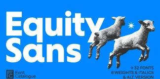
Equity Sans Font Family by Font Catalogue
Geometric sans serifs have dominated the design landscape for decades. Most of them share one problem: they are cold. Their precision keeps readers at...

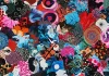
Onni Font Family by Resistenza
Why Typography Needs Controlled Chaos
The Onni font family arrives at a moment when brands demand something beyond clinical perfection. Resistenza's Helsinki-based design challenges the...
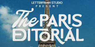
The Paris Editorial Font Duo by Letter Fresh
It's no secret that typography dictates a brand's voice before a consumer reads a single word. The Paris Editorial font duo creates a specific auditory hallucination...
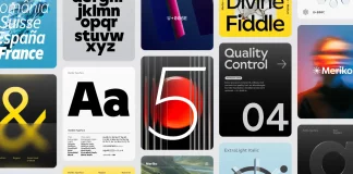
Meriko Font Family by Juri Zaech
Juri Zaech's Meriko font family shows outstanding precision, and if you are looking for a typeface that balances strict geometry with human warmth, this...
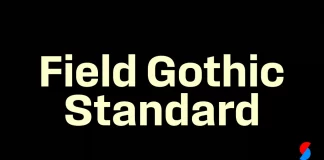
Field Gothic Standard Font Family by Signal Type Foundry
The Field Gothic Standard Typeface Shows How Signal Type Foundry Redefined the Modern American Sans Serif
As with the Narrow and Wide series, the Field...
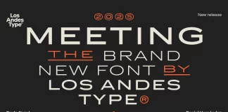
Meeting Font Family by Los Andes
What is the Meeting Font Family by Los Andes?
Designers often mistake minimalism for a lack of personality. The Meeting font family proves that restraint...
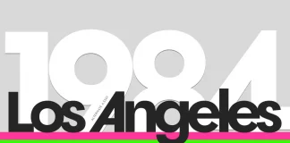
Ordine Font Family by Resistenza
Resistenza's Ordine Typeface is the Geometric Sans Font Family You Need for Modern Branding
Precision often dictates the rhythm of contemporary graphic design. Yet, finding...

Apercu Font Family by Colophon Foundry
Say Hello to the Apercu Font Family: The Friendly Face of Modern Minimalism in Typography
The Apercu font family has quietly become a design world...
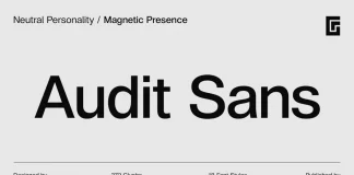
Audit Sans Font Family by Gravitype
This is Audit Sans, The Understated Powerhouse Your Brand Needs
In the vast universe of typography, finding a sans-serif that feels both new and familiar...
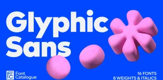
Glyphic Sans Font Family by Font Catalogue
Discover the Glyphic Sans Typeface: A Human Voice in a Geometric World
A typeface must often choose a side. It can be geometric and precise,...
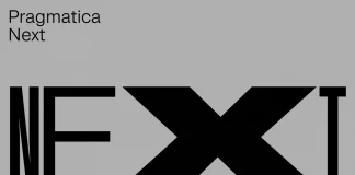
Pragmatica Next Font Family by ParaType
Pragmatica Next is a Neo-Grotesque Superfamily Redefining Versatility
In the world of typography, the neo-grotesque style remains a cornerstone of modern design. Known for clean...
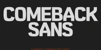
Comeback Sans Font Family by DKType Foundry
Comeback Sans is a Modern Humanist Font Family with a Soul.
Oh yes, we know that many of you are looking for typefaces with personality,...