This post contains affiliate links. We may earn a commission if you click on them and make a purchase. It’s at no extra cost to you and helps us run this site. Thanks for your support!
Resistenza’s Ordine Typeface is the Geometric Sans Font Family You Need for Modern Branding
Precision often dictates the rhythm of contemporary graphic design. Yet, finding a typeface that balances mathematical logic with human warmth remains difficult. The Ordine font family successfully bridges this specific gap for discerning designers. Resistenza, the creative foundry behind this release, creates a tool that feels both inevitable and surprising. You might expect another rigid geometric sans. However, the typeface offers much more than simple circles and lines. It brings a sophisticated narrative to digital typography. Designers looking for a versatile, contemporary geometric typeface will find their solution here. This article explores why this specific typeface deserves a permanent spot in your creative toolkit.
Why Does the Ordine Font Family Stand Out in Geometric Typography?
Geometric sans-serif fonts saturate the current design market. Consequently, a new entry must possess exceptional qualities to survive. The Ordine font family commands attention through its foundational structure. It relies on perfectly circular counters. You see this clearly in letters like ‘o’, ‘e’, and ‘a’. These shapes build a clean, contemporary foundation for any visual layout. Nevertheless, the design avoids the sterile atmosphere often found in purely mathematical typefaces. Resistenza injected refined details to break the monotony.
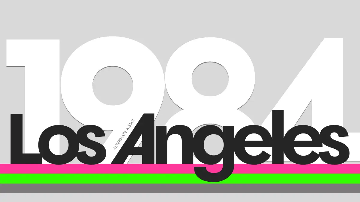
For instance, examine the lowercase ‘e’. It features a subtle horizontal bar. This specific choice significantly improves legibility at small sizes. Furthermore, the two-story ‘g’ displays sophisticated craftsmanship. Most geometric fonts choose a simple single-story ‘g’. The Ordine typeface rejects this shortcut. Instead, it embraces complex curves. These human touches make the font feel approachable rather than robotic. Therefore, brands can use it without appearing cold or distant. The balance between geometry and character defines the typeface.
Mastering Variable Font Technology
Static font files limit modern creativity. Designers today demand adaptability and speed. Unsurprisingly, the typeface shines as a variable font. This technology allows for seamless weight interpolation. You are not stuck with just “Bold” or “Light.” You can select the exact weight that fits your layout. This responsiveness provides incredible versatility for web design and responsive branding.
Additionally, the family includes oblique variants. These slanted styles maintain the geometric integrity of the upright characters. However, they add dynamic energy to the text. The Ordine font family handles these transitions effortlessly. The consistent x-height across all weights guarantees strong performance. Whether you use a hairline weight or a heavy block, the text remains readable. Balanced proportions ensure the typeface holds its ground on any screen.
How Can You Utilize the Ordine Font Family in Design Projects?
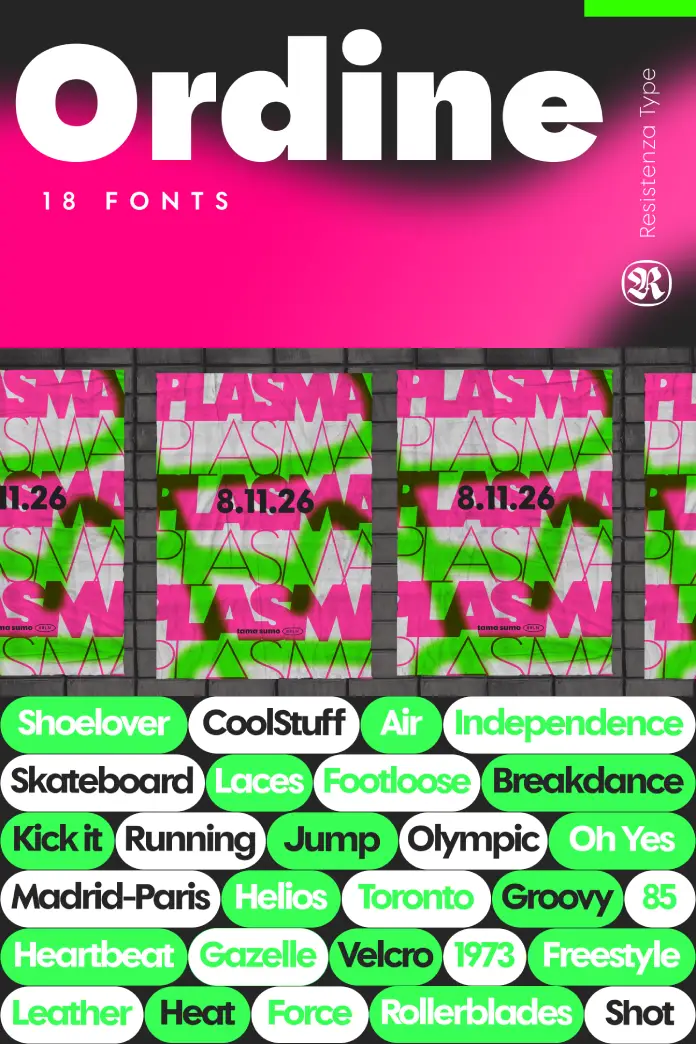
Versatility determines a typeface’s true value. A beautiful font is useless if it only works in one context. Fortunately, the Ordine font family adapts to vastly different environments. Lighter cuts bring immediate elegance to editorial design. They look stunning in fashion magazines or luxury lifestyle blogs. The thin lines create a sense of refined airiness. Conversely, the bolder styles make an impressive statement.
Consider the typeface for branding and sportswear. The geometric precision screams performance and speed. Heavy weights work perfectly for jersey numbers or aggressive marketing headlines. The text retains its clarity even when scaled up for billboards. Furthermore, cultural institutions can leverage this font. It communicates innovation and reliability simultaneously.
The Color and Vibe of Ordine
Typefaces imply color even when printed in black and white. The typeface suggests a vibrant, digital palette. Its clean geometry pairs exceptionally well with bright, neon colors or high-contrast interfaces. It captures the spirit of contemporary design perfectly. Brands that want to feel modern and sophisticated should adopt this family.
The font radiates a sense of digital native confidence. It does not try to mimic the past. Instead, the Ordine font family looks forward. It suits tech startups, art galleries, and modern apparel lines. You get a tool that feels engineered yet artistic. This duality is rare. Consequently, the typeface becomes a go-to choice for visual identities that require longevity.
Critical Perspectives on the Ordine Font Family
As a design critic, I value intention over trendiness. Many fonts merely copy the “geometric” trend. They lack soul. The typeface differs because of its internal logic. Resistenza did not just draw circles; they designed a reading experience. The inclusion of specific “human” distinctives prevents visual fatigue. Reading long paragraphs in a strict geometric sans usually hurts the eyes. However, the Ordine font family mitigates this through its unique character construction.
I believe the double-story ‘g’ is the hero of this typeface. It anchors the text block. It reminds the reader that a human hand crafted these shapes. Moreover, the variable nature of the Ordine typeface proves that the foundry understands modern workflows. We need tools that flex. We need systems, not just static assets. This font family delivers a system.
Final Thoughts on Usability
You should consider the technical benefits alongside the aesthetic ones. The Ordine font family loads efficiently. Its variable nature can reduce HTTP requests on websites, as one file serves multiple weights. This matters for SEO and user experience. Thus, choosing the Ordine font family is both a design decision and a technical optimization.
Designers often search for that “Swiss Army Knife” font. They want one typeface for headlines, body copy, and logos. The Ordine font family fits this description. It transitions from loud to whisper-quiet without losing its identity. This consistency builds strong brand recognition. If you want a typeface that works hard for you, investigate this family.
FAQ: Common Questions About the Ordine Font Family
1. What is the primary style of the Ordine font family?
It’s a modern geometric sans-serif typeface. It features perfectly circular counters in letters like ‘o’ and ‘a’ but includes humanistic details to ensure warmth and legibility.
2. Does the Ordine typeface support variable font technology?
Yes, Ordine is available as a variable font. This allows designers to use seamless weight interpolation and adjust the thickness precisely between light and bold extremes.
3. What are the best use cases for the Ordine font family?
This typeface is highly versatile. Lighter weights suit editorial design and luxury branding. Bolder weights work exceptionally well for sportswear, athletic branding, and impactful headlines.
4. Who designed the Ordine font family?
The Ordine font family was designed by Resistenza, a type foundry known for blending calligraphy and illustrative elements with solid typographic structures.
5. How does the Ordine font family improve legibility?
Despite its geometric base, the font uses a consistent x-height and specific details like a horizontal bar on the ‘e’ and a two-story ‘g’. These features guide the eye and improve reading comfort.
6. Can I use the Ordine font family for web design?
Absolutely. Its variable nature makes it efficient for loading times. Furthermore, its clean geometry renders clearly on digital screens of all sizes.
Don’t hesitate to find other popular typefaces in the Fonts section here at WE AND THE COLOR.
Subscribe to our newsletter!

