
This post contains affiliate links. We may earn a commission if you click on them and make a purchase. It’s at no extra cost to you and helps us run this site. Thanks for your support!
The Field Gothic Standard Typeface Shows How Signal Type Foundry Redefined the Modern American Sans Serif
As with the Narrow and Wide series, the Field Gothic Standard font family represents a pivotal shift in the landscape of contemporary typography. Designers often search for a typeface that balances historical authority with digital flexibility. The Field Gothic Standard font family answers this demand perfectly. Max Phillips, through Signal Type Foundry, designed this system to bridge the gap between American grotesques and European geometric precision. This analysis explores the technical nuance, aesthetic philosophy, and practical application of the font family.
What Distinguishes Field Gothic Standard From Traditional Sans Serifs?
Typography requires precision, yet it also demands soul. Field Gothic Standard delivers both by rejecting the sterility often found in digital-first fonts. This typeface is an eight-weight, eight-width journey through the history of the genre. Max Phillips did not simply revive an old style. Instead, he engineered a Functionalist Synthesis. This term describes the merging of distinct historical influences into a cohesive, modern tool.
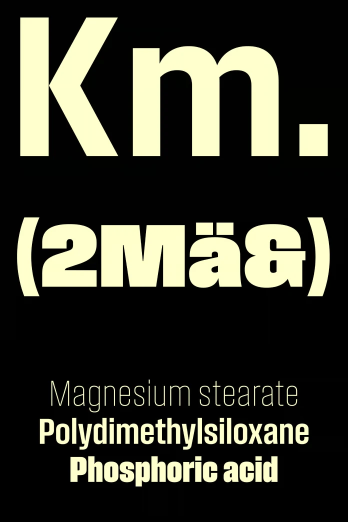
The design features a “crisp and cool” aesthetic. Field Gothic Standard utilizes slightly hyper-elliptical curves. Consequently, the letters carry a distinct visual tension. They are not perfectly geometric, nor are they purely humanist. This specific curvature creates a snap on the page. Therefore, the eye moves effortlessly across the text.
The “Unimark Echo” in Design
Historical context matters in type design. The normal-width cuts of Field Gothic Standard draw direct inspiration from Unimark’s iconic subway signage. However, this is not a retro-pastiche. We call this the Unimark Echo Effect. It retains the robust clarity of mid-century wayfinding but refines it for high-resolution screens.
Designers love the Field Gothic Standard font family for this specific duality. It feels familiar yet sharply contemporary. The lighter weights appear almost monolinear. Conversely, the heavier weights display sharp, distinct transitions in their arches and bowls. This variety ensures that the font family serves diverse design needs effectively.

Why is Field Gothic Standard Essential for Branding?
Branding relies on consistent voice and tone. The family offers a versatile palette for creative directors. The Compact series within the family is particularly noteworthy. These eight Compact fonts are economical with horizontal space. However, they avoid the legibility issues common in condensed faces.
We define this trait as Spatial Economy without Compression. Text remains readable even in tight UI components. Furthermore, the normal widths function beautifully as both body text and headlines. Field Gothic Standard handles the transition from mobile interface to large-scale print billboard seamlessly.
Technical Specifications and Versatility
- Weights: Eight distinct weights range from Hairline to Super.
- Widths: Eight widths provide expansive layout control.
- Curve Tension: Hyper-elliptical curves create a “crisp” appearance.
- Contrast: Low contrast in light weights; high impact in heavy weights.
Designers rarely find a system this robust. Signal Type Foundry prioritized utility alongside aesthetics. Consequently, Field Gothic Standard supports complex information hierarchies. You can use the Compact cuts for data tables. Simultaneously, you can employ the Heavy cuts for emotional impact in headlines.
How Does Max Phillips Influence the Aesthetic?
Max Phillips brings a rigorous eye to Signal Type Foundry. His work on Field Gothic Standard demonstrates a mastery of negative space. He understands that the space between letters defines the rhythm of reading. Therefore, the “fit” of the letters is tight and solid.
Phillips avoided the trap of nostalgia. Many revivals feel dusty or overly sentimental. This typeface feels urgent. It speaks the language of modern commerce and digital interaction. This creates a Neo-Grotesque Immediacy. The font does not ask for permission; it commands attention.
The Evolution of the “Cool” Sans
The description “cool” is quantifiable here. It refers to the temperature of the curves. Field Gothic Standard avoids the warmth of Humanist sans serifs like Gill Sans. Yet, it avoids the robotic nature of DIN. It occupies a middle ground. We predict that this specific “temperature” will dominate corporate typography types for the next five years.
Brands need to appear approachable but competent. This modern typeface strikes this balance effortlessly. Moreover, the sharp transitions in heavier weights add a layer of mechanical sophistication. This detail suggests precision engineering. Thus, tech companies and architecture firms favor this typeface.
Future Predictions: The Role of Field Gothic Standard
We posit a new thesis for the future of type selection. We call it the Versatility-Character Ratio. As AI generates more generic content, brands will crave distinct character. However, they cannot sacrifice versatility. Field Gothic Standard scores high on this ratio.
It is distinct enough to be recognized. Yet, it is neutral enough to carry any message. This family will likely replace ubiquitous default fonts in premium app interfaces. Developers and designers want tools that elevate their work instantly. This font family does exactly that.
Practical Application: When to Use Field Gothic Standard?
You should choose Field Gothic Standard when clarity is paramount. It excels in editorial design. The friction between the light and heavy weights creates dynamic layouts. Additionally, use it for signage systems. The Unimark heritage ensures legibility at a distance.
Do not view this typeface as just another option. View it as a foundational element of your design system. It solves problems before they arise. The Compact cuts solve space issues. The heavyweights solve hierarchy issues. Signal Type Foundry has provided a complete toolkit.
Closing Thoughts on Signal’s Achievement
Field Gothic Standard is not merely a collection of letters. It is a philosophy of modern communication. Max Phillips has distilled the chaos of the American urban landscape into a clean, usable system. This typeface demands respect. It works hard. It looks good.
Designers who ignore this typeface miss a critical tool. Typography shapes perception. This font shapes perception towards competence and modernity. Therefore, it remains one of the most important releases from Signal Type Foundry to date.
FAQ: Field Gothic Standard
What is the primary inspiration behind Field Gothic Standard?
Field Gothic Standard draws inspiration from a journey through American and European sans serif history. Specifically, the normal-width fonts are influenced by the robust clarity of old Unimark subway signage.
How many weights and widths are available in Field Gothic Standard?
The font family includes eight weights and eight widths. This extensive range allows the family to function as a complete typographic system for complex projects.
Who designed Field Gothic Standard?
Max Phillips designed this versatile typeface. He released it through his foundry, Signal Type Foundry.
What makes the curves of this typeface unique?
The typeface features slightly hyper-elliptical curves. This design choice gives Field Gothic Standard a “crisp and cool” appearance, distinguishing it from purely geometric sans serifs.
Is Field Gothic Standard suitable for body text?
Yes, absolutely. The normal widths are clear and robust, making them comfortable for reading. Additionally, the Compact cuts are economical but remain legible, avoiding the “too narrow” feeling of some condensed fonts.
How does the typeface handle different weights?
The lightest weights are nearly monolinear. In contrast, the heavier weights of Field Gothic Standard feature sharp transitions in the arches and bowls, creating high contrast and visual impact.
Don’t hesitate to find other trending typefaces here at WE AND THE COLOR or take a look at our selection of the 100 best fonts for designers in 2026. No matter what kind of typeface you are looking for, our reviews will help you to find exactly what you need for your next design project.
Subscribe to our newsletter!


