
This post contains affiliate links. We may earn a commission if you click on them and make a purchase. It’s at no extra cost to you and helps us run this site. Thanks for your support!
Say Hello to the Apercu Font Family: The Friendly Face of Modern Minimalism in Typography
The Apercu font family has quietly become a design world favorite. You have likely seen it without even realizing it. This typeface strikes a unique balance. It feels both familiar and refreshingly modern. Its clean lines and subtle quirks make it incredibly versatile. Apercu works for big brands and small startups alike. But what is it about this particular font that captivates so many designers and brands? Why does the Apercu font family continue to feel so relevant in a sea of sans-serifs?
The Story Behind the Apercu Font Family
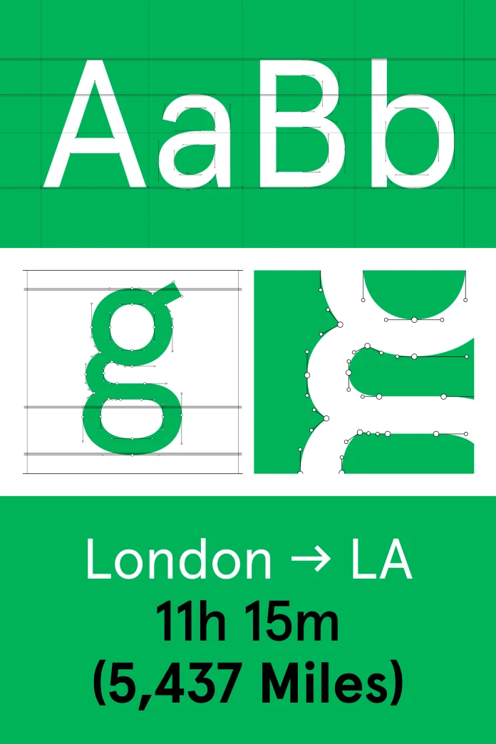
Colophon Foundry, an international award-winning type foundry based in London, created Apercu. The foundry started drawing Apercu in December 2009. They tested it extensively through various design commissions. The goal was to create a new typeface. This typeface would blend elements from classic realist fonts. Think of Johnston, Gill Sans, Neuzeit, and Franklin Gothic. Colophon wanted to give these classics a contemporary twist. The result is a typeface that feels like a greatest hits album of sans-serifs, yet it has a distinct personality all its own.
Since its official release in August 2010, the Apercu font family has seen widespread adoption. It appears across different media and sectors globally. Major institutions like MOMA, Burberry, and the Walker Art Center use it. This speaks volumes about its quality and appeal. It has become a go-to choice for those seeking a modern, legible, and friendly typeface.
What Makes the Apercu Typeface So Special?
Apercu possesses a unique charm. It avoids the cold, sterile feeling of some other sans-serifs. The letters have a slightly irregular quality. This gives them a warm, human touch. It’s like the perfect blend of geometric precision and handcrafted artistry. This makes the Apercu font family incredibly approachable. It communicates with a friendly and open tone.
The font family comes in a wide range of weights. This includes everything from Thin to Black. This versatility allows designers to create a clear visual hierarchy. It can be used for bold headlines and easy-to-read body text. The extensive language support is another key feature. This makes it a practical choice for international brands.

How to Use the Apercu Font Family Effectively
The beauty of the Apercu font family lies in its adaptability. It can be a workhorse for branding projects. Its clean aesthetic is perfect for logos and corporate identities. Yet, it also shines in editorial design. Its high legibility makes it ideal for magazines and websites. Have you ever considered how a font can shape a brand’s voice? Apercu speaks in a clear, confident, and approachable manner.
For web design, Apercu is a fantastic choice. Its simple forms render well on screens of all sizes. This ensures a consistent user experience across devices. When paired with a more traditional serif font, it can create a beautiful contrast. This combination often feels both timeless and contemporary. The key is to let Apercu’s personality shine through. Do not overcrowd it with other decorative elements.
A Personal Reflection on Apercu
There is something undeniably optimistic about the Apercu font family. It feels forward-thinking without being pretentious. It’s the kind of typeface that suggests innovation and creativity. In my own work, I have found it to be a reliable and expressive tool. It manages to be both a statement and a subtle background player. This duality is what makes it so enduring.
In a design landscape that is constantly changing, Apercu has carved out a special place. It is a testament to the power of thoughtful, well-crafted typography. It proves that a font can be both functional and full of character. The next time you see it, take a moment to appreciate its understated elegance. You might be surprised at how it enhances the message it conveys. The Apercu font family is more than just a set of letters; it’s a friendly guide in a complex visual world.
Don’t hesitate to find other trending typefaces here at WE AND THE COLOR or check out our selection of the best fonts for designers in 2026.
Subscribe to our newsletter!


