This post contains affiliate links. We may earn a commission if you click on them and make a purchase. It’s at no extra cost to you and helps us run this site. Thanks for your support!
What is the Meeting Font Family by Los Andes?
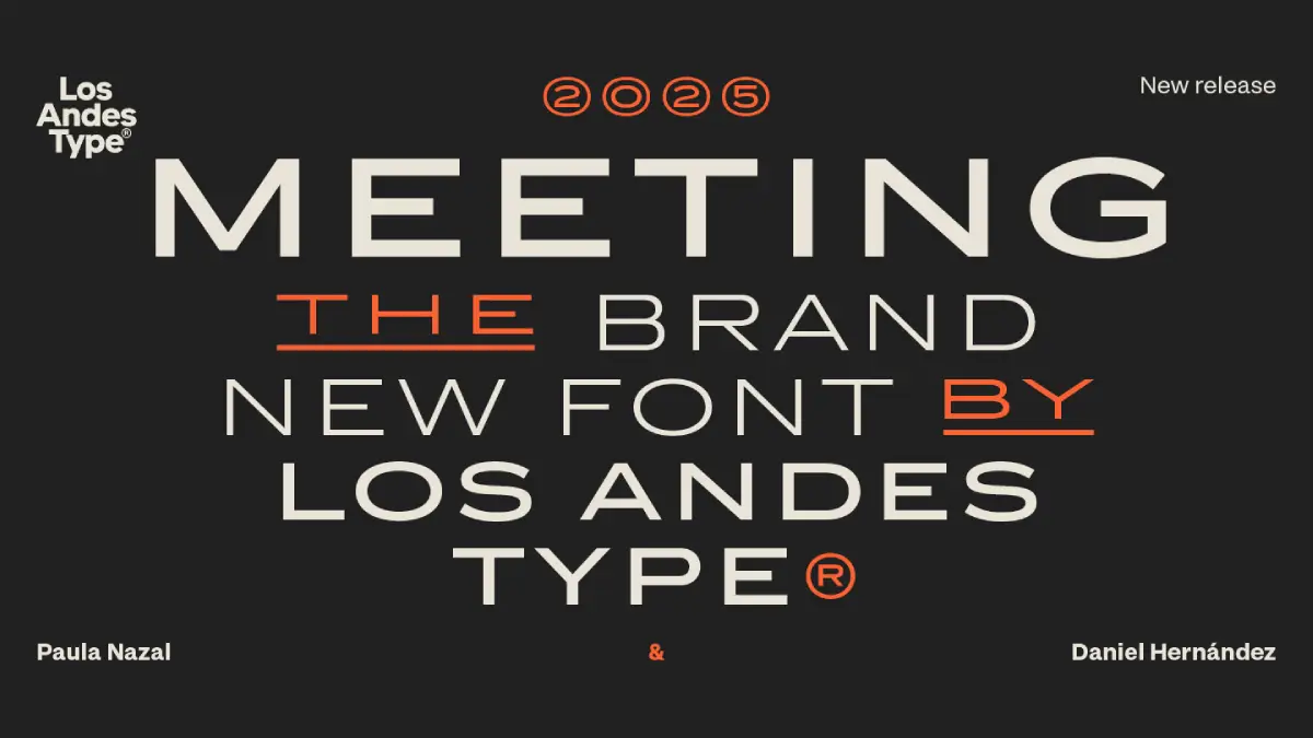
Designers often mistake minimalism for a lack of personality. The Meeting font family proves that restraint actually generates the loudest impact in modern branding. Created by the Chilean foundry Los Andes, this typeface abandons the frantic energy of digital-first trends for something more permanent. It draws a direct line back to Copperplate Gothic but strips away the Victorian stiffness. Because of this, the Meeting font family feels both nostalgic and aggressively current.
Why Does the Meeting Font Family Define Modern Elegance?
Space creates luxury. Most sans-serifs crowd the baseline, but the Meeting font family prioritizes generous letter spacing and wide proportions. These wide caps demand attention without shouting. Consequently, the rhythm of the text feels deliberate and calm. Why do we settle for cramped typography when we can give words room to breathe?
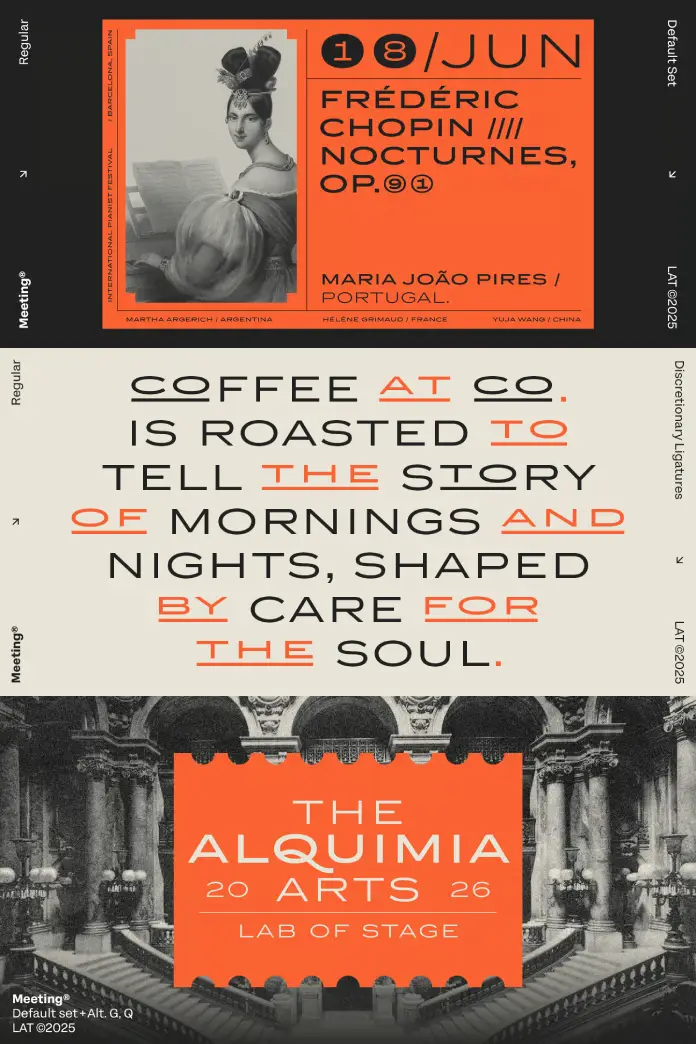
The architecture of this typeface relies on solid forms and surgical precision. Every curve feels intentional. Every terminal looks sharp. This structural integrity conveys immediate trust to the viewer. When you use the Meeting font family, you signal that the brand values quality over speed. It possesses the same balance as a perfectly mixed Negroni—sophisticated, slightly bold, and refreshing.
The Technical Brilliance of Los Andes Type Design
Los Andes understands that versatility drives a font’s longevity. They built the Meeting font family with a focus on “fixed proportions.” This means the optical weight remains consistent across different applications. Whether you print it on a textured wine label or display it on a high-resolution screen, the clarity persists.
- Generous Kerning: The default tracking provides a cinematic feel.
- Clean Geometry: The strokes lack unnecessary ornamentation.
- Balanced Visual Weight: It anchors a layout without overwhelming the imagery.
How to Apply the Meeting Font Family in Creative Projects
Successful branding requires a typeface that acts as a foundation. The Meeting font family excels in niche markets where “handmade” meets “high-end.” Specifically, it fits beautifully on coffee packaging, artisanal spirits, and boutique menus. Have you noticed how high-fashion editorials are moving toward wider, more breathable type? This font captures that shift perfectly.
Festival posters also benefit from its authoritative yet relaxed presence. It manages to look professional while maintaining a “cool” factor that generic grotesques lack. Designers should pair the Meeting font family with high-contrast imagery or minimalist grids. Because the letters are wide, they fill horizontal space with a rhythmic grace that shorter fonts cannot replicate.
Choosing the Best Sans-Serif for Branding and Logos
Many designers struggle to find a versatile sans-serif font for professional branding. The Meeting font family fills this gap by offering a “copperplate gothic alternative with a modern twist.” It avoids the clichéd look of mid-century modernism. Instead, it offers a fresh perspective on wide capital letter typography. If you need a clean typeface for high-end product packaging, this should be your first choice.
The Human Element: A Critic’s Perspective on Meeting
Most fonts today feel like they were designed by an algorithm. However, the Meeting font family feels like it was etched by a craftsman. I find its “restrained elegance” incredibly moving in a world of visual noise. It doesn’t try too hard to be “funky.” It simply is. This stoic nature makes it a powerful tool for storytellers.
Furthermore, the Meeting font family challenges the “mobile-first” obsession with narrow fonts. It reminds us that horizontal expansion is a sign of confidence. If you want your project to feel established, use a font that isn’t afraid to take up space. Does your current typeface choice convey the same level of serenity? Probably not.
FAQ: Everything You Need to Know About the Meeting Font Family
Where can I buy the Meeting font family? You can license it directly from the Los Andes Type website or major font distributors like MyFonts and Adobe Fonts.
Is the Meeting font family suitable for body text? While it excels in headlines and short phrases, its wide proportions make it less ideal for long-form reading. Use it for titles, captions, and branding elements.
What styles are included in the Meeting font family? The family typically includes several weights, ranging from light to bold, each maintaining the signature wide stance.
Is this a good font for wedding invitations? Yes. If you want a modern, sophisticated look that moves away from traditional script, this font is an excellent choice for contemporary stationery.
How does it compare to Copperplate Gothic? It removes the tiny serifs and softens the harshness. It keeps the “soul” of Copperplate but updates the skeleton for the 21st century.
All images © Los Andes. Don’t hesitate to find other trending typefaces on WE AND THE COLOR. Additionally, you can find a handpicked selection of 100 cool fonts for 2026 here.
Subscribe to our newsletter!

