
This post contains affiliate links. We may earn a commission if you click on them and make a purchase. It’s at no extra cost to you and helps us run this site. Thanks for your support!
This is Audit Sans, The Understated Powerhouse Your Brand Needs
In the vast universe of typography, finding a sans-serif that feels both new and familiar is a genuine challenge. Designers often face a choice: embrace a font with a strong, overt personality or opt for a neutral workhorse that risks being forgettable. This is precisely the territory where Audit Sans, a contemporary sans-serif from Gravitype, makes its mark. It doesn’t shout for attention. Instead, it speaks with a clear, confident voice, making it a surprisingly relevant choice for modern brands seeking distinction without sacrificing clarity.
The selection of a typeface is one of the most critical decisions in defining a brand’s voice. With digital platforms demanding unprecedented versatility, a font must perform flawlessly across countless sizes and mediums. Audit Sans rises to this occasion. It blends the rigid reliability of grotesque styles with the subtle warmth of humanist details. This unique combination creates an aesthetic that is both professional and approachable, a balance many fonts attempt but few achieve. Let’s explore what makes this font family a compelling contender for your next design project.
The Anatomy of Audit Sans: A Deep Dive
To truly appreciate Audit Sans, one must look closely at its construction. It is more than just a collection of letters; it is a carefully considered typographic system. Its design solves a common problem: how to be distinctive while remaining fundamentally neutral.
Bridging Grotesque Strength and Humanist Warmth
At its core, Audit Sans is a grotesque sans-serif. This heritage gives it a sturdy, straightforward structure reminiscent of iconic 19th-century typefaces. Yet, its designer, Marco Pezzotta, enriched this foundation with humanist details in the curves. What does this mean in practice? Look at the subtle tapers and gentle arcs in characters. These are not the cold, mechanical lines of a purely geometric font. Instead, they possess a touch of calligraphic influence that adds a layer of warmth and improves readability, especially in long-form text.
This fusion is the font’s secret weapon. The grotesque skeleton ensures it feels reliable and authoritative. The humanist touches, however, make it feel friendly and contemporary. This duality allows Audit Sans to adapt its tone, shifting from formal to casual with ease.

Beyond the Basics: OpenType Features and Language Support
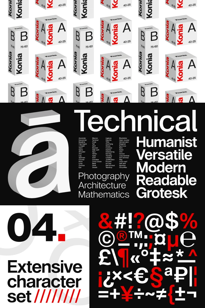
A modern font family must be versatile. Audit Sans excels here with a robust set of OpenType features. It includes stylistic alternates for the lowercase ‘a’ and ‘l,’ as well as the uppercase ‘J.’ These alternates allow designers to fine-tune their typography for specific contexts, whether for a logo or a block of text. Additionally, a discretionary ‘ff’ ligature and meticulously crafted kerning ensure that characters sit together harmoniously.
With 372 glyphs, the font family supports over 100 languages, making it a reliable choice for international brands. The full family includes an impressive range of weights, providing designers with a complete toolkit for creating complex visual hierarchies.
Why Audit Sans is a Designer’s Swiss Army Knife
So, what makes a font truly versatile? It is the ability to perform consistently across a wide range of applications without losing its essential character. Audit Sans demonstrates this adaptability, making it an invaluable asset for any designer.
Unmatched Versatility Across Print and Digital
Whether on a large-format poster or the screen of a smartphone, Audit Sans maintains its confident presence. Its core design was created with legibility in mind, making it suitable for both bold headlines and clean, readable body text. This scalability is crucial in today’s multi-platform world. A font that excels in a print magazine must also render crisply in a mobile app, and Audit Sans handles this transition seamlessly.
The clean and minimalist design is particularly effective for modern branding projects. Its balanced letterforms and smooth lines can elevate everything from corporate identity systems to editorial layouts and advertising campaigns.
Finding the Right Tone: From Corporate to Casual
The true test of a workhorse font is its tonal range. Can it feel serious and professional for a financial report, yet friendly and engaging for a lifestyle brand? Because of its unique blend of grotesque and humanist elements, Audit Sans can do just that.
Its structured forms convey reliability and elegance, making it a perfect fit for corporate branding. Simultaneously, the humanist details prevent it from feeling sterile or unapproachable. This allows it to work equally well in informal contexts, such as on packaging or in a stylish magazine.
How to Use Audit Sans Effectively in Your Projects
Understanding a font’s features is one thing; knowing how to apply them is another. The practical application of Audit Sans is where its potential truly shines. It is not just about what the font is, but what you can do with it.
Perfect Pairings: What Fonts Complement Audit Sans?
Pairing fonts can be a delicate art. Audit Sans serves as a strong, neutral foundation that can be paired with a variety of other styles. For a classic and elegant combination, consider pairing it with a timeless serif. This creates a beautiful contrast between modern and traditional, perfect for editorial or high-end branding projects.
To create a more dynamic duo of sans-serifs, pairing it with a humanist font can highlight its clean lines while adding another layer of warmth. For a more unified, modern look, it can even be combined with another grotesque, creating a subtle blend of contemporary and traditional sans-serif styles.
Practical Applications: Branding, UI, and Editorial Design
In branding, Audit Sans offers a unique opportunity to build a visual identity that is both distinctive and timeless. Its versatility means it can be the sole typographic voice for an entire brand, from the logo to the website copy.
For user interface (UI) design, its excellent legibility at smaller sizes makes it a prime candidate for app and web interfaces. Clear, readable text is paramount for a good user experience, and Audit Sans delivers. In editorial design, its extensive family of weights and styles allows for the creation of sophisticated and dynamic layouts that guide the reader’s eye.
The Mind Behind the Font: Marco Pezzotta and Gravitype
Every font has a story, and behind Audit Sans is Italian designer Marco Pezzotta and his foundry, Gravitype. Pezzotta’s passion for typography is driven by a desire to create unique and functional typefaces. Gravitype’s philosophy centers on innovation, quality, and the belief that typography has the power to convey emotion.
Pezzotta’s goal was to create a versatile sans-serif that offered a distinct personality, providing a friendlier, more contemporary alternative to established grotesques. This dedication is evident in the final product—a typeface that is both beautifully crafted and highly functional.
In a design landscape saturated with sans-serifs, Audit Sans manages to carve out its own space. It is a testament to the idea that neutrality does not have to be boring. By masterfully blending two distinct typographic traditions, Marco Pezzotta and Gravitype have created a font family that is professional, reliable, and elegant. It is a quiet powerhouse, ready to adapt to any situation and elevate any design it graces. This is what makes Audit Sans not just a good font, but a truly great one.
Feel free to find other trending typefaces here at WE AND THE COLOR or check out our selection of 100 cool fonts for 2026.
Subscribe to our newsletter!


