
This post contains affiliate links. We may earn a commission if you click on them and make a purchase. It’s at no extra cost to you and helps us run this site. Thanks for your support!
Kinetika, a geometric sans serif font family by type designer Galin Kastelov.
After the release of his last font family, Axiforma, Galin Kastelov has been working exclusively on this new geometric sans-serif font family named ‘Kinetika’. The family is the successful result of a few years of hard work. Kinetika comes in 20 weights ranging from Thin to Ultra plus matching Italics for all weights. The styles Ultra and Light are available as free demo versions. Learn more below or click on the following link to purchase the complete family as a heavily discounted introductory offer.
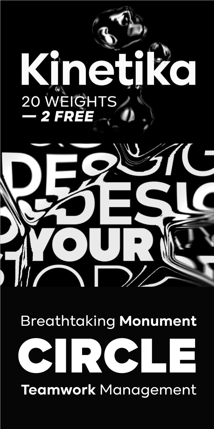
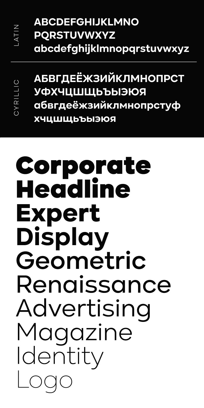
Galin Kastelov has created the font family with motion and branding projects in mind. Kinetika is truly a bold statement to the genre of sans-serifs with a large and appealing x-hight as well as its precise, round character.
Kinetika’s various OpenType features include tabular figures, old-style figures, a slashed zero, arrows, alternative glyphs, special smart quotes, and more. Furthermore, the Kinetika font family supports multiple languages and comes with extended Latin and Cyrillic alphabets consisting of over 800 glyphs per weight and the typeface supports more than 125 languages.
If you are looking for other typographic styles, we recommend you to browse through our extensive Fonts category.
Subscribe to our newsletter!


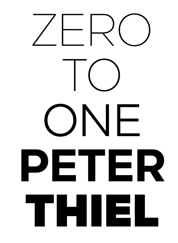
Looks nice but they lost me at “Zero to One Peter Thiel.” Was this font designed by and for self loathing homocon designers? What am I missing here? Why would they use that in their examples? I guess I better be more diligent researching who owns/funds these font houses.
Rofl 🙂 Not everything is black and white you know, except this presentation of course. Book is about building original products from the ground up (e.g zero to one) as opposed to copying what is already done before you (e.g 1 to 100). Pretty solid read, add it to your list.
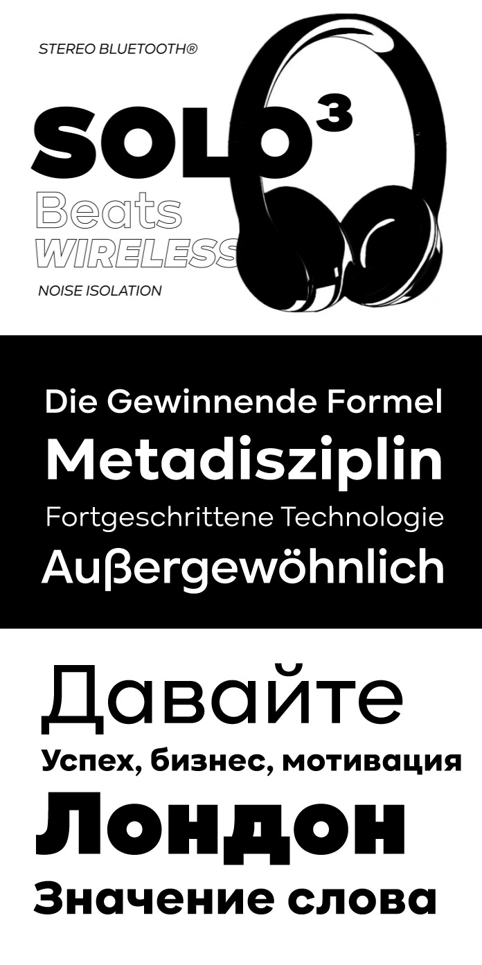
Font itself looks great. Already using the free weights.