
This post contains affiliate links. We may earn a commission if you click on them and make a purchase. It’s at no extra cost to you and helps us run this site. Thanks for your support!
Pragmatica Next is a Neo-Grotesque Superfamily Redefining Versatility
In the world of typography, the neo-grotesque style remains a cornerstone of modern design. Known for clean lines and a neutral tone, these typefaces offer clarity and functionality. The new Pragmatica Next font family from ParaType enters this arena not merely as another option, but as a comprehensive typographic system. It builds upon a significant legacy. Furthermore, it expands its capabilities for the complex demands of contemporary branding, user interface design, and multi-platform publishing. This font challenges designers to reconsider what a workhorse typeface can truly achieve.
A Legacy Reimagined for the Modern Era
To appreciate Pragmatica Next, one must first understand its origins. The journey begins with its predecessor, a notable typeface with a rich history. Subsequently, this foundation provided the basis for a complete evolution.
From Soviet Helvetica to a Global Type System
The original Pragmatica was designed at ParaType (then ParaGraph) starting in 1989 by Vladimir Yefimov and his colleagues. It was inspired by the iconic Helvetica and served as a crucial Cyrillic neo-grotesque. For many designers, it became a go-to choice for its mathematical precision and clean aesthetic. The original family grew over the years, with condensed and extended styles added by a team of designers including Alexander Tarbeev, Manvel Shmavonyan, and Olga Chaeva.
What Makes Pragmatica Next a True Successor?
Pragmatica Next is a complete reinterpretation, not just an update. Designed by Manvel Shmavonyan, Alexandra Korolkova, and Nikolay Nedashkovsky, it features more contemporary letterforms. The design team also introduced reduced contrast and tighter spacing for a more modern feel. This evolution refines the original’s core principles. As a result, it produces a typeface that feels both familiar and distinctly forward-thinking.
The Anatomy of a Typographic Super-Family
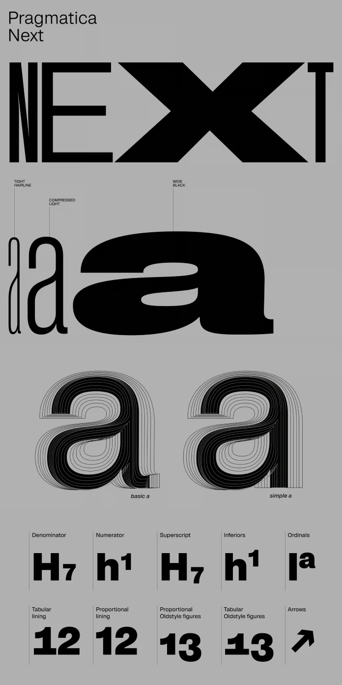
The most striking aspect of Pragmatica Next is its immense scale. This is not simply a collection of weights; it is an entire ecosystem of styles designed for cohesion and flexibility. Consequently, it offers designers an unprecedented level of control.

An Unprecedented Range of Styles
The Pragmatica Next family is vast. It includes 60 upright and 60 italic styles, creating a total of 120 distinct options. This range spans across two axes. The weight varies from a delicate Hairline to a powerful Black. Simultaneously, the width extends from a space-saving Tight to an expressive Wide. Many of these styles, especially the extreme weights and widths, were drawn from scratch, ensuring optimal quality at every point of the design space.
The Power of Variable Fonts
This incredible diversity is neatly organized into two powerful variable fonts—one for upright styles and one for italics. For web designers and digital creators, this is a significant advantage. Variable fonts allow for infinite style variations within a single, efficient file. This technology enables fine-tuned typographic adjustments and seamless responsiveness across different screen sizes. It empowers a more dynamic and adaptive approach to design.
How to Use Pragmatica Next Effectively
With such a vast toolkit, how can designers best leverage the power of Pragmatica Next? Its utility spans nearly every imaginable design context. Moreover, its advanced features provide both convenience and creative freedom.
Versatility in Application
The true strength of Pragmatica Next lies in its adaptability. It is equally at home in branding, corporate identity, user interfaces, and packaging. The core text styles are intentionally neutral. They provide excellent readability for long passages without drawing unnecessary attention. Conversely, the bolder, lighter, narrower, and wider styles offer expressive character for headlines and display use. They scale effortlessly to any size while maintaining their contemporary feel.
Unlocking Advanced Features with OpenType
Beyond its impressive range of styles, Pragmatica Next contains powerful OpenType features. The character set is extensive. It supports Extended Latin for all Western and Central European languages, as well as Extended Cyrillic. For added design variety, the typeface includes stylistic alternates, such as a single-story ‘a’ in the italics and a set of square dots.
One of the most innovative features is the integrated “Typographer” stylistic set (ss19). When activated, this feature automatically handles micro-typographic details. It corrects double spaces, inserts proper em-dashes, and applies correct quotation marks. This intelligent feature allows designers to focus on the bigger picture, confident that the typographic details are handled perfectly.
A Design Critic’s Perspective: Why Pragmatica Next Matters
In a landscape filled with excellent neo-grotesques, what makes Pragmatica Next so compelling? It solves a modern problem. Designers today need more than just a font; they need a reliable, expansive, and future-proof typographic system. Helvetica and Univers are timeless, yet Pragmatica Next offers a larger, more integrated family with the modern advantages of variable font technology.
Its heritage gives it a solid, proven foundation. However, its contemporary redesign and massive style range give it an edge. The meticulous attention to detail, from the redrawn extremes to the smart OpenType features, is evident. This is not just another sans-serif. It is a declaration that the neo-grotesque genre continues to evolve in exciting and highly functional ways. This typeface feels less like a choice and more like a long-term investment in a design system.
Ultimately, Pragmatica Next provides a compelling answer to a crucial question for designers. How do you maintain consistency, clarity, and character across countless applications and platforms? With its thoughtful design and immense versatility, this superfamily provides a powerful and elegant solution.
All images © ParaType. Check out other trending typefaces here at WE AND THE COLOR or take a look at our selection of the 100 best fonts for designers in 2026.
Subscribe to our newsletter!


