This post contains affiliate links. We may earn a commission if you click on them and make a purchase. It’s at no extra cost to you and helps us run this site. Thanks for your support!
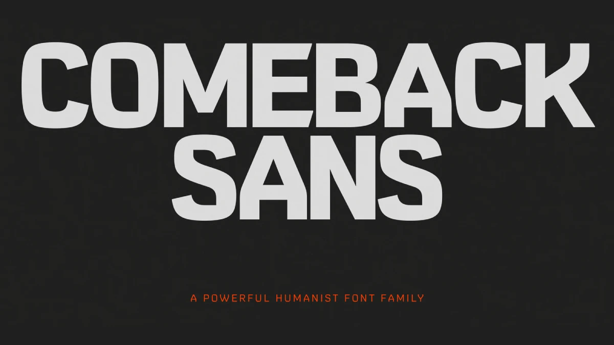
Comeback Sans is a Modern Humanist Font Family with a Soul.
Oh yes, we know that many of you are looking for typefaces with personality, warmth, and a distinct human touch. The Comeback Sans font family, a powerful humanist sans-serif from DKType Foundry, emerges as a compelling voice in this movement. This is not just another font. Instead, it is a spirit, a finely tuned instrument for visual storytelling that feels both timeless and decidedly contemporary.
You can purchase the complete family from these platforms:
Rooted in the rich traditions of calligraphy, Comeback Sans masterfully blends expressive, fluid curves with a clean, modern structure. Consequently, it speaks with a voice of purpose and strength, making it an exceptional choice for brands aiming to convey impactful messages. With its meticulously crafted styles and a versatile variable font option, the Comeback Sans font family offers a robust toolkit for building memorable visual identities. In essence, this typeface is a testament to contemporary aesthetic refinement while remaining fundamentally versatile and functional.
You can purchase the complete family from these platforms:
The Anatomy of a Modern Humanist: What Defines Comeback Sans?
To truly appreciate the Comeback Sans font family, one must first understand its classification as a humanist sans-serif. Unlike their more rigid geometric or grotesque counterparts, humanist typefaces are inspired by the forms of traditional handwriting. This lineage therefore imparts an organic quality, characterized by subtle variations in stroke thickness and a natural rhythm that enhances readability.
A Nod to Tradition: The Calligraphic Influence
The core of Comeback Sans’s personality lies in its strong calligraphic influence. This is not a sterile, mechanical font. Instead, its letterforms possess a warmth and an approachable quality, as if shaped by a skilled hand. You can see this in the gentle curves and the flowing lines that make up each character. Moreover, this humanistic design approach ensures that the font is not only legible but also engaging. It connects with the reader on a more personal level. These calligraphic roots are precisely what give the Comeback Sans font family its distinctive, dynamic energy.
Clean Structure for Contemporary Needs
While it honors tradition, the Comeback Sans font family is firmly planted in the present. The calligraphic elements are balanced with a clean and sturdy structure, making it incredibly versatile for modern design challenges. Its proportions are harmonious, ensuring it performs well across a wide range of applications. This fusion of human touch and structural integrity allows Comeback Sans to be expressive without sacrificing clarity. This is a crucial requirement for today’s design landscape.
More Than Just a Font: The Versatility of the Comeback Sans Font Family
A typeface’s true value is measured by its versatility. The Comeback Sans font family excels in this regard, offering a comprehensive system for designers. It is not a one-trick pony but a full suite of tools ready to tackle complex design projects.
Seven Styles for Every Occasion
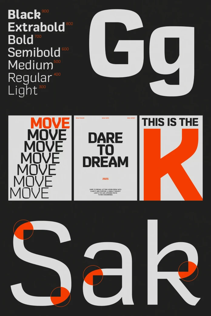
The family includes seven distinct weights, ranging from a delicate Light to a commanding Black. This extensive range provides designers with the flexibility to establish clear and effective visual hierarchies. Whether you need an elegant headline, a readable block of body copy, or a bold call-to-action, there is a style within the Comeback Sans font family perfectly suited for the task. The available styles include Light, Regular, Medium, Semi Bold, Bold, Extra Bold, and Black, providing a complete typographic palette.
The Power of Variable Fonts: A Look at Comeback Sans Variable
Beyond its static styles, Comeback Sans is also available as a variable font. Variable fonts are a game-changing technology, allowing multiple font styles to be contained within a single file. This not only reduces website loading times but also offers unparalleled design flexibility.
With the Comeback Sans variable font, designers can fine-tune the weight along a continuous spectrum, creating infinite variations. This level of control is invaluable for responsive web design, where typography needs to adapt seamlessly. Furthermore, it allows for subtle animations and interactive experiences, pushing the boundaries of dynamic typography. The ability to make precise adjustments also enhances accessibility, as text can be optimized for user needs.
The Minds Behind the Masterpiece: DKType Foundry
The Comeback Sans font family was designed by Darman Kadir and is published by DKType Foundry, an independent type foundry established in 2023. Based in Jakarta, DKType specializes in crafting distinctive fonts that help brands articulate their unique voice. Their work is characterized by precision, personality, and a deep understanding of how letterforms shape visual identity. The creation of Comeback Sans is a clear reflection of their commitment to producing high-quality typefaces with purpose.
Putting Comeback Sans to Work: Practical Applications and Inspiration
The true test of any typeface is how it performs in real-world scenarios. The combination of its strong personality and functional design makes the Comeback Sans font family an excellent choice for a wide array of projects.
Ideal for Branding and Identity Systems
Comeback Sans is a natural fit for branding and identity systems. Its distinctive yet versatile nature allows it to serve as a strong cornerstone for a brand’s visual language. The range of weights enables the creation of a cohesive typographic system that can be applied across all brand touchpoints. From logos and websites to packaging and marketing materials, it maintains consistency. If you are looking for a dynamic humanist typeface for branding, this font family should be a top contender.
Enhancing Visual Storytelling and Editorial Design
For editorial design, readability is paramount. The humanist characteristics of Comeback Sans, such as its open counters and clear letterforms, make it highly legible. This holds true even in long passages of text. Its expressive nature also allows it to capture a specific tone of voice, adding a layer of personality to articles and publications.
Long-Tail Keywords in Action: How to Get the Most Out of Comeback Sans
To fully leverage the capabilities of this typeface, consider its application in specific contexts. For those searching to “get the Comeback Sans font,” you will find it available for both desktop and web use. When designing a new website, the “versatile font for identity systems” aspect of Comeback Sans truly shines. This is especially true when using the variable font for responsive typography. Consider pairing the bolder weights of Comeback Sans with a classic serif for body text. This can create a sophisticated and harmonious typographic contrast.
You can purchase the complete family from these platforms:
In conclusion, the Comeback Sans font family is more than just a new release; it is a thoughtful and powerful contribution to typography. It successfully marries the warmth of calligraphic tradition with the demands of modern design. This results in a tool that is both expressive and exceptionally functional. For any designer looking to imbue their work with a sense of purpose and a distinct personality, Comeback Sans is a choice worth exploring. It represents a significant step forward in the evolution of humanist sans-serifs, and its impact is sure to be felt for years to come.
Check out other recommended typefaces in the Fonts section here at WE AND THE COLOR.
Subscribe to our newsletter!

