
This post contains affiliate links. We may earn a commission if you click on them and make a purchase. It’s at no extra cost to you and helps us run this site. Thanks for your support!
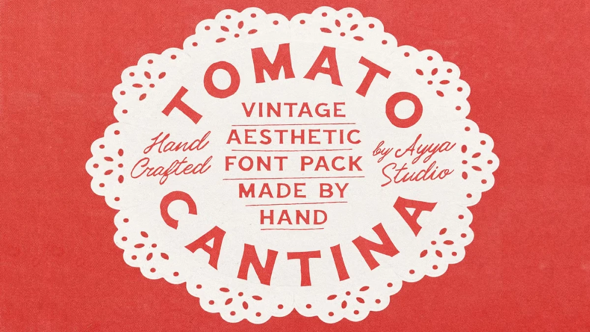
The Tomato Cantina Font Duo Pairs a Bold Vintage Sign Painter Sans Serif Typeface With a Quiet Signature Script Style.
Ayya Studio’s Tomato Cantina font duo asks for one thing. Let the bold sans do the shouting, and keep the script quiet. Designers who ignore that split will end up with a menu that argues with itself, and a customer who cannot find the price of the lasagna.
Ayya Studio built Tomato Cantina around old Italian lettering, the kind that lives on restaurant menus and painted shop windows. That brief carries real weight. Italian sign painters rarely stuck to one style, so a pair that mixes a sturdy sans with a delicate script follows an actual tradition. I think that tradition explains why the duo feels familiar before you set a single word.
What is the Tomato Cantina font duo?
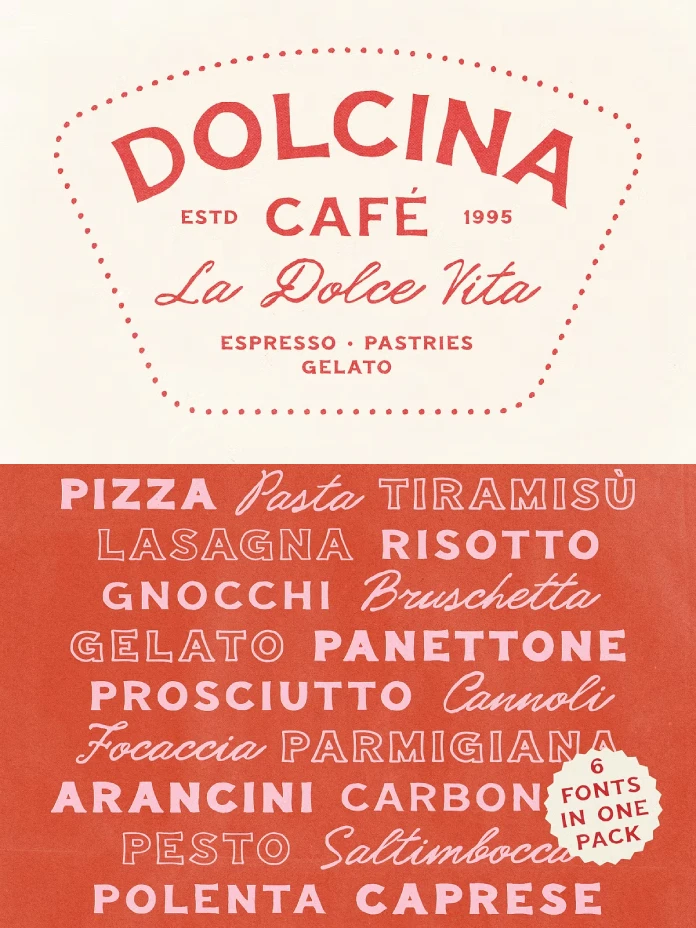
The Tomato Cantina font duo is a set of six hand-drawn fonts. It pairs a bold sans serif with a classic signature script. Ayya Studio drew the sans with an old sign painter character. The script stays slim and formal by comparison. Both fonts keep the slight irregularities of hand lettering, so no letter looks machine-perfect.
The package includes Script, Bold, Regular, Thin, Outline Bold, and Outline Regular. Each font ships in OTF, TTF, and WOFF. That format list covers print workflows and websites in one download, because OTF and TTF serve design software while WOFF serves browsers.
Why does the Tomato Cantina bold sans do the heavy lifting?
The irregularity budget of a hand-drawn sans
I judge every hand-drawn sans by its irregularity budget. Spend too little, and the font looks like a rounded grotesque with a texture filter. Spend too much, and headlines wobble. Ayya Studio describes the letters as slightly irregular, and that restraint is the right call for a typeface meant for menus. A menu header needs charm at 60 points, yet it still has to read from arm’s length.

Compare it with Cooper Black, the 1922 design by Oswald Cooper that became shorthand for retro warmth. Cooper Black is soft and round. Tomato Cantina Bold aims for the sign painter’s brush instead. That difference gives it a drier, more handmade tone, which suits a corner trattoria better than a snack brand.
Regular, Thin, and the two outline weights
Regular and Thin give you hierarchy inside the sans family. Thin carries risk. Hairline strokes suffer on kraft paper, on glossy bags, and on window vinyl. Print a proof at the final size before you commit. I would use Thin for large subheads only, and I would never set a paragraph in it.
The outline weights suit one-color printing, which the studio mentions directly with its red paper bag example. An outline lets paper show through or takes a second color as a fill. Use it once per layout. Two outlined lines will compete for attention.
How does the Tomato Cantina script work as a signature font?
The script is the studio’s favorite partner for the bold sans. It is delicate and classic. Use it for names, not sentences. A bakery owner’s name suits it, and so does a dish called nonna’s lemon cake. Set a whole ingredient list in it, however, and readers will quit by the second line.
Where would you place a signature on your own project? Maybe on a pastry box lid, or maybe on the lower third of a wine label. Pick one place and stop there.
What is the Two-Voice Rule for pairing Tomato Cantina fonts?
I use a simple framework for display pairs, and I call it the Two-Voice Rule. Every layout gets one loud voice and one quiet voice. Neither voice takes a second job. In this duo, Tomato Cantina Bold plays the loud voice, and Tomato Cantina Script plays the quiet one.
Proportion decides who leads
Give the loud voice about two-thirds of the visual weight. The script takes the remainder. If the script grows larger than the bold headline, the pair flips, and the layout loses its anchor.
Color keeps the voices apart
Set the loud voice in a saturated red, such as #C8382B. Set the quiet voice in a dark neutral such as #2B2B2B. Red on both lines turns the script into an echo of the headline, and an echo adds nothing to a menu.
Where does Tomato Cantina belong, and where does it fail?
Best uses for the Tomato Cantina font duo
Ayya Studio imagines the fonts on a small pasta restaurant menu, a neighborhood bakery box, a gelateria window, and a red paper bag. I agree with every one of those. The duo also fits invitations, posters, and wine labels. Book covers work only for cookbooks or light fiction, because a serious novel would fight the cheerful tone.
Weak spots to plan around
Hand-drawn fonts with irregular outlines wear out the reader over long passages, so nutrition panels, legal copy, and small captions need a plain companion face. Banks, law firms, and medical brands should look elsewhere, since the duo’s humor would undercut their authority, and no amount of careful kerning will fix a tone mismatch that deep. Check the license on the Creative Market listing before you commit to a packaging run, because font licenses often treat print volume and web embedding differently.
What comes next for vintage Italian lettering?
I expect more studios to sell duos instead of single fonts. Designers want pairs that already solve hierarchy. I also expect outline and thin weights to gain ground as small restaurants print one-color menus to cut costs. Tomato Cantina already ships both.
Tomato Cantina font duo at a glance
| Feature | Detail |
|---|---|
| Designer | Ayya Studio |
| Marketplace | Creative Market |
| Fonts included | Six |
| Styles | Script, Bold, Regular, Thin, Outline Bold, Outline Regular |
| File formats | OTF, TTF, WOFF |
| Character | Hand-drawn, vintage, Italian sign painter feel |
| Loud voice | Tomato Cantina Bold |
| Quiet voice | Tomato Cantina Script |
| Best uses | Menus, bakery boxes, gelateria windows, paper bags, wine labels, invitations |
| Weak spots | Long text, small captions, formal brands |
Tomato Cantina font duo FAQ
What is Tomato Cantina?
Tomato Cantina is a vintage font duo by Ayya Studio. It combines a bold, sign painter sans serif with a classic signature script.
Who designed Tomato Cantina?
Ayya Studio drew both fonts by hand and sells the duo on Creative Market.
How many fonts come with Tomato Cantina?
The package includes six fonts. They are Script, Bold, Regular, Thin, Outline Bold, and Outline Regular.
Which file formats does Tomato Cantina include?
Every font comes in OTF, TTF, and WOFF.
Is Tomato Cantina good for body text?
No. Use it for headlines, names, and short labels. Pair it with a plain text face for anything longer than a sentence.
Is Tomato Cantina good for wine labels?
The studio lists wine labels among its intended uses. Set the vintage year in Bold and the producer’s name in Script, then print a proof on the actual label stock.
Browse WE AND THE COLOR’s Fonts category for more, or check out our selection of the best retro fonts for 2027.
Subscribe to our newsletter!