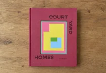
GridType Vol. 1 just landed from Slanted Publishers, and it does something most type books don’t bother with. It shows you the tool, not just the typefaces. Ten designers used the same experimental grid system, grid-type.com, and came back with ten completely different alphabets. That gap between shared method and wild outcome is the whole point of this book, and honestly, it’s the most interesting argument about type tools I’ve seen on paper this year.
If you make fonts, teach type design, or just collect Slanted titles because they’re always worth the shelf space, GridType Vol. 1 belongs on your list. Here’s what’s actually inside it, why it matters, and where I think this fits into the bigger conversation about designers building their own software instead of renting someone else’s.

What Exactly Is GridType Vol. 1?
GridType Vol. 1, subtitled Type & Tools, is a 96-page publication released in 2026 by Slanted Publishers. It documents an edition of ten typefaces, all created with grid-type.com, an experimental stencil-based type tool. Katharina Nejdl edited and designed the book, with the concept developed alongside Céline Hurka.
The contributor list reads like a snapshot of where independent type design is heading right now: Anna Cairns, Boom Promphan Suksumek and Anna Srikitkul, Charlotte Rohde, Hanna Boslau, Julie Werenskjold Sørensen, Miquel Hervás Gómez and César Rogers of fanfare, Studio HanLi, Svatopluk Ručka, Trang Hà, and Özgür Deniz Koldaş. Three additional voices, Lena Weber, studio pointer*, and Céline Hurka, contribute interviews rather than typefaces, which gives the book a critical layer most specimen collections skip entirely.
Why a Book About a Type Tool, and Why Now?
Type design has spent the last decade quietly automating itself. Variable fonts, parametric systems, AI-assisted letterform generation. Most of that conversation happens in software demos and conference talks, rarely in print. GridType Vol. 1 puts the tool itself under scrutiny, on paper, at a moment when designers are asking harder questions about who controls the software they depend on.
That question isn’t abstract. If your entire practice runs through someone else’s proprietary tool, your creative range is only as wide as that tool allows. GridType Vol. 1 argues, through its interviews and its ten wildly different outcomes, that building your own constraints can produce more range, not less. I’d call that the book’s real thesis, even though it never states it quite that bluntly.

The Tool Behind the Type: grid-type.com
grid-type.com takes its inspiration from historical grid-based stencil systems, most directly the Plaque Découpée Universelle from the 1870s. That original device was a single stencil that let you trace every letter of the alphabet from one shared structure. GridType modernizes that idea into a digital tool where you pick a grid, then adjust rows, columns, and complexity to draw your own stencil.
Nine Grids, Countless Letters
There are nine grid types built into the tool, and each one leans into a different design lineage. Some are purely geometric, built from rectangles, triangles, or circles. Others reference display technology directly, pulling from pixel grids and segment displays the way a calculator readout or an old digital clock would. A few nod openly to historical grid-based design, including Wim Crouwel’s systemic approach and Bauhaus geometric letterforms.
What makes this genuinely useful, not just a novelty generator, is the code running underneath. Because the grids are parametric, small changes in variables produce huge shifts in outcome. That means ten designers working from the same base tool land on ten typefaces with almost nothing in common visually. That’s not a bug in the system. It’s the actual argument the whole publication is making.
The Ten Typefaces (and the People Who Cut Them)
Each contributor approached the grid differently, which is exactly what GridType Vol. 1 sets out to prove. Anna Cairns, Charlotte Rohde, and Hanna Boslau bring distinct European type traditions into the mix. Boom Promphan Suksumek and Anna Srikitkul work as a pair, as do Miquel Hervás Gómez and César Rogers under the studio name fanfare. Julie Werenskjold Sørensen, Studio HanLi, Svatopluk Ručka, Trang Hà, and Özgür Deniz Koldaş round out a genuinely international lineup, spanning studios and independent practices across several countries.
The book presents each typeface as a full specimen, and every one of the ten fonts is also available to download directly from grid-type.com. That’s a smart move on Slanted’s part. The physical book sells the ideas and the process, while the website delivers the actual working files, so nobody has to choose between owning the object and using the type.
The History Baked Into the Grid
Plaque Découpée Universelle
You can’t talk about GridType Vol. 1 without going back to the Plaque Découpée Universelle. That 1870s stencil solved a real problem for sign painters and draftsmen: one physical template, every letter of the alphabet, no need to carry a full set of individual stencils. GridType borrows that logic and digitizes it, swapping a fixed metal plate for adjustable parameters.
Wim Crouwel and the Bauhaus Lineage
The Bauhaus references show up in the geometric grids, where circles, squares, and triangles do the heavy lifting instead of drawn curves. Wim Crouwel’s systemic, almost mathematical approach to letterforms sits behind several of the more rigid grid options too. If you’ve ever admired Crouwel’s New Alphabet or his exhibition posters, you’ll recognize the DNA immediately once you start clicking through the tool’s grid presets.
The Interviews: Why Designers Should Build Their Own Tools
The Q&A sections, featuring Lena Weber, studio pointer*, and Céline Hurka, push past the typefaces and into the bigger question the whole book is circling: why should type designers bother making their own software at all? It’s a fair question, given how much time that takes away from actually drawing letters.
But the interviews make a compelling case. When you build the tool, you understand exactly what constraints are shaping your output, instead of inheriting invisible defaults from someone else’s product decisions. That’s a point I’ve made about design software generally for years, so it’s satisfying to see it argued this directly inside a type-focused publication. GridType Vol. 1 treats tool-building as a design discipline in its own right, not a side hustle for the technically inclined.
GridType Vol. 1 at a Glance
| Detail | Information |
|---|---|
| Title | GridType Vol. 1: Type & Tools |
| Publisher | Slanted Publishers |
| Editor | Katharina Nejdl |
| Concept | Katharina Nejdl, Céline Hurka |
| Design | Katharina Nejdl |
| Typeface Contributors | Anna Cairns, Boom Promphan Suksumek & Anna Srikitkul, Charlotte Rohde, Hanna Boslau, Julie Werenskjold Sørensen, Miquel Hervás Gómez & César Rogers (fanfare), Studio HanLi, Svatopluk Ručka, Trang Hà, Özgür Deniz Koldaş |
| Interview Contributors | Lena Weber, studio pointer*, Céline Hurka |
| Release Year | 2026 |
| Format | 13.6 × 19 cm, 96 pages |
| Language | English |
| Printing | Risography by no kiss (Tjobo Kho), Amsterdam |
| Paper | Holmen bleached / unbleached, 70 g/sm and 120 g/sm |
| Binding | Open thread-stitching |
| ISBN | 978-3-69202-010-5 |
| Price | €18.00 (DE) |
| Where to Buy | slanted.de/product/gridtype-vol-1-type-tools |
My Take on GridType Vol. 1
I want to name two patterns I noticed reading through GridType Vol. 1, because they explain why this book works better than a standard type specimen collection.
The first I’ll call the Constraint-to-Character Ratio, purely as an editorial shorthand, not an established industry term. The tighter the grid constraint, the more personality tends to show up in the final letterforms. Designers working with the stricter geometric grids produced some of the most distinctive typefaces in the whole set, because the limits forced unusual decisions instead of default ones.
The second is what I’d call the Tool-as-Typeface Principle, again just my own framing. GridType Vol. 1 makes the case that the tool itself carries as much design intent as any individual font drawn with it. That’s a bigger claim than it sounds. It means the real creative act here happened twice, once when the grid system was built, and again when each designer pushed against it.
Who Should Buy GridType Vol. 1?
Type students will get the most out of this one, especially anyone frustrated by how opaque most professional type software feels. Studio owners curious about building internal tools should read the interviews closely. And if you just like risograph printing and open thread-stitching, the physical object alone is worth the €18.
I’d also point graphic design educators toward this book. It’s a genuinely useful case study for teaching how constraints shape creative outcomes, and it does that with real typefaces instead of theoretical examples.
Frequently Asked Questions About GridType Vol. 1
What is GridType Vol. 1?
GridType Vol. 1 is a 96-page book from Slanted Publishers featuring ten typefaces created with the experimental grid-based type tool grid-type.com, along with interviews about type design and tool-building.
Who published GridType Vol. 1?
Slanted Publishers released GridType Vol. 1 in 2026, edited and designed by Katharina Nejdl, with the concept developed alongside Céline Hurka.
Can I download the typefaces from GridType Vol. 1?
Yes. All ten typefaces featured in GridType Vol. 1 are available to download directly from grid-type.com.
What inspired the grid-type.com tool?
The tool takes its core idea from the Plaque Découpée Universelle, an 1870s stencil that allowed a single template to draw every letter of the alphabet, along with grid-based design traditions from the Bauhaus and Wim Crouwel.
How much does GridType Vol. 1 cost?
GridType Vol. 1 costs €18.00 in Germany and can be purchased at slanted.de/product/gridtype-vol-1-type-tools.
Who designed the typefaces in GridType Vol. 1?
Ten contributors designed the typefaces: Anna Cairns, Boom Promphan Suksumek and Anna Srikitkul, Charlotte Rohde, Hanna Boslau, Julie Werenskjold Sørensen, Miquel Hervás Gómez and César Rogers of fanfare, Studio HanLi, Svatopluk Ručka, Trang Hà, and Özgür Deniz Koldaş.
All images © Slanted Publishers. Browse WE AND THE COLOR’s Graphic Design section for more inspiring content.
Subscribe to our newsletter!