This post contains affiliate links. We may earn a commission if you click on them and make a purchase. It’s at no extra cost to you and helps us run this site. Thanks for your support!
Sudtipos’ Chimango Font Family Is a High-Contrast Serif for Editorial Typography.
Chimango arrived quietly. No big campaign, no flashy launch reel. And yet, the moment you set it at display size, something shifts. The Chimango font family from Sudtipos carries a specific kind of authority—one that feels contemporary but not trendy, expressive but never chaotic. Designer Eduardo Dulin built something that holds tension well. That’s rarer than it sounds in type design.
Typography is having a genuine renaissance in editorial and brand design. Art directors are moving away from safe, utility-first typefaces and back toward fonts that communicate a personality before a single word is read. Chimango lands squarely in that moment. It speaks to a design culture that wants presence without pretension.
So what exactly makes Chimango different? And more importantly, how does it actually perform across real-world use cases? I tested it. Here’s what I found.
What Makes the Chimango Font Family Stand Apart From Other High-Contrast Serifs?
Start with the construction. Chimango is built on classical serif principles—stroke contrast, structural tension, and a dialogue between straight and curved forms. But Dulin doesn’t trace any single historical model. That’s the key decision.
Most revival serifs walk a tightrope. They honor their source material so faithfully that they end up feeling like costumes. Chimango skips the costume entirely. Instead, it develops what I’d call a gestural serif voice—a typographic personality shaped by proportion, visual weight, and the movement embedded in each letterform.

The result is a font that feels like it belongs to now, not to a museum display case. Furthermore, it reads as considered rather than constructed. Every curve has intent. Every thick-to-thin transition earns its place.
The Architecture of Tension
What Chimango does structurally is fascinating. It maintains a balance between tension and fluidity—two qualities that usually fight each other. Heavy serifs tend toward stiffness. Light, high-contrast serifs often feel fragile or precious. Chimango avoids both traps.
The construction creates what I’d describe as controlled tension typography: forms that carry visual stress without breaking. You feel the energy in the letterforms, but they never become unstable. This quality makes Chimango particularly effective at headline sizes, where typographic tension reads as charisma rather than noise.
Think about how a well-designed editorial masthead works. It has to command attention immediately, then step aside and let the content breathe. Chimango does this with ease. Moreover, it does it across six weights, which is where the family’s real range shows.
Six Weights, One Clear Editorial Vision
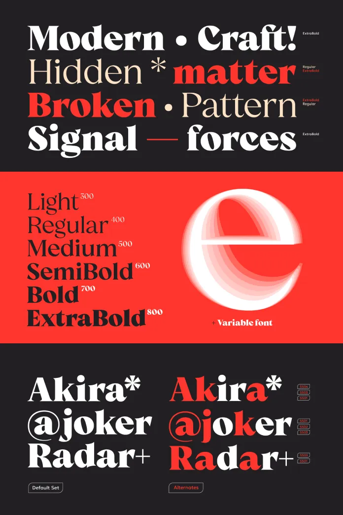
The Chimango font family runs from Light to ExtraBold. That’s six cuts covering a substantial functional range. But what matters isn’t the number—it’s how each weight behaves in context.
The Light and Regular Cuts
The lighter weights are where Chimango surprises most. High-contrast serifs often become illegible or overly delicate when taken below Medium. Chimango Light holds its integrity. The stroke contrast is still visible and intentional, yet the overall impression is refined rather than fragile.
I tested Chimango Light in a mock editorial spread at 18pt and 24pt sizes. The result? Elegance without softness. It has backbone at sizes where many comparable serifs start to feel uncertain. Additionally, the letterfit in the lighter cuts is well-considered—tight enough to feel purposeful, open enough to sustain readability.
Chimango Regular sits in a comfortable editorial sweet spot. It works for subheadings, pull quotes, and display text where you want presence without volume. The stroke contrast at this weight is subtle but active. You notice it without necessarily being able to name what you’re responding to. That’s good type design.
Bold and ExtraBold: Where Chimango Commands
Go heavy with Chimango and the character changes fundamentally. The ExtraBold cut turns the inherent gestural quality into something close to a typographic declaration. The thick strokes become dominant, the serifs land with authority, and the overall impression shifts from “elegant” to “loud in the best way.”
I tested Chimango ExtraBold for a hypothetical fashion brand headline at 96pt. The result was immediate and confident. It fills space without crowding it. Furthermore, the high contrast becomes even more pronounced at display size, creating a visual rhythm across a multi-word headline that keeps the eye moving.
This weight range is ideal for visual identity typography—logos, masthead lettering, packaging statements, and campaign headlines. It’s a font that earns its place in brand systems where personality and legibility need to coexist.
How Chimango Performs in Real Editorial Layouts
Theory and practice rarely agree perfectly. So I put Chimango through a set of practical tests: magazine cover mockups, brand identity sketches, and long-form editorial layouts. Here’s the honest breakdown.
Magazine and Editorial Contexts
For editorial work, Chimango is nearly ideal at headline and subheadline sizes. The structural tension it carries translates well to print, and the proportions remain balanced across different headline lengths. Short headlines read as punchy. Longer headlines maintain rhythm.
One observation worth noting: Chimango is not a body text font. At small sizes (below 10pt), the high stroke contrast makes sustained reading uncomfortable. However, that’s not a criticism—it’s a design choice Dulin clearly made with intention. Chimango belongs at the top of the typographic hierarchy, not in the footnotes.
Pairing it with a neutral, low-contrast sans-serif creates a classic editorial contrast that works immediately. Additionally, pairing it with a monolinear geometric serif introduces an interesting tension—the Chimango headlines anchor the page while the body text provides a clean counterpoint.
Brand Identity Applications
Brand typography has different demands than editorial typography. It needs to work at small sizes (business cards, favicons, social media), across media, and over time. Chimango meets most of these demands well.
The Medium and SemiBold cuts are particularly versatile for brand use. They hold enough contrast to feel distinctive, but they’re robust enough to survive the inevitable compromises of real-world brand implementation. Moreover, the ExtraBold delivers strong visual differentiation for brands that want to own a specific typographic territory.
The one caveat: Chimango works best for brands with a confident, assertive personality. It would feel mismatched with brands that prioritize approachability or softness. That’s not a weakness—it’s specificity, and specificity is a virtue in typeface design.
Eduardo Dulin and the Sudtipos Approach to Contemporary Serif Design
Understanding Chimango requires understanding where it comes from. Sudtipos, the Buenos Aires-based type foundry, has long occupied a specific space in the type world—expressive, Latin-rooted, and unafraid of personality. Their catalog reads like a brief history of considered risk-taking in type design.
Eduardo Dulin works within that tradition but pushes it in a specific direction. Chimango reflects a designer who understands historical serif construction deeply enough to depart from it meaningfully. The classical principles are present—but they’re filtered through a contemporary sensibility that prioritizes gesture and visual weight over strict historical fidelity.
This is what I’d call the Sudtipos synthesis: deep typographic knowledge expressed through a contemporary Latin American design voice. It’s a particular and valuable position in a global type market often dominated by either European historical revivals or American utility serifs.
What Chimango Says About Current Trends in Serif Design
High-contrast serifs are having a significant moment. Across fashion, culture, editorial, and luxury brand design, there’s a clear appetite for typefaces that communicate authority, sophistication, and character simultaneously.
Chimango arrives at exactly the right time. However, it avoids the trap many trend-aligned typefaces fall into: it doesn’t feel designed to capitalize on a moment. Instead, it feels designed to outlast one. The gestural quality in its letterforms, the careful balance of tension and fluidity—these are qualities that will read well in ten years as they do today.
In fact, I’d argue that Chimango represents a specific strand of post-revival serif design—typefaces that absorb the lessons of historical models without reproducing them, creating something genuinely new while remaining typographically grounded. That’s a harder achievement than it looks.
Chimango Font Family: Practical Use Cases and Recommendations
Let’s get concrete. Based on my testing, here’s where Chimango works best and where it’s less well-suited.
Where Chimango Excels
Magazine covers, newspaper headlines, and editorial display contexts are natural territory for Chimango. The high contrast and structural tension make it visually arresting at large sizes. Furthermore, the range across six weights gives art directors flexibility in creating typographic hierarchy within a single-family system.
Visual identity work for fashion, culture, architecture, publishing, and luxury sectors is another strong application. Chimango communicates premium positioning without resorting to cliché luxury signifiers. It simply has typographic authority.
Campaign typography—posters, outdoor advertising, social media statement graphics—is a third area where Chimango performs exceptionally. The ExtraBold cut especially was practically made for a full-bleed typographic poster.
Where Chimango Is Less Suited
Long-form body text is not Chimango’s territory. Additionally, interfaces requiring high legibility at small sizes will find the stroke contrast working against them. UI typography, wayfinding systems, and any context demanding functional neutrality at small sizes would be better served by a different typeface.
That said, a hybrid approach works well: use Chimango for headlines and display elements, then pair with a more utility-focused typeface for body and functional copy. This is standard practice in editorial design, and Chimango is explicitly built for it.
A Framework for Evaluating High-Contrast Display Serifs
After testing Chimango thoroughly, I developed what I’d call the TFR Framework for evaluating high-contrast display serifs: Tension, Fluidity, and Range. Here’s what each dimension means.
Tension
Tension refers to the visual energy embedded in a typeface’s construction. High-contrast serifs derive tension from the relationship between thick and thin strokes. Chimango scores high here—the contrast is active rather than decorative, and you feel the structural energy in the letterforms even at a glance.
Fluidity
Fluidity measures how smoothly the tension resolves across a word or headline. Tension without fluidity creates visual noise. Chimango handles this exceptionally well—the forms flow despite their structural energy, which is precisely why it reads cleanly at display sizes.
Range
Range evaluates whether a typeface family maintains coherent character across its weight spectrum. Chimango’s six weights form a genuinely coherent family. Moreover, each weight feels like a logical development of the same underlying character rather than a mechanical interpolation.
Using this framework, Chimango scores strongly on all three dimensions. That makes it one of the more complete high-contrast serif families released in recent years.
My Personal Take: Is Chimango Worth Adding to Your Type Library?
Yes. Unequivocally.
I’ve tested a significant number of contemporary serif releases over the past several years. Many of them are technically accomplished but tonally vague—they could belong to anyone, which means they ultimately belong to no one. Chimango has a voice. That’s the fundamental criterion for any display typeface, and Chimango passes it with clarity.
What I find most compelling is that Chimango doesn’t try to do everything. It’s not designed for the designer who wants one typeface to rule all applications. It’s designed for the designer who wants exactly the right typeface for editorial and brand contexts that demand character, authority, and visual presence.
If your work lives in editorial design, brand identity, publishing, fashion, culture, or any adjacent field where typographic personality matters—add Chimango to your library. Then use it at 96pt on a full-bleed poster and watch it justify its price within thirty seconds.
Furthermore, I believe Chimango will age well. The gestural serif voice that Dulin developed isn’t tied to a specific micro-trend. It’s rooted in structural principles that have been relevant for centuries and will remain so. The contemporary expression of those principles is what makes Chimango timely. The structural foundation is what will make it timeless.
Forward-Looking Predictions: The Future of the Chimango Font Family
Type families rarely stay static. Based on what Chimango already offers and where contemporary type design is heading, I’d make the following predictions.
First, I expect Chimango to become a reference point for what I’d call gestural serif design—a growing category of typefaces that prioritize expressive construction and visual movement over strict historical classification. Chimango is an early, strong example of this approach done well.
Second, as variable font technology continues to mature, Chimango’s six-weight range would translate exceptionally well into a variable axis. The coherence across weights suggests the design has been developed with interpolation quality in mind, whether or not a variable version is currently planned.
Third, Chimango’s specific combination of Latin American type design sensibility and international editorial appeal positions it well for global uptake. As design culture continues to diversify its typographic references beyond European and American traditions, foundries like Sudtipos and fonts like Chimango will play an increasingly central role.
These aren’t wishful thinking. They’re structural observations based on where the type market is heading and where Chimango already stands within it.
Frequently Asked Questions About Chimango
What is the Chimango font family?
The Chimango font family is a high-contrast serif typeface designed by Eduardo Dulin and published by Sudtipos. It includes six weights, ranging from Light to ExtraBold, and is designed specifically for headlines, visual identities, and editorial applications.
Who designed Chimango?
Chimango was designed by Eduardo Dulin, a type designer working with Sudtipos, the Buenos Aires-based type foundry known for expressive, personality-driven typefaces.
What are the best use cases for the Chimango font family?
Chimango is best suited for editorial headlines, magazine covers, brand identity typography, campaign posters, and visual identity systems for fashion, culture, architecture, publishing, and luxury brands. It’s a display serif and performs best at large sizes.
How many weights does Chimango include?
The Chimango font family includes six weights: Light, Regular, Medium, SemiBold, Bold, and ExtraBold. Each weight maintains a coherent typographic voice while offering distinct visual impact.
Can I use Chimango for body text?
Chimango is not recommended for body text. Its high stroke contrast makes sustained reading at small sizes uncomfortable. It’s designed as a display typeface and performs best at headline and subheadline sizes.
What makes Chimango different from historical revival serifs?
Chimango draws on classical serif principles—stroke contrast, structural tension, and the dialogue between straight and curved forms—but doesn’t follow any specific historical model. Instead, it develops its own contemporary voice shaped by gesture, proportion, and visual weight. This distinguishes it from traditional revival serifs that closely reference a specific historical source.
What fonts pair well with Chimango?
Chimango pairs well with neutral, low-contrast sans-serifs for standard editorial contrast, or with monolinear geometric serifs for a more complex typographic system. The key principle is pairing Chimango’s high contrast and expressive character with something quieter and more utilitarian in the supporting role.
Where can I buy the Chimango font family?
The Chimango font family is available through MyFonts and directly from Sudtipos. It’s available for desktop and web licensing.
Is Chimango suitable for logo design?
Yes. Chimango’s structural authority and distinctive typographic voice make it well-suited for logo design, particularly for brands in fashion, culture, publishing, and luxury sectors that want to communicate confidence and character through typography.
What is the TFR Framework for evaluating display serifs?
The TFR Framework—Tension, Fluidity, and Range—is an evaluation model developed in this article for assessing high-contrast display serifs. Tension measures the visual energy in the letterform construction. Fluidity measures how smoothly that tension resolves across words and headlines. Range evaluates the coherence and utility of the typeface across its complete weight spectrum. Chimango scores strongly on all three dimensions.
Don’t hesitate to browse WE AND THE COLOR’s Fonts category to find other trending typefaces for different typographic needs.