
This post contains affiliate links. We may earn a commission if you click on them and make a purchase. It’s at no extra cost to you and helps us run this site. Thanks for your support!
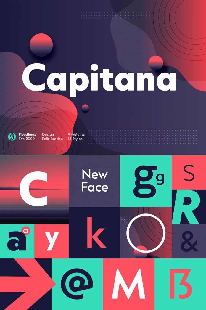
Capitana, a bridge between humanistic and geometric sans serif fonts.
Just a few days ago, German typeface designer Felix Braden of foundry Floodfonts released Capitana, a new font family that masterfully bridges the gap between humanistic and geometric sans serif fonts. All shapes are based on simple forms such as circles, triangles, and squares. In addition, they have been designed according to the classic proportions of the Roman Antiqua.
Capitana comes with 784 characters per style in nine weights ranging from Thin to Black. This legible font family works well for both headings and body text. Capitana has been equipped with plenty of OpenType features including small caps plus corresponding figures, tabular and old-style figures, arrows, alternate letters for g and a, as well as fractions, subscript and superscript. Feel free to click on the following link to learn more about this newly designed typeface.
Check out other trending typefaces in our Fonts category.
Subscribe to our newsletter!


