This post contains affiliate links. We may earn a commission if you click on them and make a purchase. It’s at no extra cost to you and helps us run this site. Thanks for your support!
Say Hello to TAN Dialogue, the Sophisticated Font Duo Your Designs Have Been Missing.
Designers constantly search for typographic perfection. We seek fonts that communicate a specific feeling. This search often ends in a compromise between strength and elegance. The TAN Dialogue font duo by TanType directly addresses this challenge. It provides a complete typographic system in one package. This font pairing is not just a trend. Instead, it is a thoughtful solution for modern branding and editorial work. Its relevance grows as brands seek more nuanced visual identities.
Why Should Designers Prioritize a Cohesive Font Duo?
A well-chosen font duo creates instant visual hierarchy. It guides the reader’s eye effortlessly through the content. Consequently, it establishes a clear and professional tone for a brand. Using a pre-designed pairing like TAN Dialogue removes the guesswork. It ensures that the bold headlines and elegant body text work in perfect harmony. This built-in coherence saves designers valuable time. Furthermore, it prevents the common mistake of clashing typefaces. A great duo does more than present text. It builds a visual narrative, which is crucial for impactful communication.
A Closer Look at the TAN Dialogue Font Duo
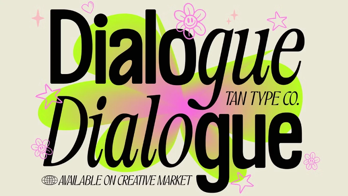
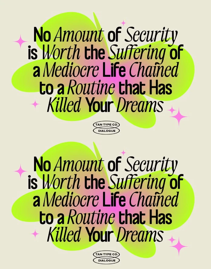
TAN Dialogue is a study in beautiful opposition. TanType carefully crafted two distinct voices that engage in a perfect conversation. One does not overpower the other. Instead, they enhance each other’s best qualities. This balance is the core of its appeal.
The Sans Serif: Modern Strength with a Human Touch
The primary voice is a bold, clean sans serif font. It has a modern, structured foundation. However, its soft edges add a surprising warmth. This subtle detail prevents the font from feeling sterile or overly corporate. It feels approachable and confident. This sans serif works exceptionally well for headlines and powerful statements. It provides clarity and commands attention without shouting. Its legibility makes it a versatile tool for both digital and print media.
The Italic: A Whisper of Classic Elegance
The second voice is a refined, classic italic. This thin, graceful typeface offers a stunning contrast. It brings a sophisticated charm to any design. Think of it as the elegant counterpoint to the sans serif’s strength. This font is perfect for subheadings, pull quotes, or delicate branding elements. It adds a touch of luxury and personality. Using this italic signals a high level of taste and attention to detail.
The Genius of Contrast: How TAN Dialogue Creates Harmony
The real power of the TAN Dialogue font duo lies in its contrast. What does this contrast achieve? It creates a dynamic visual tension that is incredibly engaging. The robust sans serif provides a stable anchor. Meanwhile, the delicate italic introduces a sense of movement and grace. This interplay is fundamental to compelling graphic design fonts.
This professional font pairing allows you to build a sophisticated typographic system with ease. You can establish a clear hierarchy immediately. For example, use the bold sans serif for your main headline. Then, use the elegant italic for the supporting tagline. This combination immediately tells a story of strength and refinement. TAN Dialogue makes high-end editorial design accessible.
Practical Applications: Where Does TAN Dialogue Shine?
Versatility is a key feature of this modern typeface. The TAN Dialogue font duo excels in various creative projects. Its balanced aesthetic makes it suitable for a wide range of applications. Let’s explore where it performs best.
Luxury Branding and Packaging
For luxury brands, perception is everything. TAN Dialogue communicates premium quality effortlessly. Imagine it on a boutique’s logo or the packaging for a high-end cosmetic product. The clean sans serif conveys trust and modernity. The elegant italic adds that essential touch of exclusivity. It’s one of the best font duos for luxury branding because it feels both current and timeless.
Editorial Layouts and Magazine Headlines
In editorial design, readability and style must coexist. TAN Dialogue is an exceptional editorial design typeface. The strong sans serif makes for powerful, legible headlines that pop off the page. The italic is perfect for author bylines, introductory paragraphs, and evocative pull quotes. Together, they create a reading experience that is both beautiful and functional. This font pairing brings a magazine layout to life.
Sophisticated Web Design and UI
Digital spaces demand fonts that are clear on screen. The TAN Dialogue sans serif provides excellent legibility for user interfaces. You can use it for navigation menus, buttons, and body copy. Subsequently, you can deploy the italic for testimonials or feature callouts to add visual interest. This strategic use creates a user experience that feels intuitive and visually polished.
My Personal Take on TAN Dialogue
As a design critic, I see hundreds of fonts each year. Very few make me stop and take a closer look. TAN Dialogue is one of them. What I find most compelling is its intelligent design. TanType did not just create two separate fonts. They designed a relationship. The conversation between the bold and the elegant voices is what makes this duo special.
It solves a real-world problem for designers. We no longer need to spend hours searching for the perfect sans serif and italic pairing. TAN Dialogue delivers it in a single, well-executed package. Moreover, the inclusion of multilingual support and free future updates shows a commitment to the user. This is not just a font. It is a long-term design asset. While some may search for a TAN Dialogue font free download alternative, the investment in a professional license is a clear advantage for serious creative projects.
The Final Word: More Than Just Letters
Ultimately, typography is about communication. The TAN Dialogue font duo communicates a message of balanced sophistication. It blends modern strength with classic grace. This duality makes it an incredibly powerful tool for any designer. Whether you are building a brand identity or designing a beautiful magazine, TAN Dialogue provides the typographic foundation you need to succeed. It helps you tell a compelling story, one letter at a time.
Check out other popular typefaces on WE AND THE COLOR or discover our handpicked selection of 100 cool fonts for 2026.
Subscribe to our newsletter!

