
This post contains affiliate links. We may earn a commission if you click on them and make a purchase. It’s at no extra cost to you and helps us run this site. Thanks for your support!
Nostalgia currently dominates the global design landscape with unprecedented force. Creative professionals everywhere actively seek tools that bridge the gap between digital precision and organic warmth. TAN Mon Amour answers this specific visual hunger with remarkable elegance. TanType, the foundry behind this release, understands that modern audiences crave personality over perfection. Consequently, this font does not merely replicate history; it reimagines the 70s for a high-definition world. Designers frequently cite TAN Mon Amour as a perfect example of the “New Retro” movement. It feels familiar yet surprisingly fresh. This article examines the specific qualities making this typeface a necessary addition to your creative toolkit.
Why is TAN Mon Amour Capturing the Design World’s Attention?
You might wonder why a single font generates such massive engagement on social platforms. TAN Mon Amour succeeds because it rejects the sterility of corporate minimalism. For years, sans-serif genericism ruled the branding world. Now, brands desperately want to stand out. Therefore, they turn to expressive typography to carry their voice. This cheerful retro typeface offers instant character without requiring complex illustration.
The font possesses a unique “thumb-stopping” quality. Its high contrast and curvy strokes demand attention immediately. Furthermore, the aesthetic perfectly aligns with the current resurgence of psychedelic and groovy art. However, TanType refined these chaotic influences into something usable. TAN Mon Amour retains the fun of 70s lettering but maintains strict typographic discipline. Thus, it performs exceptionally well in digital spaces where legibility usually fights with style.
The Role of Personality in Branding
Consumers today buy stories, not just products. TAN Mon Amour acts as a visual narrator. When a designer uses this font, they signal playfulness and approachability. It transforms a standard headline into a welcoming invitation. Consequently, lifestyle brands favor it for packaging and social media graphics. The font suggests that a human, not a machine, crafted the message. This human touch remains the most valuable currency in modern design.
Deconstructing the Aesthetic: What Makes it Work?
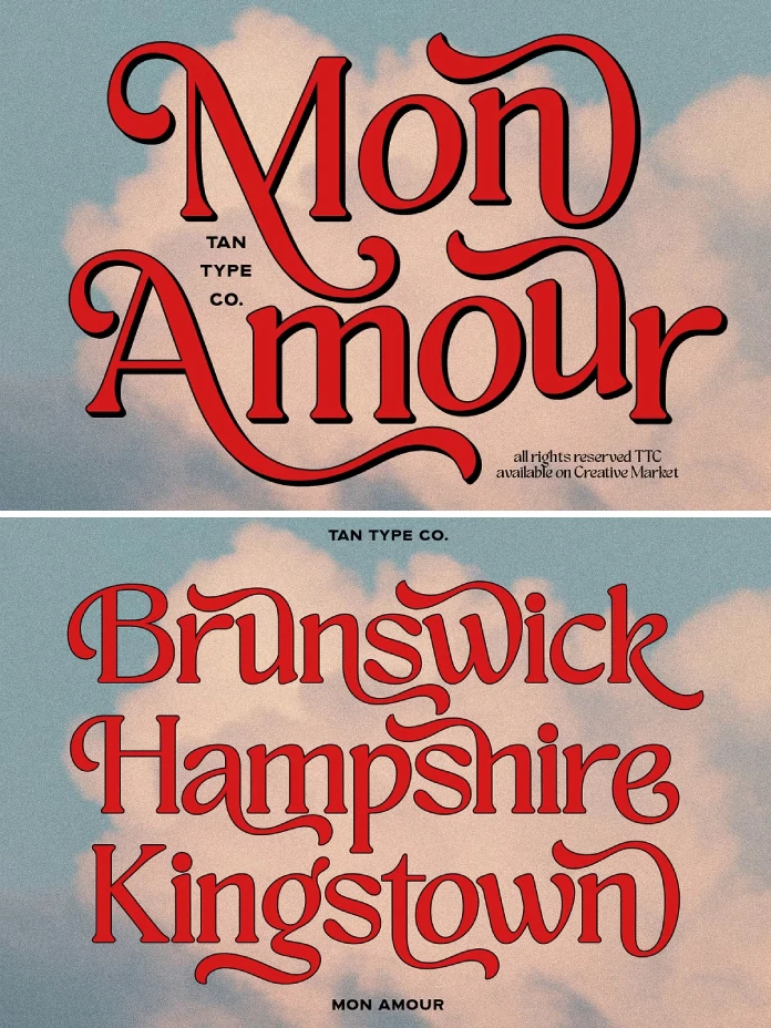
We must look closer at the specific glyphs to understand the magic. TAN Mon Amour balances weight and negative space masterfully. The rounded shapes prevent the design from feeling too aggressive or sharp. Instead, the letters flow into one another like liquid. This flow mimics the hand-drawn advertisements of the mid-20th century. Yet, the vectors remain razor-sharp for 4K screens.

The true power of this retro typeface lies in its alternates. A standard font locks you into a grid. Conversely, this typeface encourages experimentation. You can swap standard characters for flowing alternates that dip and swirl around neighboring letters. This feature allows you to create wordmarks that look like custom lettering. Designers love this flexibility. It saves time while delivering high-end results.
Ligatures and Soft Swirls
Ligatures often define the success of a display font. TAN Mon Amour offers a generous collection of these special character combinations. They connect letters in unexpected, playful ways. For instance, a crossbar might extend to cradle the next vowel. These soft swirls add a romantic rhythm to the text. Therefore, the font name “Mon Amour” feels entirely appropriate. It creates a visual romance between the characters.
How to Style TAN Mon Amour for Maximum Impact
Great power requires great responsibility in typography. This vintage-inspired typeface serves as a display font, meaning it shines brightest at large sizes. You should use it for headlines, logos, and short phrases. Do not use it for long body text. The ornate details would hamper readability in small paragraphs. Instead, pair it with a clean, neutral sans-serif to create dynamic contrast.
Consider the color palette when using TAN Mon Amour. It loves warm, earthy tones like terracotta, olive, and mustard. These colors enhance its vintage branding appeal. However, it also pops in neon against dark backgrounds for a modern twist. The versatility is surprising. You can push it towards “groovy” or restrain it for “elegant.”
Ideal Use Cases
- Editorial Headlines: It grabs the reader immediately.
- Packaging Design: It makes products feel artisanal and premium.
- Wedding Invitations: The romantic flair suits joyful celebrations.
- Social Media Quotes: It turns text into a shareable image.
TanType and the Rise of Decorative Typography
TanType has effectively revolutionized the market for display fonts. They identified a gap where designers wanted eccentric but well-made typefaces. TAN Mon Amour stands as a flagship product in their diverse library. It represents a shift away from Swiss Modernism toward expressive freedom.
The foundry ensures that TAN Mon Amour supports a wide range of languages. Multilingual support is essential for global brands. Additionally, they promise free future updates. This commitment adds value for the user. You buy the font once, but it evolves over time. This business model respects the designer’s investment.
Why You Should Add This Font to Your Library
You need tools that inspire you. TAN Mon Amour provides an instant spark of creativity. We often get stuck using the same “safe” fonts. Breaking that cycle requires a bold choice. This typeface forces you to think about composition differently. It asks you to play with the letters rather than just typing them.
Furthermore, the trend toward nostalgia shows no signs of fading. TAN Mon Amour will remain relevant for years. It taps into a timeless desire for warmth and craft. By mastering this font, you equip yourself to handle projects requiring a touch of nostalgia.
Final Thoughts on the Vibe
Does your work need a wink and a smile? TAN Mon Amour delivers exactly that. It possesses a rare combination of joy and sophistication. The curvy strokes dance across the page. It makes design feel fun again. Ultimately, that is why we create. We want to evoke emotion. TAN Mon Amour makes that emotional connection effortless.
TAN Mon Amour is not just a collection of letters; it is a mood. It invites the viewer to relax and enjoy the visual journey. So, go ahead and experiment with it. Let the swirls guide your layout. You will likely find that it brings a fresh, personal, and handmade feel to your portfolio.
Feel free to find other trending typefaces here at WE AND THE COLOR, or check out our handpicked selection of 100 cool typefaces for designers in 2026.
Subscribe to our newsletter!


