This post contains affiliate links. We may earn a commission if you click on them and make a purchase. It’s at no extra cost to you and helps us run this site. Thanks for your support!
Postcards from Napoli Font Family: The Ultimate Guide to Italian-Inspired Typography
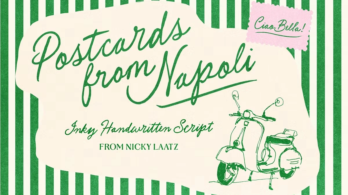
Design demands personality, especially when digital spaces feel increasingly sterile and repetitive. You need tools that convey emotion, warmth, and a distinct human touch. The Postcards from Napoli font family delivers exactly this kind of authentic character. Nicky Laatz crafted this typeface to capture the essence of a sun-soaked Italian afternoon. It radiates romance, wanderlust, and that elusive “dolce vita” vibe effortlessly. Designers seeking a balance between chic elegance and playful sass will find their solution here. The Postcards from Napoli font family is not just a tool; it is a visual vacation.
Why Does the Postcards from Napoli Font Family Stand Out?
Marketplaces overflow with generic script fonts that lack genuine soul or rhythm. However, the Postcards from Napoli font family breaks that predictable mold entirely. The designer meticulously preserved the inky, bumpy imperfections of the original lettering. Consequently, every stroke retains the spontaneity of a quick love note written on a napkin. You rarely see this level of texture in standard digital typography. Most fonts smooth out these quirks to achieve mathematical perfection.
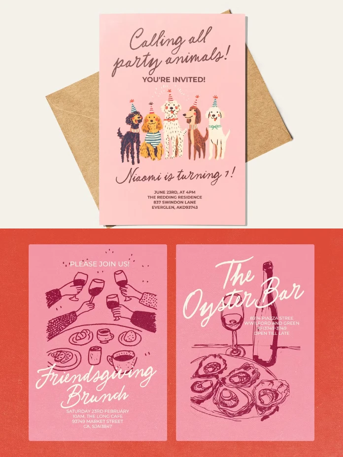
In contrast, this typeface celebrates the flaw as a feature. It looks sassy yet remains undeniably classy in its execution. The letters dance across the page with a rhythm that feels organic. Therefore, it appeals to brands that value authenticity over corporate rigidity. You can feel the pen pressure and the ink flow. This tactile quality creates an immediate emotional connection with the viewer.
The Technical Brilliance Behind the Aesthetic
A pretty face is useless without strong underlying mechanics in typography. Fortunately, the Postcards from Napoli font family includes robust Opentype features. These features ensure your text never looks like a repetitive computer pattern. You have access to a vast array of ligatures and alternates. Ligatures automatically fix awkward connections between specific letter pairs.
Furthermore, the alternate characters allow you to choose different styles for specific letters. This variety mimics the natural inconsistencies of actual handwriting. Consequently, your headlines and logos appear custom-made rather than typed. Accessibility also plays a major role in its success. The font is PUA encoded for maximum usability. Thus, you can access all extra glyphs without needing expensive professional design software.
How Can You style the Postcards from Napoli Font Family?
Versatility defines a truly great typeface, and this one is a jack of many trades. You can use the Postcards from Napoli font family for diverse project genres. It fits perfectly within the wedding industry for invitations and save-the-dates. The romantic, wandering baseline suggests intimacy and personal care. Moreover, it works exceptionally well for boutique branding and packaging design.
Imagine a label for artisanal olive oil or a logo for a travel blog. The font brings warmth, personality, and flair to every single letter. However, you must use it with a discerning eye for balance. Pair this expressive script with a clean, minimal sans-serif font. This contrast allows the script to shine without overwhelming the viewer. You should use it for headers, while letting a simpler font handle body text.
Creating Authentic Travel Journals and Stationery
Travel-themed designs require a specific aesthetic that blends nostalgia with excitement. The Postcards from Napoli font family captures this intersection beautifully. Its authentic pen-and-paper touch evokes the feeling of vintage travel posters. Therefore, it is an ideal choice for digital travel journals or printed stationery.
Designers often struggle to find fonts that feel both legible and artistic. Yet, this font maintains high readability despite its quirky nature. You can create stunning social media graphics that stop the scroll. The “perfectly imperfect” look signals to users that a real human created the content. In an age of AI-generated art, this human touch is invaluable.
A Critique on Current Handwritten Trends
We currently see a massive resurgence in analog aesthetics within digital design. The Postcards from Napoli font family arrives at the perfect cultural moment. Audiences are tired of hyper-polished, soulless corporate branding. They crave the “inky” and the “bumpy” textures that signify reality. Nicky Laatz understands this psychological shift in the design market deeply.
This font does not try to hide its construction or its origins. Instead, it proudly displays the artifacts of the writing process. This honesty makes it a powerful asset for modern storytelling. When you choose the Postcards from Napoli font family, you choose narrative over neutrality. You are making a statement about the value of craftsmanship.
Final Thoughts on Using This Typeface
Typography carries the heavy emotional weight of your entire visual message. Therefore, selecting the right tool changes the reception of your work. The Postcards from Napoli font family offers a passport to a more romantic design world. It invites the viewer to slow down and appreciate the details.
You should explore the full range of previews to understand their potential. Turn on those Opentype features to get the full, authentic experience. Embrace the extra alternates for a truly customized look. Your projects deserve that extra touch of humanity and Italian flair. Ultimately, this font proves that imperfection is the truest form of perfection.
Check out other amazing typefaces here at WE AND THE COLOR or take a look at our selection of the 100 coolest fonts for designers in 2026.
Subscribe to our newsletter!

