
This post contains affiliate links. We may earn a commission if you click on them and make a purchase. It’s at no extra cost to you and helps us run this site. Thanks for your support!
The WTF Forma Font Family: A Modern Typographic Solution for Brands
Corporate identity faces a constant tug-of-war. Businesses must project authority and professionalism. Simultaneously, they need to foster a genuine, human connection with their audience. This delicate balance has become a defining challenge of modern communication. The typeface a brand chooses sits at the very heart of this conversation. Consequently, the WTF Forma font family by W Type Foundry emerges as a direct answer to this problem. It was designed from the ground up to be a complete typographic “solution” for companies navigating this complex landscape.
What Is the Core Idea Behind the WTF Forma Font Family?
At its heart, the WTF Forma font family is a contemporary sans-serif typeface. The designers at W Type Foundry, a Latin-American award-winning collective, crafted it with three specific goals in mind. They wanted a font that served large corporations, exuded friendliness, and provided a true “solution”. The result is a typeface that feels both mature and professional. However, it skillfully sidesteps the cold, impersonal tone common in many corporate fonts. It offers a warm and approachable voice instead. This quality makes it a reliable choice for multinational firms. It is also perfect for any company needing clear, formal, yet deeply human communication.
Inspired by a Classic, Rebuilt for Today
The remarkable clarity and structure of WTF Forma have historic roots. Its design DNA comes from a legendary German typeface: DIN. The German Institute for Standardization (Deutsches Institut für Normung) created the original DIN font for industrial and technical applications. Its purpose was pure function. Therefore, its geometric simplicity and high legibility made it incredibly effective for everything from road signs to official documents.
The WTF Forma font family masterfully channels this utilitarian spirit. It then re-tunes that voice for the complex needs of today’s global brands. While DIN can feel rigid and mechanical, Forma introduces an intentional, subtle warmth. It softens the hard edges without sacrificing the order and functionality that made its predecessor an icon. This thoughtful blend of structured precision and approachable design is what truly defines WTF Forma.
A Versatile Typographic Workhorse
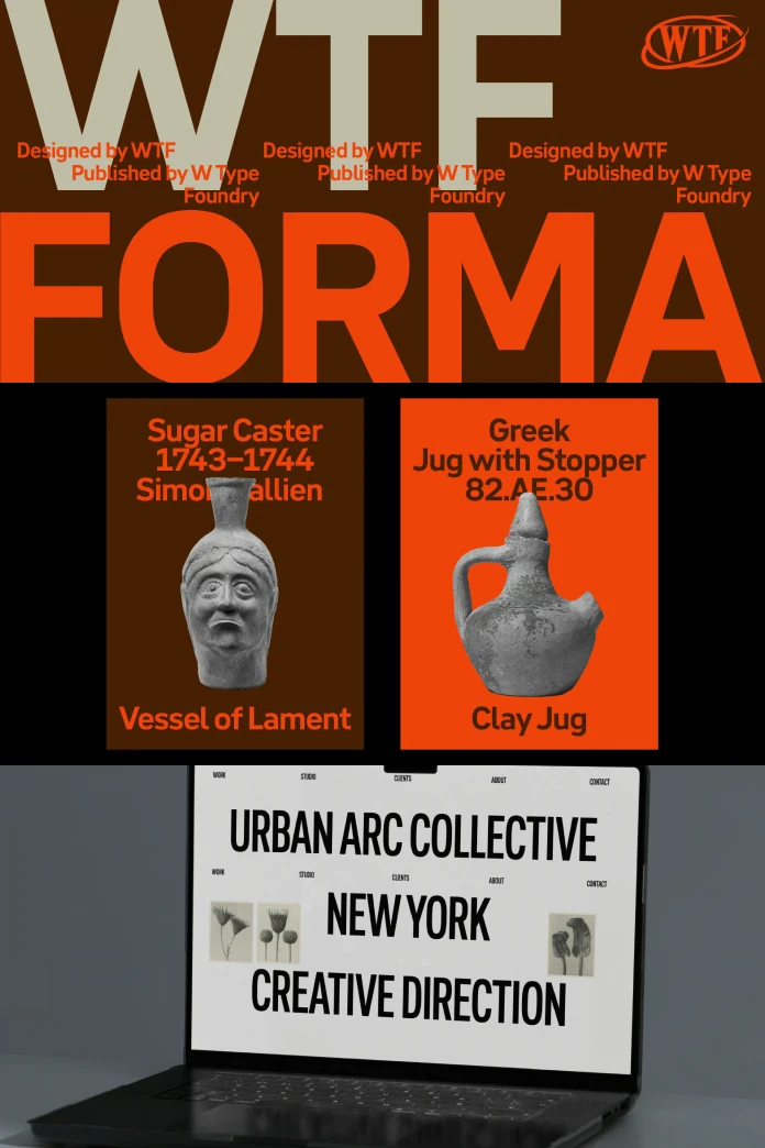
Versatility is arguably the greatest strength of the WTF Forma font family. The foundry developed an exhaustive system comprising 50 distinct styles. This includes a complete set of italics for every weight. This expansive range covers an impressive spectrum of widths. It moves seamlessly from Compressed and Condensed to Regular, Expanded, and Wide.

This incredible variety makes Forma an immensely practical tool for designers and brand managers. For instance, do you need a bold, attention-grabbing headline that saves space? A compressed style will serve you perfectly. Are you setting a lengthy block of text for a company prospectus? The regular width ensures a comfortable and effortless reading experience. This built-in adaptability guarantees brand consistency across every conceivable platform.
How Can Your Brand Use the WTF Forma Font Family?
Selecting a font is a profound strategic decision, not just an aesthetic one. Sans-serif fonts are popular in branding for good reason. They appear clean, simple, and are highly legible, especially on digital screens. In turn, they help brands communicate modernity, honesty, and an approachable nature. The WTF Forma font family embodies these traits perfectly. This makes it an excellent candidate for building a comprehensive and cohesive brand identity system.
Creating a Unified Brand Voice
The extensive range of styles within the WTF Forma font family is its most powerful asset for brand implementation. A company can use the bold, expanded weights for impactful logos and marketing headlines. Concurrently, it can use the light and regular weights for body copy on websites and in official communications. This strategy creates a unified, recognizable look and feel. Ultimately, that consistency builds audience trust and reinforces the brand identity at every single touchpoint.
A Design Critic’s Perspective on WTF Forma
In a market saturated with neo-grotesque sans-serifs, does the WTF Forma font family do enough to distinguish itself? One could argue that its foundation in DIN’s structure is a conservative choice. However, I believe this is precisely its strength. W Type Foundry did not try to reinvent the wheel. Instead, they meticulously refined it for a specific, modern-day corporate requirement.
The true success of the WTF Forma font family lies in its exquisite balance. It gives designers the geometric precision they admire in fonts like DIN. Yet, it infuses the design with a subtle, humanistic quality that prevents it from feeling sterile or robotic. This is not a typeface that shouts for attention. Rather, it is a quiet, confident, and highly adaptable tool. It provides a solid foundation upon which a brand can construct a clear, engaging, and trustworthy voice. It absolutely delivers on its promise to be a reliable and endlessly versatile typographic solution.
All images © W Type Foundry. Feel free to browse WE AND THE COLOR’s Fonts category or take a look at our selection of the 100 coolest typefaces for professional designers in 2026.
Subscribe to our newsletter!


