
This post contains affiliate links. We may earn a commission if you click on them and make a purchase. It’s at no extra cost to you and helps us run this site. Thanks for your support!
The Marblis Typeface is a Modern Grotesque Redefining Clarity in Design. Is this the Perfect Helvetica Alternative You’ve Been Searching For?
Designers constantly seek that perfect typeface that combines flawless functionality with a unique personality. Enter the Marblis font family, a creation by Julien Fincker of Fincker Font Cuisine. This is not merely another sans-serif typeface. Instead, it is a thoughtful, modern interpretation of the classic grotesque genre. Marblis presents a compelling alternative to the ever-present Helvetica, designed specifically for clear and reliable communication. Its clean, neutral forms create a solid and dependable feel, giving the font a sense of stability and poise. This article explores the distinct qualities of the Marblis font family, its underlying design philosophy, and its versatile role in modern design.
You can purchase the complete family from these sites:
Btw, Marblis is available for 50% off exclusively at Font Cuisine with the coupon code “Marblis50” until January 16, 2026.
You can purchase the complete family from these sites:
What Makes Marblis a Superior Choice for Designers?
At its heart, Marblis is built for supreme functionality and performance. This modern grotesque sans-serif typeface is the product of careful, meticulous design. It successfully balances aesthetic grace with everyday usability. The truly distinguishing feature of Marblis is its incredible versatility. This makes it a powerful tool for a huge range of typographic projects. Whether used in print or on-screen, this font family ensures the content always remains the central focus. The typeface itself never becomes a distraction. The design of Marblis proves that a typeface can be both a dependable workhorse and an object of beauty.

A Modern Grotesque with Personality
Julien Fincker, the creative mind at Fincker Font Cuisine, designed the Marblis typeface with a modern character. He also made sure to honor the rich heritage of the grotesque style. The name “Fincker Font Cuisine” is a clever nod to his family’s history in the delicatessen business. This background reflects a deep commitment to quality craftsmanship and fine detail. This philosophy is clearly visible in the precise, refined forms of Marblis. The font’s clean lines and neutral shapes give it a solid, reliable character. Consequently, it becomes a trustworthy choice for any professional communication need. The design achieves a perfect balance, feeling both unobtrusive and subtly warm, which keeps it from appearing cold or impersonal.
An Extensive Family for Diverse Applications
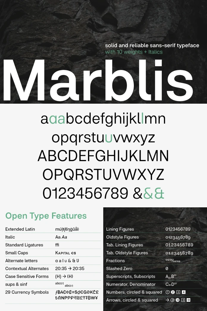
The Marblis font family is remarkably complete. It features ten distinct weights, and each weight includes a matching italic version. This extensive range, from a delicate Thin to a powerful Black, gives designers a rich typographic palette. Such a broad selection allows for creating a clear visual hierarchy within complex layouts. This is an absolutely essential element of effective design. Furthermore, with over 1410 glyphs, Marblis supports a wide array of languages. It also offers a wealth of typographic features. These include various ligatures, stylistic alternates, and multiple numeral sets. This depth and versatility make Marblis an ideal font for corporate design, editorial layouts, wayfinding systems, and many other uses.
How Marblis Enhances Modern Branding and Digital Experiences
A brand’s identity is critically shaped by its choice of typeface. A font communicates a brand’s values and personality before the audience reads a single word. In our current digital-first world, a font’s readability and performance on screens are more important than ever.
A Refreshing and Reliable Helvetica Alternative
For many years, Helvetica has dominated the sans-serif landscape. Designers have valued it for its neutrality and clarity. However, its widespread use has prompted many to look for alternatives. They want a font with similar functionality but a more distinctive character. Marblis stands out as a powerful contender in this search. It possesses the same clean, functional qualities as Helvetica. Yet, it introduces a subtle personality that helps a brand distinguish itself. This makes the Marblis typeface an exceptional choice for companies aiming to build a modern, approachable, and reliable brand image.
Optimized for Clarity Across All Platforms
Marblis was carefully designed to perform beautifully in both print and digital formats. Its clear and open letterforms guarantee high legibility, even at small sizes on a screen. This is a vital consideration for user interface design, web design, and any application where clear communication is non-negotiable. The comprehensive range of weights allows for the creation of dynamic, responsive typographic systems. These systems adapt flawlessly to different screen sizes and resolutions, ensuring a consistent user experience.
The Future of Grotesque Fonts and Marblis’s Role
Typography trends are always changing. Designers continuously find new ways to use type to create engaging and powerful experiences. While some trends favor more expressive and decorative styles, the demand for clean, functional, and versatile typefaces never fades.
The Enduring Appeal of the Marblis Grotesque Style
Modern grotesque fonts like Marblis are set to remain a fundamental part of every designer’s toolkit. Their unique blend of historical roots and contemporary refinement makes them incredibly adaptable. Designers can use them to create work that feels both timeless and current. As brands continue to navigate a complex global and digital market, the clarity and reliability of fonts like Marblis will only grow in value. Its subtle personality offers a key advantage.
A Personal View on the Marblis Typeface
In my view, the true strength of Marblis is its quiet confidence. It does not demand attention. Instead, it provides a solid, elegant foundation that allows the content to shine. Julien Fincker’s meticulous attention to detail is apparent in every curve and counter. The result is a typeface that is not only visually pleasing but also incredibly comfortable to read. It represents a mature, thoughtful evolution of the grotesque genre. It offers a fresh perspective without compromising the functional integrity that makes these typefaces so lasting. For any designer seeking a versatile, reliable, and modern sans-serif with a touch of warmth, Marblis is an outstanding and highly recommended choice.
You can purchase the complete family from these sites:
Don’t hesitate to find other professional typefaces for different creative needs here at WE AND THE COLOR. In addition, take a look at our selection of 100 cool fonts for 2026.
Subscribe to our newsletter!


