
This post contains affiliate links. We may earn a commission if you click on them and make a purchase. It’s at no extra cost to you and helps us run this site. Thanks for your support!
Great typography defines the visual language of the modern web. You do not need an expensive budget to access professional-grade design tools anymore. The best free fonts available in 2026 now rival the quality of expensive legacy foundries. Open-source culture has democratized high-end typography for everyone. Consequently, designers can now access variable weights, extensive glyph sets, and multilingual support without spending a dime. This article curates the definitive list of typefaces you need right now. We prioritize usability, aesthetic flexibility, and technical excellence above all else.
Do you ever wonder whether a free typeface can compete with a paid one? The sheer quality of the free options available now makes that a reasonable question. Fonts today are design statements that twist, stretch, and misbehave. Forward‑looking brands and studios are embracing this expressive potential. It means that free fonts are not only accessible; they also capture the very trends shaping contemporary design.
What Shapes Free Font Trends in 2026?
Embracing Expressiveness
Designers are falling for funky curvy serifs, novel italics, quiet sans serifs, and several other styles. Fonts in 2026 are expected to bend traditional rules; they may evoke the 1970s, add chaotic scripts, or double as graphic illustrations. This shift means that the best free fonts combine creative flair with everyday utility.
Warmth Over Corporate Neutrality
People crave a personality they can trust. Designers are responding by softening letterforms, rounding edges, and adding warmth. Even minimalist sans serifs are designed to whisper rather than shout. Rounded fonts and gentle scripts can make brands feel approachable.
Inclusive and Global Type
Another emerging trend is lingua‑lettering, where typefaces combine multiple scripts to reflect global audiences. Designers might pair Latin characters with Arabic or Japanese forms to tell richer stories. If you serve diverse communities, multi‑script families or fonts with extensive language support are worth exploring.

Fonts as Graphic Art
Lastly, fonts are increasingly treated as graphic elements. Halftone textures, oversized dots, and geometric patterns become part of the letterforms. Such experimental styles turn headlines into visual compositions. They are well-suited for event posters, indie publishers, and creative packaging.
How to Choose the Best Free Fonts
Choosing the right typeface goes beyond personal taste. Here are some guidelines to help you identify the best free fonts for your projects:
- Clarify the Use Case. The font for a blog should differ from a logo or a UI interface. For example, a font designed for screens offers excellent readability for dashboards and apps.
- Consider Brand Personality. Match the font’s mood to the brand’s character. Tech firms might prefer modern sans serifs, while luxury brands might choose elegant serifs.
- Check Licensing. Verify that the font is genuinely free for commercial use. Many fonts in this guide are either open‑source or distributed through platforms that clear commercial rights.
- Prioritize Readability. For body copy, opt for simple, legible fonts such as friendly sans‑serifs. Use display fonts sparingly for headlines or logos.
- Test Pairings. Pair fonts that complement each other in weight and contrast. Popular combinations include geometric sans serifs with neutral serifs, and elegant serifs with friendly sans.
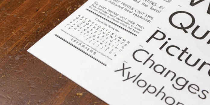
100 Coolest Free Fonts for Designers in 2026
The following list combines new releases, open‑source favorites, and hidden gems. Please always check each font’s licensing terms before downloading—some typefaces are licensed for both personal and commercial use, others are limited to personal projects, and a few are available only as trial versions. The typefaces are grouped into categories to help you choose according to style and application.
Bold Display Fonts
- CoFo Kabeltouw – A modular display font inspired by shipyards and cargo cranes; its industrial look is softened by brush‑painted curves. Great for logos and posters.
- Sausage – A playful, plump typeface with no straight lines; perfect for food packaging and children’s products.
- Alphabet Soup – A rounded sans‑serif rooted in 1980s Boston signage; it offers warmth and nostalgia.
- Mingler – A hand‑painted sans that feels friendly and professional; ideal for headlines and packaging.
- Willard Sniffin Script – A brush script reimagined from a 1933 design; it balances informal charm with legibility.
- SK‑Modernist – A geometric sans with minimalist forms; its simplicity makes it suitable for digital interfaces.
- Project Blackbird – A grotesque font offering unique glyphs and shapes; it adds character to editorial layouts.
- Panagram Sans Rounded – Inspired by geometric classics, this font features rounded corners that feel welcoming.
- Söhne – A contemporary interpretation of classic grotesques filtered through modern influences; it evokes urban transit signage.
- GT America – A workhorse bridging historical American Gothics with modern European styles. Its versatility suits corporate identity systems and editorial design.
- Neue Montreal – A contemporary sans‑serif with clean strokes and modern proportions.
- Geist – A coding font known for monospaced clarity; it is popular among developers.
- Spartan MB – A modern sans-serif typeface renowned for its practicality and versatility.
- Humane V2.0 – A variable display font with striking, playful curves.
- Harmond Display – A modern serif combining readability with flair.
- Chillax – A modern sans-serif typeface that has become increasingly popular among designers for its simplicity and elegance.
- Apex Mk3 – A striking, bold geometric typeface that has been designed to command attention in any design project.
- Margaret – A sophisticated serif font crafted by Kacper Janusiak and the K94 Studio team, embodies timeless elegance.
- Rounded Block – A free font that has a round block style for headlines, logos, headers, and more.
- Handler – A free vintage typeface with a cool retro style, including three options: regular, stamp, and rough.
- Singo – A bold and narrow display typeface featuring hard lines and smooth curves.
- Hollow – A bold sans serif typeface with thick strokes and unique characteristics.
- Bechtlers – An elegant sans serif font characterized by unique ascenders.
- Passion One – An expressive display sans serif with heavy strokes and a strong visual presence, perfect for eye-catching headlines.
- Momo Trust Display – A friendly, rounded sans-serif display font — warm and approachable in tone, while remaining clean and modern.
Modern Sans‑Serifs
- Inter – Designed for screens, it offers excellent readability at small sizes and a large x‑height.
- Roboto – A universally adopted sans‑serif that balances mechanical structure with friendly curves.
- Kedebideri – A versatile sans-serif typeface with clear, neutral proportions and a utilitarian tone.
- Montserrat – Inspired by urban signage; it brings bold character to logos and hero sections.
- Open Sans – An extremely readable font for long text; it is warm and neutral.
- Lato – A friendly yet professional sans‑serif suitable for presentations and business materials.
- Oswald – A condensed sans‑serif that commands attention in headlines and banners.
- Raleway – A thin, elegant sans‑serif ideal for event posters and portfolio sites.
- Arimo – A clean, modern sans-serif font designed for high readability.
- Source Sans – A clean, modern type family with excellent legibility.
- Fira Sans – Commissioned by Mozilla, Fira offers humanist shapes and works well for coding and UI design.
- Work Sans – Optimized for on‑screen text, with multiple weights and an approachable personality.
- Manrope – A versatile semi‑grotesque sans with high readability and a contemporary finish.
- Google Sans Flex – A sans serif that adapts its weight, width, and tone for everything from crisp UI text to warm, rounded headlines.
- Elms Sans – A clean geometric sans serif with balanced proportions, ideal for both readable text and modern display work.
- Special Gothic – A contemporary, multi-width sans-serif typeface that reimagines the raw, industrial tenacity of early 20th-century.
- Stack Sans Text – A utilitarian, modernist sans-serif with distinctively “notched” joints inspired by the concept of building and stacking.
- Space Grotesk – A proportional version of Space Mono; it brings a futuristic aesthetic while staying readable.
- Archivo – Developed for high performance on digital screens; it supports a wide range of languages and weights.
- Alan Sans – A playful, “not so corporate” sans-serif that softens a traditional grotesque skeleton with flexible details.
- Red Hat Display – Part of a larger font family built for digital platforms and open‑source projects.
- Bricolage Grotesque – A quirky yet balanced geometric sans with unexpected shapes and a wide range of weights.
- Graphik – A neo‑grotesque with minimal detail, widely adopted by editorial designers.
- Satoshi – A modern, minimal sans with multiple styles that pair nicely with serif companions.
- Nata Sans – A spacious, grotesque sans-serif with a subtle humanist warmth, designed for relaxed, clear reading on digital interfaces.
Elegant Serifs and Transitional Fonts
- Playfair Display – A high‑contrast serif that evokes classical elegance; ideal for editorial and luxury branding.
- Cormorant Garamond – Inspired by Garamond but with sharp contrasts; it feels both traditional and contemporary.
- Libre Baskerville – A free interpretation of Baskerville optimized for digital screens.
- Merriweather – Designed for readability on screens; its sturdy serifs make long paragraphs pleasant to read.
- Crimson Pro – An old‑style serif with multiple weights; it lends sophistication to editorial layouts.
- Lora – A modern serif with calligraphic roots; perfect for blogs and branding.
- EB Garamond – A faithful revival of the classic Garamond; it exudes timeless elegance.
- Vollkorn – A sturdy serif built for body text; its robust letterforms hold up on high‑density screens.
- Ibarra Real Nova – A revival of a historic Spanish typeface; it offers refined details.
- Majesty Goldera Modern Serif Font – A luxurious font that captures 1920s Art Deco opulence through dramatic high-contrast strokes.
- Bright Sunlist Modern Vintage Serif – A “modern vintage” serif that combines voluminous, high-contrast strokes with sweeping curves.
- Bodoni Moda – A modern take on Bodoni with variable axes; ideal for fashion branding.
- Elsie – A chic display serif with swooping curves and Art Deco flair.
- Cinzel – Inspired by Roman inscriptions; it brings gravitas to logos and titles.
- Spectral – A variable serif that balances humanist warmth with modern structure.
- Public Sans – A neutral typeface developed for public use; it is free and accessible, making it a reliable workhorse.
- Literata – A book‑friendly serif designed for e‑books; its soft serifs aid extended reading.
- Halyard – A modern serif with subtle curves; it offers clarity with individuality.
- Reforma – A contemporary serif from South America; it is versatile in editorial design.
- Prata – A display serif with high contrast; it adds luxury to branding.
Expressive Scripts and Handwriting Styles
- Great Vibes – A flowing script with elegant loops; perfect for invitations and greeting cards.
- Pacifico – Inspired by 1950s surf culture, this script is playful and relaxed.
- Dancing Script – A casual yet sophisticated script that feels like modern handwriting.
- Satisfy – A calligraphic script with round forms and a friendly tone.
- Yellowtail – A vintage brush script reminiscent of mid‑century sign painting.
- Allura – A refined script that maintains clarity even at small sizes.
- Juliette – A handwritten signature font that pairs natural, fluid strokes with a refined elegance.
- Bad Script – A Cyrillic and Latin font inspired by everyday handwriting; ideal for personal projects.
- Marck Script – A friendly script that emulates marker handwriting.
- Aguafina Script – A small‑caps style script with elegant swashes.
- Shadows Into Light – A light handwriting font that adds warmth to casual branding.
- Beverly Drive Right – A playful script reminiscent of mid‑century roadside signage; its alternates offer a handcrafted feel.
- Signika Negative – A reversed‑contrast script that delivers a strong personality.
- Cedarville Cursive – A simple, neat cursive that works well for education materials.
- Old Bridges – A rustic, textured signature script that mimics the natural, hasty flow of an authentic vintage autograph.
Variable and Experimental Typefaces
- Halyard Variable – An adaptable family with multiple optical sizes and weights, offering precision for modern designs.
- Calistoga – A variable serif with chunky strokes; it brings retro charm to headlines.
- Recursive – A monospaced variable font that moves between sans and serif.
- Nable – A vibrant, isometric color font inspired by retro computer games, featuring variable 3D depth and lighting to create playful optical illusions.
- Chivo Variable – A comprehensive sans‑serif with multiple weights and width axes.
- Program – A modular variable font with industrial roots; it offers fourteen styles for flexible branding.
- Zen Dots – A dotted display font with variable size; it echoes halftone textures.
- Sora – A crisp, geometric sans-serif that blends “low-res” aesthetic cues with a modern, high-tech structure.
- Spline Sans – A variable sans built for digital products, offering smooth interpolation between weights.
- Plex Mono – A monospaced variant of a popular corporate family, perfect for code and editorial design.
- Orbitron – A futuristic, geometric sans-serif inspired by classic sci-fi movies, characterized by a wide stance and distinctively squared-off curves designed for high-impact display.
- Exo – A contemporary geometric sans-serif designed to convey a sharp, high-tech, futuristic aesthetic while maintaining an elegant structure for versatile use.
Inclusive and Multi‑Script Families
- Noto Sans – An extensive family covering dozens of scripts; designed to harmonize across languages.
- Noto Serif – The serif companion to Noto Sans; ideal for multilingual publications.
- Anek Devanagari – A multi-script variable typeface family that supports Latin along with nine different Indian languages.
Final Thoughts and Personal Insights
The sheer breadth of high‑quality, free, and open‑source fonts in 2026 is remarkable. Designers no longer need to compromise between budget and quality when selecting typefaces for branding, UX, print, or packaging. Fonts are evolving from static letters into flexible, artistic tools. This guide has shown that the best free fonts mirror those trends: they can be bold and expressive, warm and inclusive, or technically precise. The availability of variable fonts means type can adapt to different contexts, while multi‑script families reflect our increasingly global communication.
A creative editor might conclude that 2026 is a watershed moment for typography. Free fonts are catching up to, and even surpassing, their commercial counterparts in both craftsmanship and versatility. This democratization of type design opens opportunities for emerging designers and indie brands, who can now experiment with a broader palette. Rather than chasing every trend, thoughtful selection and pairing will remain essential. Ask yourself: Does the font support your message? Does it evoke the mood your audience expects? And does it stand out without overwhelming your design? The answers will guide you toward the right choice.
Ultimately, fonts are voices in the design conversation. In 2026, the chorus is louder, richer, and more diverse than ever. Embrace the possibilities, enjoy the best free fonts, and let your projects speak with clarity and character.
Frequently Asked Questions (FAQ)
What does “free for commercial use” mean?
It means that you can use the font in projects for yourself or your clients without paying licensing fees. Always review the licensing details, as some fonts require attribution or have specific restrictions.
Are these fonts really as good as paid fonts?
Many free typefaces are designed by professional foundries and rival their paid counterparts in quality. While premium fonts may offer exclusive features or unique styles, free fonts often provide everything a designer needs for most projects.
What is the difference between a variable font and a static font?
A static font requires a separate file for every weight (e.g., Bold, Light, Italic). Conversely, a variable font contains all weights and styles in a single file. This reduces website loading times and offers infinite styling possibilities.
How do I pair fonts effectively?
Choose fonts with complementary characteristics. Pair a display or decorative font with a neutral body text. Pay attention to contrast in weight and style while maintaining harmony.
What are variable fonts?
Variable fonts are a single font file that contains multiple styles and weights. They allow you to adjust weight, width, and other axes dynamically. This flexibility helps with responsive design and creative expression.
Can I use these fonts on my website?
Yes. Most fonts listed here are available through services that provide web font files. Always host them properly or embed via the provider’s recommended method to ensure fast loading and legal usage.
How often do font trends change?
Trends evolve annually, influenced by broader cultural and design movements. Following trend reports and exploring new releases helps you stay current while ensuring your designs remain timeless.
You want more? If so, feel free to browse WE AND THE COLOR’s Fonts category or check out our selection of the 100 best typefaces (purchase options) for 2026.
Subscribe to our newsletter!


