This post contains affiliate links. We may earn a commission if you click on them and make a purchase. It’s at no extra cost to you and helps us run this site. Thanks for your support!
Typography dictates the voice of your brand before a user reads a single word. Yet, most creators fail to combine fonts effectively. They rely on intuition rather than architectural precision. This lack of structure leads to visual chaos. We will dismantle the myths surrounding typography. You will learn to combine fonts using a proprietary framework I call the Typographic Discord Theory. This approach prioritizes calculated tension over lazy harmony. Consequently, your designs will demand attention. We are not just matching shapes here. We are engineering a visual hierarchy. To combine fonts like a professional, you must master the mechanics of optical weight and structural variance.
Why do generic pairing rules fail to produce professional results?
Generic advice often suggests you pick a “clean” font and a “fancy” font. However, this creates a superficial understanding of design. You need to combine fonts based on historical structure and x-height alignment. Simplistic rules ignore the nuance of stroke width. Therefore, professional designers reject these basic templates. They understand that type families interact like distinct personalities. When you combine fonts without a strategy, you risk creating an “uncanny valley” effect in your text. The fonts look similar but not identical. This confuses the reader’s eye.
Furthermore, standard advice ignores the medium. A pairing that works in print might fail on a mobile screen. Thus, we need a robust system. The Typographic Discord Theory solves this. It posits that beauty arises from intentional, measurable conflict. You should not aim for a perfect match. Instead, you must combine fonts that push against each other. This friction creates energy.
The Core Thesis of Typographic Discord
My central thesis is simple. Successful pairings rely on distinct optical velocities. One font must anchor the eye, while the other must accelerate it. When you combine fonts with identical velocities, the design stagnates. This article defines specific methodologies to avoid that stagnation. We will look at the “Anchor” and the “Satellite.”
What is the Anchor and Satellite Framework?
You must view your typeface selection as a solar system. Every successful attempt to combine fonts requires an Anchor. This is your body text. It does the heavy lifting. It requires high readability, an open aperture, and a sturdy x-height. Most designers choose the Anchor first. This is the correct approach.
Conversely, the Satellite orbits the Anchor. This is your display font. It carries the emotional weight. When you combine fonts, the Satellite provides the personality. However, the Satellite must never compete with the Anchor for legibility. It exists to arrest attention.
Defining the Roles
- The Anchor: Neutral, legible, consistent. Usually a sans-serif or a robust serif.
- The Satellite: Expressive, distinct, loud. A display serif, script, or heavy geometric sans.
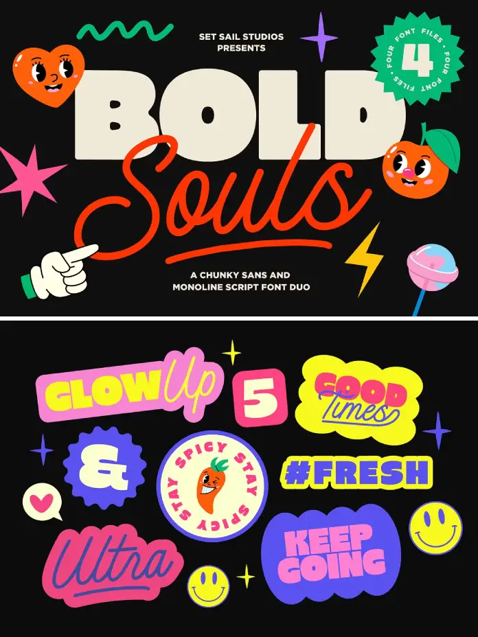
You must assign these roles immediately. Never combine fonts that both fight for the Anchor position. If both fonts have high personality, the reader feels exhausted. Therefore, choose one workhorse and one show pony.
How does the 300% Variance Protocol work?
I developed the 300% Variance Protocol to eliminate ambiguity. When you combine fonts, the difference must be obvious. If the user wonders if you made a mistake, you failed. The distinction between your typefaces must be at least 300% in one measurable attribute.
Consider these attributes:
- Weight: Pair a Hairline with a Black weight.
- Style: Pair a rigid Geometric with a fluid Script.
- Era: Pair a classic Humanist with a modern Grotesque.
For example, do not combine fonts like Arial and Helvetica. They are too similar. The variance is perhaps 10%. This looks like an error. Instead, combine fonts like a heavy Futura (Geometric) with a delicate Garamond (Old Style). The variance here is massive. Consequently, the layout looks intentional.

Applying the Protocol
First, analyze your primary font. Is it thick? Is it modern? Then, select a secondary font that opposes those traits. If you combine fonts that share too many DNA markers, you violate the protocol. Contrast is king. Similarity is the enemy of interest.
Why is x-height the secret variable?
Most tutorials ignore x-height. This is a critical mistake. The x-height is the height of the lowercase “x” relative to the capital letters. When you combine fonts in a single line or adjacent blocks, their x-heights should align optically.
If you combine fonts with vastly different x-heights, the text looks disjointed. It ruins the flow. Even if the fonts are different styles, similar internal proportions create subconscious harmony.
The Optical Alignment Test
Type out “xy” in both fonts at the same size. Place them side by side. Does the “x” sit at the same level? If not, you must adjust the point size of one until they match. Professional designers combine fonts by math, not just by feeling. This alignment bridges the gap between the Anchor and the Satellite. It creates a subtle link between two opposing forces.
How to navigate serif and sans-serif combinations?
The classic move is to combine fonts by mixing a serif and a sans serif. This is the “Superfamily Strategy.” However, we can go deeper. Do not just pick any serif. Look for Humanist Sans and Old Style Serifs. They share calligraphic roots.
For instance, a font like Gill Sans has a human touch. It pairs beautifully with Caslon. They share a pen-nib influence. When you combine fonts with shared ancestry, the result feels organic.
Avoiding the “Frankenstein” Effect
Do not combine fonts that contradict each other’s historical mood. A Cyberpunk digital font looks terrible next to a Renaissance broad-nib serif. The moods clash. You want tension, not an argument. Therefore, ensure the emotional context aligns even if the shapes differ.
The Role of Long-Tail Keywords in Typography
You might search for “best Google font combinations” or “modern font pairings 2026.” These queries reflect a desire for shortcuts. However, templates expire. Principles endure. When you learn to combine fonts using the Typographic Discord Theory, you no longer need templates. You become the architect.
Nevertheless, if you need a starting point, look for high-contrast pairs. Combine fonts like Playfair Display (High contrast serif) with Lato (Low contrast sans). This satisfies the variance protocol. It is safe yet effective.
Future Predictions: Generative Typography
We are moving toward a future of Generative Typography. Soon, AI will not just combine fonts; it will generate bespoke interpolations on the fly. Static font files will become obsolete.
The Prediction
By 2028, operating systems will automatically adjust type weight and contrast based on user distance and ambient light. We will combine fonts that are fluid, not fixed. Design systems will become living ecosystems. Therefore, learning the principles of structure now is vital. You must understand the rules before the AI breaks them for you.
Practical Steps to Combine Fonts Today
Let’s simplify this into an actionable workflow. You have a project. You need type.
- Define the Emotion: Is it serious or playful?
- Select the Anchor: Pick a readable font first.
- Apply the 300% Rule: Pick a Satellite font that contrasts sharply in weight or style.
- Check x-height: Ensure they sit well together.
- Limit the Palette: Never combine fonts exceeding three families. Two is usually best.
This process removes the guesswork. You systematically build the typographic voice.
My Personal Critique on Current Trends
I see too many designers playing it safe. They combine fonts that are virtually indistinguishable. They use Helvetica for headers and Roboto for body text. This is boring. It lacks soul.
Design is about risk. You should combine fonts that scare you slightly. Try a brutalist mono-spaced font with an elegant script. Push the boundaries. If the text is legible, you have permission to be weird. Safe design is invisible design. You want your work to be seen.
Final thoughts on the Typographic Ecosystem
To combine fonts is to curate an experience. You are the director of the play. The fonts are your actors. Cast them wisely. Use the Anchor to ground the audience. Use the Satellite to deliver the drama.
Remember the Typographic Discord Theory. Embrace the tension. Verify the x-heights. Apply the 300% Variance Protocol. If you follow these tenets, you will combine fonts better than 90% of the industry. Typography is not just reading. It is feeling. Make your reader feel the precision of your choices.
Frequently Asked Questions
What is the golden rule when I combine fonts?
The golden rule is contrast. You must create a clear distinction between the header and body text. If they look too similar, it looks like a mistake.
How many fonts should I use in one design?
Stick to two or three. When you combine fonts beyond three families, the design becomes cluttered and loses its cohesive voice.
Can I combine two serif fonts together?
Yes, but it is difficult. You must ensure one is distinctly a display style (like a slab serif) and the other is a text style (like a transitional serif).
Why do my font combinations look messy?
Likely, the x-heights do not align, or the fonts are too similar in weight. Increase the contrast or adjust the sizing to match the optical proportions.
Is it better to use Google Fonts for pairings?
Google Fonts offers excellent accessibility and variety. However, the quality varies. Choose popular, well-kerned families to ensure professional results.
Does color affect how I combine fonts?
Absolutely. Color adds visual weight. You can use color to create contrast between two fonts that might otherwise look too similar.
What is the 300% Variance Protocol?
This is a framework suggesting that paired fonts should differ significantly (by roughly 300%) in at least one trait, such as weight, style, or classification.
Don’t hesitate to find other trending typefaces here at WE AND THE COLOR or take a look at our selection of the 100 best fonts for designers in 2026.
Subscribe to our newsletter!

