
This post contains affiliate links. We may earn a commission if you click on them and make a purchase. It’s at no extra cost to you and helps us run this site. Thanks for your support!
Let’s explore the Cyprus Sunrise vintage font duo and how these two typefaces can help you redefine organic branding.
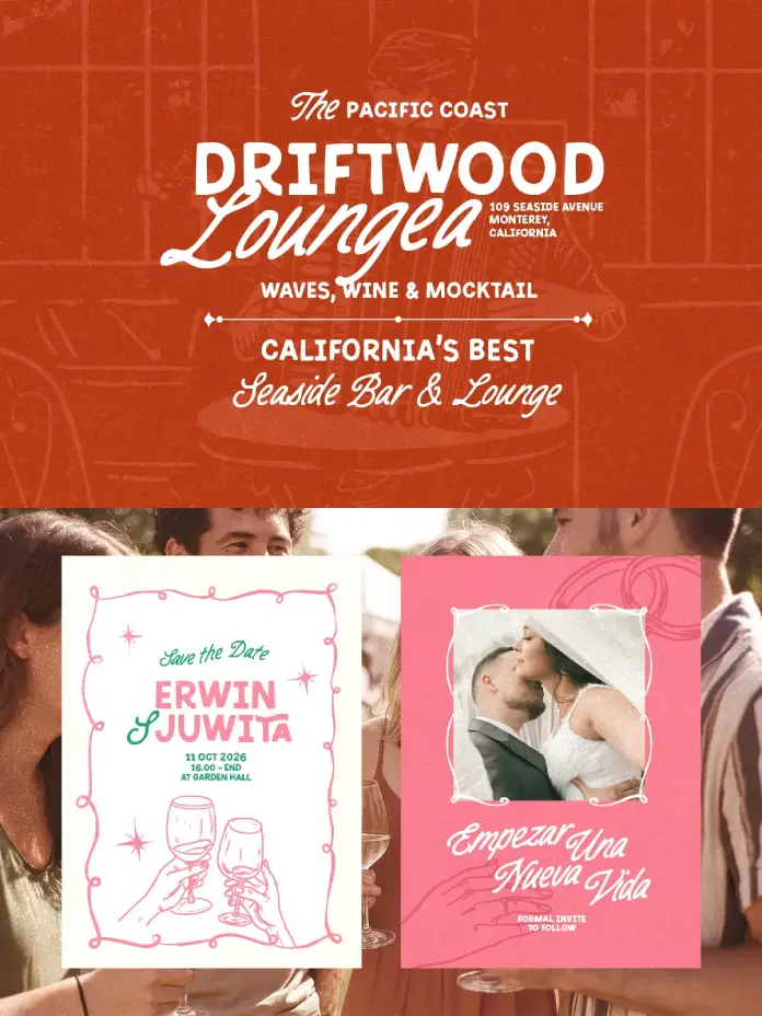
Authenticity drives successful design in our current visual landscape. Users ignore sterile, over-polished graphics. They crave connection. Cyprus Sunrise delivers this exact connection through its unique aesthetic. This organic font duo by Sarid Ezra captures a specific, tactile energy. It balances structural boldness with fluid, handwritten imperfection. Designers seeking a tool for narrative-driven branding find immediate value here. The typeface implies a story before a reader finishes the first word. Consequently, it dominates the niche of rough and outdoor themes.
What Distinguishes Cyprus Sunrise From Standard Font Duos?
Many type families lack cohesion. They often force two mismatched styles together. Cyprus Sunrise operates differently. It functions on what we define as the Tactile Duality Framework. This framework suggests that visual harmony emerges from the friction between a heavy, static element and a light, dynamic one. Sarid Ezra mastered this balance. The bold sans serif component anchors the design. Meanwhile, the monoline handwritten script introduces movement. Therefore, the duo feels curated rather than assembled.
The Bold Sans Serif Architecture
The sans-serif portion of Cyprus Sunrise acts as the foundation. It avoids geometric perfection. Instead, it embraces a hand-lettered roughness. This texture mimics the inconsistencies found in traditional letterpress printing. Furthermore, the inclusion of ligatures creates natural connections between characters. These ligatures prevent the text from looking like a standard computer font. Brands utilize this weight to establish authority without appearing corporate.
The Monoline Script Fluidity
In contrast, the script component offers a personal signature. It follows a monoline structure, maintaining a consistent stroke width. This consistency ensures legibility even at smaller sizes. The script complements the sans serif by softening its edges. Consequently, Cyprus Sunrise allows for versatile typographic hierarchies. One font shouts while the other whispers. This dynamic interplay characterizes the vintage font duo market, yet few achieve this level of seamless integration.
Why Is the “Rough Aesthetic” Essential for Modern Identity?
We must consider the “Grit Renaissance” Hypothesis. This theory predicts that as AI generates cleaner, perfect imagery, human-centric design will prioritize texture. Cyprus Sunrise anticipates this shift. Its organic and handmade nature signals human involvement. The rough edges imply a history. They suggest that a person, not an algorithm, crafted the message.

Application in Outdoor and Lifestyle Branding
Outdoor brands specifically benefit from the rough aesthetic within Cyprus Sunrise. Hiking gear, craft breweries, and adventure tour operators need valid visuals. A clean Helvetica fails to convey the scent of pine or the texture of granite. However, this font duo succeeds immediately. It evokes the feeling of wood grain and worn leather. Therefore, it aligns perfectly with products that champion the natural world.
Elevating Wedding Stationery
Weddings increasingly favor rustic themes over formal traditionalism. Cyprus Sunrise fits this niche effortlessly. The script invites the guest with intimacy. Simultaneously, the sans serif conveys the necessary details clearly. Couples often seek a “farm-to-table” visual vibe for their invitations. This font delivers that specific atmosphere. It transforms a simple date and time into a stylistic statement.
How Do Designers Maximize the Potential of Cyprus Sunrise?
Using a font duo requires a strategic approach. We call this Contrast-Based Composition. Designers should never use the two styles in equal measure. One must lead. The other must support.
Structuring Logos and Headlines
Effective logos often feature the brand name in a bold sans serif. The tagline then appears in the monoline script. This hierarchy guides the viewer’s eye. Cyprus Sunrise makes this hierarchy intuitive. The weight difference between the two styles creates an automatic focal point. Additionally, the ligatures in the sans serif allow for unique wordmarks that require minimal customization.
Utilizing Multi-Language Support
Global brands require versatile tools. Cyprus Sunrise supports multiple languages. This feature allows a consistent brand voice across different regions. A cohesive identity strengthens brand recognition. Therefore, a designer creates a logo for a localized campaign without switching typefaces. This technical capability elevates the font from a decorative asset to a functional system.
The Future of Vintage Typography
We predict a sustained trajectory for fonts like Cyprus Sunrise. The digital space continues to crowd. Consequently, distinctive, handcrafted assets gain value. Sarid Ezra creates work that resists the homogenization of design. This font duo stands as a testament to the enduring appeal of the human touch. It creates a bridge between the nostalgic past and the digital future.
The Strategic Value of Cyprus Sunrise
Cyprus Sunrise is not merely a collection of letters. It represents a strategic asset for emotional branding. Furthermore, it solves the problem of digital sterility and provides a ready-made solution for contrast and hierarchy. Designers who adopt the Tactile Duality Framework within this font will see higher engagement. The audience feels the texture. They trust the imperfection. Ultimately, this font duo empowers creators to build identities that breathe.
FAQ: Cyprus Sunrise Font Duo
Q: What specific files are included in the Cyprus Sunrise download?
A: The download typically includes font files for both the Bold Sans Serif and the Monoline Script. It also contains the necessary formats (OTF/TTF) for installation on various operating systems.
Q: Can I use Cyprus Sunrise for commercial projects like logos?
A: Yes, designers frequently use Cyprus Sunrise for logotypes, branding, and commercial packaging. However, you should always check the specific license agreement provided by Sarid Ezra or the marketplace where you purchased it.
Q: Does Cyprus Sunrise support languages other than English?
A: Yes, Cyprus Sunrise features multi-language support. This makes it suitable for international projects requiring accents and special characters standard in European languages.
Q: How do I access the ligatures mentioned in the article?
A: You access ligatures through design software that supports OpenType features, such as Adobe Illustrator, Photoshop, or InDesign. The glyphs panel allows you to manually select these special character combinations.
Q: Is this font suitable for body text in a book or website?
A: Generally, Cyprus Sunrise works best for headlines, logos, and short quotes. The rough texture and bold weight may affect readability in long paragraphs or small body text sizes.
Check out other trending typefaces in the Fonts section here at WE AND THE COLOR.
Subscribe to our newsletter!


