
This post contains affiliate links. We may earn a commission if you click on them and make a purchase. It’s at no extra cost to you and helps us run this site. Thanks for your support!
The Bold Souls Font Duo is a Great Pairing for Modern Retro Branding.
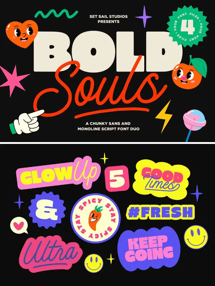
Typography dictates the emotional rhythm of visual design. Designers frequently search for tools that balance aggressive impact with elegant fluidity. The Bold Souls font duo offers exactly this dynamic interaction. Sam Parrett of Set Sail Studios crafted this pairing to solve visual monotony. It merges a heavy sans-serif with a fluid script. This combination grabs attention immediately. You need versatile assets that work harder than standard typefaces. The Bold Souls font duo delivers a cohesive aesthetic without requiring hours of manual adjustment. It streamlines the creative process significantly.
You can download the tpeface from these platforms:
Why Does the Bold Souls Font Duo Demand Your Attention?
Visual hierarchy remains the cornerstone of effective graphic design. The Bold Souls font duo masters this principle through extreme contrast. One half of the duo shouts while the other whispers elegantly. Consequently, the pairing creates immediate tension and interest. Sam Parrett understands that modern branding requires flexibility. Therefore, he included multiple variations within the typeface package. You get a Super Chunky Sans for the heavy lifting. Simultaneously, the Smooth Monoline Script provides the necessary flair. This interplay allows designers to construct logos that feel both vintage and contemporary.
You can download the tpeface from these platforms:
Analyzing the “Heavy Lifter”: Bold Souls Sans
Solid foundations build strong brands. The package features an extra chunky sans font that commands respect. This component utilizes uppercase-only characters for maximum authority. It anchors the design space. Furthermore, the designer included a thoughtful variation. Bold Souls font duo users can select the “Round” version. This alternative softens the edges. It transforms the vibe from industrial to approachable. Consequently, you can adapt the tone without changing the typeface family. The Sans component supports numerals and extensive punctuation. It creates the perfect stage for its script partner.

The Fluid Counterpart: Bold Souls Script
Rigid structures need organic movement. The script component of the Bold Souls font duo provides this essential contrast. It features a super smooth, monoline build. The cursive, connected characters flow seamlessly across the screen. Unlike the Sans, this script includes both uppercase and lowercase letters. Additionally, the package offers stylistic alternates. You can access ten alternate uppercase characters via the Glyphs panel. This feature adds a custom, hand-lettered feel to digital work. It prevents the text from looking too mechanical.
How Do the Bonus Swashes Elevate the Bold Souls Font Duo?
Customization separates professional design from amateur templates. The package includes a dedicated “Swash” font file. This unique addition allows for rapid embellishment. You simply install it as a separate font. Afterward, typing any character from A-Z generates a unique underline swash. The typeface package creates these swashes to fit the script perfectly.
Sam Parrett designed swashes A-F specifically for end-of-word styling. They join the final letter of your script text naturally. Conversely, swashes G-Z sit best on a new layer. You can position them underneath the main text for emphasis. This modular approach gives the Bold Souls font duo immense versatility. It invites you to experiment with composition.
Where Should You Utilize the Bold Souls Font Duo?
Context determines the success of typography. The Bold Souls font duo shines in high-impact environments. Think about merchandise design. The chunky Sans works brilliantly for catchy slogans on t-shirts. Meanwhile, the script adds a signature-style element. Social media overlays also benefit from the duo. The high legibility of the Sans cuts through busy background images.
Furthermore, the retro-modern aesthetic fits lifestyle branding perfectly. Coffee shops, indie apparel labels, and creative agencies will find the typeface package particularly useful. It conveys personality without sacrificing readability. However, designers should avoid using the script for long body text. The duo works best as a display solution.
Technical Specifications and Global Reach
Professional tools must work globally. The typefaces support a vast array of languages. It covers English, French, Spanish, German, and many others. From Danish to Indonesian, the font ensures your message travels. This extensive language support makes the package a viable choice for international campaigns.
Moreover, the technical execution implies high-quality standards. The curves remain smooth at large sizes. The kerning between the Sans characters feels tight and deliberate. Sam Parrett optimized these typefaces for modern design software. It functions smoothly in Adobe Illustrator, Photoshop, and even Canva.
Why This Duo Represents a Shift in Type Trends
Design trends currently favor nostalgia mixed with precision. The Bold Souls font duo captures this zeitgeist perfectly. It rejects the sterility of corporate minimalism. Instead, it embraces character and warmth. The package proves that typefaces can be fun yet professional.
You often see fonts that try to do too much. They fail to execute any single style well. In contrast, the Bold Souls font duo excels because it separates its duties. The Sans stays rigid; the Script stays fluid. They do not compete; they collaborate. This clearly defined relationship helps designers avoid visual clutter.
Maximizing Your Workflow with Bold Souls
Efficiency drives profit in the creative industry. The Bold Souls font duo reduces the time spent font hunting. Usually, designers waste hours testing different serif and sans pairings. This package solves that problem instantly. The package arrives pre-matched. You know the stroke weights will complement each other.
Additionally, the bonus swashes eliminate the need to draw underlines manually. You type a letter, and the graphic element appears. This feature alone makes the package a valuable asset for busy art directors. It creates a bespoke look with a few keystrokes.
You can download the tpeface from these platforms:
Final Thoughts on the Bold Souls Aesthetic
Every designer needs a reliable display pair in their arsenal. The pairing earns its place through utility and style. It balances weight, curve, and personality effectively. Whether you choose the sharp Sans or the friendly Round version, the impact remains strong. The typefaces empower creators to speak louder. It turns simple words into visual statements. If you seek a toolkit that injects soul into your typography, this duo delivers.
Frequently Asked Questions (FAQ)
What exactly is included in the package?
The package contains four distinct files: Bold Souls Sans (extra chunky), Bold Souls Sans Round (softened edges), Bold Souls Script (monoline cursive), and Bold Souls Swash (decorative underlines).
How do I use the swashes in the Bold Souls font duo?
You install “Bold Souls Swash” as a separate font. Type uppercase letters (A-Z) or lowercase (g-o) to generate different swash styles. Type A-F to join the end of script words. Place G-Z swashes on a separate layer underneath your text.
Does the Bold Souls font duo support languages other than English?
Yes, the fonts support a wide range of languages, including French, German, Italian, Spanish, Portuguese, Swedish, Norwegian, and many more.
Can I use the typefaces for commercial logos?
Generally, yes. Standard licenses usually cover commercial use, like logos and branding. However, you should always check the specific license terms from the marketplace where you purchase the Bold Souls font duo.
Is the duo compatible with Canva?
Yes, if you have a Canva Pro account or a similar service that allows custom font uploads, you can upload the Bold Souls font duo files (.otf or .ttf) and use them in your designs.
How do I access the alternate characters in the script font?
You can access the 10 alternate uppercase characters by turning on ‘Stylistic Alternates’ in your design software or by selecting them manually via a Glyphs panel.
Check out other stunning typefaces on WE AND THE COLOR or take a look at our selection of the 100 best fonts for graphic designers in 2026.
Subscribe to our newsletter!


