
This post contains affiliate links. We may earn a commission if you click on them and make a purchase. It’s at no extra cost to you and helps us run this site. Thanks for your support!
Discover Why the Pavilion Serif Font is the Essential Typeface for Modern Editorial and Brand Identity.
Typography defines the voice of a brand before a reader processes a single word. Designers constantly hunt for that elusive balance between historical weight and contemporary sharpness. The Pavilion serif font delivers this exact equilibrium with surprising confidence. God Control has crafted a typeface that feels instantly timeless yet distinctly current. It does not just sit on the page; rather, it performs. You rarely find a Pavilion typeface alternative that manages such a rhythm. Therefore, this typeface deserves a closer look from serious typographers and creative directors alike.
The typeface is available for a very low budget from:
Why Does the Pavilion Serif Font Demand Your Attention?
Designers often struggle to find a serif that works for both punchy headlines and dense body copy. Why does the Pavilion serif font succeed where others fail? The answer lies in its intentional duality. God Control designed every curve and cut to serve a specific purpose. Consequently, the font marries refinement with flow. It offers a unique visual texture that keeps long-form text readable while giving headlines a necessary jolt of energy.
The typeface is available for a very low budget from:
Most modern serifs lean too heavily into minimalism or get bogged down in excessive ornamentation. However, the Pavilion serif font walks the line perfectly. It respects the grid but is not afraid to break visual monotony. If you value precision, this font speaks your language. Moreover, it brings a human touch to digital interfaces, something usually lacking in stark, geometric designs.

Analyzing the Anatomy of a Modern Classic
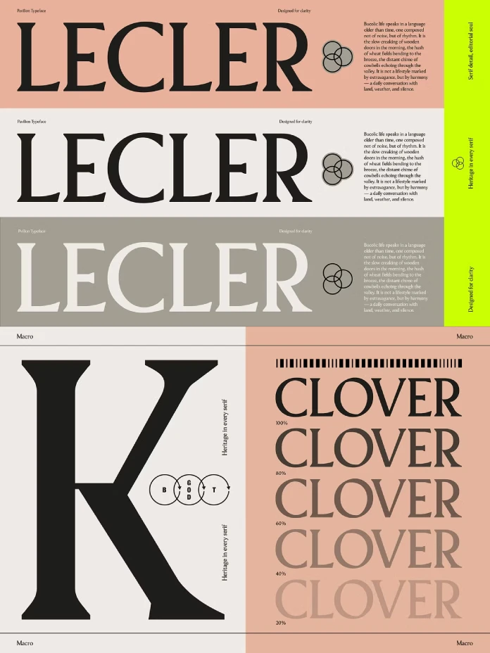
You must understand the mechanics to appreciate the beauty. The Pavilion serif font features lowercase letters with incredibly soft curves. These curves contrast beautifully with the sharp cuts of the serifs. Additionally, the spacing is balanced meticulously. This ensures that the Pavilion serif font maintains its integrity even at smaller sizes.
The Role of X-Height and Rhythm
A defining feature of the Pavilion serif font is its perfect x-height. This specific proportion makes paragraphs read like butter. Your eyes glide across the text without stumbling. God Control fine-tuned every character to keep the flow on lock. Therefore, the texture of a block of text feels consistent and soothing.
Furthermore, the uppercase letters bring a different energy. They are strong and balanced but avoid feeling heavy or clunky. The Pavilion serif font uses these bold uppercase forms to anchor designs. They command attention without shouting.
Versatile Applications for the Pavilion Serif Font
Versatility often separates a good font from a great one. Fortunately, the Pavilion serif font belongs everywhere. You can deploy it effectively in high-end magazines where elegance is paramount. Similarly, it works wonders in packaging design. The Pavilion serif font adds a layer of sophistication to physical products that consumers want to touch.
Digital and Print Consistency
Web designers will appreciate the included web font formats. The Pavilion serif font renders crisp on screens, making it a top contender for best serif for long-form text on the web. It is rare to find a Pavilion serif font competitor that transitions so seamlessly from print branding to responsive web layouts.
You receive a complete package with this purchase. The set includes Pavilion_Regular in OTF, TTF, WOFF, and WOFF2 formats. Additionally, it features 215 total characters, covering special characters and punctuation. Thus, the Pavilion serif font handles complex editorial requirements with ease.
Elevating Brand Identity with God Control
Using the Pavilion serif font is a statement. It says that you value tradition but look toward the future. God Control created a tool that empowers you to control the narrative. When you choose the Pavilion serif font, you own the visual space.
Consider the emotional impact of your typography. A generic font blends in, but the Pavilion serif font stands out. It establishes authority. Branding typography needs to be memorable. Therefore, utilizing this modern serif typeface gives your project a distinctive voice.
Practical Implementation
Integrating the Pavilion serif font is straightforward. The files are ready for immediate use. You can drop them into your font book and start designing instantly. Whether you are building a lifestyle blog or a corporate identity, the Pavilion serif font adapts to the context.
Designers searching for readable fonts for websites will find a solution here. The Pavilion serif font maintains clarity on various display types. This technical reliability matches its aesthetic appeal.
Final Thoughts on the Pavilion Serif Font
We see many fonts released every week, but few leave a lasting impression. The Pavilion serif font by God Control breaks through the noise. It offers a masterclass in balance. The soft curves invite readers in, while the strong structure keeps them engaged.
If you want to elevate your design game, you need this tool. The Pavilion serif font is that serif you didn’t know you needed—until now. It represents the intersection where tradition meets modern edges. Own it. Ctrl it.
Frequently Asked Questions
What file formats are included with the Pavilion Serif font?
The download includes Pavilion_Regular.otf, Pavilion_Regular.ttf, Pavilion_Regular.woff, and Pavilion_Regular.woff2. These formats ensure compatibility across print and web projects.
Is the Pavilion serif font suitable for body text?
Yes, absolutely. The Pavilion serif font features a perfect x-height and balanced spacing. These features make it highly readable for long-form articles and books.
Does the Pavilion serif font include special characters?
Yes, the font comes with 215 total characters. This set includes standard punctuation and special characters needed for professional typesetting.
Can I use the Pavilion typeface for website design?
Definitively. The package includes WOFF and WOFF2 files. These files are optimized for fast loading and crisp rendering on modern web browsers.
Who designed the Pavilion serif font?
God Control designed this typeface. They focused on creating a balance between soft curves and strong, modern edges.
The typeface is available for a very low budget from:
All images © God Control. Check out WE AND THE COLOR’s Fonts category or take a look at our review of the 100 best typefaces for graphic designers in 2026.
Subscribe to our newsletter!


