
This post contains affiliate links. We may earn a commission if you click on them and make a purchase. It’s at no extra cost to you and helps us run this site. Thanks for your support!
The Brinell Font Family Is a Slab Serif Built to Resist Cold Precision
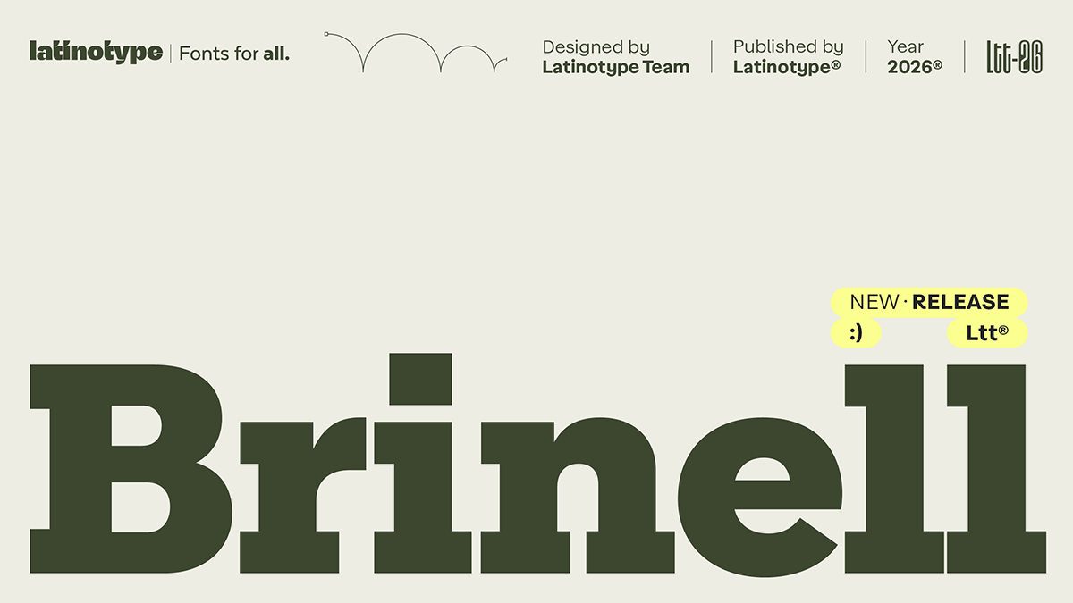
The Brinell font family argues against the sterile slab serif, and I side with it. Latinotype started from the Rockwell blueprint, then loosened a few bolts on purpose. Most industrial slabs flex muscle and skip personality. Brinell does the opposite. It looks mechanical from across the room. Up close, it reads as human.
This matters now because clients keep asking for “warm but strong.” Few typefaces deliver both. The Brinell font family does, and it earns that claim through specific drawing decisions. I will name them, and I will say where I would hesitate.
What Is the Brinell Font Family?
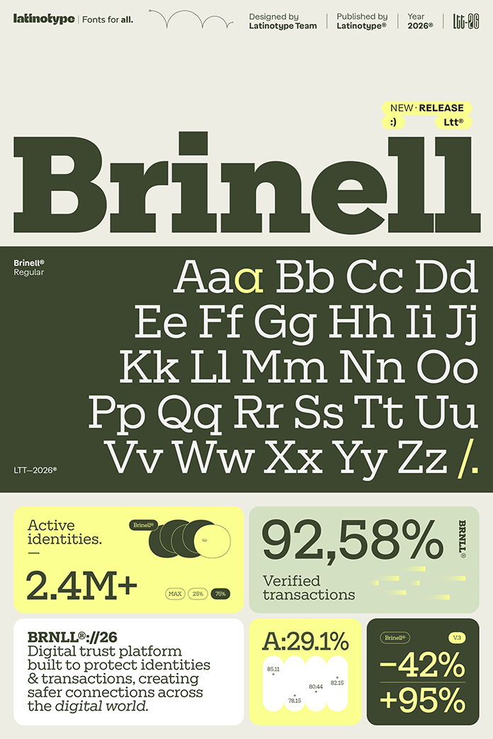
The Brinell font family is an industrial slab serif from the Chilean foundry Latinotype. The Latinotype Team designed it, and MyFonts distributes it. The family covers eight weights, from ExtraLight to Black. Every weight has a matching italic, so you get 16 styles. The character set holds 512 glyphs. Standard ligatures, fractions, ordinals, and superscripts sit inside it too.
Why Does a Typeface Carry the Name of a Hardness Test?
Johan August Brinell developed the Brinell hardness scale in 1900. It measures how well a material resists deformation. Latinotype borrowed the name because the typeface holds its shape under pressure. The Brinell font family does not buckle where it should stay firm. I like a name that makes a promise the letters can keep.
How Does the Brinell Font Family Differ From Rockwell?
Rockwell is the obvious ancestor. Monotype released it in 1934, and designers still reach for it when they want a geometric slab. Latinotype did not copy it. The team reworked proportions and details, removed some expected serifs, softened the contrast, and gave the curves stronger geometry. So the Brinell font family works as a Rockwell alternative with its own handwriting.

Fewer Serifs, Clearer Shapes
Removing serifs sounds risky for a slab. Slabs live on their feet. Yet Brinell trims only where a letter stays readable without help. The silhouette gets cleaner at headline sizes. This is the first rule of what I call the Warm Slab Principle: a slab serif earns trust when it breaks its own rules in a few deliberate places.
Numerals Without Their Usual Serifs
The figures drop serifs where you would expect them. That choice should keep prices and dates calm on a packaging label. Dense numerals often turn spiky in slab faces. Brinell avoids that habit.
The Stylistic Set and the Final “a”
A stylistic set swaps in an alternate character. It changes the voice without upsetting the system. Latinotype also built in deliberate inconsistencies, such as the treatment of the letter a at the end of a word. Corrected, precise fonts usually lose warmth because every glyph obeys. Brinell lets a few glyphs misbehave. I call this approach controlled irregularity. It gives the Brinell font family a pulse.
Where Does the Brinell Font Family Work Best?
Use it where strength must feel friendly. Craft breweries, workshop brands, hardware packaging, and magazine headlines all fit. A Black weight on a poster delivers weight without aggression. The lighter weights suit captions and short deck text. For example, an ExtraLight italic could carry a pull quote beside a Black headline. I would test ExtraLight on screens before promising anything to a client, because thin slabs can look brittle at small sizes.
Pairing Brinell With a Quiet Sans
Slab serifs hate competition. Pair this one with a neutral grotesque for body copy. Inter or Helvetica Now would stay out of the way. Then let the Brinell font family handle titles and numbers. A single slab voice gives a layout a spine.
A Slab Serif Font for Branding
Brand teams often want a slab serif font for branding that feels trustworthy and approachable. Brinell fits that brief. Eight weights give an identity system room to build hierarchy without a second family. The italics add a quieter register for taglines. I expect more identity work to favor warm industrial slabs over cold geometric sans through 2027. Call it a bet.
What Is the Weak Spot of the Brinell Font Family?
Long text. Slab serifs tire the eye in paragraphs, and I would not set a novel in Brinell. At small sizes, I would add extra tracking, because heavy slabs crowd quickly. Still, a typeface built for character should not apologize for that. Every industrial slab serif font makes the same trade.
Brinell Font Family at a Glance
| Attribute | Detail |
|---|---|
| Typeface | Brinell font family |
| Foundry | Latinotype |
| Designer | Latinotype Team |
| Distributor | MyFonts |
| Classification | Industrial slab serif |
| Name origin | Brinell hardness scale, developed by Johan August Brinell in 1900 |
| Reference point | Rockwell and classic industrial slab serifs |
| Weights | Eight, from ExtraLight to Black |
| Styles | 16, each weight with a matching italic |
| Glyphs | 512 |
| Features | Standard ligatures, fractions, ordinals, superscripts, stylistic set |
| Signature details | Fewer serifs, softer contrast, serif-free numerals, a distinct final a |
| Best use | Branding, packaging, posters and editorial headlines |
| Main caution | Long text and ExtraLight at small sizes |
What I Think of the Brinell Font Family
I would license it for any project with real hardware in it. Tools, tins, workshops, and engines. The Brinell font family fits those subjects because it looks built, not decorated. Many slabs shout. This one holds a conversation.
Common Questions About the Brinell Font Family
What is the Brinell font family?
The Brinell font family is an industrial slab serif by Latinotype. It offers eight weights, matching italics, and 512 glyphs.
Who designed the Brinell font family?
The Latinotype Team designed it. Latinotype is the foundry, and MyFonts lists it.
How did the Brinell font family get its name?
It takes its name from the Brinell hardness scale. Johan August Brinell developed that scale in 1900 to measure resistance to deformation.
Is Brinell a good Rockwell alternative?
Yes. Latinotype based the design on classic industrial slabs such as Rockwell. It then softened the contrast, removed some serifs and sharpened the curves.
How many styles does the Brinell font family include?
It includes 16 styles. Eight weights run from ExtraLight to Black, and each has an italic.
Does the Brinell font family work for body text?
I would not use it for long passages. Set it in headlines, numerals, and short deck text, and pick the Black weight when you want the strongest effect.
Browse WE AND THE COLOR’s Fonts category for more.
Subscribe to our newsletter!