This post contains affiliate links. We may earn a commission if you click on them and make a purchase. It’s at no extra cost to you and helps us run this site. Thanks for your support!
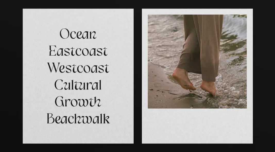
The Vinnes Display typeface, designed by Haris Purnama Putra and Egi Ahmad Mufid of Typetemp Studio, is a modern exploration of classical serif aesthetics, thoughtfully reimagined for contemporary applications. This typeface stands out with its elegant proportions, high contrast between thick and thin strokes, and a distinct, almost calligraphic flair. It draws inspiration from traditional serif fonts but infuses them with fluidity and modernity, making it a versatile choice for various design needs.
The overall style of Vinnes Display can be described as refined and sophisticated, with an undercurrent of romanticism. The font’s delicate curves and sharp terminals evoke the grace of historical serif typefaces, yet it maintains a fresh, modern appeal. The letterforms exhibit a dynamic rhythm, particularly in the alternates and ligatures, which add a touch of personality and playfulness to the otherwise classical structure. These features make Vinnes Display particularly suitable for projects that require a balance of elegance and creativity, such as luxury branding, editorial design, and high-end invitations.
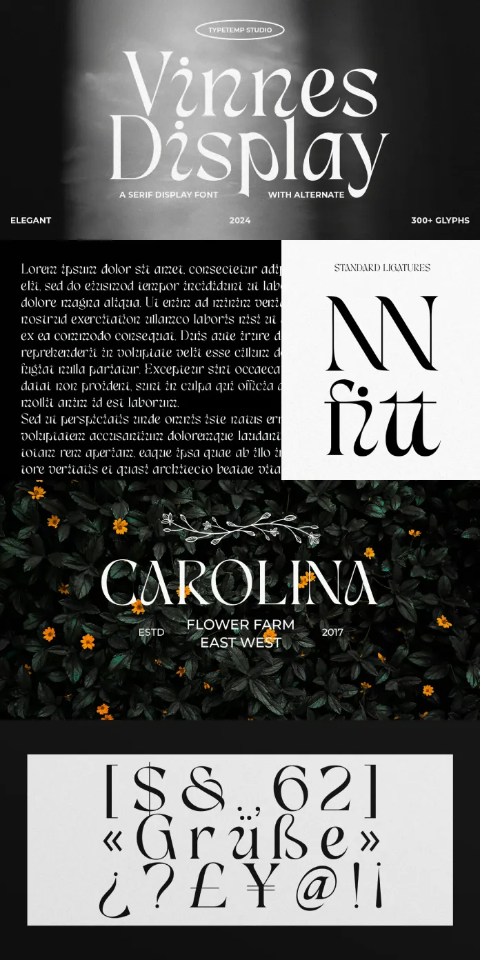
One of the key strengths of Vinnes Display is its versatility. The font includes a wide range of alternate characters and ligatures, allowing designers to customize their work and create unique typographic compositions. This adaptability is particularly valuable in logo design, where the ability to craft distinctive wordmarks is crucial. Moreover, the font’s extensive glyph set supports a variety of languages, enhancing its usability in global projects.
In application, Vinnes Display excels in creating striking visual hierarchies, thanks to its strong contrast and commanding presence. It is ideal for headlines, pull quotes and other display uses where the type needs to draw attention. However, it is also capable of performing well in shorter blocks of text, especially when used in branding or editorial layouts where the visual quality of the type is paramount.
In conclusion, Vinnes Display is a typeface that masterfully bridges the gap between the classical and the contemporary. Its elegant design, combined with a rich set of alternates and ligatures, makes it a powerful tool for designers seeking to create sophisticated and memorable visual content. Whether used in logos, branding projects, or editorial designs, Vinnes Display offers a timeless appeal with a modern twist, making it a valuable addition to any designer’s type library.
All images © by Typetemp Studio. Feel free to find other new typefaces on WE AND THE COLOR.

