This post contains affiliate links. We may earn a commission if you click on them and make a purchase. It’s at no extra cost to you and helps us run this site. Thanks for your support!
In 2025, the graphic design landscape is (once again) set for a transformative shift. Designers today face a unique opportunity to merge the familiar with the futuristic, creating visuals that resonate emotionally yet push creative boundaries. Current graphic design trends reflect a variety of influences: from the surge of AI-assisted design tools enhancing efficiency and sparking creativity to nostalgia-driven aesthetics that revisit retro-futuristic themes, each trend plays a crucial role in redefining modern design. Designers are now at the crossroads of art and technology, where they can harness powerful tools to produce engaging, personalized, and memorable visual experiences.
The digital transformation is setting a new standard, with hyperrealistic graphics meeting the simplicity of minimalism, while dark mode and colorful gradients create impactful, high-contrast visuals. With kinetic typography, text itself becomes part of the storytelling, animating words to engage viewers on a dynamic level. This movement toward interactivity signals a shift in how audiences connect with content; designs no longer sit static on the page but engage the viewer, responding to user actions or even adapting to their needs. In parallel, accessibility and inclusivity have moved to the forefront. As brands seek to reach broader audiences, designers are compelled to create interfaces and graphics that are universally accessible, from high-contrast visuals to adaptable fonts, ensuring a positive experience for all users.
The integration of AR is adding another layer of interactivity, bringing physical and digital spaces together in ways previously limited to science fiction. This immersive technology is allowing designers to transform print and digital experiences into interactive journeys, where the line between reality and digital content blurs. Meanwhile, sustainability has emerged as more than just a fleeting interest—it has become a design imperative. Eco-friendly materials, earthy color schemes, and eco-conscious design elements now resonate with a growing audience of consumers who prioritize environmental responsibility. Brands that embrace this shift contribute to a positive societal impact while strengthening their connection with eco-conscious audiences.
As we delve into the following selection of the 10 best graphic design trends for 2025, it becomes clear that this is a year for embracing innovation, revisiting the past with a modern twist, and putting the user experience at the center of every visual decision. These graphic design trends represent a fusion of technology, art, and social awareness, marking a new era in design that is visually striking as well as deeply attuned to the values and expectations of today’s audiences. For brands and creatives looking to remain relevant and compelling, understanding these emerging graphic design trends is key to creating work that is not only aesthetically pleasing but also culturally resonant and user-focused. This detailed guide explores each trend, providing an in-depth analysis to help designers and brands navigate the evolving landscape of graphic design in 2025.
- AI-Assisted Design Tools
- Hyperrealism Meets Minimalism
- Retro-Futurism
- Dark Mode Enhanced by Colorful Gradients
- Kinetic Typography
- Inclusive and Accessible Design
- Customizable 3D Elements
- Experimental Fonts and Fluid Typography
- Augmented Reality Integration
- Eco-Friendly and Sustainable Design
1. AI-Assisted Design Tools: A New Era of Creative Efficiency
AI has evolved beyond experimental tech to become a cornerstone of the design process. In 2025, this technology promises a profound impact on how designers approach their work. It pushes current graphic design trends to unprecedented heights. AI-assisted design tools are reshaping workflows by elevating the creative possibilities within graphic design. These tools, including generative AI models and smart design assistants, analyze vast amounts of data in real-time, allowing designers to ideate, prototype, and execute with unprecedented speed and accuracy. AI algorithms can now analyze user behavior, drawing insights from patterns, demographics, and preferences to help designers make data-backed decisions. As a result, designers are better equipped to meet their audiences’ needs while also experimenting more freely with creative concepts.
One of the most notable advantages of AI-assisted tools is their ability to streamline repetitive or time-intensive tasks. These tools offer everything from automatic background removal and smart cropping to layout adjustments based on design principles, freeing up designers to focus on concept development and strategic work. For instance, AI can quickly adjust layouts, select color palettes, or even generate typography variations that align with a brand’s tone. This automation of technical tasks allows designers to concentrate on higher-level creative elements, such as narrative and messaging, while ensuring that final visuals are polished and coherent.
AI-driven tools also facilitate real-time collaboration, making remote work more efficient. Designers can share progress instantly, with clients or team members receiving suggested changes or personalized previews within seconds. Additionally, as AI tools integrate with popular design software like Adobe Creative Cloud and Figma, they offer an increasingly intuitive experience. Many of these platforms can provide instantaneous feedback on balance, composition, and contrast, reducing the need for back-and-forth adjustments. With such intuitive support, designers can fine-tune details, experiment with unconventional ideas, and review variations more quickly than ever before.
Those AI-generated designs are also making waves in personalization, as they allow for highly customizable user experiences. Through dynamic content creation, AI can help designers build tailored visuals that adapt to different audience segments. For example, e-commerce platforms can use AI to generate personalized graphics based on a user’s previous interactions, interests, or demographic data, leading to a more engaging and targeted customer experience. Additionally, AI-driven predictive analytics mean designers can proactively adapt campaigns based on forecasted trends, making designs relevant and fresh.
While some skeptics worry about the potential for AI to limit creativity, these tools actually empower designers by taking over technical tasks and freeing up time for innovation. For instance, generative AI models enable designers to experiment with novel compositions or suggest inspiration from unrelated fields, opening doors to creativity that might otherwise remain unexplored. The availability of these tools enables designers to refine skills, explore different design languages, and elevate their craft without sacrificing productivity.
The result of these advancements is a design landscape where the line between human creativity and machine precision becomes increasingly collaborative. AI-driven tools act as creative partners, expanding the boundaries of what’s possible within graphic design. As we move further into 2025 with additional graphic design trends, it is clear that AI will be essential for designers looking to keep pace with the rapid changes in the field, allowing for an efficient and inventive approach to visual storytelling. For brands and creatives, AI-assisted design tools are more than just a trend; they’re a critical asset for those looking to produce impactful, agile, and forward-thinking work.
2. Hyperrealism Meets Minimalism: The Contrast of Rich Texture and Clean Lines
As graphic design enters 2025, the fusion of hyperrealism and minimalism is emerging as a defining aesthetic that captures attention through the balance of intricate detail and simplicity. This trend embodies the best of both worlds, combining the striking realism of fine textures and lifelike details with the clarity and elegance of minimalist layouts. By incorporating hyperrealistic elements, such as meticulously crafted shadows, three-dimensional textures, and true-to-life materials, designers create a tactile visual experience that draws viewers in. Paired with minimalistic design principles, these hyperrealistic details stand out with even greater impact, guiding the viewer’s eye toward the essential message without distraction.

Hyperrealism in design has evolved significantly, with advances in digital tools allowing designers to replicate real-world textures with incredible accuracy. From intricate leather grains and fabric weaves to polished metal surfaces and organic wood finishes, each hyperrealistic element is crafted to evoke a sense of physicality and depth. These details allow viewers to experience designs that almost feel tangible, adding an immersive quality to what might otherwise be a static image. For instance, an advertisement for a luxury product might showcase the realistic glint of a metallic logo on a minimalist backdrop, immediately conveying sophistication and exclusivity. This blending of textures provides a multi-sensory experience that communicates quality and elegance in a way that minimalism alone may not achieve.
Despite the high level of detail, this trend maintains the simplicity characteristic of minimalist design, creating a focused and harmonious composition. By setting hyperrealistic textures against open spaces or flat color backgrounds, designers prevent visual clutter and keep the audience focused on the key message. This contrast between realism and minimalism produces a striking visual hierarchy, where each detail becomes a focal point and the overall layout remains clean and easy to digest. This approach is especially effective in digital interfaces, where users appreciate clarity and immediacy, but also want visually engaging experiences. Hyperrealistic details highlight key elements without overwhelming the design, allowing users to process the content intuitively.
The hyperrealism-meets-minimalism trend also caters to audiences increasingly seeking authenticity in brand communications. By presenting hyperrealistic visuals within minimalist contexts, brands convey transparency, trustworthiness, and a sense of grounding. For example, a skincare brand might use hyperrealistic imagery to showcase product textures, such as smooth creams or delicate botanical ingredients, against a simple, uncluttered background. This approach grabs attention and speaks directly to the senses, making the product feel tangible and approachable. Minimalism keeps the presentation clean, while hyperrealism adds an authentic, believable quality that resonates with audiences looking for genuine brand experiences.
In web and app design, this trend enhances the user interface by providing visual depth without sacrificing functionality. By applying hyperrealistic elements sparingly—such as realistic shadows on buttons or subtle textures on icons—designers can introduce dimension to otherwise flat interfaces. These enhancements make buttons, icons, and interactive elements more intuitive and visually engaging, helping users navigate digital spaces with ease. The restrained use of hyperrealistic textures within a minimalist framework aligns with usability best practices, as users can focus on key information while experiencing subtle visual cues that improve comprehension and interaction.
This trend’s appeal also lies in its versatility across various industries and design formats. In print design, hyperrealistic textures can elevate minimalist posters, brochures, or packaging, making them feel premium and polished. Similarly, in digital advertising, brands can use these hyperrealistic details to create a sense of luxury or innovation, standing out in a crowded visual landscape. By using textures strategically, designers give brands a unique way to convey values such as quality, durability, or exclusivity. For example, a tech company may showcase hyperrealistic circuit board patterns within a minimalist ad to convey both high precision and cutting-edge technology, appealing to a tech-savvy audience.
As a hybrid of two powerful aesthetics, the hyperrealism-meets-minimalism trend requires a careful balance. Successful designs in this style are precise in their use of detail and selective with the placement of hyperrealistic elements. Too much realism can overwhelm the minimalist space, while too little may lack the immersive quality that defines this trend. Designers are tasked with finding that equilibrium, using hyperrealistic textures to punctuate the layout without overpowering it. This precision-driven approach calls for an understanding of both aesthetics, as well as a clear vision for how they should interact to achieve the intended effect.
In 2025, this graphic design trend represents more than a style choice; it embodies the shifting preferences of modern audiences toward visually rich, yet elegantly simple designs. By marrying hyperrealistic textures with minimalist layouts, designers cater to viewers’ desire for depth and clarity, achieving an aesthetic that feels both innovative and timeless. Brands that adopt this approach are likely to find success, as the combination of immersive details and streamlined compositions offers a memorable and accessible visual experience. This aesthetic of refined simplicity, enriched by tactile details, will likely become a key design language for brands aiming to captivate and connect with audiences in a sophisticated, authentic manner.
3. Retro-Futurism: Nostalgia with a Visionary Twist
The retro-futuristic aesthetic is making a strong comeback in 2025, blending elements from past visions of the future with today’s technological advancements. This trend is characterized by a stylistic fusion of mid-century modernism, neon-lit cyberpunk, and optimistic visions of the future from the 1960s through the 1980s, wrapped in a contemporary digital context. As society grapples with rapid technological shifts and an uncertain future, retro-futuristic design offers a comforting bridge between nostalgia and innovation. It allows designers to look back while reimagining what lies ahead, creating a unique aesthetic that resonates deeply with audiences who find familiarity and intrigue in these juxtapositions.
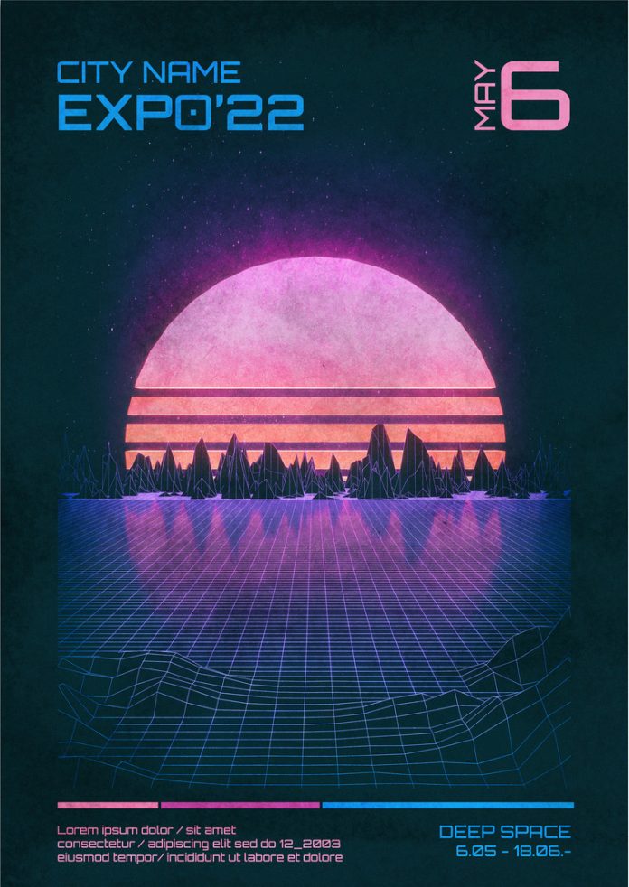
One of the primary features of retro-futurism is its bold, often saturated color schemes that evoke a sense of optimism and energy. Color palettes are often inspired by vintage sci-fi films, arcade games, and early computer interfaces, featuring neon blues, hot pinks, electric greens, and chrome effects. These vibrant colors add excitement and intensity to designs, capturing the audience’s attention instantly. The use of these colors in digital design, especially on websites, apps, and branding, helps invoke a sense of adventure and discovery. For instance, a brand aimed at tech-savvy young adults may use neon and chrome to evoke the thrill of early arcade games or ’80s pop culture, creating an experience that feels both nostalgic and forward-thinking.
In addition to color, retro-futuristic aesthetics are defined by their distinct shapes and forms, often inspired by mid-century modernism and industrial design. Geometric shapes, rounded edges, and clean, streamlined lines are common, reminiscent of the “space age” designs from the 1950s and 60s. These shapes are often combined with futuristic textures like chrome, polished steel, and reflective surfaces, creating a sleek, mechanical look. Designs may feature stylized spaceships, atomic motifs, or robotic imagery, which lend a playful, almost whimsical quality to the visuals. This combination of shapes and textures creates a look that is both imaginative and cohesive, providing a sense of structure within an otherwise abstract and conceptual aesthetic.
Typography in retro-futurism is another defining element, often borrowing from vintage sci-fi movie posters and early computer fonts. Designers favor bold, sans-serif typefaces with wide kerning, chunky letters, and often include subtle pixelation or glitch effects to evoke early digital aesthetics. Fonts inspired by CRT monitors, dot matrix printers, and arcade machines are also common, adding a distinctively nostalgic yet tech-inspired feel to the visuals. For instance, a brand looking to evoke a sense of innovation through nostalgia might use bold, pixelated typefaces in combination with futuristic gradients, capturing the spirit of retro computing and arcade culture. This approach makes typography an active component of storytelling, as each letter or word reinforces the theme of “future-past.”
Retro-futurism is also notable for its embrace of “low-fi” digital effects, which echo the analog textures and imperfections of earlier technology. Pixelation, grainy textures, VHS glitch effects, and scanlines are commonly used to add character and a sense of authenticity to the design. Rather than perfect, polished images, retro-futuristic designs often intentionally include “flaws” to mimic older technologies, celebrating the era before digital perfection became standard. This analog approach in a digital age resonates with audiences who appreciate the raw, unfiltered feel of earlier media. These imperfections not only add nostalgia but also create an intimate, almost tactile experience, as viewers can “feel” the texture and imperfections that remind them of a different era.
In motion graphics and web design, retro-futurism’s appeal is amplified through animation and interactivity. Designers often integrate subtle animations like glitch effects, flickering neon lights, or robotic movements to make the retro-futuristic experience more dynamic. On websites, hover effects, rotating objects, and interactive interfaces with retro elements like pixelated icons or simulated screens provide a playful, engaging experience. For example, a brand might create an immersive website that mimics a vintage arcade game or sci-fi control panel, where users can click and interact as if they are navigating a retro-futuristic world. This type of immersive experience enhances user engagement, encouraging visitors to explore and spend more time interacting with the brand.
In product design, packaging, and branding, retro-futurism has become popular for products that aim to blend innovation with nostalgia. It’s especially effective for consumer electronics, gaming, and lifestyle brands targeting tech-savvy, nostalgia-prone audiences. Product packaging might incorporate holographic foils, metallic finishes, or vintage sci-fi-inspired illustrations to evoke a sense of wonder and timelessness. Some brands use this aesthetic to playfully suggest that their products are “from the future,” with labeling that mimics control panels or adds vintage sci-fi-style instructions. This approach doesn’t just appeal visually but also emotionally, reminding consumers of the optimistic, imaginative visions of the future they may have seen in classic films, books, and games.
The retro-futuristic trend also speaks to deeper cultural themes. As technology advances rapidly, people often seek comfort in familiar aesthetics that evoke simpler times. Retro-futurism offers a way to confront the future with optimism, drawing on past depictions of tomorrow that were full of wonder and excitement. It taps into a sense of collective nostalgia, reminding audiences of an era when the future felt like a place of endless possibility rather than a source of stress or uncertainty. For many, these visuals rekindle a childlike curiosity and fascination with space exploration, robots, and flying cars, making the future feel exciting and inviting once again.
In 2025, the retro-futuristic aesthetic represents more than just a style—it’s a cultural bridge. By merging the optimism of past eras with the sophistication of modern design tools, this trend brings a sense of hope and playfulness back into contemporary design. Brands and designers who embrace retro-futurism effectively communicate innovation while tapping into the emotional appeal of nostalgia. The result is a memorable, visually rich aesthetic that captivates audiences by making the future feel both familiar and thrilling. It’s one of the graphic design trends we are super excited about!
4. Dark Mode Enhanced by Colorful Gradients: The Depth of Digital Nightscapes
Dark mode has become a staple in digital design, and in 2025, this feature is evolving to incorporate striking, colorful gradients that create vivid, almost otherworldly nightscapes. By combining the elegance of dark mode with vibrant gradient overlays, designers are transforming what was once a simple color inversion into a sophisticated visual experience that engages users through depth, color, and contrast. This blend of dark backdrops with radiant colors enhances aesthetics as well as improves readability and reduces eye strain, making it both functional and visually captivating. As user demand for customizable digital interfaces grows, these enhanced dark mode designs are capturing attention across websites, apps, and social media platforms.
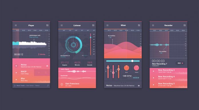
One of the most distinctive characteristics of dark mode enhanced with gradients is the striking contrast created between light and dark elements. Gradients in this context don’t just fill spaces; they are carefully layered to create a sense of depth and dimension within a digital interface. Colors such as electric blues, purples, neon pinks, and deep greens emerge vividly against black or dark gray backgrounds, creating an atmospheric, almost cinematic feel. These color transitions are often smooth and multidimensional, using subtle shifts in hue and saturation to make each gradient seem as though it’s glowing against the darkness. This effect is particularly popular in mobile apps and gaming interfaces, where the vivid gradients not only draw the user’s attention but also enhance the immersive experience of the content.
In practical applications, these dark-mode gradients are used to elevate everything from UI buttons and icons to full-screen backgrounds. Designers are experimenting with gradient overlays that bring light to specific areas of the screen, directing users’ attention to key elements while creating visual interest. For instance, in a music app, a gradient that shifts from deep indigo to vibrant magenta might be used to highlight the play button, creating an inviting focal point. Similarly, in streaming services or social media platforms, dark-mode gradients are used in notification banners, buttons, and navigation bars, making them pop without overwhelming the user with brightness. This strategic use of gradients enables designers to maintain a sleek, modern aesthetic that’s pleasing to the eye and easy to navigate.
Another key element of this trend is the integration of motion effects and interactive elements. Designers are increasingly adding subtle animations to these dark-mode gradients, making them shift, shimmer, or pulse as users interact with the interface. These animations can mimic real-life lighting effects, such as the way colors change under shifting lights or how they might reflect off various surfaces. For example, a gradient might slowly transition from teal to purple when a user hovers over a menu option, or a button might emit a faint glow when tapped. These animated effects add a layer of dynamism to the design, engaging users and making interactions feel intuitive and satisfying. For web designers, this trend offers a way to enrich user experience without adding excessive visuals or crowding the screen, as the gradients are generally restrained and seamlessly integrated into the dark backdrop.
From an accessibility perspective, dark mode enhanced with colorful gradients can improve readability and reduce screen glare. By softening the visual impact of a fully dark background with subtle gradient transitions, designers create a more comfortable viewing experience, especially in low-light conditions. This is particularly beneficial for users who spend extended time on digital devices, as dark backgrounds are known to reduce eye strain compared to lighter interfaces. Gradients also help in differentiating sections of content, especially when vibrant colors are used to mark distinct areas within the app or website. These visual cues allow users to navigate more intuitively, helping them quickly locate features or information without overwhelming them visually.
In branding, dark mode gradients are proving to be a powerful tool for creating modern, memorable identities. Many brands are using these nightscape-inspired designs to convey a sense of sophistication and innovation, particularly those in technology, fashion, and entertainment sectors. The blend of dark tones with vivid colors lends itself to futuristic aesthetics, making it ideal for brands aiming to appear cutting-edge. For instance, a tech company might use gradients from blue to purple to create a digital “galaxy” background for their app or website, giving users the impression of exploring an advanced, virtual environment. This approach also works well for brands in the creative industries, as dark-mode gradients allow for a flexible, visually striking design that can be adapted to a variety of marketing materials, from web pages to social media posts.
Designers are also exploring how dark-mode gradients can be used to reflect brand personality and mood. In product design, for example, a fitness app might use vibrant reds and oranges to create an energetic, motivating atmosphere, while a meditation app might use calming blues and greens to create a soothing effect. The gradient choices can help communicate the brand’s values and intentions, making it easier for users to form an emotional connection. Because these gradients can range from bold to subtle, they provide a versatile design tool that can be tailored to different types of user experiences, from lively and active to calm and reflective.
Dark mode enhanced with gradients has also gained popularity in digital art and content design, where it’s used to create stunning visual compositions. Social media graphics, particularly those on visually-driven platforms like Instagram and Pinterest, are embracing these rich gradients to create dramatic, eye-catching content that stands out on users’ feeds. Artists and content creators can use these gradients as digital canvases, blending multiple colors in a way that feels both artistic and accessible. This approach is especially effective for posts that aim to capture a mood or theme, such as nightscapes, space, or neon cityscapes. With the right color choices, these visuals can evoke powerful emotions, whether it’s a sense of wonder, calm, or excitement, enhancing the overall impact of the message.
In summary, dark mode with colorful gradients is an aesthetic choice and a versatile tool that enhances functionality, accessibility, and brand personality. By layering vibrant colors over dark backgrounds, designers create depth and movement that engage users on multiple levels. These nightscape-inspired visuals offer a fresh, immersive way to interact with digital spaces, appealing to a generation increasingly drawn to sleek, modern interfaces that offer more than mere functionality. As designers continue to explore and innovate within this trend, dark-mode gradients are likely to become an even more integral part of digital design, transforming how we experience digital environments from night-inspired calm to vivid dynamism.
5. Kinetic Typography: Typefaces that Capture Attention and Tell Stories
Kinetic typography, or animated text, is emerging as a powerful design tool in 2025, allowing brands and creators to capture attention and tell stories in a way that static text simply cannot. By adding motion to typography, designers can convey emotion, highlight critical points, and bring words to life, transforming text into a storytelling device that engages viewers on multiple levels. Unlike traditional typography, kinetic text plays with rhythm, speed, and style to evoke specific responses, whether it’s excitement, suspense, or curiosity. As more digital platforms embrace dynamic elements, kinetic typography is quickly becoming a staple in web design, social media, advertising, and mobile apps, providing brands with a unique way to make their messaging unforgettable.
At its core, kinetic typography brings energy to a design. By animating text, designers can make words appear to jump, stretch, fade, or rotate, adding a layer of drama that draws the eye. This type of motion can guide the viewer’s gaze, directing them to key information in a sequence that reinforces the message. For instance, in a brand’s social media post, a phrase like “New Collection” might start small and expand quickly, creating a sense of anticipation and urgency. This strategic use of movement makes kinetic typography ideal for promotional content, as it creates visual interest without overwhelming the viewer. It’s an efficient way to pack more information into limited space, making it a favorite among marketers and content creators aiming to capture attention quickly.
The storytelling potential of kinetic typography lies in its ability to change how text is perceived. Unlike static fonts, animated text can transform tone and mood, creating an emotional impact that enhances the overall message. Designers can adjust the speed, rhythm, and style of the animation to mirror the brand’s voice—whether playful, serious, or dynamic. For example, slow, flowing movements might evoke a sense of calm and elegance, while fast, bouncy text can convey excitement or joy. By aligning typography animations with the brand’s personality, designers can create a memorable experience that resonates deeply with audiences. This is especially impactful for brands in industries like fashion, entertainment, and technology, where identity and experience are key.
In advertising, kinetic typography serves as a highly effective tool for conveying complex messages in a short timeframe. Since animated text can compress multiple words or phrases into a single, visually engaging motion sequence, it allows brands to communicate their points concisely. For example, an ad promoting a subscription service might feature words like “Flexible,” “Affordable,” and “Reliable” as they animate in and out of the frame, with each word representing a core benefit of the service. This type of kinetic design allows viewers to quickly absorb essential information without feeling overwhelmed by long blocks of text. With the addition of animated transitions, the text flows seamlessly from one point to the next, creating a smooth, logical progression that strengthens the message.
Beyond commercial use, kinetic typography has found a home in digital storytelling, particularly in explainer videos and educational content. By animating text in a way that emphasizes key points or illustrates concepts, designers make complex ideas more accessible and memorable. For instance, in a tutorial video, words can appear alongside visuals, growing, shrinking, or changing color to match the steps being explained. This interactive use of typography helps break down information into digestible chunks, making learning more engaging and enjoyable. Educational apps, language learning platforms, and online courses often use kinetic typography to hold the learner’s attention, guiding them through concepts with text that responds to the content in real time.
One of the most compelling aspects of kinetic typography is its versatility. It can be bold and loud or subtle and refined, adapting to any type of content or audience. Brands are experimenting with diverse animation techniques, such as parallax scrolling, where text moves at different speeds as the user scrolls, or micro-interactions, where small animations trigger when users hover over specific words. These effects add a level of interactivity that enhances user experience, inviting viewers to engage actively with the content. For example, an e-commerce site might use kinetic typography in product descriptions, where key features animate as users hover over them, making the shopping experience both informative and enjoyable. This versatility allows kinetic typography to transcend traditional design boundaries, integrating seamlessly across digital interfaces and adapting to various formats and screen sizes.
With the rise of mobile browsing, kinetic typography also serves as an effective solution for compact screens. Mobile devices demand a user-friendly, visually engaging experience, and kinetic text animations provide exactly that by allowing designers to present information dynamically without overcrowding the screen. Short, impactful text animations ensure the viewer’s attention remains focused, even within the confines of a small screen. For example, a news app might use kinetic typography in headlines, where breaking news slides in with a bold, attention-grabbing animation. This helps the viewer instantly recognize important updates, creating a more responsive and visually stimulating interface that adapts well to mobile usage patterns.
The impact of kinetic typography goes beyond aesthetics; it also influences user perception and behavior. Motion graphics naturally draw the eye, and by directing this focus with purposeful, well-timed animations, designers can influence the way users interact with a website or app. For instance, if a call-to-action button uses kinetic typography to animate phrases like “Join Now” or “Sign Up Today,” users are more likely to notice and engage with it. These subtle cues help guide the user journey, creating an interactive narrative that feels intentional and compelling. In e-commerce, kinetic typography can emphasize promotional deals or highlight limited-time offers, adding urgency that encourages conversions. This ability to subtly direct attention and evoke specific actions makes kinetic typography a valuable tool for driving user engagement.
A critical element of effective kinetic typography is balance. Overly animated text can be distracting and may overwhelm the user, so it’s essential to use motion sparingly and strategically. Designers need to consider pacing, ensuring that animations are smooth and well-timed to complement the content without overshadowing it. A well-crafted kinetic typography animation doesn’t just look impressive; it should feel intuitive, blending seamlessly with the overall design while adding layers of meaning and emphasis. For example, on a website’s landing page, a title might slowly fade in with a slight bounce, followed by a more prominent subheading that zooms in to solidify the message. This kind of balanced animation keeps the viewer’s focus centered, creating a harmonious visual experience that enhances comprehension.
In the context of brand storytelling, kinetic typography offers a powerful way to establish a unique voice and stand out in a crowded digital space. By personalizing the way text moves and interacts, brands can express a signature style that resonates with their audience. For instance, a luxury brand might use slow, elegant animations to convey sophistication, while a tech startup might opt for quick, snappy movements that suggest innovation and energy. By tailoring typography animations to the brand’s essence, companies can create a visual language that speaks directly to their target demographic, reinforcing brand recognition and fostering loyalty.
As software and design tools evolve, kinetic typography is becoming more accessible for designers at all levels. Platforms such as Adobe After Effects, Figma, or Canva now offer tools and templates specifically for creating text animations, making it easier than ever to experiment with kinetic typography. This accessibility is encouraging more designers to incorporate animated text into their projects, pushing the boundaries of what’s possible and expanding the ways kinetic typography can be used. With an increasing variety of animation techniques and tools available, kinetic typography is poised to continue transforming digital communication, providing brands and creators with an innovative way to connect with audiences and enhance storytelling through dynamic, interactive text.
In 2025, kinetic typography stands as one of the most versatile and impactful graphic design trends, offering endless creative possibilities for engaging, storytelling-focused designs. By adding motion to text, designers are transforming ordinary words into immersive experiences that capture attention, convey personality, and drive engagement across digital platforms. As brands continue to compete for attention in a fast-paced digital landscape, kinetic typography provides a powerful tool for making a lasting impression, bringing the text to life in a way that is both meaningful and visually captivating.
6. Inclusive and Accessible Design: A Commitment to Universal Usability
Inclusive and accessible design has become more than a trend; it’s a fundamental commitment to making digital spaces open and usable for everyone, regardless of their abilities, backgrounds, or circumstances. As brands increasingly recognize the value of diversity and equity, designers are implementing strategies to create digital experiences that accommodate the full spectrum of human diversity. This approach goes beyond legal compliance and technical guidelines—it represents an ethical shift toward universal usability. The focus on inclusivity and accessibility in design reflects a deeper understanding that digital spaces must serve all users equally, ensuring no one is excluded due to barriers in functionality, comprehension, or visual clarity.
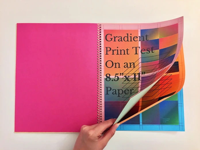
Accessible design begins with the basics: visual legibility, intuitive navigation, and alternative content formats. However, in 2025, designers are expanding these standards, going beyond traditional accessibility features to create experiences that are enjoyable and effective for all users. This means considering the needs of people with visual, auditory, cognitive, and motor impairments, as well as users with varying language skills, internet access, and device preferences. Designers are increasingly relying on universal design principles, which encourage the development of products and environments usable by all people to the greatest extent possible. By designing with universal usability in mind, creators ensure that their interfaces are flexible, adaptable, and accessible across a wide range of contexts and user needs.
One of the most visible aspects of accessible design is the focus on color contrast and text legibility. High-contrast color schemes ensure that text is easily distinguishable against backgrounds, enhancing readability for users with visual impairments or color blindness. Designers are choosing color combinations that meet or exceed the WCAG (Web Content Accessibility Guidelines) standards, providing options that are both visually appealing and compliant with accessibility requirements. Additionally, font sizes and line spacing are being optimized for readability, with larger text and more generous spacing ensuring that content is easy to read for users with low vision or dyslexia. By incorporating these adjustments, designers make sure their content is accessible to a wider audience without compromising on aesthetics or brand consistency.
Another key component of inclusive design is the use of alternative text descriptions for images, videos, and other multimedia elements. Alt text allows users who rely on screen readers to understand visual content through descriptive text, making it possible for those with visual impairments to fully engage with the site. In 2025, this practice is becoming more sophisticated, with designers providing more detailed and nuanced descriptions that capture the essence of the visuals. Rather than generic descriptions, designers now strive to include context and detail, helping users visualize the content more accurately. For instance, an image of a landscape might not only describe the scene but also convey the mood, colors, and atmosphere, offering a richer experience for all users.
Incorporating captioning and transcription for video and audio content is another critical aspect of inclusive design. With the rise of multimedia content on websites, social media, and apps, providing captions and transcripts ensures that users with hearing impairments can access the information just as easily as those without. Captions are increasingly essential for both accessibility and usability, as many users prefer to watch videos with captions in noisy environments or while multitasking. In addition to transcription, some platforms are experimenting with sign language interpretations alongside video content, creating an inclusive viewing experience that accommodates various preferences and needs. By prioritizing these options, designers acknowledge that accessibility considerations improve the experience for all users, not just those with disabilities.
The concept of neurodiversity is also playing a significant role in inclusive design. Neurodiverse users may experience challenges with attention, memory, and sensory processing, and design adjustments can make a huge difference in usability for this group. To accommodate neurodiverse users, designers are opting for clean, uncluttered layouts, minimizing the cognitive load required to navigate the site. Simple, consistent navigation patterns reduce confusion and frustration, while features like customizable font sizes, colors, and contrast settings offer users control over their environment. Some designers are even exploring “focus mode” interfaces, which allow users to temporarily reduce visual elements on the screen, such as animations or pop-ups, creating a more calming and focused experience. These practices benefit everyone, as they promote clarity and ease of use in digital interfaces.
Mobile accessibility is also a core aspect of inclusive design, given the global prevalence of mobile internet use. Responsive design that adapts seamlessly across various screen sizes and orientations is essential, as many users with disabilities rely on mobile devices with built-in accessibility features. Designers are creating layouts that prioritize tap targets large enough for users with motor impairments, ensuring buttons and interactive elements are easy to access and use. Voice recognition, gesture navigation, and assistive touch are other technologies that enhance mobile accessibility. By optimizing for mobile accessibility, designers make digital experiences more convenient and functional for everyone, recognizing that an accessible site should be available and enjoyable on any device, anywhere.
Cultural inclusivity is another important focus within universal usability. As brands and creators reach audiences across different cultural backgrounds, designs must reflect and respect this diversity. This involves adapting content, visual elements, and layouts to resonate with global audiences. Localization—such as translating text, modifying imagery, and adjusting color schemes to suit cultural preferences—is now standard practice in inclusive design. This extends to gender-neutral language, representation of diverse communities, and content that respects different social norms and beliefs. By paying attention to cultural nuances, designers create an environment that feels welcoming and inclusive, fostering a sense of belonging and respect among users from all walks of life.
Language accessibility is crucial to reaching diverse audiences. Designers are implementing multilingual options and simple, clear language that accommodates users who may not be fluent in the platform’s primary language. This approach includes using icons and visuals that transcend language barriers and provide a universally understandable experience. AI-powered translation tools are also becoming popular, allowing websites to offer real-time translation services that are accurate and contextually relevant. By bridging language gaps, designers ensure that users can access and engage with content in their preferred language, fostering a more inclusive digital experience.
Another emerging trend in accessibility is voice-activated navigation, which allows users to control websites and applications using voice commands. This feature is particularly beneficial for users with motor impairments, as it eliminates the need for precise gestures or clicks. Voice navigation can also be advantageous for users with visual impairments, enabling them to interact with digital content without relying on sight. As voice recognition technology becomes more advanced, designers are exploring new ways to integrate voice commands with traditional navigation options, creating hybrid interfaces that allow users to choose their preferred mode of interaction.
Emotional accessibility is a newer concept, focusing on the emotional impact of design choices. Designers are becoming aware that certain visuals, animations, or interactions can evoke stress, anxiety, or frustration, particularly for individuals with sensory sensitivities. To address this, they are creating options to adjust or disable high-stimulation features like auto-play videos, flashing animations, or busy backgrounds. By giving users control over these elements, designers create a more comfortable experience that respects individual needs and sensitivities. This approach underscores a commitment to empathy in design, recognizing that inclusivity encompasses physical and cognitive considerations as well as emotional well-being.
Lastly, inclusive design has moved beyond just user-facing elements to include accessible backend practices. Designers and developers are implementing accessible coding standards, such as ARIA (Accessible Rich Internet Applications) attributes, to ensure screen readers and other assistive technologies can interpret the content correctly. These attributes provide information about the structure and function of different elements on a webpage, enabling smoother interactions for users who rely on assistive devices. Consistent and organized coding structures also contribute to better accessibility, as they reduce the risk of errors that could impede usability.
As inclusive and accessible design becomes a non-negotiable standard, brands and organizations are meeting the needs of diverse audiences to enhance their reputation as socially responsible entities. This commitment to inclusivity resonates with a growing audience that values ethics and equity in the brands they support. By prioritizing accessibility, companies demonstrate their dedication to inclusivity, sending a message that every user is valued and respected. This shift towards universal usability reflects a broader trend in society, where diversity, empathy, and equity are celebrated, paving the way for digital spaces that truly serve all. In 2025, inclusive and accessible design is more than an industry standard—it’s a defining characteristic of responsible, modern design.
7. Customizable 3D Elements: Personalized Interactivity in Virtual Spaces
Customizable 3D elements have surged in popularity, transforming how users engage with digital content and creating richer, more personalized interactions within virtual spaces. This trend taps into the evolving demands of a digital audience that craves immersive and interactive experiences, driven by advances in AR (augmented reality) and VR (virtual reality) technologies. As 3D design becomes more accessible to both designers and consumers, brands and creators are leveraging these elements to craft bespoke experiences that respond to individual preferences, allowing users to manipulate, customize, and interact with virtual objects in real time.
The appeal of customizable 3D elements lies in their ability to bring a tactile sense to the digital realm, bridging the gap between physical and virtual experiences. People increasingly spend time online and the ability to move, rotate, and resize 3D objects or environments brings a new layer of engagement, turning passive viewers into active participants. This shift encourages a deeper emotional connection with digital products, as users can make personal choices and see the immediate impact of their interactions. By enabling users to personalize 3D components—whether through choosing colors, textures, shapes, or sizes—brands foster a sense of ownership and creativity, making digital experiences feel genuinely unique and user-centered.
A primary application of customizable 3D elements can be seen in e-commerce, where retailers use them to enhance the shopping experience by allowing users to interact with virtual products. For instance, in the furniture industry, customers can explore different material options, swap colors, and adjust dimensions on 3D models to visualize how items would look in their spaces. This customization is beneficial for aesthetics. In addition, it enables users to make more informed purchasing decisions, as they can better envision how the product will fit into their home or office environments. Additionally, this level of interaction shortens the gap between online and in-person shopping, providing a more tangible experience that reduces the hesitation often associated with purchasing items sight unseen.
Websites, apps, and digital platforms are increasingly utilizing 3D elements to make interfaces more intuitive and engaging. Customizable 3D icons and menus allow users to personalize their digital environments, creating unique experiences tailored to individual tastes and preferences. This can range from adjusting the color and layout of navigation menus to modifying the appearance of interactive elements, like buttons or icons. Such customization fosters a stronger sense of connection between users and digital spaces, as they can arrange the visual elements to suit their style or mood, creating a more enjoyable and personalized browsing experience. As interfaces evolve, this trend could become central to user interface (UI) design, with platforms offering modular, 3D assets that can be rearranged and personalized at the user’s discretion.
Gaming is another sector where customizable 3D elements are making a significant impact, giving players unprecedented control over the appearance and behavior of virtual characters, environments, and objects. In 2025, game developers are focusing on providing users with customization options that extend far beyond aesthetics, allowing players to tailor gameplay experiences to align with their preferences and play styles. For example, players can select or modify character outfits, weapons, and environments to suit their personalities or themes within the game. In some cases, these elements even adapt to the user’s choices and progress, creating a dynamic experience that responds to individual play patterns. By offering customization, games become more immersive, allowing players to create narratives that feel genuinely personal and distinctive.
In addition to enhancing individual experiences, customizable 3D elements foster a sense of community and self-expression, especially on social media platforms where users share personalized avatars, scenes, or digital representations of real-life items. Social platforms are expanding customization options to empower users to create 3D avatars or scenes that represent their personalities, hobbies, and interests. These personalized 3D elements can be shared as digital keepsakes, profile images, or even virtual gifts, allowing users to connect and interact in ways that feel authentic and reflective of their individuality. Furthermore, with the emergence of the metaverse—a shared virtual space for social interaction—customizable 3D avatars and environments will play a critical role in facilitating self-expression, enabling users to project unique identities and participate in social interactions that feel meaningful and genuine.
The application of customizable 3D elements extends beyond social interactions to education, healthcare, and professional training, where interactive 3D models offer new ways to visualize complex concepts. In educational contexts, for example, students can explore detailed 3D models of anatomy, historical artifacts, or scientific phenomena. By manipulating these elements, students gain a deeper, hands-on understanding of intricate subjects, enhancing the learning process. Similarly, in healthcare, professionals are using 3D models to visualize organs, procedures, and pathologies, allowing patients to better comprehend their conditions and treatment options. In professional training, workers can engage with simulations of equipment or environments, enabling safer and more effective learning experiences in virtual settings that are nearly indistinguishable from reality. Customizable 3D elements make complex information more accessible and interactive, enhancing learning and comprehension across fields.
Creating these interactive, customizable 3D experiences requires advanced design tools, but as technology progresses, software is becoming more user-friendly, empowering more designers to incorporate 3D elements into their work. Tools like Blender, Unity, and WebGL enable designers to craft detailed, interactive 3D environments that are accessible across various devices and platforms. Innovations in AI-driven design software are also accelerating this trend, as automated tools simplify the process of creating complex 3D assets, enabling designers with varying skill levels to incorporate 3D elements into their projects. With these tools, designers can offer a wider range of customization options, providing users with more choices and control over their digital experiences. This democratization of 3D design tools is likely to continue, as accessibility and ease of use become priority considerations for software developers.
One of the most exciting advancements in customizable 3D design is the integration of augmented reality (AR), allowing users to bring their digital customizations into real-world contexts. For instance, in the fashion industry, AR allows users to try on virtual garments, modify colors or patterns, and see how the pieces look in real life before making a purchase. Similarly, home decor apps with AR functionality let users place 3D models of furniture or decor items in their physical space, adjusting colors, materials, and styles to match their tastes. This blend of digital customization and physical interaction enriches the user experience and bridges the gap between online and offline interactions, making customization a tangible and practical aspect of daily life.
As customizable 3D elements continue to evolve, designers must also consider issues related to performance and accessibility, ensuring that these features enhance usability without slowing down or complicating the user experience. Lightweight 3D models and optimized rendering techniques are essential, especially as customization becomes a standard feature in web and mobile applications. Ensuring that users on a range of devices, including those with lower processing capabilities, can enjoy these features is crucial. By prioritizing both functionality and user experience, designers can ensure that customizable 3D elements remain an inclusive, user-friendly addition to the digital landscape.
In sum, customizable 3D elements are redefining digital interaction in 2025, providing users with unprecedented levels of personalization, immersion, and engagement. This trend is transforming how people connect with brands, products, and each other, creating virtual spaces that feel unique and responsive to individual needs. As the technology behind 3D design continues to advance, customizable 3D elements will play a central role in shaping the future of digital design, setting new standards for user-centered experiences that are as flexible, creative, and inclusive as they are visually compelling. For brands and creators, embracing this trend means recognizing the power of personalization, and providing users with the tools to craft experiences that truly resonate with their tastes and preferences, whether in shopping, gaming, learning, or social interaction.
8. Experimental Fonts and Fluid Typography: Breaking Typographic Boundaries
In 2025, typography is becoming increasingly dynamic and experimental, with designers boldly pushing the boundaries of traditional type aesthetics. Experimental fonts and fluid typography—often kinetic, shape-shifting, or morphing—are redefining text as a visual medium that transcends its functional role as a vehicle for language. This trend focuses on creating engaging, unique typographic experiences that feel almost alive, and its versatility spans various fields, from branding and editorial design to digital media and user interface (UI) design. In an age where attention spans are short, the unpredictability and creativity of experimental typeface design provide a fresh way to capture and hold viewers’ attention, positioning type as a focal point rather than a mere communicative tool.
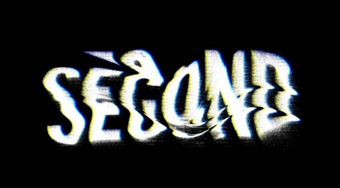
At the core of this trend is the concept of fluidity—a departure from static, rigid letterforms to ones that feel flexible, adaptable, and responsive. Designers are harnessing the latest in design technology to create fonts that react to user interactions or environmental variables, bringing a new sense of motion and dynamism to text. Fluid typography allows letters to subtly morph or transform based on user inputs, like cursor movement, clicks, or scrolling. For example, in web design, designers employ variable fonts that change in size, weight, or style as users interact with the page, creating a sense of organic movement that captures the user’s attention. This kind of typography not only adds aesthetic appeal but also enhances user engagement, making the text an interactive element that evolves within a digital environment.
Custom fonts, designed with irregular forms, gradients, and experimental serifs or sans-serifs, are leading the way in creating distinctive visual identities for brands. By deviating from traditional letter structures and proportions, these fonts break away from convention and add a memorable edge to brand visuals. Brands aiming to express creativity, innovation, or individuality are particularly drawn to this trend, as it allows them to stand out in a crowded digital landscape. Fonts with abstract, unconventional shapes lend themselves to highly expressive designs, often combining multiple typographic styles within the same letterform or introducing unusual cuts and curves. These unique, often surprising typefaces invite viewers to linger on the message, challenging them to explore and interpret the visual presentation of words in new ways.
Fluid typography has also become a valuable tool in creating emotional resonance, particularly in digital media and advertising. By using a responsive type that adapts to different moods or themes, designers can create a text that feels almost empathetic, matching the tone or emotion of the surrounding content. For instance, a promotional video might incorporate typography that pulsates with the beat of the background music, or an app may use text that changes shape to reflect a narrative arc. Such choices allow typography to visually communicate subtleties that static text alone cannot convey, adding layers of meaning to the user experience. In motion graphics, fluid type is often animated to evoke specific emotions, such as excitement, tension, or calm, by altering elements like the speed, curvature, or texture of the letters.
Designers are also experimenting with variable font technology, which allows a single typeface to shift seamlessly between different styles and weights without the need for multiple font files. This flexibility has paved the way for fonts that can adapt to various screen sizes, orientations, and user preferences, offering a more cohesive and accessible typographic experience. For instance, on responsive websites, variable fonts can automatically adjust letter spacing, weight, and proportions based on screen dimensions or user settings, ensuring readability across devices without sacrificing design integrity. This adaptability is particularly valuable for brands and publications that need to maintain a consistent visual identity while accommodating the diverse range of screens on which their content is viewed.
In addition to enhancing user experience, fluid typography is making a significant impact in branding by allowing companies to create distinctive, memorable typographic identities. For companies looking to convey a message of innovation, experimentation, or boldness, the use of unconventional fonts signals a willingness to challenge norms and create something new. Logos, headlines, and even body text in brand assets can feature subtly or dramatically shifting typography, creating a lasting impression of modernity and forward-thinking values. Such typographic expressions reinforce the brand’s identity, adding depth and personality to the design in a way that more traditional fonts may lack. This approach appeals to younger audiences, who often gravitate toward brands that embrace creativity and break away from conformity.
In the field of editorial design, fluid typography allows magazines, websites, and blogs to make more immersive reading experiences by presenting text in unconventional formats. Experimental fonts can make articles feel more engaging and dynamic, as text might wrap around images in unusual shapes, weave through graphics, or change styles mid-article to emphasize certain points or themes. This approach encourages readers to slow down and engage with the content on a visual level, enhancing the storytelling aspect of the design. For example, a travel magazine might use typography that curves and flows like the natural landscapes being described, immersing readers in the narrative before they even read a word. In addition to enhancing readability, it also strengthens the connection between the design and the editorial content, creating a more cohesive and memorable reading experience.
Social media is another space where experimental fonts are gaining popularity, as designers explore ways to make text-based posts more visually compelling. With the rise of platforms like Instagram and TikTok, where visuals dominate, fluid and experimental typography can help static text stand out amid a flood of images and videos. Whether it’s through animated typography in video posts or custom typefaces in static graphics, designers are using these fonts to create distinctive, shareable content that grabs attention in users’ feeds. Fluid typography provides a means to create an element of surprise, with words that appear to breathe, stretch, or morph, aligning with the aesthetics and fast-paced, experimental nature of social media culture.
Experimental typography also aligns well with the shift toward more inclusive and accessible design. While experimental fonts often lean toward the abstract, designers are increasingly aware of the need to balance creativity with readability and inclusivity. Accessibility-focused fluid fonts can adapt to user settings for contrast, size, and spacing, making them engaging and functional. Designers are prioritizing legibility and screen adaptability, ensuring that their experimental typefaces work effectively across devices and accessibility settings. By considering accessibility at every stage of font design, designers can create typefaces that are both visually intriguing and inclusive, ensuring a broader audience can enjoy and interact with experimental typographic expressions.
Lastly, as more brands look to incorporate augmented reality (AR) and virtual reality (VR) into their marketing strategies, experimental and fluid typography is poised to play a central role in these immersive experiences. In an AR or VR context, fluid typography can respond to user movement, with letters shifting as the user navigates a virtual space or interacts with elements in real time. For example, in an AR marketing campaign, a brand might use text that seems to hover in the user’s environment, dynamically changing in style, size, or opacity based on the user’s physical proximity or gestures. This interactivity brings a new level of engagement to typography, making it a pivotal part of creating memorable, immersive experiences that seamlessly blend the digital and physical worlds.
In sum, experimental fonts and fluid typography are redefining the boundaries of text as both a visual and functional element. By embracing fluidity, interactivity, and adaptability, designers are transforming typography from a static component of design into a dynamic storytelling tool. This shift invites audiences to interact with text in more personal and imaginative ways, making typography a vehicle for both expression and experience. As technology advances and audiences seek richer, more interactive digital encounters, experimental and fluid typography will likely continue to grow, reshaping how we perceive, interact with, and interpret the written word in the digital era. For brands and designers alike, this trend offers a powerful opportunity to break free from typographic conventions and explore new possibilities for creativity and communication in a rapidly evolving design landscape.
9. Augmented Reality Integration: Bridging Physical and Digital Experiences
Augmented reality (AR) is becoming an essential tool for bridging the divide between digital and physical worlds, providing an interactive layer that overlays virtual elements onto real-world environments. This trend in design is transforming user experiences across various industries, from retail and architecture to education, art, and entertainment. AR is no longer a novelty; it has evolved into a practical and engaging means to enhance everyday interactions. With the prevalence of AR-capable devices—primarily smartphones and tablets—designers are capitalizing on the potential of AR to add context, depth, and interactivity to digital content in ways that feel personal and immersive.
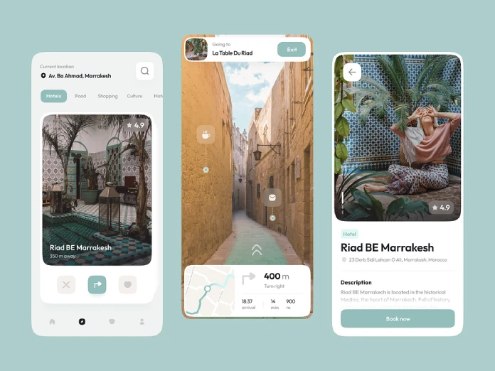
In the retail sector, AR is redefining how consumers interact with products, moving beyond traditional online shopping to offer an immersive experience that helps them make more informed choices. Brands and retailers are using AR applications to let users visualize products within their own spaces, allowing them to place virtual furniture in their homes, try on clothing, or test different shades of makeup—all from the convenience of their devices. IKEA, for instance, has pioneered AR integration in e-commerce by enabling customers to place life-size models of furniture in their rooms through an app, giving a realistic view of how items would fit and look in context. This ability to virtually “try before you buy” helps customers make purchasing decisions with more confidence, reducing the risk of buyer’s remorse and minimizing returns for retailers. For design professionals, this integration of AR means developing models that are optimized for user interaction while also being visually realistic and adaptable to varying lighting conditions.
Architects and interior designers are also leveraging AR to help clients visualize their projects with unprecedented clarity. Through AR-enabled apps, clients can walk through 3D floor plans or explore design concepts by superimposing virtual structures onto real spaces. This adds a new dimension to presentations, allowing clients to understand spatial relationships, scale, and aesthetics before construction even begins. In urban planning, AR has significant potential to assist designers and decision-makers in visualizing how buildings, parks, and infrastructure will impact existing environments. By using AR to display models at actual locations, stakeholders can make more informed decisions about community layouts and environmental impact. This integration enables designers to convey their vision with unparalleled realism, ensuring that both clients and communities have a clear understanding of what to expect from future developments.
Art and museums are another field in which AR integration is gaining traction, enhancing visitor experiences by offering an interactive layer to traditional exhibitions. Museums are increasingly integrating AR into exhibits to provide additional information, context, or interactive elements that enhance understanding and engagement. For example, an AR-enhanced art exhibit might allow visitors to view background details about artwork by pointing their devices at the piece, revealing layers of meaning or historical context. The Louvre, for example, has experimented with AR in exhibitions to provide visitors with virtual tours that add depth to the viewing experience. This fusion of AR and art offers endless possibilities for storytelling, enabling artists to create multi-layered experiences that transcend the limitations of static displays. For designers in the art world, AR integration involves carefully crafting elements that complement the original pieces without detracting from the art itself, a balance that requires both artistic sensitivity and technical skill.
In education, AR is proving to be an invaluable tool for creating engaging, hands-on learning experiences. By overlaying information on real-world objects or creating virtual models that students can interact with, AR helps make complex concepts more accessible and understandable. For instance, biology students can examine a 3D model of a human heart, exploring its chambers and vessels in a detailed way that textbooks cannot offer. In history classes, students can use AR to view ancient artifacts or historical events brought to life in 3D, adding a dynamic element to learning that fosters curiosity and retention. For designers, this means developing AR content that is both educational and intuitive, balancing detail with ease of interaction so students can focus on the learning experience rather than the technology itself.
AR integration is also revolutionizing the fashion and beauty industries by offering consumers a risk-free way to experiment with products and styles. Beauty brands like L’Oréal have launched AR applications that allow users to virtually try on makeup, such as lipstick shades or eye shadows, in real time. This form of digital try-on technology adds a fun, interactive element to the shopping experience and helps customers find products that best suit their unique features and style preferences. Similarly, in fashion, AR enables users to see how different outfits look on them before making a purchase. By aligning with the trend toward personalization, AR in fashion and beauty gives consumers more confidence in their selections and reduces the chances of dissatisfaction with products post-purchase. For designers, creating these realistic AR filters requires a deep understanding of color theory, lighting, and human anatomy to ensure virtual elements look natural and flattering.
The gaming and entertainment industries, long-time adopters of AR, continue to lead in innovating new ways to engage audiences. With popular games like Pokémon GO paving the way, more developers are exploring how AR can create unique, location-based experiences that encourage players to explore the real world. These games often feature interactive elements that react to players’ physical surroundings, making gameplay a unique experience based on where the user is located. This technology is evolving to include augmented reality escape rooms, scavenger hunts, and outdoor adventures that blur the line between reality and fantasy. For designers, this requires the ability to create seamless transitions between digital and physical worlds, as well as an understanding of user experience (UX) to keep players engaged safely and intuitively.
With the rising interest in AR, social media platforms have incorporated AR filters to provide users with interactive, immersive content. Platforms like Instagram, Snapchat, and TikTok offer various AR effects that let users alter their appearance, add virtual elements to their environment, or interact with brand experiences. For brands, this opens up new opportunities to engage users with branded filters and experiences, creating a fun and memorable way to build brand identity. Designers play a crucial role in this integration, as they must create AR effects that are visually appealing, accessible, and easy to use, allowing users to share branded experiences with their followers in a way that feels natural and engaging.
The rapid development of AR technology is also impacting how designers think about user experience, as they must now consider the physical context in which their designs will be viewed. Unlike traditional digital design, AR requires an understanding of real-world factors like lighting, scale, and movement. Designers must consider how virtual elements will appear in various lighting conditions and how they will respond to user interactions. For instance, designing an AR application for a sunny outdoor environment will have different visual requirements than one for an indoor, low-light setting. Additionally, AR demands a strong focus on accessibility, ensuring that users of all ages and abilities can interact with and enjoy the experience.
For brands and designers alike, AR integration offers a wealth of possibilities for creating memorable, user-centered experiences that merge digital convenience with the tangible appeal of physical interaction. As AR technology becomes more advanced and widely accessible, the potential for innovation in this space will only continue to grow. In 2025, AR is more than just a technology trend; it’s a powerful tool for enhancing human interaction with the digital world, making experiences more personal, immersive, and meaningful. This trend is a clear sign that the future of design is not just about creating visually stunning layouts but about crafting experiences that bridge the digital and physical realms, offering users an enhanced way of engaging with brands, art, education, and more.
For designers, embracing AR means learning new tools and techniques while adopting a mindset that considers the physical and digital as interconnected rather than separate. By tapping into this immersive technology, designers can create a new level of interaction that transforms how we experience everything from shopping and entertainment to learning and exploring our world. As AR continues to evolve, its integration into design will shape the future of interactivity, setting new standards for how we connect with and experience digital content in the real world.
10. Eco-Friendly and Sustainable Design: Aligning Aesthetics with Environmental Responsibility
Driven by the climate crisis, environmental awareness deepens worldwide. Therefore it’s not surprising that eco-friendly and sustainable design has moved from a niche interest to an essential aspect of contemporary design practice. In 2025, the shift toward sustainability reflects a global commitment to reducing waste, conserving resources, and minimizing environmental impact. For graphic designers, architects, and product designers alike, the focus on sustainable practices means integrating ethical considerations into every stage of the design process. More than just a trend, eco-friendly design has become an ethical imperative, prompting creators to rethink materials, production methods, and even aesthetic choices to prioritize longevity, low impact, and reduced waste.

In graphic design, sustainability starts with the conscious selection of materials and printing methods. Designers today are increasingly opting for recycled and FSC-certified paper stocks, soy-based inks, and water-based adhesives to create print materials that are visually appealing and gentle to the environment. While digital design has largely replaced print, many projects still require tangible materials—business cards, posters, packaging, and more. Sustainable printing, however, does not stop with paper choices; it extends to inks, coatings, and even the design layout. For instance, single-ink designs and two-color processes minimize the need for additional dyes and reduce energy consumption during printing. Many designers are also leaning toward minimalist designs that require less ink coverage overall. A crucial part of this shift is client education, as designers work with brands to help them understand the environmental advantages of these sustainable options.
Packaging design has perhaps seen the most dramatic push toward eco-conscious approaches, especially in sectors like retail and food services, where waste is high and regulations increasingly demand sustainable solutions. In this arena, designers are focusing on minimal, biodegradable, or compostable packaging materials that break down quickly in landfills or, ideally, can be easily recycled or reused. Edible packaging, for instance, has emerged as an innovative solution in the food industry, with materials made from seaweed, rice paper, or gelatin that can be eaten alongside the product or disposed of with minimal environmental impact. Similarly, compostable packaging derived from corn starch, mushroom roots, and other plant-based materials provides a zero-waste alternative to traditional plastics. Designers are exploring ways to create aesthetically appealing packaging that meets consumer expectations while being mindful of environmental responsibility. This requires creative problem-solving to balance attractive, brand-specific designs with functional, eco-friendly solutions.
The emphasis on sustainable design extends to digital experiences as well. While it may seem that digital content is inherently eco-friendly, since it doesn’t require paper or physical materials, there are hidden environmental costs in server energy consumption, data storage, and device production. To combat this, sustainable digital design focuses on optimizing file sizes, streamlining code, and minimizing bandwidth consumption to reduce energy usage across the digital ecosystem. Techniques like “dark mode,” for example, provide a visually appealing aesthetic and help save energy on devices with OLED screens by using less power. By compressing images and minimizing animations, designers can create smoother user experiences that consume fewer resources. Sustainable digital design requires developers and designers to work hand-in-hand, streamlining websites and apps to reduce their carbon footprint while retaining visual appeal and functionality.
In typography, the shift toward sustainability has inspired a renewed focus on typefaces that balance readability and efficiency. Eco-fonts, for example, are specially designed to use less ink without compromising legibility. Some fonts use strategically placed “holes” within characters, reducing ink consumption by up to 30% compared to traditional fonts. Additionally, type designers are increasingly exploring variable fonts—typefaces that allow users to adjust weight, width, and slant dynamically. By offering multiple variations within a single font file, variable fonts reduce the need for multiple font weights and styles, saving storage space and streamlining digital assets. For designers focused on digital and print projects alike, adopting these eco-conscious typography choices allows them to contribute to environmental sustainability without sacrificing aesthetics.
Interior design and architecture are likewise undergoing significant shifts in response to environmental challenges. Designers are prioritizing locally sourced, renewable materials like bamboo, cork, and recycled wood. Bamboo, for instance, grows quickly and requires minimal resources to cultivate, making it an excellent sustainable alternative to traditional hardwoods. Cork, harvested from the bark of cork trees, is another eco-friendly material that is both renewable and biodegradable. Designers are also repurposing discarded materials, such as reclaimed wood, metal, and glass, to create unique and aesthetically rich interiors that tell a story of transformation. This approach conserves resources while adding a layer of authenticity to the design by highlighting the beauty of imperfection and the value of reuse. In 2025, the trend toward sustainable architecture has become a focal point, encouraging the creation of buildings that generate their own energy, collect rainwater, and integrate seamlessly into natural landscapes.
A critical component of sustainable design is the concept of a circular economy, where products are designed to be easily recycled, upcycled, or returned to the production cycle in a new form. This principle has become central to product design in fields ranging from fashion to technology. For example, in the fashion industry, designers are opting for modular clothing that can be taken apart and reused or garments made from recycled fabrics. In product design, manufacturers are increasingly exploring the use of recyclable electronics that minimize e-waste. For instance, modular phones allow users to replace or upgrade parts individually, rather than discarding the entire device. This shift requires designers to adopt a long-term view, crafting products that prioritize durability, adaptability, and minimal waste over time.
Eco-friendly design isn’t limited to physical products; it also influences brand identities and messaging. Consumers today are increasingly aware of and invested in companies’ sustainability practices, and brands are responding by incorporating eco-consciousness into their visual identities. From logos that evoke natural imagery to color palettes inspired by earth tones, brands are using design as a means to communicate their commitment to sustainability. Visual consistency is key; for instance, a brand promoting eco-friendly practices should avoid glossy, high-ink packaging or overly complex designs that contrast with its green messaging. Designers are guiding brands to embrace simplicity, with natural colors, minimalistic layouts, and textures that reflect organic materials, fostering a sense of authenticity and environmental respect.
In addition to aesthetic considerations, designers focusing on sustainability often advocate for reducing, reusing, and recycling within their own workflows. This includes minimizing material waste during the production phase, choosing energy-efficient workstations, and finding ways to repurpose prototypes or unused samples. By actively practicing sustainability, designers model eco-friendly behavior and inspire clients and collaborators to adopt similar approaches. This alignment between professional practices and ethical values strengthens the overall commitment to sustainable design, highlighting the designer’s role as a responsible contributor to a larger environmental cause.
Moreover, designers are increasingly engaged in educational initiatives to promote eco-conscious practices within their communities. Workshops, conferences, and online courses on sustainable design practices are becoming more prevalent, creating platforms for knowledge-sharing and collaboration across industries. These initiatives encourage designers to stay informed about emerging materials, techniques, and technologies that support sustainability. By fostering a community centered around environmental responsibility, the design world is working collectively to build a future where aesthetics and sustainability go hand-in-hand.
In summary, eco-friendly and sustainable design in 2025 goes beyond simply following a trend; it embodies a holistic approach to environmental responsibility. Designers are finding innovative ways to incorporate sustainable practices into their work, whether through material selection, energy-efficient digital design, or a commitment to waste reduction. As consumers increasingly demand ethical and sustainable products, the role of the designer has expanded to include environmental advocacy and education. By embracing sustainability, designers are not only creating products and experiences that resonate with eco-conscious audiences but also playing a vital role in fostering a more sustainable world. This transformation signals a future where beauty, functionality, and sustainability are not mutually exclusive but harmoniously aligned.
The most popular graphic design trends of 2025 will reflect a blend of cutting-edge technology, nostalgia, and inclusivity. From AI-powered tools to eco-conscious practices, these graphic design trends are reshaping the visual landscape for brands and consumers alike. By understanding and adapting to these shifts, brands can maintain relevance, capture attention, and enhance user experiences. This focus on innovation and inclusivity will continue to drive the graphic design field forward, crafting visuals that are beautiful and meaningful at the same time.
All images © by the respective designers. Header image by Login (via Adobe Stock). Hungry for more? If so, feel free to browse WE AND THE COLOR’s Graphic Design category. Find out what’s in and what’s out in the world of graphic design. Update: Check the top 10 graphic design trends for 2026.



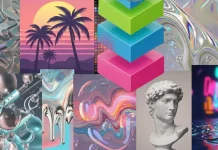


I recently experimented a lot with kinetic typefaces. It’s just fun.
What a massive article but I took the time to read it all. I love the trend of retro futurism, always did.
What’s wrong with Google?! I had to go to page 5 to find this article, which is absolutely the best! Thanks so much!
Here one can see that someone knows what he is talking about. Love it.
These design trends for 2025 are really exciting! I love how sustainability and minimalism are becoming more prominent. Can’t wait to see how these ideas evolve in future projects!