
This post contains affiliate links. We may earn a commission if you click on them and make a purchase. It’s at no extra cost to you and helps us run this site. Thanks for your support!
What Makes This Adobe Illustrator Event Poster Layout So Effective?
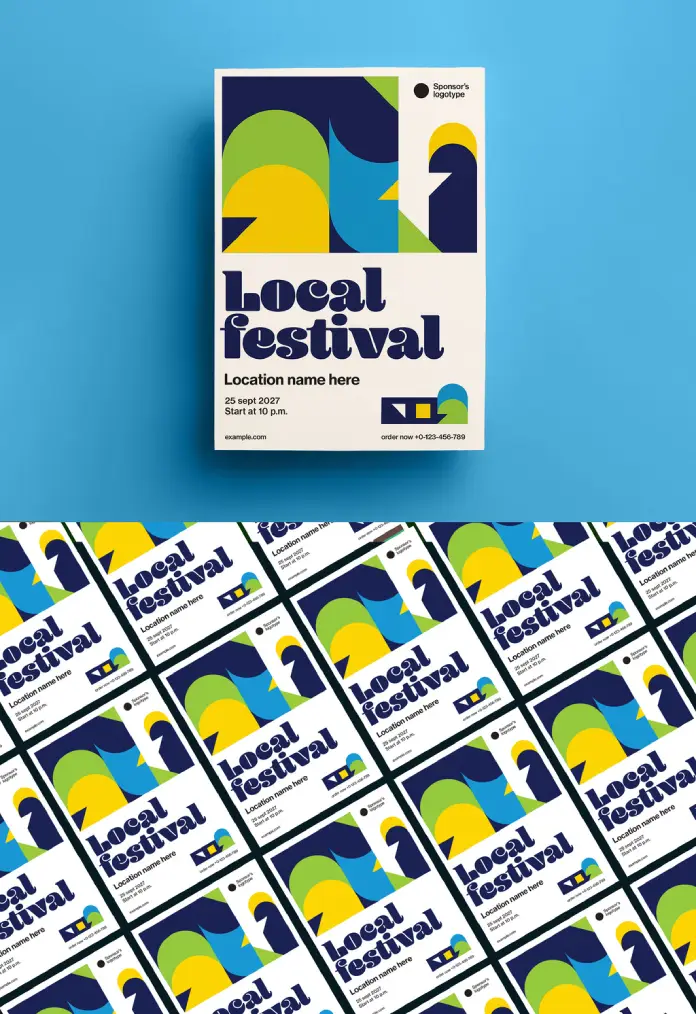
Visual impact defines successful marketing campaigns in our crowded digital landscape. This specific Adobe Illustrator event poster layout grabs attention immediately through bold choices. It abandons subtle gradients for flat, assertive colors. Furthermore, the design balances chaos and order perfectly. Viewers crave structure, yet they also desire visual excitement. Consequently, this artwork delivers both by mixing rigid geometry with playful curves. GrafVishenka, the Adobe Stock contributor, crafted a template that feels timeless yet current. It serves as a prime example of how vector graphic design templates should function.
Please note that this template requires professional graphic design software, such as Adobe Illustrator, installed on your computer. You can get the latest version from the Adobe Creative Cloud website. Just have a look here.
The Power of Geometric Abstraction
You might wonder why simple shapes hold such power. The answer lies in cognitive processing. The human brain recognizes simple forms faster than complex imagery. Therefore, this Adobe Illustrator event poster layout communicates efficiently. The abstract shapes—circles, arches, and sharp angles—create a dynamic flow. Your eye travels naturally from the top graphic down to the typography. Additionally, the color palette plays a crucial role. Deep navy anchors the design, while lime green and sunny yellow add energy. This high-contrast approach ensures the poster remains visible from a distance.
Typography That Demands Attention
Text often becomes an afterthought in template designs. However, this layout treats type as a visual element. The “Local Festival” headline utilizes a chunky, retro-inspired serif font. It carries a heavy visual weight that rivals the graphic elements. This choice reflects current creative typography trends for 2025. It feels nostalgic but avoids looking dated. Moreover, the hierarchy remains crystal clear. The headline dominates, followed by the location and date. This structure ensures the audience absorbs the critical information instantly.
Technical Excellence in Print Design
A pretty picture provides little value if it fails in production. Fortunately, this Adobe Illustrator event poster layout meets professional technical standards. GrafVishenka designed the file in the A3 format. This size works perfectly for standard bulletin boards and shop windows. Because it utilizes vector graphics, you can scale the artwork without quality loss. You could theoretically print this on a billboard, and the lines would remain crisp. Furthermore, the file uses the CMYK color mode. This ensures that the colors you see on screen match the final printed product.

How to Leverage Customizable Event Flyer Templates
Designers often face tight deadlines. Consequently, starting from scratch isn’t always an option. Using a high-quality Adobe Illustrator event poster layout solves this logistical problem. You simply open the file and access the fully editable layers. Every shape, text block, and background element sits on its own layer. Thus, customization becomes a quick, intuitive process. You can change the “Local Festival” text to your specific event name in seconds. Also, changing the color palette to match brand guidelines takes minimal effort.
Why This Style Resonates Now
We currently see a resurgence of the Swiss Style and Bauhaus influences. This template fits squarely within that movement. It champions function and clarity. However, it adds a layer of warmth that strict modernism often lacks. The cream-colored background softens the harshness of the geometric forms. This combination creates an inviting atmosphere. It suggests that the event will be fun, organized, and stylish. Therefore, using such an Adobe Illustrator event poster layout signals professionalism to your potential attendees.
Best Practices for Using This Template
To get the best results, keep your edits clean. Avoid overcrowding the negative space with too much text. The design relies on breathing room to maintain its elegance. Additionally, stick to the font hierarchy established by the creator. If you change the fonts, choose typefaces that match the geometric weight of the original. Finally, always check your color contrasts. The success of this Adobe Illustrator event poster layout relies on the interplay between dark and light values.
The Role of Vector Assets in Branding
Investing in vector-based assets pays off long-term. Unlike raster images, vectors offer infinite flexibility. You can repurpose elements from this poster for social media headers, tickets, or merchandise. For instance, the abstract graphic at the top could easily become a logo mark. This versatility increases the value of the template significantly. It transforms a single Adobe Illustrator event poster layout into a comprehensive branding kit.
The Bottom Line: Elevating Your Event Identity
Great design does more than inform; it inspires. This artwork by GrafVishenka offers a perfect blend of form and function. It stands out because it dares to be bold. By utilizing this Adobe Illustrator event poster layout, you elevate the perceived quality of your event. You show your audience that you care about aesthetics and detail. Ultimately, that perception drives ticket sales and attendance. Download this template, customize it, and watch your event promotion stand out.
Check out other amazing graphic design templates here at WE AND THE COLOR.
Subscribe to our newsletter!


