
This post contains affiliate links. We may earn a commission if you click on them and make a purchase. It’s at no extra cost to you and helps us run this site. Thanks for your support!
Consistency builds trust in the design world. A scattered visual identity confuses the audience. Therefore, designers must enforce rules strictly yet elegantly. This Adobe InDesign brand guidelines presentation template serves that purpose exactly. Created by the Adobe Stock contributor RedGiant, it transforms complex rules into a digestible narrative. It does not merely list hex codes; it tells a brand’s story.
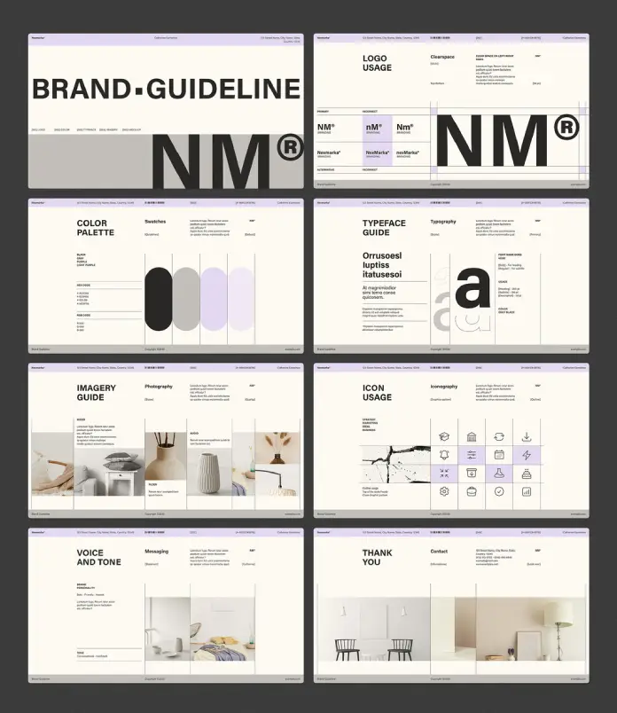
Many designers struggle with the final handoff. You create a beautiful logo, but the client destroys it with the wrong font. Consequently, you need a document that limits their errors. This Adobe InDesign brand guidelines presentation template acts as that necessary shield. It offers a professional structure in a 1920 x 1080 px format, making it perfect for screen-based presentations. The layout uses purple and gray accents to guide the eye without overwhelming the content.
Please note that this professional graphic design template requires Adobe InDesign installed on your computer. Whether you use Mac or PC, the latest version is available on the Adobe Creative Cloud website—take a look here.
Why Should You Choose This Adobe InDesign Brand Guidelines Presentation Template?
Designers often waste hours building decks from scratch. However, efficiency dictates a different approach. Using a pre-designed Adobe InDesign brand guidelines presentation template saves valuable creative energy. You focus on the content, while the grid manages the layout. This specific template features eight fully editable pages. Therefore, it covers the essentials without bloating the document.
The aesthetic is distinctively modern. Soft lavender tones contrast with bold black typography. This creates a hierarchy that feels both academic and approachable. Furthermore, the template implies a high level of professionalism. When you present your work using this Adobe InDesign brand guidelines presentation template, clients perceive the work as more expensive. Value perception is crucial in the creative industry.

The Power of a Structured Grid System
A chaotic layout kills credibility. RedGiant designed this template with a strict, visible grid in mind. You can see the alignment in the “Logo Usage” and “Typeface Guide” sheets. The grid organizes information logically. Thus, the viewer knows exactly where to look.
The screen-ready resolution (1920 x 1080 px) is a massive advantage. Most guidelines today live as PDFs on a server, viewed on monitors. Unlike print-focused layouts, this Adobe InDesign brand guidelines presentation template fills the screen perfectly. You do not need to scroll awkwardly. The information fits the frame. This improves the user experience significantly.
Simplifying Complex Information
Brand guidelines can become boring manuals. Nobody reads a 50-page text document. In contrast, this template relies on visual cues. The “Imagery Guide” and “Icon Usage” pages use placeholders effectively. You simply drop in your assets. The layout automatically balances the image with the text.
Moreover, the “Voice and Tone” section addresses a common gap. Many designers ignore verbal identity. This template forces you to define how the brand speaks. It dedicates space to “Brand Personality” and “Messaging.” Consequently, the final deliverable becomes a holistic brand strategy, not just a logo sheet.
How Customization Enhances Your Workflow
Flexibility remains a top priority for creative professionals. This Adobe InDesign brand guidelines presentation template is fully customizable. Every element is editable. You can change the purple accents to match your client’s corporate color. You can swap the sans-serif fonts for a serif pairing.
The file structure is intuitive. RedGiant set up the layers for easy access. You do not need advanced InDesign skills to manipulate the file. Simply open the file, locate the master pages, and apply your changes globally. This speeds up the revision process. If a client demands a layout tweak, you handle it in seconds.
Visualizing the “Do’s and Don’ts”
One specific highlight is the “Logo Usage” page. It clearly demarcates the “Clearspace” and “Incorrect” usage. Clients often stretch logos or place them on busy backgrounds. This section visually forbids those actions. The Adobe InDesign brand guidelines presentation template makes these rules undeniable.
By showing examples rather than just writing rules, the template educates the client. Education is part of the designer’s job. When the client understands the “why” behind the spacing, they respect the work. This template facilitates that educational conversation.
A Personal Critique on the Design Aesthetics
The choice of purple and gray is sophisticated. It avoids the sterility of pure black and white but remains neutral enough not to clash with most portfolios. The typography used in the preview suggests a Neo-Grotesque style. It feels Swiss, clean, and timeless.
However, the real strength lies in the whitespace. The designer resisted the urge to fill every corner. The “Color Palette” page breathes. It allows the swatches to stand out. In the realm of presentation design, whitespace is a luxury. This Adobe InDesign brand guidelines presentation template uses whitespace as an active design element.
Practical Application for Freelancers
Freelancers often operate on tight deadlines. Delivering a comprehensive brand book usually takes days. With this tool, you cut that time in half. You ensure consistency across all your client deliverables. Furthermore, you build a reputation.
Think of this template as a container for your creativity. You provide the soul; the template provides the skeleton. It holds the work together. Whether you are rebranding a tech startup or a fashion label, the structure adapts.
Final Thoughts on This Design Resource
Investing in a quality Adobe InDesign brand guidelines presentation template pays off immediately. It elevates your presentation game. It ensures your client receives a polished, useful product. RedGiant created a file that balances form and function beautifully.
The template focuses on what matters: the brand. It does not distract with unnecessary decorations. It is clean, sharp, and professional. For any designer looking to streamline their branding process, this asset is indispensable.
Frequently Asked Questions
Q: Is this Adobe InDesign brand guidelines presentation template difficult to use for beginners?
A: No, it is very user-friendly. If you have a basic understanding of Adobe InDesign, you can easily replace text and images. The layers are organized to help you navigate the file.
Q: Does the template include the photos shown in the preview?
A: No, the images are for display purposes only. The template comes with image placeholders. You must insert your own photography and graphics.
Q: Can I use this template for print, or is it strictly for screens?
A: The dimensions are 1920 x 1080 px, which is optimized for screens. However, you can print it. Just be aware that the aspect ratio fits a monitor better than standard A4 or Letter paper.
Q: Do I need a specific version of Adobe InDesign?
A: You generally need a recent version of Adobe InDesign (CC) to ensure all features work correctly. Most templates are compatible with versions from the last few years.
Q: How do I change the color scheme if my brand isn’t purple?
A: You can use the Swatches panel in InDesign. By editing the primary color swatch, the change will reflect across all pages where that specific color is applied.
Feel free to find other amazing graphic design and branding templates here at WE AND THE COLOR.
Subscribe to our newsletter!


