
This post contains affiliate links. We may earn a commission if you click on them and make a purchase. It’s at no extra cost to you and helps us run this site. Thanks for your support!
Where Vintage Glamour Meets Modern Impact: Let’s Explore the Cinema Typeface.
In the dynamic landscape of visual communication, typography that tells a story is more valuable than ever. The Cinema font family, a condensed serif from the creative minds at the Los Andes Type foundry, does exactly that. It captures a nostalgic essence while serving the demands of contemporary design. This isn’t just another typeface; it’s a statement piece, blending the flair of old-school theater marquees with the polished finish required for today’s media platforms. Its timely arrival answers the growing demand for fonts with personality and a strong, hierarchical presence.
Inspired by the bold editorial designs of Chilean magazines from 1941, the Cinema font family offers a compelling link to a rich graphic history. Yet, it is meticulously crafted to perform in the digital age. Its narrow profile and significant weight provide an immediate and powerful visual impact, making it a go-to choice for designers aiming to create memorable and expressive work. This typeface is not merely about arranging letters; it’s about setting a scene and evoking an emotion.
The Anatomy of a Design Star: Deconstructing the Cinema Font Family
What gives a typeface its soul? For the Cinema font family, it’s a combination of historical roots and carefully considered design elements. Consequently, understanding these components reveals why it stands out in a crowded field.
Inspired by History, Built for Today
The font’s core inspiration stems from the vibrant print culture of 1940s Chile. This era’s editorial design was characterized by its need to be bold and space-efficient, qualities that are highly sought after today. The designers at Los Andes have masterfully translated this vintage spirit into a versatile and modern digital tool. In fact, this historical underpinning provides a layer of authenticity and character that is often missing in more generic typefaces.
Striking Characteristics of Cinema
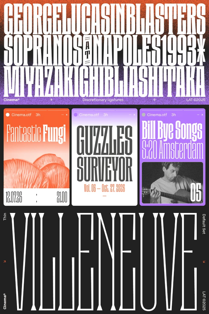
Cinema is defined by its condensed form, which allows for impactful statements in tight spaces—a crucial asset in both print and web design. Several key features contribute to its commanding presence:

- Distinctive Serifs: The sharp, pronounced serifs give the font a classic elegance and improve its structure.
- High Contrast: The significant variation between thick and thin strokes creates a dramatic and rhythmic quality.
- Precise Proportions: Every character is meticulously proportioned to ensure that text blocks are compact, yet highly readable and visually expressive.
- Robust Weight Options: Furthermore, the family includes nine distinct styles, ranging from Thin to Black, offering extensive versatility for creating a clear typographic hierarchy.
The Masterminds Behind the Typeface
The Cinema font family was brought to life by the collaborative efforts of Chilean designer César Araya and the Latinotype Team, and published by the Los Andes foundry. Los Andes, established in 2011 as a spin-off of the renowned Latinotype, aims to create typefaces that simplify and enhance the work of designers. Indeed, their portfolio is known for telling stories, drawing inspiration from travel, nature, and unique experiences.
Why Cinema? The Strategic Advantage in Your Design Toolkit
Choosing a font is a strategic decision that shapes how a message is perceived. The Cinema font family offers a distinct set of advantages that make it a powerful choice for a wide range of creative projects.
Commanding Attention with Typographic Hierarchy
In design, hierarchy is everything. Cinema’s tall, narrow letterforms and heavy weights are engineered to draw the eye. Therefore, this makes the font exceptionally effective for headlines, titles, and any text that needs to make an immediate impression. Whether on a movie poster or a website’s hero section, Cinema establishes a clear focal point, guiding the reader’s attention with authority and style. It excels in creating a strong contrast when paired with a more neutral body font.
Evoking Emotion: From Nostalgia to Modern Sophistication
Good typography connects on an emotional level. The Cinema font family masterfully blends a sense of nostalgia with a clean, modern finish. This duality allows it to feel both timeless and contemporary. For a brand, this can translate into a perception of being established and trustworthy, yet innovative and forward-thinking. It’s a sophisticated choice for projects that aim to convey strength, elegance, and a touch of visual drama.
How to Master the Cinema Font Family in Your Projects
Adopting a new typeface requires understanding its strengths and how to best utilize them. The Cinema font family is a versatile tool, but a few key strategies can help you unlock its full potential.
Perfect Pairings: Fonts that Complement Cinema
Pairing fonts is an art form. To complement Cinema’s strong personality, you might consider these approaches:
- Clean Sans-Serif: For body text, a clean, geometric, or humanist sans-serif like Roboto, Open Sans, or Lato creates a balanced and highly readable combination. The simplicity of the sans-serif allows Cinema’s character to shine in the headlines without overwhelming the reader.
- Subtle Slab Serif: Additionally, a light-weight slab serif can provide a sturdy but understated companion for subheadings or blockquotes, adding another layer of textural interest.
- Minimalist Monospace: For projects requiring a more technical or contemporary feel, pairing Cinema with a simple monospace font for captions or metadata can create a chic, modern aesthetic.
Practical Applications and Inspirational Use Cases
The Cinema font family is adaptable to a variety of applications. Its best use cases are those that call for a strong, expressive voice:
- Branding and Logos: Its distinctive character makes it ideal for creating memorable logotypes and brand identities, especially for industries like fashion, film, and high-end retail.
- Editorial Design: In magazine covers, spreads, and headlines, Cinema can create a powerful and sophisticated editorial tone.
- Posters and Covers: Whether for films, events, or books, the font’s high-impact nature ensures it will capture attention from a distance.
- Web Design: Finally, when used for main headings and call-to-action buttons, Cinema can add a touch of elegance and visual drama to digital interfaces.
A Personal Take on Cinematic Typography
What I find most compelling about the Cinema font family is its unapologetic confidence. It doesn’t just occupy space; it commands it. This makes it an exciting choice, but also one that requires thoughtful implementation. This is not a font for timid designs. Instead, it thrives when given room to breathe and when paired with strong visuals and a clear message. Its true power is in its ability to transform simple text into a captivating visual statement, ultimately making it an invaluable asset for any designer looking to leave a lasting impression.
Feel free to find other trending typefaces in the Fonts category here at WE AND THE COLOR.
Subscribe to our newsletter!


