
This post contains affiliate links. We may earn a commission if you click on them and make a purchase. It’s at no extra cost to you and helps us run this site. Thanks for your support!
Sanremo Vintage Font Duo: The Mid-Century Matchbook Magic Your Brand Needs
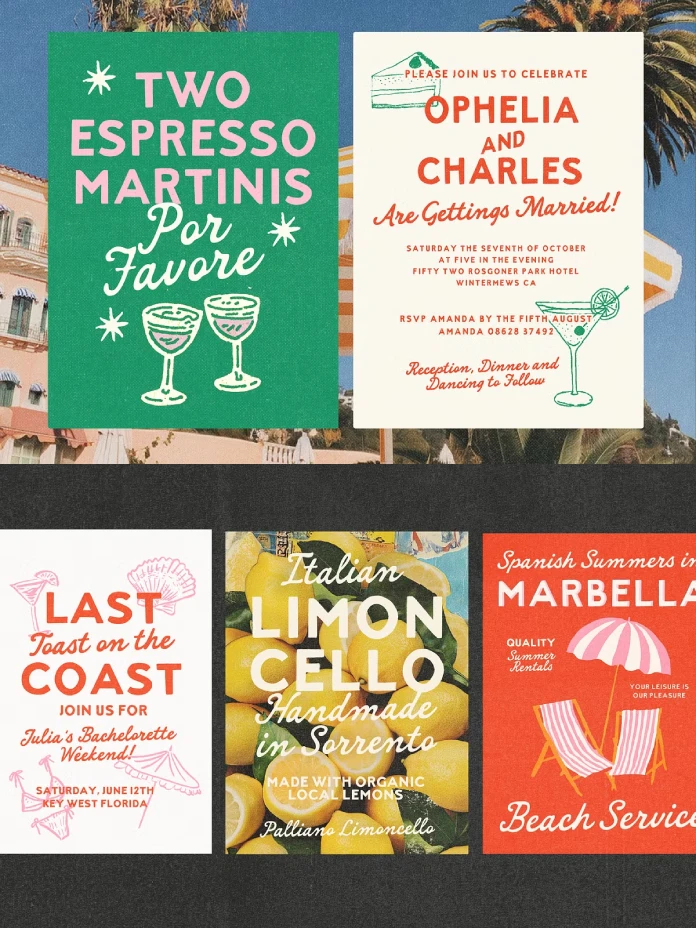
Retro design dominates current trends. Authenticity matters more than ever. The Sanremo vintage font duo from Nicky Laatz arrives at the perfect moment. This pairing captures the charm of 40s and 50s hand-painted signs. Think old matchbooks, classic cocktail lounges, and sun-faded advertising. Nicky Laatz designed Sanremo to offer modern creatives instant nostalgia without cliché.
A great font duo works like a balanced cocktail. It needs structure and flair. Sanremo delivers both.
The Mechanics of the Sanremo Vintage Font Duo
Nicky Laatz built Sanremo with intention. Consequently, the two fonts work together seamlessly. They balance boldness with warmth.
The Confident Sans Serif
First, we have the all-caps sans serif. It stands boldly. It commands attention on any layout. This font looks hand-drawn but remains clean. It possesses the confidence of vintage signage. Furthermore, it includes height variations, allowing for a dynamic, hand-set look.
The Cheeky Script
Second, the smooth, handwritten script adds a personal touch. It acts as the friendly counterpoint to the bold sans. It flows easily. Additionally, the script includes slanted versions for more attitude. A lighter variant exists for use on dark backgrounds.

Texture and Grit
Authenticity requires imperfection. Both the sans and the script come in “smooth” and “slightly rough” versions. The rough option mimics aged ink. This texture adds the crucial “grit” that makes vintage fonts believable.
Why Sanremo Succeeds Where Others Fail
Many “retro” fonts feel like costumes. They look too perfect. The Sanremo vintage font duo feels genuine. Its imperfections are controlled.
Nicky Laatz clearly studied authentic vintage signage fonts. The letterforms are not standardized. They have character. This distinction is vital. Sanremo suggests history without sacrificing modern legibility. It feels collected, not purchased.
How to Use the Sanremo Font Duo Effectively
Where does this duo shine brightest? Its 1950s matchbook typography roots suggest specific, high-impact uses.
Crafting Artisanal Packaging
The Sanremo vintage font duo excels on product labels. Use the bold sans for the primary brand name. Use the script for the flavor profile or tagline.
Picture a craft beer label. The sans shouts the name. The script whispers the ingredients. It works equally well for coffee bags or apothecary goods.
Designing Memorable Menus
Consider the Sanremo font duo for cocktail menus. The sans-serif clearly lists the drink names. The script elegantly describes the ingredients below. The pairing creates a sophisticated yet relaxed atmosphere. It invites the customer in.
Building a Friendly Brand Identity
This combo gives a brand an instant voice. Use the sans for headlines on your website. Use the script for pull quotes or social media announcements. The mix of structure and spontaneity keeps the audience engaged.
Global Reach and Accessibility
Great design knows no borders. The Sanremo vintage font duo supports extensive languages. This includes German, French, Spanish, Italian, and Portuguese. Consequently, your vintage branding can travel internationally without issues.
Personal Observations on the Sanremo Vintage Font Duo
As a creative editor, I test countless typefaces. Sanremo stands out immediately. The balance between the two weights is exceptional.
The script avoids the overly sweet look common in modern calligraphy. It has real swagger. I find the “rough” texture slightly subtle at small sizes. Nevertheless, it looks fantastic when scaled up for impact. This duo is versatile and immediately elevates any project.
The Sanremo vintage font duo is more than just software. It is a mood. It connects the tactile past with the digital present. Laatz delivered a tool that is both useful and inspiring.
Will you use Sanremo to shake up your next design? Feel free to find other trending typefaces here at WE AND THE COLOR.
Subscribe to our newsletter!


