
This post contains affiliate links. We may earn a commission if you click on them and make a purchase. It’s at no extra cost to you and helps us run this site. Thanks for your support!
The Moriz Font Family Provides Geometric Power with a 1930s Soul
The world of typography often looks for inspiration in the future. However, sometimes the most powerful innovations come from studying the past. The Moriz font family by Josep Patau Bellart of Tipo Pèpel perfectly illustrates this idea. This typeface masterfully blends the rational, geometric aesthetics of the 1930s with modern variable font technology. It draws its unique inspiration from the historic labels of Moritz, a famous Spanish beer. Consequently, the Moriz font family is not just a set of letters; it is a versatile design system for today’s creators.
This typeface offers a compelling solution for designers seeking both character and utility. It channels a distinct historical period while providing the cutting-edge flexibility needed for modern projects. For this reason, Moriz is quickly becoming a preferred choice for branding, editorial work, and digital design. This article explores the what, why, and how of this remarkable font family.
The Soul of Moriz: A Nod to 1930s Geometric Purity
To understand Moriz, one must first appreciate the 1930s. This era saw a significant shift toward Modernism in typography. Influenced by movements like the Bauhaus, designers began prioritizing function and simplicity over ornate styles. Geometric sans-serifs, with their structured and precise forms, captured the spirit of the age. Fonts from that period defined the decade with their focus on pure shapes like circles and squares.
The Moriz font family expertly channels this aesthetic. Its letterforms are built on a foundation of clean geometry, creating a sense of order and clarity. However, it avoids feeling cold or sterile by incorporating a subtle human warmth. This balance between industrial rationality and an approachable feel is what makes Moriz so compelling today. It feels both timeless and perfectly suited for contemporary needs.
More Than a Font: The Moriz Font Family as a Variable Powerhouse
While its soul lies in the 1930s, its engine is thoroughly modern. Moriz is a variable font, which represents a significant leap forward in typographic technology.

What Is a Variable Font? A Quick Primer
Instead of requiring separate font files for each style, a single variable font file contains the entire family’s range. Designers can access any point within these variations, not just predefined steps. This technology offers two immense benefits. First, it results in significantly smaller file sizes for faster web performance. Second, it provides an unparalleled level of creative control.
Deconstructing Moriz’s Axes: Width and Weight
The Moriz font family provides two variable axes: width and weight. This means a designer can fluidly adjust text from thin to black, and from condensed to a normal width. This capability allows creators to achieve the exact expression needed for any situation. Imagine fine-tuning a headline to fit perfectly across a banner on any screen. Consider adjusting body copy for optimal readability on different devices. This precision allows for incredibly complex typographic hierarchies from a single file.
Designing with Moriz: From Legible Text to Expressive Headlines
One of the most impressive aspects of the Moriz font family is its profound versatility. Many fonts excel as either a workhorse for body text or a charismatic display face. Moriz was deliberately designed to conquer this divide.
Its primary design focuses on use in running text. For this purpose, it features generous spacing and open letterforms, which provide absolute legibility. This makes it a reliable choice for websites, articles, and user interface design.
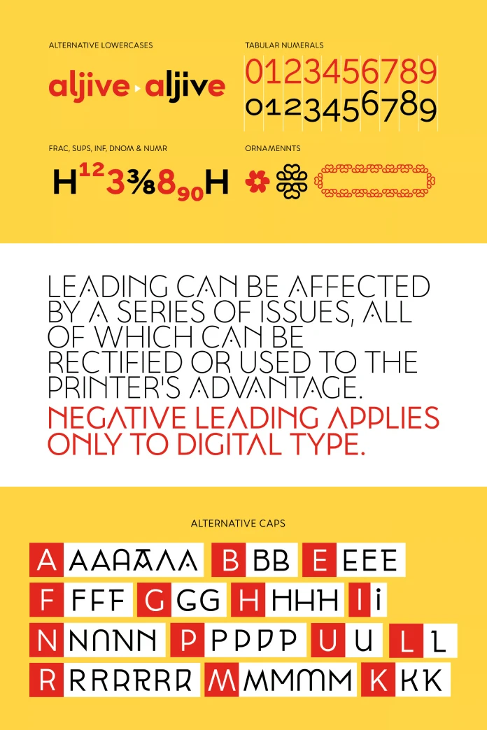
However, Moriz also offers a wealth of tools for customization. The family includes a large number of stylistic alternatives for its capital letters and even for some lowercase letters. Furthermore, it comes with a complete set of small caps for sophisticated typographic detailing. This gives designers the ability to transform a standard headline into something truly unique. Do you need a font that can be both the clear voice of your body copy and the bold face of your brand?
The Mind Behind Moriz: Josep Patau Bellart and Tipo Pèpel
Behind this powerful font family is a dedicated craftsman. Josep Patau Bellart is a self-taught designer who runs the digital type foundry Tipo Pèpel. He has built a reputation for creating unique and high-quality fonts. Patau Bellart emphasizes the importance of usability. He subjects his designs to thousands of tests to ensure they are legible and meet the highest standards. This dedication to quality is evident in every curve and counter of the Moriz font family.
Practical Applications and Why Moriz Stands Out
So, where should you use the Moriz font family? Its blend of classic modernism and flexible technology makes it a strong contender for a wide array of projects.
How to Use the Moriz Font Family for Branding
For corporate branding, Moriz offers a unique balance of professionalism and personality. Its geometric foundation conveys stability and modernity. Meanwhile, the stylistic alternates allow for a memorable and distinctive logo. In editorial design, its legibility shines in body text, and its variable axes allow for dynamic headlines and captions. Its inspiration from packaging also makes it a natural fit for product labels.
A Critical Perspective: Moriz vs. The Competition
In a market with excellent geometric sans-serifs, Moriz distinguishes itself with its unique story and technical power. While other fonts offer clean geometry, Moriz provides a specific historical narrative. Moreover, its implementation as a feature-rich variable font with extensive stylistic alternates gives it a creative edge. It is a font with both a strong point of view and the tools to adapt to any context.
Ultimately, the Moriz font family is more than just a revival or a technical exercise. It is a thoughtful synthesis of history and innovation. It empowers designers to create work that is clean, expressive, and incredibly adaptable. The font proves that the enduring principles of the past can fuel the most dynamic designs of the future.
Feel free to find other popular typefaces here at WE AND THE COLOR.
Subscribe to our newsletter!


