
This post contains affiliate links. We may earn a commission if you click on them and make a purchase. It’s at no extra cost to you and helps us run this site. Thanks for your support!
Where Art Nouveau’s Soul Meets Modern Sophistication: Say Hello to the Aquavit Typeface!
Indeed, a significant shift is underway in the current landscape of typography. Designers and brands are consciously moving beyond the cold precision of geometric sans-serifs. Instead, they seek typefaces with personality, a rich history, and a distinct point of view. It is precisely within this movement that the Aquavit font family from Floodfonts makes its debut, not merely as another font, but as a compelling and timely design statement. This high-contrast sans-serif, deeply rooted in the organic elegance of Art Nouveau, presents a powerful choice for brands aiming to communicate both luxury and genuine character.
You can purchase the complete family from these platforms:
The introduction of Aquavit is especially relevant now. We see a clear trend in luxury branding for 2025 that favors expressive, almost bespoke typography capable of telling a compelling story. Companies are abandoning ubiquitous fonts to embrace unique typefaces that strengthen their identity. The Aquavit font family, with its expert blend of crisp modernity and vintage warmth, is perfectly engineered to meet this demand. This article delves into the what, why, and how of this typeface, offering a critical perspective on its design and practical advice for its application.
You can purchase the complete family from these platforms:
Deconstructing the Aquavit Font Family: A Modern Interpretation of an Old Soul
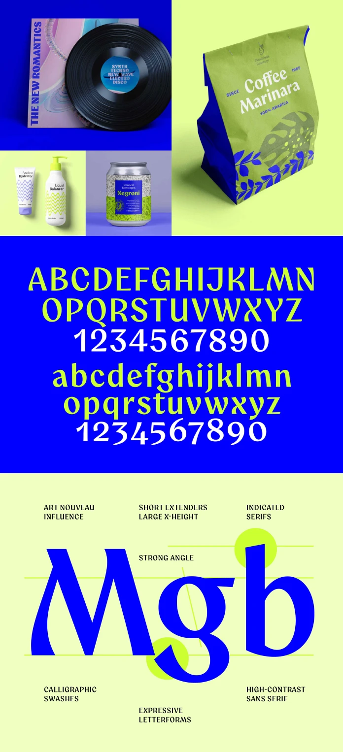
At its heart, the Aquavit font family is a high-contrast sans-serif. This classification points to the dramatic variation between its thick and thin strokes, a feature that creates a sophisticated and visually arresting effect. However, what truly distinguishes Aquavit is its undeniable Art Nouveau influence. This artistic movement from the turn of the 20th century, celebrated for its flowing lines and natural forms, gives Aquavit a unique spirit that feels both handcrafted and exquisitely refined.

What Defines Aquavit’s Design?
Designed by Felix Braden of the Cologne-based foundry Floodfonts, Aquavit skillfully walks the line between cool sophistication and the charm of handcrafted design. This duality is its most significant asset. Consequently, the typeface masterfully avoids the overly ornate qualities of some historical Art Nouveau fonts. It instead presents a cleaner, more contemporary aesthetic. You might think of it as Art Nouveau’s inherent elegance, thoughtfully translated for the digital age. This font finds its place in the world of exclusive lifestyle products. From beauty and fashion to music and interior design, Aquavit adds a layer of authenticity to any project.
The Thoughtful Design Process
The journey to create Aquavit began as a deliberate exploration of infusing a modern typeface with the spirit of Jugendstil, the German term for Art Nouveau. Initially, the primary challenge was finding the perfect balance. Should the design be highly experimental and decorative, or should it lean towards a more legible, functional form? Ultimately, clarity and precision guided the final outcome. The serifs evolved to become more subtle, almost merely suggested in some characters. This refinement significantly improved readability while beautifully preserving the expressive, flowing forms of its core inspiration.
A truly clever innovation in Aquavit’s design is the treatment of its hairlines. In many high-contrast sans-serifs, the thinnest strokes can lose their visual weight, which often compromises legibility at smaller point sizes. Braden’s elegant solution was to add a calligraphic swash to the end of each hairline, created as if with a broad-nib pen. This detail not only adds visual stability, functioning much like a traditional serif, but it also acts as a distinctive feature that enriches the font’s unique character.
Why the Aquavit Font Family is Perfect for Today’s Brands
The appeal of the Aquavit font family stems from its ability to tap into several important trends in contemporary design. A renewed interest in historical design movements, combined with a collective desire for authenticity, makes Aquavit an incredibly compelling choice for designers and brands. Its unique, non-conformist style makes it a perfect choice for alternative brands aiming to stand out.
Answering the Call for Authenticity
In our increasingly digital world, the visual landscape can often feel homogeneous. As a result, there is a growing appreciation for design that feels human and tells a story. The organic, flowing lines of the Aquavit font family, with their subtle calligraphic touches, evoke a sense of craftsmanship and artistry. This feeling stands in stark contrast to the mechanical perfection of many mainstream fonts. Therefore, this handcrafted quality can help brands cultivate a powerful image of authenticity and superior quality.
Elevating Luxury and Exclusive Branding
Modern luxury branding is steadily shifting towards a more nuanced and sophisticated visual language. High-contrast typography, whether serif or sans-serif, is a fundamental tool for creating a sense of elegance and exclusivity. The Aquavit font family, with its dramatic stroke variation and refined details, is perfectly suited for this purpose. It is an outstanding choice for brands within the beauty, fashion, jewelry, and high-end food and beverage industries.
How to Masterfully Use the Aquavit Font Family
The versatility of the Aquavit font family, available in nine distinct weights from Thin to Black, makes it remarkably adaptable to a wide array of applications. However, to truly harness its unique character, it is essential to consider its context and pairings thoughtfully.
Best Use Cases for Aquavit
Given its expressive and attention-grabbing nature, Aquavit truly excels as a display typeface. It proves especially effective for:
- Logos and Wordmarks: The distinctive character of Aquavit makes it an excellent choice for creating memorable and sophisticated brand identities.
- Headlines and Titles: In both print and digital formats, Aquavit’s high contrast and elegant forms can produce impactful and engaging headlines.
- Packaging Design: For luxury goods, Aquavit can elevate packaging, instantly conveying a sense of premium quality and fine craftsmanship.
- Editorial Design: Within magazines and lookbooks, Aquavit can be used to establish a refined and atmospheric typographic palette.
While it is primarily a display face, Aquavit’s design ensures clarity, making it surprisingly legible in smaller sizes. This makes it quite functional for short blocks of text or subheadings.
Smart Font Pairing Suggestions
When pairing other fonts with Aquavit, the goal is to create a harmonious contrast that allows Aquavit’s personality to remain the focal point. Here are a few practical suggestions:
- For a classic and elegant pairing, you might consider a timeless serif typeface such as Garamond or Baskerville for the body text. This approach creates a sophisticated visual hierarchy and enhances readability for longer passages of text.
- For a more modern and clean aesthetic, a neutral sans-serif like Helvetica Neue or Lato can provide a subtle and functional counterpoint to Aquavit’s expressive headlines.
- For a more eclectic and characterful combination, a script font with a handcrafted feel could be used for accents. However, this should be done with restraint to avoid creating a cluttered and overwhelming design.
A Design Critic’s Perspective: Aquavit’s Place in Typography
The Aquavit font family is a truly welcome and noteworthy addition to the world of typography. It successfully navigates the fine line between historical homage and contemporary relevance. By reinterpreting the core principles of Art Nouveau in a modern context, Felix Braden has created a typeface that is both stunningly beautiful and highly functional.
One could argue that the high-contrast sans-serif trend is becoming increasingly popular. Nevertheless, Aquavit’s unique calligraphic details and organic forms clearly set it apart from its contemporaries. It is not simply following a trend; rather, it is contributing to it with a distinct and thoughtfully considered voice.
The ultimate test of any typeface, of course, is its longevity. While Aquavit aligns perfectly with current design trends, its classical proportions and inherent elegance strongly suggest that it will remain a relevant and valuable tool for designers for many years to come. It stands as a testament to the idea that great design is not about slavishly copying the past, but about understanding and reinterpreting it for the present.
You can purchase the complete family from these platforms:
Meet the Designer: Felix Braden of Floodfonts
Felix Braden, the creative mind behind the Aquavit font family, is a distinguished graphic and typeface designer based in Cologne, Germany. He founded the independent type foundry Floodfonts in the year 2000, initially making a name for himself by designing numerous free typefaces. Braden’s work is often characterized by a high degree of legibility and a strong conceptual foundation. His commercial fonts have been released by several renowned foundries, and his work has been recognized with numerous prestigious awards, including from the Communication Arts Typography Annual and the European Design Award.
Find other amazing typefaces here at WE AND THE COLOR, or check out our selection of our most popular typefaces for designers in 2025.
Subscribe to our newsletter!


