
This post contains affiliate links. We may earn a commission if you click on them and make a purchase. It’s at no extra cost to you and helps us run this site. Thanks for your support!
Typography shapes how we read, feel, and remember information. At the start of the year, WE AND THE COLOR published a reference list of the 50 best fonts based on the top typography trends in 2025. Since then, dozens of new type families have been released, and several cultural shifts have altered how designers think about lettering. This mid‑year update of the most popular typefaces revisits the original list with fresh insights, explores why designers are still obsessed with fonts, and uncovers emerging trends that will influence branding, UX, and motion graphics over the next months.
Why Update the Most Popular Typefaces 2025 List?
Early in 2025, it seemed like the typography landscape had settled: designers were embracing nostalgic serifs, bold sans‑serifs, and versatile variable fonts. Yet the market evolves quickly. Foundries launch new families every month, and cultural shifts—from Y2K nostalgia to AI‑generated artwork—change what clients want to see in a brand. New design technologies have also made advanced font features more accessible; variable fonts allow multiple weights and widths in a single file, optical sizing improves legibility across screens, and kinetic type turns static letters into animated narratives. Updating the most popular typefaces of 2025 list ensures the recommendations stay relevant, introduces noteworthy newcomers, and keeps designers ahead of the curve.
Transitioning from analog nostalgia to digital experimentation, we’re seeing a renaissance of serif fonts optimised for screens and a rise in expressive sans‑serifs. Designers also crave fonts that offer flexibility—extensive language support, multiple weights and styles, and variable axes. At the same time, handwritten and display typefaces continue to captivate with unique personalities. These macro‑trends set the stage for the new entrants and style directions outlined below.
Macro Trends Shaping Typography in 2025
The Return of the Serif
Sans‑serifs dominated digital branding for years, but designers are rediscovering the authority and elegance of serifs. We currently experience a broad serif revival—a nostalgic yet modern response to the dominance of sans‑serifs. Serifs evoke heritage and craftsmanship, making them ideal for brands seeking credibility. Modern serifs blend tradition with contemporary forms, while optical sizing ensures they remain legible on small screens. Expect to see more editorial websites and luxury brands adopting sharp yet approachable serif families.
Variable and Multi‑Axis Fonts
Variable fonts consolidate multiple styles in one file, allowing designers to adjust weight, width, or slant on the fly. Multi‑variable typefaces give designers more control and reduce file sizes. Netflix Sans and Spotify Circular—custom variable fonts used by major brands—adapt seamlessly across devices. Variable fonts are game‑changers for responsive design because the same font can scale from bold headlines to small captions without compromising consistency.

Experimental Display Fonts: Brutalism, Y2K, and Bubble
Playful brutalist display typefaces combine raw, heavy letterforms with quirky ligatures and rounded edges. Inspired by neo‑brutalist architecture, these fonts make statements while remaining approachable. The Y2K aesthetic continues as well; chunky retro letters and pixel‑style fonts evoke early‑2000s digital culture. Designers are also embracing bubble and inflatable 3D fonts—balloon‑like letterforms that pop off the page and add nostalgia. Bubble fonts convey friendliness and joy, making them popular for playful brands.
Optical Sizing and Bitmap Aesthetics
Variable fonts aren’t the only technical innovation. There is a growing importance of optical sizing, where fonts adjust letterforms depending on size to optimise readability. This feature, once reserved for print, is now essential for digital interfaces. At the opposite end of the spectrum, bitmap and distressed fonts celebrate pixelation and glitches reminiscent of early computer screens. They pair retro aesthetics with modern layouts, injecting a rebellious edge into branding.
Kinetic, Liquid, and Eco‑Friendly Typography
Typography no longer sits still. Kinetic type uses animation to make letters dance or respond to sound. Liquid chrome fonts mimic molten metal, creating shiny 3D effects. Eco‑typography uses fonts designed to minimise ink usage or reflect organic shapes, aligning type aesthetics with environmental values. There is currently a shift towards glitch and organic typography. These styles embrace imperfections and hand‑drawn authenticity as counterpoints to digital perfection.
New Entrants to the Top 50 List
Remastered Classics: Quadraat and Arnhem
Fred Smeijers’ Quadraat blends Renaissance elegance with contemporary construction. Released in 1992 and remastered in 2019, the typeface now meets modern digital standards. Its calligraphic roots and sharp edges evoke an authoritative yet vibrant tone, making it ideal for editorial design or refined branding. Arnhem, also by Smeijers, started life in the Dutch state newspaper; its functional design and tall x‑height ensure legibility in long texts. Both serifs demonstrate how classic forms can evolve with new technology.
RST Thermal: Variable Heritage
RST Thermal by Reset marries classical French influences with modern variable‑font technology. With weight and optical size axes, designers can tailor the typeface for both text and display use. Its warm atmosphere and comforting rhythm stem from 16th‑century inspirations, making it suitable for literature or packaging that needs a human touch.
Perfectly Imperfect: Cringe Gothic
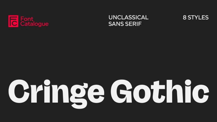
Cringe Gothic by Font Catalogue is a bold new typeface that reflects today’s cultural shift from polished perfection to raw authenticity. Designed as a grotesk with character, it transforms typographic discomfort into a versatile design tool, making it ideal for brands that value honesty over hype. More than just a font, Cringe Gothic embodies the “post-cringe” era—where what once felt awkward or embarrassing is redefined as genuine, relatable, and powerful. This typeface invites designers to embrace imperfection and use vulnerability as a creative strength.
Bold Display Options: Druk and Romie
Berton Hasebe’s Druk is a condensed sans‑serif designed for impactful headlines. Inspired by historical condensed faces and artists like Barbara Kruger, Druk uses flat surfaces and tight spacing to maximise visual impact. Romie, a calligraphy‑inspired display serif by Margot Lévêque, offers twelve styles and supports over 300 languages. Its June 2024 update added italics, enhancing versatility for editorial and branding contexts.
Editorial Elegance: PP Editorial New and Tausend
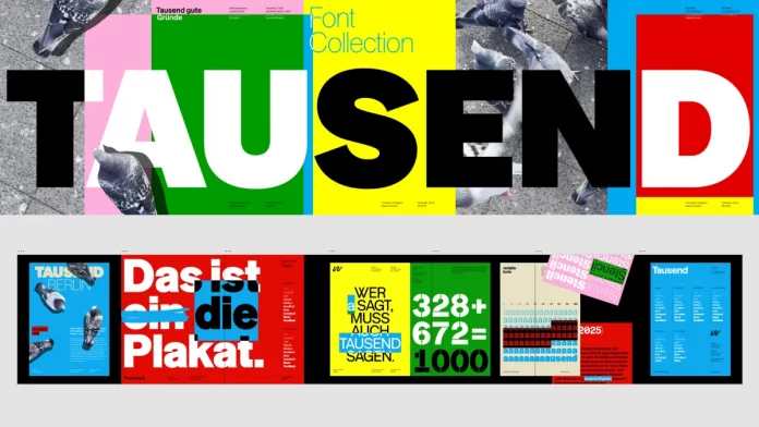
Pangram Pangram’s PP Editorial New combines a retro mid‑90s feel with contemporary richness. Its lighter weights exude elegance, while heavier styles introduce exaggerated curves and lush italics. The Tausend font family by Fontwerk, designed by Christoph Koeberlin and Gabriel Richter, began with the sketch of a single ‘a’ that evolved into a versatile, contemporary homage to German grotesque typefaces. With six distinct subfamilies, Tausend combines historical roots with modern sharpness, offering designers a confident and adaptable typographic system.
Performance‑Driven Type: NaN Serf
NaN Serf is designed for consistent performance across sizes. Its orthogonal detailing and perpendicular terminals provide a letterpress feel at small sizes and crisp geometry at large sizes. Updated in July 2024 with italics for all weights, this serif demonstrates the trend toward versatile fonts that serve multiple roles.
Clarity and Character: Moderna Grotesque
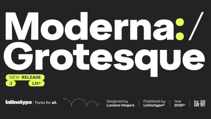
The Moderna Grotesque font family, designed by Luciano Vergara for Latinotype, is a rare example of a typeface that feels both timeless and perfectly contemporary. Rooted in the spirit of early 20th-century grotesques yet refined with geometric precision, it balances historical influence with modern clarity. More than just another sans-serif, Moderna Grotesque is a versatile design tool—clean and functional without ever appearing sterile. Its ability to serve as both a reliable workhorse and an expressive centerpiece makes it an essential asset for designers seeking enduring appeal and a strong, clear typographic voice.
Emerging Free Fonts and Independent Releases
Beyond commercial releases, many independent designers offer free fonts that gain popularity through social media. Here comes a curated list introducing fresh names:
- Geist represents the coding and design spirit of Vercel’s creative community. Its monoline construction suits UI design and developer documentation.
- SK‑Modernist strips away complicated forms for a minimalist digital look.
- Project Blackbird offers unique grotesk shapes, and Neutral Face channels Swiss‑style sans‑serifs for clean interfaces.
- Bergul is a retro display typeface with a 70s vibe, fitting the Y2K resurgence.
These additions illustrate the breadth of the most popular typefaces 2025 beyond big foundries.
Logo and Branding: Stand‑Out Fonts and Strategic Choices
Logo typography in 2025 balances expressiveness with timelessness. Brands continue to choose distinctive fonts with strong serifs, playful swooshes, and romantic terminals for logos. For sans‑serif directions, geometric extended cuts and bubble‑ or retro‑inspired letters dominate. Designers also adopt minimal logo fonts with subtle tweaks to individual letters, giving a clean wordmark personality. Conversely, maximalist logos use decorative elements and fonts that push beyond simple sans‑serifs; typefaces like Granke embrace contrast, loops, and alternate glyphs.
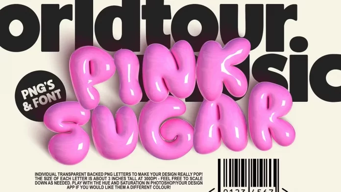
When choosing a logo font, consider the industry and the desired emotional tone. Flexible but distinctive typefaces like Valentino Vergan’s Granke or bubble letters like Pink Sugar, designed by Nicky Laatz, appeal to fashion and children’s brands, while elegant contrast fonts like Nothina Mount by Alit Design suit luxury products. Tweaking one letter or selecting a variable font can differentiate a logo without sacrificing readability. Most importantly, ensure the typeface aligns with the brand’s voice—maximalism might work for a creative studio, but overwhelm a healthcare company.
Applying Typography Trends in Your Work
Designers often ask: How can I use these trends without overwhelming my brand? Stick to two complementary typefaces to maintain hierarchy and readability. Combine a serif and a sans‑serif to create contrast, or use a variable font for both headlines and body copy. Experiment with pixel fonts or glitch effects in small doses to add personality. For digital products, optical sizing and variable fonts ensure your typography scales gracefully across devices.
Before jumping on a trend, ask yourself if it supports your message. Does a bubble font convey the warmth you want? Could a softened brutalist display typeface make your heading stand out without intimidating readers? Alignment with brand purpose is key. Always keep in mind—blending too many styles creates chaos. Instead, develop a consistent design system with font pairings, sizes, and spacing rules.
Looking Ahead: Future Directions in Typography
The second half of 2025 will likely push typography further into interactive and experimental realms. Motion design and kinetic type will be integrated into websites and digital signage, while variable fonts will become standard as browser support matures. AI‑generated typefaces and holographic effects may create bespoke letterforms that respond to user interactions. Designers will continue exploring eco‑typography to align with sustainability goals. At the same time, the yearning for authenticity will drive demand for organic, hand‑drawn, and ephemera‑inspired fonts. The balance between innovation and nostalgia will define the next stage of the most popular typefaces in 2025.
Conclusion
Typography remains a cornerstone of visual communication. This most popular typefaces of 2025 update demonstrates how rapidly the field evolves—from remastered classics like Quadraat and Arnhem to playful brutalist displays, variable fonts, and nostalgia‑driven bubble lettering. Understanding the trends and the rationale behind them helps designers select fonts that are not only stylish but functional and on message. Whether you’re creating a sophisticated editorial layout, a bold logo, or an interactive digital experience, the fonts highlighted here offer inspiration and practical tools.
When designing, remember to prioritise clarity, readability, and brand alignment. Ask yourself: Does this font amplify my story? The most popular typefaces of 2025 are not simply fashionable; they are versatile instruments that, when chosen thoughtfully, can elevate any creative project.
Explore WE AND THE COLOR’s Fonts category to discover the latest trending typefaces for graphic design, branding, and creative projects. Our expert font reviews make it easy to find the perfect typeface for your next design. Check out our selection of the 100 coolest fonts for designers in 2026.


