
This post contains affiliate links. We may earn a commission if you click on them and make a purchase. It’s at no extra cost to you and helps us run this site. Thanks for your support!
Say Hello SLTF Arcilla: The Modern Serif Typeface for Elevated Editorial Design
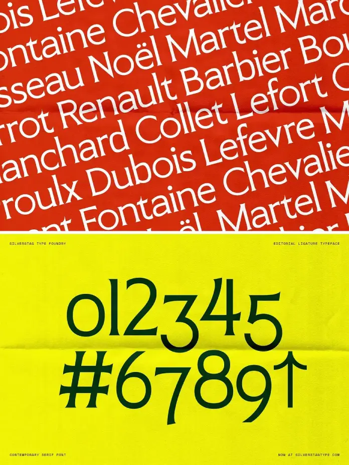
Typography shapes the immediate perception of a brand’s visual voice. Designed and published by SilverStag Type Foundry, SLTF Arcilla arrives as a precise answer to modern design fatigue. This modern serif typeface cuts through visual noise with remarkable clarity. Designers often struggle to find tools that balance structure with personality. SLTF Arcilla solves this by offering a distinct visual character. It blends sharp angles with smooth curves effortlessly. Consequently, it creates a serif that feels refined, stylish, and highly usable. You need a tool that speaks with authority yet remains approachable. SLTF Arcilla delivers this balance for branding and creative projects.
What Makes SLTF Arcilla Stand Out in Contemporary Typography?
You might notice the market is flooded with generic serifs. However, SLTF Arcilla refuses to blend into the background. Its sculpted details create a refined, stylish aesthetic immediately. The terminals feature thoughtfully designed shapes that catch the eye. This attention to detail ensures a recognizable silhouette in logos. Fashion brands particularly benefit from this clean design language. It brings a necessary edge to lifestyle products and packaging.
Furthermore, the font avoids the stiffness of traditional serif options. It feels alive because of its dynamic stroke variations. Designers appreciate how it maintains a strong editorial look. Therefore, it serves as a robust foundation for visual identities. You can rely on SLTF Arcilla to anchor a complex layout. It provides stability while simultaneously adding a touch of personality.
The Art of Structure and Fluidity
Editorial design demands both rigorous readability and artistic flair. SLTF Arcilla offers a curated set of ligatures to enhance this. These features allow you to create custom wordmarks easily. You do not need additional lettering work to achieve a bespoke look. The font maintains clarity even in smaller editorial settings. Consequently, it performs exceptionally well across various layout formats.
I find the interplay between the uppercase and lowercase characters fascinating. The geometry feels intentional rather than strictly mathematical. This gives the typeface a human touch despite its digital precision. Moreover, the alternates add extra expression to standard headlines. You gain flexibility without sacrificing the cohesive look of the typeface.

Why Branding Experts Choose This Typeface
Visual identities thrive on consistency and flexibility across platforms. SLTF Arcilla provides uppercase and lowercase characters for full versatility. It handles multilingual support seamlessly for global campaigns. Social media graphics require fonts that pop on small screens. This typeface balances elegance and simplicity for digital platforms. It fits effortlessly into your creative toolkit for diverse projects.
Additionally, the numerals and punctuation match the font’s sculpted aesthetic. Every glyph contributes to the overall sense of modern luxury. High-end brands need typography that implies value without shouting. SLTF Arcilla achieves this through subtle contrast and sharp execution. Therefore, it remains a top choice for contemporary visual identities.
Examining the Technical Precision
I believe a font’s true test lies in its details. SLTF Arcilla passes this test with rigorous geometric logic. The contrast between thick and thin strokes feels intentional. It avoids the trap of being too delicate for practical use. Instead, it asserts a strong editorial look without overwhelming the viewer.
Designers searching for a serif for headlines will value this durability. It holds up under the scrutiny of large-format printing. Simultaneously, it remains legible when reduced for business cards. This scalability proves vital for comprehensive branding packages. Thus, SLTF Arcilla bridges the gap between display and text usage.
Practical Applications for the Modern Designer
Consider using SLTF Arcilla for luxury packaging requirements. It elevates the perceived value of the product immediately. Print magazines also benefit from its sharp, high-contrast readability. Designers looking for a serif for headlines should prioritize this option. It anchors a page while maintaining a sense of airiness.
Furthermore, the fashion industry demands typography that feels current yet timeless. SLTF Arcilla fits this niche perfectly. It captures the spirit of modern elegance effortlessly. Lifestyle blogs can use it to establish a sophisticated tone. Consequently, the font helps content creators stand out in crowded feeds.
Creating a Distinct Visual Character
Uniqueness remains the gold standard in creative direction today. SLTF Arcilla helps you build a unique narrative. The sharp angles distinguish it from softer, older serifs. You convey innovation and confidence by selecting this typeface. It suggests that the brand understands contemporary aesthetics.
Also, the smooth curves soften the aggressive nature of the terminals. This duality makes the font versatile for various industries. It works for tech startups seeking a human element. Conversely, it suits artisanal brands looking for structure. SLTF Arcilla adapts to the context while keeping its soul.
Integrating SLTF Arcilla into Your Workflow
Adopting a new typeface requires understanding its specific rhythm. I recommend testing SLTF Arcilla in high-contrast black and white. You will see the structural integrity of the forms clearly. Then, apply it to color-rich backgrounds for social media graphics. The font holds its own against complex imagery.
Moreover, pair it with a minimal sans-serif font for body copy. This combination allows SLTF Arcilla to shine as the hero. It takes command of titles and logos naturally. Therefore, you should let it drive the visual hierarchy. Do not be afraid to use it at massive scales. The sculpted details deserve to be seen up close.
A Critic’s Perspective on Usability
We often see fonts that prioritize style over substance. However, SLTF Arcilla avoids this common pitfall completely. It remains highly legible despite its high-fashion appearance. The designer clearly prioritized function alongside form during creation. This makes it a reliable workhorse for daily design tasks.
I appreciate how the ligatures function as design elements themselves. They reduce the need for accompanying graphics or icons. The type becomes the image in many instances. This approach aligns perfectly with modern minimalist trends. Thus, SLTF Arcilla is not just a font; it is a design solution.
Final Thoughts on This Modern Serif
Your choice of typography defines your design narrative. SLTF Arcilla offers the sophistication needed for high-end work. It blends clean structure with sculpted details effectively. Designers who want a strong editorial look need this font. It is refined, stylish, and highly usable.
Ultimately, SLTF Arcilla represents the future of editorial typography. It respects tradition but pushes forward with sharp modernity. You will find it an indispensable part of your library. Give your projects the distinct character they deserve. Choose SLTF Arcilla for your next breakthrough design.
Frequently Asked Questions
What is the best use case for SLTF Arcilla?
SLTF Arcilla excels in high-impact areas like logo design, fashion branding, and editorial headlines. Its sharp details and strong silhouette make it perfect for display purposes where a distinct visual character is required.
Does SLTF Arcilla support multiple languages?
Yes, the typeface includes multilingual support. This ensures that designers can use it for international branding projects and global campaigns without losing the font’s distinct aesthetic.
Can I use SLTF Arcilla for body text?
While SLTF Arcilla creates a strong editorial look in headlines, it maintains clarity in smaller settings. However, it performs best in short blocks of text, captions, or pull quotes rather than dense academic paragraphs.
How do the ligatures in SLTF Arcilla enhance design?
The curated set of ligatures allows for custom wordmarks without extra lettering work. They connect characters fluidly, adding a bespoke, sculpted feel that elevates the elegance of titles and logos.
Is SLTF Arcilla suitable for digital screens?
Absolutely. The design balances elegance and simplicity, ensuring it remains legible on social media graphics and websites. Its distinct contrast helps it pop on digital screens just as well as in print.
Check out other popular typefaces on WE AND THE COLOR or take a look at our selection of 100 cool fonts for designers in 2026.
Subscribe to our newsletter!


