
This post contains affiliate links. We may earn a commission if you click on them and make a purchase. It’s at no extra cost to you and helps us run this site. Thanks for your support!
The Highway Motel Font is the Cinematic Retro Tool Your Designs Need
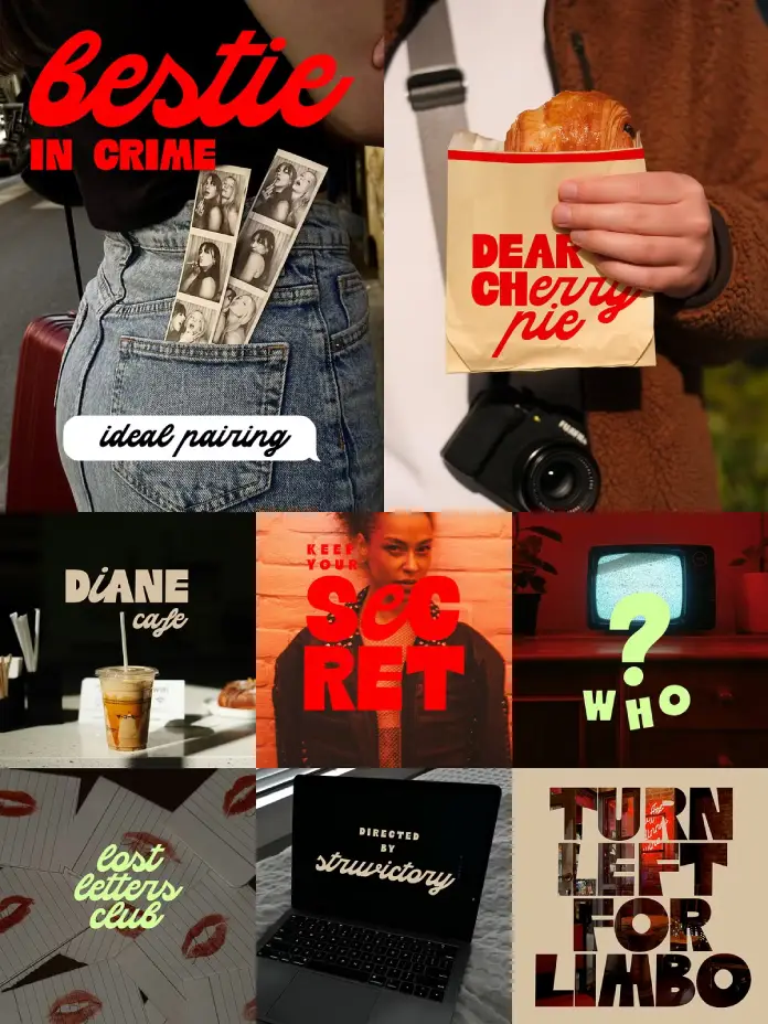
Nostalgia often traps designers in a loop of repetitive kitsch. However, fresh typography can break this cycle effectively. The Highway Motel font arrives as a perfect solution for this creative dilemma. It blends geometric stability with fluid, script-like motion. Designers seeking a cinematic edge will find immediate value in this tool. This typeface captures the essence of a late-night drive effortlessly. It feels familiar yet surprisingly modern in its execution. Furthermore, it offers a specific mood that generic fonts simply cannot match. You need tools that evoke emotion instantly. This experimental sans-script does exactly that.
You can download the typeface for a very low budget from these platforms:
Why Does the Highway Motel Font Feel So Cinematic?
Most typefaces pick a lane and stay there. They are either a rigid sans-serif or a flowing script. Highway Motel font ignores this rule completely. Its uppercase characters stand tall as a bold geometric sans. They provide a sturdy, authoritative framework for your text. Conversely, the lowercase letters flow as a connected script. This duality creates a dynamic visual tension on the page. It mimics the contrast of a neon sign against dark pavement. You rarely see such effortless cool in digital typography.
You can download the typeface for a very low budget from these platforms:
Consequently, this contrast tells a story. It evokes images of Americana and roadside adventures. The font feels like a subtitle from an indie film. Struvictory.art crafted this to be more than just letters. It acts as a visual atmosphere generator. Therefore, using the Highway Motel font instantly sets a scene. It transforms a simple headline into a narrative hook.

Analyzing the Experimental Sans-Script Structure
We must look closely at the construction. The uppercase letters anchor the eye. They possess confident retro curves without being overly ornamental. This ensures readability remains high even at a distance. Meanwhile, the lowercase adds the personality. It brings a touch of motion to the layout. This combination is what makes the Highway Motel font unique. It balances professional clarity with artistic flair.
Designers often struggle to pair different fonts. Usually, you must hunt for a script that matches a sans. Here, the work is already done for you. The unity between the two styles is organic. As a result, your workflow becomes significantly faster. You get a complex typographic look with a single file.
Mastering the Highway Motel Font for Modern Branding
You must use this tool with clear intention. It dominates a composition easily due to its strong character. Therefore, you should pair it with minimal imagery. The Highway Motel font thrives in branding projects requiring distinct personality. Think about coffee shop logos or indie band posters. It also works beautifully for social media graphics. The aesthetic connects instantly with younger, vibe-focused audiences.
Do not clutter the layout around it. Let the typeface breathe to maximize its impact. A retro font aesthetic requires negative space. Furthermore, color choice plays a huge role here. Neon pinks, deep blues, or faded vintage creams work best. They enhance the late-night movie energy of the design.
Ideal Use Cases for Creative Projects
- Editorial Headers: It grabs attention immediately.
- Merchandise Design: It looks incredible on t-shirts.
- Album Covers: It captures a specific sonic mood.
- Social Media overlays: It stops the scroll effectively.
Using the Highway Motel font in these contexts elevates the perceived value. It suggests a bespoke, handcrafted approach to design. Clients often look for this exact “custom” feel.
Is This Experimental Style Too Niche?
Critics might argue that the style limits broad application. Indeed, it is not for corporate banking reports. However, specificity is its greatest strength. Generalist fonts often lack soul or a distinct flavor. This Highway Motel font commits fully to its narrative. It demands attention rather than fading into the background. Struvictory.art took a calculated risk with this design. That risk pays off for bold art direction.
We are seeing a shift away from sterile minimalism. Audiences crave texture and personality in visual communication. Consequently, “niche” designs are becoming the new mainstream. They offer the authenticity that consumers currently demand. Therefore, this font is not just a trend. It is a response to a changing visual landscape.
Technical Versatility Behind the Retro Curves
Visuals matter, but function ensures longevity in your toolkit. The font supports most popular Latin-based languages. This extends its utility beyond English-speaking markets significantly. You can verify specific symbols in the font preview box. This accessibility is crucial for global campaigns. A pretty face must also work hard technically. Highway Motel font passes this technical test easily.
You can rely on it for diverse client needs. Whether in Spanish, French, or German, the vibe remains consistent. This is vital for maintaining brand identity across borders. Designers need tools that travel well. This typeface packs its bags and goes anywhere.
Personal Thoughts on the Americana Revival
I see a shift toward emotional design. We crave things that feel human and handmade. This typeface captures that fleeting feeling of freedom. It reminds me of 3 AM roadside diners. That emotional hook drives engagement today. Consequently, using the Highway Motel font adds narrative depth. It tells a story before you read the words.
The mix of sans and script feels rebellious. It breaks academic typography rules in the best way. It encourages us to be playful with language. Design should be fun, after all. This font brings that joy back to the process.
Final Verdict on This Typographic Tool
Struvictory.art has delivered a serious contender for your library. It bridges the gap between vintage nostalgia and modern precision. You get the best of both worlds. The Highway Motel font is an investment in style. It solves the problem of boring headers instantly. Moreover, it inspires you to create bolder work.
You can download the typeface for a very low budget from these platforms:
If you want your designs to speak loudly, choose this. It offers a voice, not just text. Next time you need a cinematic touch, remember this name. The Highway Motel font is ready for the open road.
Check out other amazing typefaces for different purposes on WE AND THE COLOR. In addition, you can find 100 top typefaces in our selection of the 100 best fonts for 2026.
Subscribe to our newsletter!


