
This post contains affiliate links. We may earn a commission if you click on them and make a purchase. It’s at no extra cost to you and helps us run this site. Thanks for your support!
Design trends often cycle back to the past for inspiration. However, few aesthetics capture the imagination quite like the mid-century holiday style. Visual storytellers currently crave authenticity and warmth in their projects. Consequently, they need tools that evoke nostalgia without feeling outdated or derivative. Nicky Laatz answers this specific demand with Club Merry. This playful, layered font system offers more than just letters. Indeed, it provides a comprehensive toolkit for building festive engagement. It stands out as a premier Christmas typeface for contemporary branding. Therefore, designers looking for a blend of fun and function find their solution here.
This article examines why Club Merry works so effectively. Furthermore, we will explore how this Christmas typeface elevates seasonal campaigns. We analyze the technical features that separate it from standard holiday fonts. Additionally, we provide specific tips for maximizing its layered potential. Professional creatives understand that typography sets the voice of a brand. Thus, choosing the right Christmas typeface remains a critical decision during the holiday season.
Why Does a Retro Christmas Typeface Resonate So Deeply Now?
Nostalgia acts as a powerful psychological trigger in marketing. Specifically, it transports audiences to a simpler, happier time. A well-executed Christmas typeface taps into this collective memory instantly. Club Merry utilizes soft edges and quirky geometry to achieve this effect. Moreover, it avoids the rigid perfection of digital-native fonts. Instead, it mimics the imperfections of hand-painted signs from the 1950s. This imperfection signals humanity to the viewer. Consequently, the audience builds an emotional connection with the design immediately.
Visual clutter often overwhelms consumers during the holidays. Therefore, a clean yet character-rich Christmas typeface cuts through the noise. Club Merry balances legibility with decorative flair perfectly. It does not scream for attention; rather, it invites the viewer in. This subtlety makes it a superior Christmas typeface for high-end campaigns. Brands seeking a “hometown” feel benefit immensely from this specific aesthetic. Ultimately, the font bridges the gap between commercial polish and artisanal charm.
The Mechanics of the Layered System
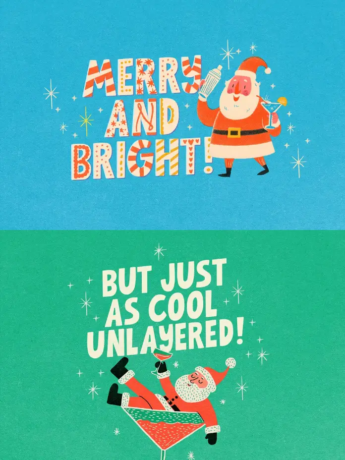
Club Merry is not a single font file. On the contrary, it functions as a robust design engine. The foundation begins with a playful sans-serif base. This base layer works beautifully on its own for clean headers. However, the magic happens when designers apply the additional layers. This Christmas typeface includes a “Deco” version featuring decorative bits and bobs. These elements add instant festivity without requiring custom illustration.

Furthermore, the system includes multiple shadow options. A slight shadow to the left creates a casual vibe. Alternatively, a shadow to the right offers a different perspective. Both options mimic a misprinted look for added vintage realism. Additionally, a 3D extruded version provides significant weight. This versatility ensures the Christmas typeface adapts to various contexts easily. One might use the simple outline for a modern look. Conversely, stacking all layers creates a maximalist retro explosion.
Mastering the Art of Typographic Layering
Effective use of a layered Christmas typeface requires restraint and strategy. Beginners often make the mistake of using every layer simultaneously. However, professional designers know that contrast creates impact. For instance, combine the solid base with just the outline for a sticker effect. This technique keeps the text readable while maintaining style. Moreover, the “Deco” layer offers unique customization opportunities.
Here is a pro tip for using this Christmas typeface. You do not need to display all decorative elements at once. Perhaps some letters look better without the extra flair. Simply change the color of the “Deco” layer to match the background. Consequently, the unwanted bits disappear visually. This trick allows for a truly bespoke typographic arrangement. Therefore, Club Merry functions less like a static font and more like a dynamic lettering kit. This flexibility cements its status as a top-tier Christmas typeface.
How Does Club Merry Compare to Other Holiday Fonts?
The market saturates with holiday fonts every October. Yet, most lack the cohesion found in Nicky Laatz’s work. Many alternatives feel too cartoonish or overly formal. Club Merry, however, strikes a sophisticated balance. It creates a “grown-up” festive atmosphere. This distinction is vital for lifestyle brands. A luxury candle company, for example, needs a Christmas typeface that feels premium yet seasonal. Club Merry fits this niche perfectly.
Additionally, the texture quality sets this Christmas typeface apart. The edges possess a natural, organic tremble. This detail mimics the bleed of ink on paper. Digital perfection often feels cold and sterile. In contrast, Club Merry brings warmth to the screen. Social media graphics particularly benefit from this tactile quality. Users stop scrolling when typography feels tangible and human. Thus, this Christmas typeface drives higher engagement rates on platforms like Instagram and Pinterest.
Practical Applications for Digital and Print
Versatility defines a truly great typeface. Fortunately, Club Merry excels in both physical and digital environments. In print, the 3D and shadow layers hold up remarkably well at large sizes. Packaging designers can use this Christmas typeface to make products pop on the shelf. The bold weight ensures readability from a distance. Furthermore, the retro style pairs excellently with kraft paper and matte textures.
On the web, the font maintains its integrity even at smaller sizes. However, designers should use the intricate “Deco” layer sparingly on mobile screens. Instead, utilize the solid base for body copy or smaller headers. Save the full layered effect for hero banners. This hierarchy ensures the user experience remains smooth. A responsive Christmas typeface must prioritize legibility across devices. Club Merry manages this technical requirement without unexpected rendering issues.
Why This Christmas Typeface Deserves a Spot in Your Toolkit
Investing in quality assets saves time and elevates output. Club Merry offers high value through its layered complexity. You essentially get multiple fonts for the price of one. Moreover, the “misprinted” shadow options save hours of manual texturing in Photoshop. A designer simply types, layers, and achieves the look instantly. This efficiency is crucial during the busy holiday crunch. Therefore, having a reliable Christmas typeface ready to go is a strategic advantage.
Critically, this font encourages creativity. It asks the designer to play with color and depth. You can create neon sign effects or cookie-cutter styles easily. The 3D extruded layer suggests physical depth naturally. Consequently, simple text becomes a central graphic element. You do not need expensive stock photography when your Christmas typeface serves as the main image. This shift allows for cleaner, bolder layouts that stand out.
Final Thoughts on Seasonal Branding
Typography carries the emotional weight of a message. During the holidays, that emotion should be joy. Club Merry delivers this feeling effortlessly. It avoids the clichés of bleeding cowboy fonts or standard scripts. Instead, it offers a fresh take on the mid-century aesthetic. This Christmas typeface proves that retro design can feel incredibly modern.
Nicky Laatz has created a system that respects the designer’s need for control. The ability to customize layers gives you ownership over the final result. No two designs need to look exactly the same. Ultimately, Club Merry is not just a font; it is a celebration of print history. It reminds us why we love design in the first place. Therefore, if you need a Christmas typeface that delivers results, look no further. This layered beauty lights up any project it touches.
Take a look at WE AND THE COLOR’s Fonts category or check out our selection of the best 100 free typefaces for 2026.
Subscribe to our newsletter!


